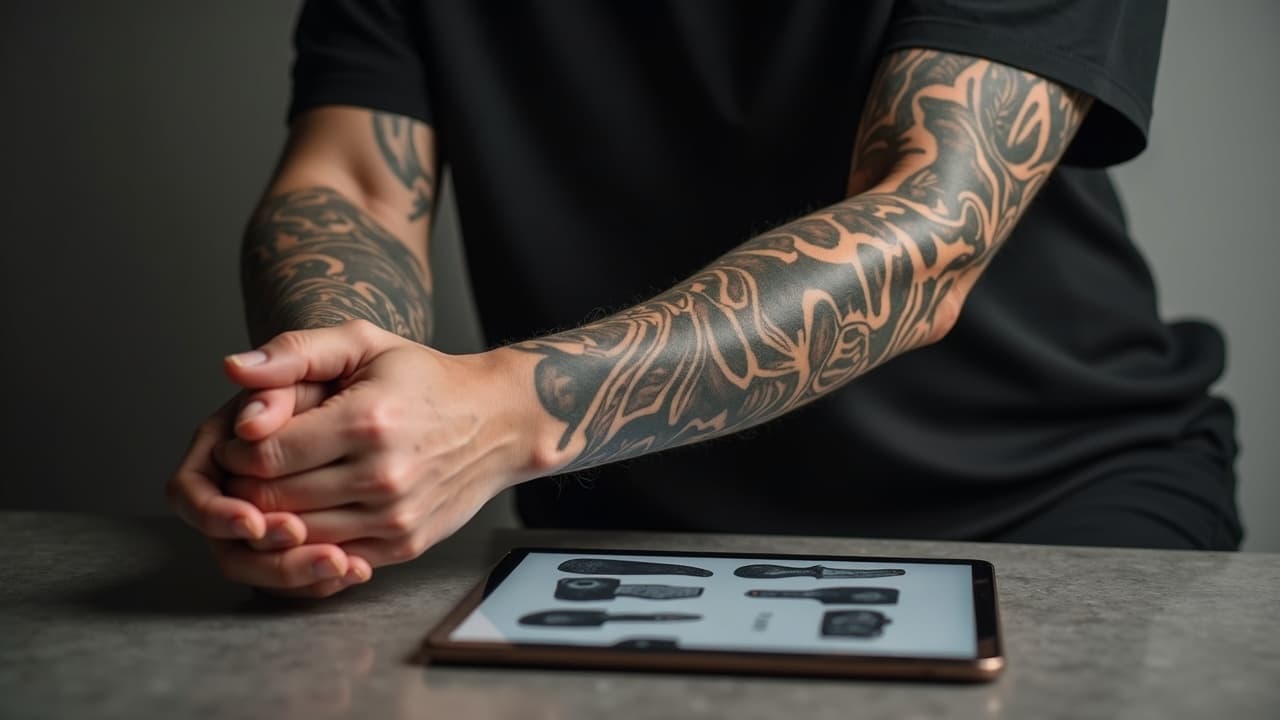
About one third of U.S. adults have at least one tattoo, and roughly one in five have multiple pieces, according to Pew Research Center. If you are stepping up to an arm sleeve, composition is the difference between a gallery of stickers and a piece that moves like fabric. Here is how a pro plans sleeves so they flow, breathe, and age cleanly.
Patchwork vs Cohesive Sleeves, What Actually Reads Clean
Both strategies can look excellent when composed with intent. Patchwork, sometimes called a sticker sleeve, builds a collection from discrete pieces across months or years. Cohesive sleeves are designed as a single composition that wraps the arm with a continuous flow. The mistake is treating patchwork like random placement or forcing a cohesive piece without respecting the arm’s twists. Think of the arm as a rotating cylinder with three public views, outside, side, and inside. Patchwork shines when you curate 3 to 6 anchors per limb segment, then knit them with consistent line weight and value. Cohesive sleeves excel when you lead the eye along directional motifs, like windbars, leaves, waves, filigree, or geometric ribbons, so there is always a path to follow around each turn. Artists like Chris Garver make Japanese flow read from shoulder to wrist, while Thomas Hooper’s dotwork and geometry prove that even abstract sleeves can have a consistent rhythm. Color realism specialists like Nikko Hurtado succeed by controlling value structure and edge quality so the sleeve scans well from 5 feet away. Whichever route you choose, decide your viewing priority first, the wearer’s view or the viewer’s. That orientation rule drives how faces, text, and directional elements rotate.
Build Your Map, Anchors, Orientation, and Arm Zones
Start with anchor pieces on each major zone, outer bicep, front bicep, inner bicep, triceps panel, outer forearm, inner forearm, and the wrist cuff. For a patchwork sleeve, choose 2 large anchors on the outer arm planes, then 2 to 3 medium anchors on secondary planes. Space them with planned negative rivers, not accidental holes. For a cohesive sleeve, sketch a spine of motion that connects deltoid to wrist, then set focal points along that spine. Orientation rule of thumb, faces and text should face the viewer on the outside planes and the wearer on the inside planes. If you prefer everything to face you, keep that consistent across the whole sleeve so it does not flip mid-forearm. Size anchors by plane, the outer upper arm can carry a 6-8 inch tall focal, the inner forearm works best with 4-6 inches, and the wrist zone rarely fits more than 2-3 inches without crowding. Before you commit, sanity check what those sizes actually look like with our size reference guide. Finally, pre-plan where high-detail elements land, keep micro-details on flatter zones, outer forearm and triceps, and reserve the tightest curvature, inner forearm and bicep cradle, for simpler reads and connective flow.
Route the Flow Around Joints, Elbow Ditch and Wrist
The elbow is two problems, the outer point is bone and the inner crease, the ditch, is tender and dynamic. Flow-wise, avoid hard perpendicular edges across the ditch. Instead, arc bands or leaves that bend with the crease. For patchwork, do not let two separate stickers terminate directly at the ditch, they will drift apart visually when you extend and flex. Drop a ribbon of connective background across that span to smooth the transition. For cohesive builds, treat the outer elbow point as a low-detail zone or a bold, simple emblem, like a rosette, filigree medallion, or solid black cap. At the wrist, decide early if you want a cuff ending or a feathered fade. Cuffs should align to bone landmarks, radial and ulnar edges, and stop roughly 1-2 finger widths above the wrist crease to avoid blowouts and keep watch bands comfortable. If you plan to tattoo into the wrist crease, expect more touch-ups and longer healing. According to the American Academy of Dermatology, tattoos across flexing areas can take longer to heal, often 2-4 weeks for surface healing. A second-skin bandage like Saniderm can help protect high-motion zones, but ask your artist, since adhesive removal too early can lift fresh flakes.
Negative Space That Breathes, Real Spacing Rules
Negative space is not passive, it is a deliberate design element that shapes motion and gives the eye a place to rest. For patchwork sleeves, aim for at least one primary river of skin that runs shoulder to wrist, 10-20 mm wide, widening to 25-30 mm as it bends around the ditch. Secondary gaps, 6-12 mm, can edge around stickers to keep each decal framed. If you crowd every gap with micro filler, the sleeve compresses into mid-gray mush at distance. For cohesive sleeves, build negative zigzags that steer the eye around the cylinder, like S-curves that rotate 120-180 degrees as they travel the limb. Reserve the flattest planes for your highest contrast transitions, like light skin next to a black leaf silhouette. In both strategies, avoid checkerboarding contrast, for example, black fill next to black fill across a seam, leave skin between so seams remain legible. If you plan a future cover-up, maintain continuous skin corridors so you can thread new flow through later. Our tattoo cover-up guide explains why preserved light skin is your best future asset.
Sleeve Filler and Backdrops Compared, What To Use and When
Filler should support, not steal the show. Choose one or two families and repeat them throughout, rather than dumping every texture you know. Here is how the common options behave and where they shine.
- Smoke or whip shading ribbons, Fast to apply and flexible around joints. Works under neo-traditional, realism, and Japanese. Keep edges soft on the ditch and sharper on outer planes to imply depth.
- Dotwork and stipple gradients, Great for geometry, botanical, and blackwork. Use larger dot sizes near joints to survive wear. Avoid peppering micro dots in high rub zones like the wrist crease.
- Filigree and baroque scrolls, Ideal for neo-traditional and realism frames. Keep scroll thickness consistent across the arm, 3-6 mm line weight for outlines, softer interior shading so anchors pop.
- Geometric patterns, tessellations, hexes, or sacred geometry, Strong unifier across mixed subject matter. Break patterns at seams and shift scale subtly to wrap the cylinder without warping.
- Leaves, windbars, waves, Natural flow directors, essential for Irezumi. They create motion lanes and hide tricky seams. Keep leaf stems pointing toward cuffs to lead the eye down-arm.
- Black fills and negative cutouts, The most powerful unifier. Use to sink busy areas and lift focal contrast. Do not overdo, large black planes demand balanced light skin next to them.
- Background textures, woodgrain, sand, clouds, or watercolor washes, Use sparingly. Watercolor should be anchored by strong linework or black shapes, or it will fade into haze over time.
One caution on pigments, red inks carry a higher rate of allergic reactions than most other colors according to case reports summarized in JAMA Dermatology. If your sleeve relies on a red backdrop, discuss pigment choices and spot testing with your artist in advance. The FDA’s page on tattoo inks is a solid primer on pigment safety and regulation status in the U.S.
Unifying Mixed Styles, Line Weight, Value Range, and Color
You can mix neo-traditional faces with geometric bands and a realism rose, as long as you control three variables, line weight, value grouping, and color palette. Line weight, set a house outline, for example 5-7 round liner for primaries and 3 for secondaries, and apply it across every sticker. Even realism can take a hairline keyline to keep edges from melting into backgrounds. Value, decide your black, mid, and highlight percentages before you start. A sleeve that lives between 15 percent and 85 percent value will read better than one that hovers at 40-60 percent everywhere. Reserve true black for drop shadows, undercuts, and focal outlines, then stage soft midtones in your filler so the anchors breathe. Color, limit your sleeve to 1-2 dominant hues plus a neutral. A rosy red with desaturated olive and charcoal carries across wildly different subjects. If you love high chroma, make it pop only on the outer planes and mute the inside. Test your palette under warm and cool light because arms live under both. For longevity, avoid micro texture that relies on hairline whites or whisper-thin gray lines in high rub zones. Scale dainty textures up 10-20 percent on the ditch and wrist so they survive friction. If you want more on longevity by style, see our guide to tattoo aging.
Cuff Endings, Wrist, Elbow, and Shoulder Transitions
A clean finish sells the sleeve. At the wrist, a hard cuff reads formal and pairs well with blackwork, Japanese, and ornamental builds. Options include sawtooth leaf cuffs, rope or braid bands, and negative cutout geometry. A feathered fade reads casual and modern, best with realism and watercolor, aim for a 15-25 mm gradient of soft shading above the crease. At the elbow, consider a rosette, compass, chrysanthemum butt, or simple black cap. You want a calm center that can take hit after hit without turning to soup. At the shoulder, decide between a deltoid cap, a soft cloudburst taper, or integration into chest or back work. Keep seams honest, do not jam an unrelated sticker into the armpit to pretend the chest and arm are one piece. If you plan to wear short sleeves often, align your upper cuff to the shirt sleeve line so the composition ends cleanly when clothed. When in doubt, photograph your arm in your favorite shirts and jackets, then map cuff heights that look intentional.
Sample Sleeve Layout Templates With Real-World Spacing
Use these templates as starting blueprints. Adjust scale to your arm and style, and remember the outside planes earn the highest contrast. If you plan multiple long sessions, lock these maps before your first big anchor to avoid painting yourself into a corner.
- Three-anchor patchwork forearm build, Outer forearm, 5x8 inch realism animal facing the viewer. Inner forearm, 4x6 ornamental mandala facing the wearer. Secondary 3x4 neo-trad flower near wrist. Rivers of skin, 12-18 mm, with dotwork fade tying the trio.
- Cohesive Japanese half sleeve, Shoulder chrysanthemum as the primary, leaves and windbars spiraling clockwise to the wrist cuff. Elbow point capped with simple swirl. Negative S-curves, 15-25 mm, keep the flow readable.
- Blackwork geometry full sleeve, Hex grid ribbon running deltoid to wrist, width 50-70 mm, alternating with solid black planes and negative cutouts. Outer elbow kept simple with a black disc. Line weights 5 mm outlines, 3 mm detail.
- Neo-traditional sticker collage, 7-9 pieces placed by plane, two 6-8 inch anchors on outer bicep and outer forearm, 3-5 medium anchors elsewhere. Filigree scrolls and smoke whip as unified filler. Color palette limited to teal, rust, bone.
- Botanical dotwork sleeve, Three large leaves as anchors across upper arm, stems leading down to forearm vines. Stipple gradients in 3 sizes, larger around joints. Negative rivers carve through inner arm for breathability.
Mock it up before needles. Generate anchors and filler variants in minutes, place them on your own arm, and check orientation from every angle. Use our Create tool to draft multiple subject options, then open Try On to test sizes and spacing on live photos. Check these four views, outer arm relaxed, inner arm with elbow bent, arm overhead, and arm holding a bag or phone. Measure gap widths in the app and aim for the spacing guidelines above. If a sticker looks cramped, reduce its scale 10 percent and recheck the rivers. If your background swallows an anchor, darken the anchor outlines or lift background values by 10-15 percent. Cross reference pain and timing for joints with our pain chart guide so you schedule dense areas for fresh mornings and shorter sits. Better mockups mean fewer redraws and cleaner heals.
Design a sleeve that actually flows. Use AI for Tattoo to generate anchors, pick fillers, and preview spacing on your arm with virtual try-on before you book sessions.
Try AI for Tattoo Free