Burgundy, rust, emerald, cobalt, and deep violet hold their ground on melanin-rich skin. Pastels and low-saturation yellows often fade into the background once healed. If you want color tattoos that show on dark skin, design for contrast first, then hue. This guide breaks down palettes, line weights, sizing, and placement that read clearly after healing, plus simple tests to preview how your piece will look on your tone before you book.
How Color Reads on Melanin-Rich Skin
Color lives under the epidermis, and melanin in that top layer acts like a tinted filter. Healed tattoos are viewed through that filter, so low-contrast and low-saturation colors look muted. This is not a limitation, it is a design parameter. On darker skin, value contrast carries visibility more than hue contrast. Start with a clear value map anchored by black or near-black, then layer color for interest. Opaque pigments with strong chroma and mid-to-low value read best once healed, especially when you frame them with confident linework. Expect fresh color to look brighter and higher contrast than the healed result. As the epidermis regenerates, the visual contrast drops slightly. Whites and very light pastels can look chalky or disappear entirely after healing. Strong mid-values like burgundy, rust, emerald, cobalt, ultramarine, and deep teal tend to hold. Yellows and oranges can work if you keep them warm, saturated, and surrounded by black. If you want a soft look, build it from solid anchors first, then soften edges with controlled washes. If you want a primer on why this happens, the American Academy of Dermatology explains how tattoos sit in the dermis and heal over several weeks, which changes perceived color marginally after the peel phase. See the AAD’s public resources for context American Academy of Dermatology. For a broad overview of melanin’s light absorption, the entry on melanin provides accessible background Wikipedia, Melanin.
Anchor Black, Line Weight, and Sizing That Stay Legible
If the outline is timid, color will not rescue the piece. Anchor lines and shape breaks are what your eye reads first, especially on deep brown and near-black skin. Use black and near-black confidently. Line weights that hold: for outlines on melanin-rich skin, plan a healed line of 0.4–0.8 mm for most designs, up to 1.0–1.2 mm for graphic styles. That typically means a 5RL to 9RL depending on your machine stroke, taper, and hand speed. For micro-script and fine ornaments, maintain at least 0.35–0.45 mm healed thickness and keep negative space between strokes no tighter than 1.0–1.5 mm. For readable script, aim for a minimum 8–10 mm x-height and generous internal counters. If you are dialing in typography, start with our minimum line weight guide. Sizing thresholds: tiny color shapes under 6–8 mm across often blur into noise within a year. Keep color fields at least dime-sized, and make gradient transitions at least 10–12 mm long so the shift is visible once healed. Separate neighboring hues with linework, a hairline of negative space, or a step in value. If the design relies on micro-details to read, convert those details to black or remove them. Pack black in key accents. Solid blacks for pupils, nostrils, deepest folds, and background cuts do the heavy lifting, especially in color realism. Use 60–80 percent black for soft shadows where you do not want full saturation. Test on paper first, then commit on skin.
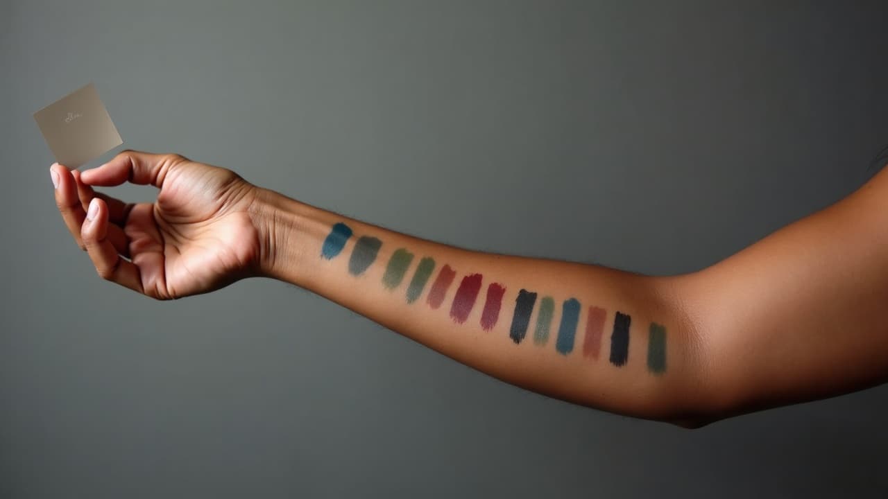
Palettes That Pop vs. Hues That Often Disappear
- Colors that usually read clearly on dark skin: burgundy, oxblood, rust, brick, emerald, forest green, deep teal, cobalt, ultramarine, indigo, royal purple, magenta, and clean orange-reds.
- Colors that can work with support: warm golds, pumpkin orange, chartreuse, and saturated turquoise, when framed with black or separated by negative space from similar values.
- Colors that often fail once healed: baby yellow, pastel pink, pale lavender, powder blue, low-saturation beige, and pure white outlines. Use these as tiny highlights at most, not structure.
- Use opaque packing for small shapes: inlays, petals, and graphic blocks need fully saturated passes rather than soft washes to avoid muddy results after healing.
- Reserve washes for value, not color identity: a cool gray wash under color can help modeling, but a pastel wash to represent color on dark skin often vanishes once healed.
Brand matters less than technique, but choose high-load opaque pigments from reputable makers. Many pros reach for Eternal Ink, Fusion, World Famous, or Solid Ink for clean chroma. Red pigments cause a disproportionate share of allergic reactions in all skin tones according to dermatology reports, so discuss sensitivities before you commit to large red fills. JAMA Dermatology has extensive coverage of tattoo reactions and pigment issues JAMA Dermatology. The FDA also offers consumer guidance on tattoo inks and safety considerations U.S. FDA Tattoos and Permanent Makeup. Technique notes: slow hand speed, consistent stretch, and cross-hatching your passes maintain saturation without overworking the skin. Avoid dry brushing for color on dark skin. It looks nice fresh, then turns to fog within months.
Match the Palette to Undertone: Warm, Cool, and Neutral
Skin tone is not just lightness, it is undertone. On brown and darker skin, undertones can be golden, olive, red, or neutral. The wrong undertone match can make a color look dull even if the value is correct. Quick undertone checks: look at the underside of the wrist, the neck in indirect daylight, or the chest. Greenish veins plus olive cast often means cool to neutral. Golden cast often means warm. If gold jewelry seems to harmonize with your skin while silver feels stark, you are likely warm. If silver looks right and gold looks brassy, you are likely cool. Many people are neutral or mixed by area. Warm undertones love: rust, brick, tomato red, pumpkin, emerald, teal that leans green, cobalt blue framed with black, and plummy purples. Cool undertones love: claret, magenta, blackberry, ultramarine, indigo, cool emerald, and electric blue accents. Neutral undertones can take both, but stay mindful of value so colors do not collapse into the background. Design tip: swatch directly on skin with alcohol markers or fine-tip paint pens, then film a 4K clip in daylight and in warm indoor light. What disappears on camera will likely read weak healed. You can also generate digital swatches and test them with a contrast grid, described below, then preview body placement in our try-on.
Placement and Friction: Where Color Stays Visible
Placement affects both visibility and longevity. High-friction zones tend to blur, shed pigment, or fade faster, which magnifies color visibility issues. High-visibility, reliable placements: outer forearm, inner forearm, upper arm, shoulder cap, outer calf, and upper outer thigh. These areas photograph well, have reasonable sun exposure control, and offer flat planes for clean color packing. Tricky or high-friction zones: fingers, sides of hands, palms, feet and toes, ankle bones, elbow points, under-bra line, waistline, and inner thighs. Expect faster fading or blowout risk. If you choose these, simplify the palette and go bolder with line weight. Avoid relying on yellow or white as structure here. Think about natural contrast, too. If you have dense hair growth on forearms or legs, color may look slightly darker once hair returns. Plan darker outlines and larger shapes for those zones. Sun exposure is a big variable. UV light fades all inks, and lighter colors show fade earlier. Use a broad-spectrum SPF 50 or higher once healed, and reapply. For brand-by-brand picks and UVA star ratings, see our best sunscreen for tattoos.
Healed vs. Fresh: What to Expect and How to Care
Fresh color looks saturated because the skin is open and hydrated. Within 24 hours you will often see a white haze under a second-skin bandage, which is plasma, not faded ink. After removal, the surface dulls during the peel phase, then regains clarity over weeks two to four. On darker skin, the healed look is typically one value step softer than day one. Whites shift toward cream or warm gray, pale yellows mute slightly, and blacks settle to a clean near-black. Healing window: surface healing usually takes 10–14 days, deeper layers settle over 6–12 weeks. The AAD’s general guidance aligns with this timeline American Academy of Dermatology. Keep aftercare simple: a breathable second-skin bandage like Saniderm or Tegaderm for 3–5 days if your artist approves, then a thin layer of Aquaphor for 2–3 days followed by Bepanthen or a light unscented lotion. Do not over-moisturize. Avoid soaking, sun, and workouts that twist or rub the area for the first week. If you are sensitive or have a history of reactions, especially to reds, communicate that up front. Patch testing a small dot of intended pigments is reasonable when planning large color work. The FDA maintains up-to-date safety notes for consumers considering tattoos U.S. FDA Tattoos and Permanent Makeup.
Black + Color Hybrids: Proven Structures for Visibility
The most reliable color tattoos on melanin-rich skin use black to define edges and value, then drop in color as a secondary read. Think of color as the accent, not the backbone. Outlines and value mapping: outline major forms in black, then block shadows in black or a dense cool gray to separate planes. Use crosshatching or dotwork to create gradients, then lay color into mid-tone and highlight zones. Keep rim lights in warm gray rather than pure white so they heal naturally. Graphic color blocking: for neotraditional or illustrative styles, place color fields inside strong black frames. Choose two to three colors with clear value separation, like rust against emerald with cobalt accents. Separate adjacent hues with a black keyline or a 1–2 mm strip of negative skin. Realism with color: anchor the portrait or object with true blacks in pupils, lashes, nostrils, and core shadows. Use burgundy or magenta to warm blood-rich areas, deep greens or teals for cool shadows, and avoid relying on pastel highlights to tell the story. If you plan to take a pencil sketch to stencil, read through our design-to-stencil workflow and build your value map before color selection. White and yellow as highlights only: use them sparingly in 1–2 mm touches on reflected points or texture, never as outlines. On darker skin they often heal to a subtle warm highlight rather than a crisp white line, which is fine if you plan for it.
Checkerboard Contrast Tests You Can Do in 5 Minutes
Before you lock a palette, test visibility with a simple checkerboard. This takes guesswork out of color-on-skin contrast. How to run the test digitally: create a 6x6 grid. Fill alternating squares with pure black and your test color at 100 percent opacity. Duplicate the color square at 75 percent and 50 percent opacity in other rows to simulate wash or healed softening. Export and view the grid on your phone at arm’s length, then shrink to 50 percent. If the 50 percent squares vanish against your simulated background or look muddled next to black, do not rely on that color for structure. How to run it on skin: use alcohol-based paint pens or cosmetic-grade body paint to lay the same checkerboard directly on your skin. Take photos in daylight and warm indoor lighting. This real-world snapshot tells you which hues pop when viewed through your own melanin filter. For a deeper understanding of contrast math, see the W3C’s contrast guidelines for how luminance differences drive readability in design W3C Accessibility Guidelines. Once you have a winning set, preview it at true scale with our virtual try-on calibration guide, then adjust line weights or element sizes so your design still reads at social-media photo distances.
Preview on Your Tone and Lighting With AI for Tattoo
Your screen can lie if you only look at a flat mockup. Use realistic scale, angles, and lighting. AI for Tattoo lets you generate multiple colorways and test them on a range of skin tones under different lighting so you can see what holds up on brown and black skin once healed. Try a rust-emerald-cobalt set against bold black on your forearm, then swap the cobalt for ultramarine and compare. If shadows swallow a soft wash, increase line weight and pack color more opaquely. This builds confidence before you commit needle time. A quick reality check on popularity and expectations: plenty of people choose color successfully. Pew Research found about one third of Americans have tattoos, with significant growth in the last decade Pew Research Center. Visibility is a design problem, not a skin-tone limitation. Test, preview, and pick a pro who has healed examples on clients with your tone.
Ready to see your palette on your skin tone before you book? Generate concepts and preview placement at true scale with AI for Tattoo. Start in the creator, then use try-on to compare colors in different lighting. Try it now: [Create](/create) or [Try On](/try-on).
Try AI for Tattoo Free