
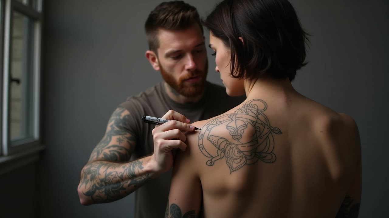
Composition is what separates a sketch that looks great on paper from a tattoo that reads clean on a moving body. Most cover-up consultations I take start with a layout problem, not a drawing problem. No focal point, no flow, no breathing room. The good news, composition is learnable. With a few reliable tools, you can plan designs that carry across the room, hold up up-close, and still make sense as your body changes.
The body is a moving canvas, so design for flow
Skin stretches, muscles flex, and joints compress. A tattoo that ignores that motion can feel stiff. Start by mapping flow lines along muscles and bone landmarks, then hang your imagery on those rails. Think collarbone arcs for chest pieces, the lateral line of the thigh for quads, and the medial forearm for sleeves that twist when you pronate. Use a mirror and slow turns to check how shapes read from straight on, three-quarter, and profile views. Place your anchor point where the eye should land first, then let secondary forms echo that direction. Keep obvious negative space corridors where skin needs to fold, like the elbow ditch and knee pit, so your design stays legible in motion.
- Sketch a loose S-curve over the placement to set directionality, then thumbnail three compositions that follow it.
- Mark joints and fold zones to avoid packing detail where skin creases heavily.
- Use wrap-aware stencils by cutting darts or slicing the stencil to prevent warping over round areas.
- Photograph the area in neutral, flexed, and stretched positions to preview distortion.
- Test a rough placement with a temporary transfer or our virtual try-on guide.
Balance 101: symmetry, asymmetry, and visual weight
Balance is not perfect mirroring. It is the felt equilibrium between elements. You can balance a heavy black shape on one side with a bed of fine linework on the other because visual weight comes from more than size. Density, value, saturation, texture, and even subject matter carry weight. Symmetry reads formal and calm, great for sternums or mandalas. Asymmetry feels dynamic, ideal for sleeves and ribs. Decide the mood first, then distribute weight so nothing topples your focal point.
- Pick one dominant mass and place it off center, then counterweight it with two lighter accents.
- Use triangular balance, three points that form a stable base for the composition.
- Keep heavy blacks and bold color toward the core of the body so edges feel lighter and breathable.
- Echo angles and motifs across the piece to tie asymmetrical layouts together.
- Run a grayscale test on your mockup to see if values balance without color.
Hierarchy that reads at 3 distances
Viewers read tattoos at three ranges: across the room, conversational distance, and up-close. Plan for all three. Use the 60-30-10 rule. About 60% of the area is supportive shapes and midtones, 30% is your main forms, and 10% becomes high-contrast accents. The big read is shape and silhouette, so protect clean outlines and large value blocks. The medium read is secondary forms that add story without clutter. The micro read is textures and easter eggs you only catch when close. If everything shouts, nothing speaks. Protect your focal point by keeping nearby areas quieter in value and detail.
- Design a bold silhouette for your primary element and preview it as a solid black shape first.
- Limit microtexture to shadow pools and accent zones so it does not fuzz the main read.
- Reserve spot color or white highlights for that 10 percent, never everywhere at once. See our contrast guide.
- Test the design at 25%, 50%, and 100% scale on screen to verify the three reads.
Lines that lead: S-curves, diagonals, and wrap
Lines are arrows for the eye. A gentle S-curve is the friendliest line in tattoo composition, calm but alive. Diagonals ramp energy. Radials spin attention around a hub, perfect for knees and elbows. In sleeves, stack your diagonals so they climb toward the shoulder, not crash into the wrist. In backpieces, a spine-parallel flow keeps the read vertical and tall. When lining, vary line weight to separate planes, using heavier contours for foreground and lighter inside lines for texture so forms do not melt together once healed.
- Map one master flow line that every major element respects.
- Avoid barriers that slice the limb straight across, especially at joints.
- Use leading lines in background elements, like waves or clouds, to steer attention.
- Feather edges with broken contours where the piece fades out, so it breathes into nearby skin.
- Check wrap by rotating the limb while looking at the focal path in a mirror.
Grids, thirds, and controlling tangents
Grids are not only for graphic design. A quick rule of thirds overlay on your iPad helps place focal points in powerful spots away from dead center. Golden spiral approximations can also point to pleasing anchor zones, but do not force math over anatomy. The enemy of clarity is the tangent, where edges just kiss and create visual knots. Separate overlaps cleanly, or commit to an intersection with shadow or a break in the line. A 2 to 3 millimeter gap can prevent years of confusion once skin softens edges during healing.
- Avoid kissing edges where two outlines barely touch. Separate or overlap decisively.
- Stagger parallel lines so they do not buzz against each other at distance.
- Round hard corners with a tiny fillet to reduce blowout-looking stiffness.
- Place focal points at thirds intersections unless anatomy demands otherwise.
- Block in major shapes with a light grid in Procreate before detailing.
Contrast, cohesion, and color that last
Contrast is your readability engine. Balance value first, then temperature and saturation. Cohesion comes from a limited palette and repeated shapes. On darker skin, push contrast with bolder shapes, more open negative space, and saturated warm colors for readability. For palettes by skin tone, see our color guide for dark skin. Expect color and black to fade with UV exposure. The American Academy of Dermatology notes that consistent sunscreen use helps reduce skin and pigment damage over time, which protects clarity AAD guidance. Healthline also underscores that sun, friction, and time soften edges and dull saturation, so build extra contrast into new work Healthline overview.
- Pre-plan a value map in grayscale before touching color.
- Repeat two to three shapes or motifs throughout to knit styles together.
- Reserve your brightest hue for the focal zone. Do not spread it everywhere.
- Protect tattoos with SPF 30+ broad-spectrum sunscreen to slow fade AAD guidance.
- Good sunscreen picks: Neutrogena Ultra Sheer SPF 50, La Roche-Posay Anthelios SPF 60, Supergoop! Play SPF 50 (non-sponsored examples).
Negative space that breathes and heals
Negative space is not empty. It is a designed shape that lets forms read and gives the skin room to move. Carve breathing channels around primary forms and between panels in a sleeve. Avoid micro-gaps that will close as lines soften in healing. Use larger open shapes near high-motion areas so the composition does not compress into mud. Place light textures, not heavy linework, over bony spots like the hand and foot where abrasion is high. Big takeaway, protect your white and skin tones like any other color. They are your quiet notes that make the loud ones work.
Designing for time: aging, motion, and add-ons
Skin changes as collagen and elastin decline with age, which means fine detail will soften. The Cleveland Clinic explains that skin loses elasticity and firmness as part of normal aging, so plan slightly larger details and bolder edges for longevity Cleveland Clinic overview. The U.S. FDA also reminds consumers that tattoo pigments are not fully inert or standardized, and some colors fade faster than others over years FDA tattoo information. Build for maintenance. That can mean tighter blacks, restrained white, and saving small script for stable zones like the forearm. If you want future expansions, leave expansion joints of negative space so new elements can slot in without crowding. For joints and ribs, anticipate skin stretch during weight change and pregnancy. Bold silhouettes and clean overlaps survive motion better than decorative filigree packed edge to edge.
Planning a sleeve, backpiece, or multi-piece flow
Large compositions succeed when you design the map first, not the stickers. Break the area into panels with a backbone flow line, then assign subjects to each panel by scale. Connect with a cohesive background language, like wind bars, water flow, or botanical shadows. Book 2 to 3 sessions to build structure before filling detail, so you can live with the skeleton and adjust. Expect a working budget of $500 to $1,500 per long session depending on artist and city. Use body-mapping tools to preview wrap and gaps before committing. Our sleeve planner with 3D body mapping explains how to check flow around a limb and avoid dead seams.
- Start with a macro sketch of flow and panels, no detail.
- Place focal points away from high-crease zones so they do not distort.
- Bridge gaps with a unified background vocabulary, not random fillers.
- Stage your plan across milestones, lining and black first, color and texture later.
- Preview the whole set with a true-to-size try-on before booking virtual try-on guide.
Two final sanity checks before you lock art: run a black and white version to confirm the value story still holds, and spin 360 degrees on video to verify flow from every angle. If it reads at a glance in grayscale while you move, you have composition working for you, not against you.
Citations for durability and safety are real considerations. The American Academy of Dermatology advises year-round sun protection to maintain skin health and tattoo clarity AAD. Healthline summarizes how tattoos naturally fade and blur as collagen changes and sun exposure accumulates Healthline. The Cleveland Clinic highlights aging skin changes that influence how fine detail holds over time Cleveland Clinic. And for context, Pew Research reports that roughly a third of U.S. adults now have at least one tattoo, so planning composition that lasts is not niche, it is normal Pew Research.
Ready to pressure-test your composition before ink? Use AI for Tattoo to generate variants that respect flow and hierarchy, then try them on your body at scale. Start in the creator to block in flow lines, focal points, and negative space, then preview with Create or instant Try-On. If you are building a full sleeve, read the 3D sleeve planner next.
Try AI for Tattoo Free