
Great tattoos are built on contrast, not on a single universal palette. When saturation, line weight, and scale match your complexion, color holds and reads clearly, from porcelain to deep ebony. Red pigment is also the most frequent culprit in tattoo allergies, so choosing hues is about longevity and skin safety, not just style, a point echoed by the American Academy of Dermatology. People with darker skin have a higher risk of keloids and post-inflammatory hyperpigmentation, which makes gentle technique and correct aftercare even more critical, as noted by the Cleveland Clinic.
Skin tone, undertone, and contrast: what actually changes
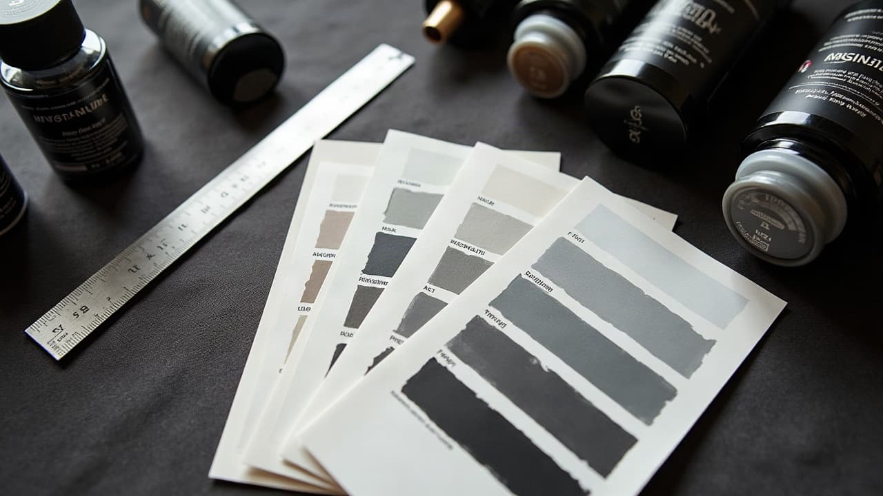
Skin tone is the depth of color you see at a glance, undertone is the subtle warm, cool, or neutral cast underneath. More melanin filters light differently, so low-contrast pastels that pop on fair skin can read muted on deep skin. Designing for visibility means building value contrast first, then adding hue. I often sketch in grayscale to proof readablility before choosing ink. The Fitzpatrick I–VI spectrum is a useful shorthand for how skin responds to sun and trauma, but it is not a style rulebook. Two people with the same depth can have very different undertones, so always test colors on the actual skin. Health sources like Healthline and the AAD consistently remind clients that melanin affects how color appears and heals, which is why swatches are worth the extra 10 minutes in the chair.
Picking palettes by tone: real-world color recommendations
- Fair to light skin, cool undertones: Lean on deep blacks, charcoal, cool jewel tones like emerald, sapphire, and violet. Keep whites minimal, they can heal stark and overpower subtle shading.
- Fair to light skin, warm undertones: Sepias, rusts, muted olive, and vintage mustard give warmth without oversaturation. True scarlet lines punch hard, but patch test reds due to higher allergy risk.
- Medium to olive skin: Build contrast with black linework and high-saturation teals, magentas, and golds. Avoid dusty pastels that can blend with the base. Think neo-traditional clarity and bold fills.
- Tan to brown skin: Prioritize high-opacity pigments like cobalt-blue, bright orange, and chartreuse outlined in black. Keep gradients wider, and ground color blocks with 7–11RL outlines for definition.
- Deep brown to ebony skin: Go contrast-first. Use dense black, royal blue, canary yellow, and hot magenta. Pastels and white alone will fade visually. Reserve white for tiny accents, never the star.
Across all tones, black is your anchor. It structures the design, deepens color, and keeps readability high years later. If you love muted aesthetics, combine bold linework with selective desaturation so the piece still reads from six feet away.
Black and grey clarity across complexions
Black and grey thrives on value control. On deeper skin, run heavier midtone packing and cleaner silhouettes so details do not get lost. Techniques like whip shading and pepper shading create smooth blends without overworking. Aim for crisp 9RL or 11RL main lines and reserve fine 3RL micro-details for lighter or taut areas where they will hold. White ink can brighten a highlight briefly, but on medium to deep skin it often heals to a quiet beige or disappears. Think of white as a specular accent, not a backbone. If you need a luminous edge, pack a tight light gray and save white for a final minimal pop.
Saturation and needle choices that make color hold
Color visibility is a saturation game. More melanin requires high-saturation pigments placed cleanly, not aggressively. Overworking creates trauma that dulls color through excess healing. Use well-tuned machines, slow your hand speed a touch, and aim for efficient single-pass packing with a good mag.
- Use curved magnums 11–17M for smooth, even fills. Fewer passes, less trauma, better color hold.
- Drop voltage slightly and stretch consistently. A steady canvas allows color to seat without blowouts.
- Choose opaque, high-load inks for visibility. Many pros rely on Fusion, Eternal, Solid, and World Famous (non-sponsored examples).
- For deep skin, favor pure hues over muted mixes. Then build depth with black, not gray washes.
- Pack to the corner, then stop. Overworking causes more PIH and can mute the final read.
Placement, scale, and style for legibility
Small and low-contrast is the enemy of longevity on any skin, more so on melanated tones. If you want watercolor or soft realism on deep skin, scale up the composition and lock it with bold contour lines. Geometric, tribal, American Traditional, and neo-traditional styles hold well across tones because they prioritize contrast, negative space, and scale. Fine-line micro scripts can look elegant on lighter skin at micro sizes, but on medium to deep skin, increase font weight and letter spacing so it ages cleanly.
- Choose placements with natural flat planes for smooth shading, like outer forearm, calf, and upper arm.
- Avoid tiny pastel pieces on high-melanin areas. Opt for bigger motifs or iconic silhouettes instead.
- Sun-exposed spots need extra contrast. Expect more fading, so plan for bolder initial saturation.
Healing realities on melanated skin and how to manage them
On all tones, flaking starts around days 3–7, top layers settle by 2–3 weeks, and true color appears by around 6–8 weeks. Darker skin may show PIH or slight textural change if the area was overworked. Keep it gentle, moisturized, and protected from the sun to minimize this. Red pigments cause most allergic tattoo reactions, documented by the AAD, with case literature in JAMA Dermatology noting delayed hypersensitivity patterns. Consider a test dot of suspect colors, especially reds and certain yellows, 4 to 6 weeks before a large fill. The U.S. FDA also reminds consumers that tattoo inks are not FDA approved, and pigment composition varies, so artist experience matters.
- Use breathable dressings like Saniderm for the first 24–72 hours, then switch to light moisturizers (Bepanthen, Aquaphor, Hustle Butter, Mad Rabbit, non-sponsored examples).
- Clean with lukewarm water and fragrance-free soap. Pat dry, do not rub. Avoid heavy occlusion on humid days.
- Daily SPF 30+ after peeling reduces hyperpigmentation and fading. Reapply if you sweat or swim.
- If you have a history of keloids, discuss placement and technique with your artist, and consult your clinician if needed. The Cleveland Clinic has plain-language guidance.
If your skin runs dry, adapt aftercare to your baseline. We wrote a dedicated piece on products and routines that do not smother the healing layer, see tattoo aftercare for dry skin.
Working with the right artist and budget
Portfolio first, promises second. Ask to see healed photos on skin like yours, not just fresh shots. An artist experienced across tones will explain how they build contrast maps, choose high-opacity pigments, and avoid overworking. Expect quality work to cost around $150–$300 per hour in major markets, more for sought-after specialists. Pay for the testing, not just the tattoo, including swatch panels and small test dots when pigments are uncertain.
- Questions worth asking: Which inks do you use for yellows and reds, and do you test-dot first?
- Will you show me a grayscale proof to confirm contrast before color selection?
- How do you adjust needle groupings and passes for deep skin saturation?
- Do you have healed examples of white highlights on medium to deep tones so I can set expectations?
Previewing and swatching before you commit
Two low-risk tools save regret. First, ink swatches on your actual skin under indoor and sunlight, photographed on day 1 and again at 4–6 weeks. Second, visual previews at correct scale, on your own body. Use our virtual try-on to check placement, size, and contrast before booking. You can also browse styles and palettes in our styles directory or refine prompts with style adaptation tips. If you want a short-lived test on skin, two-week inks like Inkbox are helpful for placement and vibe, though they do not replicate true tattoo saturation.
Ready to see what reads best on your complexion? Use AI for Tattoo to generate high-contrast designs, preview them on your skin with /try-on, and customize palettes in /create before you book. Start with a bold black anchor, test a few colorways, and choose the version that stays legible at real-life distances.
Try AI for Tattoo Free