If your AI design looks perfect on your phone but your artist cannot stencil it, it is not a tattoo design yet. The difference is clean, deliberate linework sized for skin, not screens. This guide shows you exactly how to go from prompt to a stencil an artist can actually use, with real numbers for resolution, line weight, and negative space that heal well.
Prompts That Produce Stencil-Ready AI Art
Start by steering the model toward high-contrast shapes and decisive contours. You want the generator thinking like a blackwork illustrator, not a painter. Avoid soft gradients, tiny filigree, and photographic textures in the first pass. Your goal is clean contour hierarchy, then you can add shading on a separate layer later.
- Use direct style calls like blackwork, line art, engraving, woodcut, etching, stipple, minimal gradients, no color, high contrast, bold outlines.
- Specify contour logic: primary outline thicker, secondary interior lines thinner, consistent hatching direction, large negative spaces between elements.
- Ban mush: no soft gradients, no watercolor bleed, no photorealism, no micro-realism, avoid hair-thin strands, avoid dense crosshatching in small areas.
- State placement and size in inches or centimeters, for example forearm 7 inches tall, shoulder cap 12 cm wide, to help scale detail density appropriately.
- Clarify focal distance: readable from 2 meters, silhouette recognizable, avoid clutter behind the main subject, maintain 1–2 mm minimum gaps in linework.
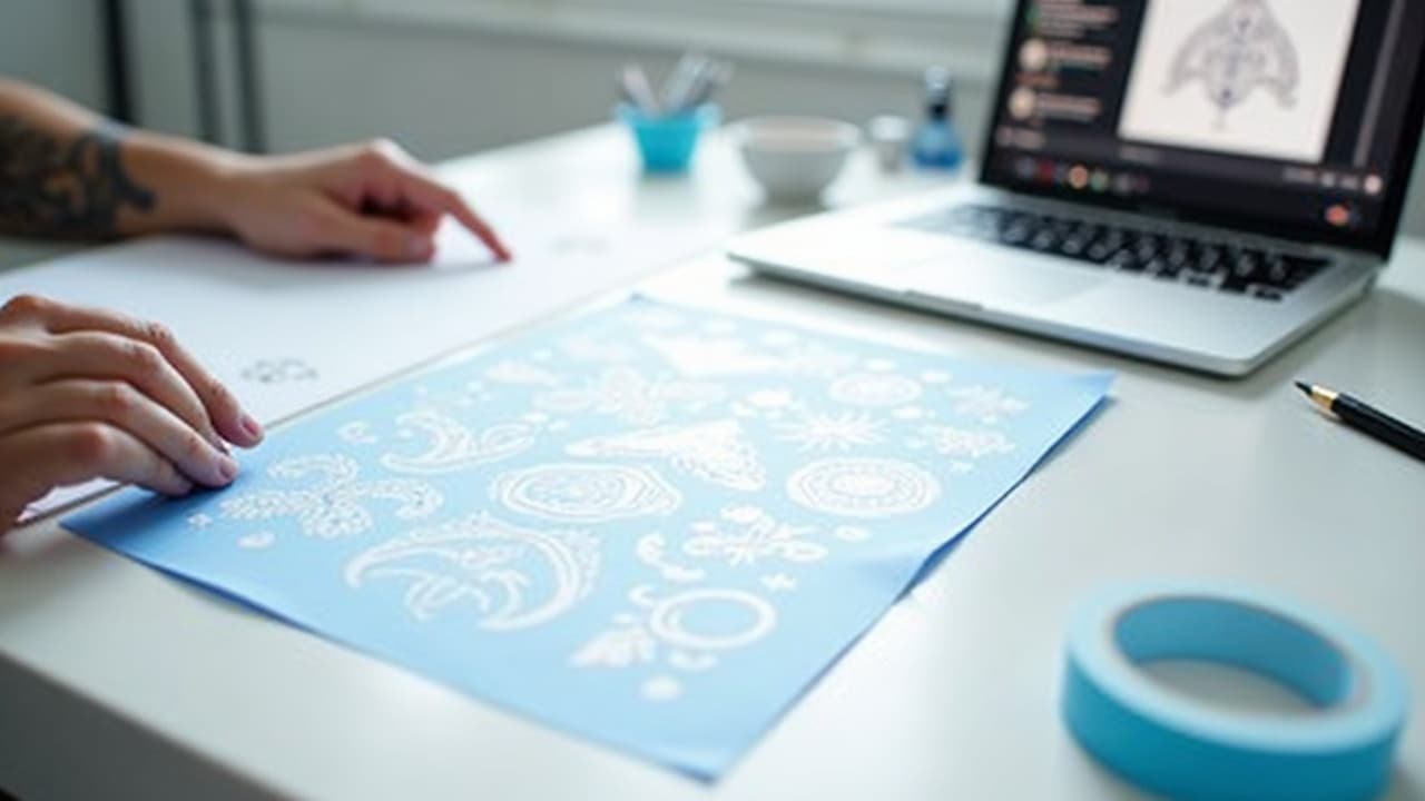
Example prompts to try, then refine with your own subject: “blackwork line art owl, bold outer contour, minimal interior shading, engraving style, no color, high contrast, 1–2 mm negative space, 7 inch forearm placement.” Or, “ornamental mandala, vector-like symmetry, thick primary petals, thin secondary filigree, avoid micro detail, stencil-ready linework, 10 cm diameter calf.” Use AI for Tattoo’s generator, then toggle line-art and stencil preview modes to see how your design will translate before you invest time in cleanup.
Canvas Size and Resolution That Print Like Stencils
Tattoo stencils live or die on resolution. Set your canvas at the final print size and at 600–1200 dpi. Vector is king for lines, but if you are in raster, 600 dpi is a safe floor and 1200 dpi makes hairlines and stipple behave. Lower resolutions smear edges during thermal transfer and create fuzzy needles on skin.
- Final size first, resolution second, for example 7 inches tall at 600–1200 dpi, or 18 cm wide at 240–480 px/cm. Do not scale up later if you can avoid it.
- Know your math: 600 dpi equals roughly 23.6 pixels per millimeter, 1200 dpi equals 47.2 px/mm. This helps you check line weights accurately on screen.
- Work in grayscale when possible. Color distracts from edge quality. You can plan color on a separate reference layer, but stencils are black and white.
- Keep margins. Leave at least 5–10 mm clear around the design for tape, registration notes, and artist marks.
- If you must upscale, use a vector redraw or AI super-resolution, then harden edges with Threshold or Levels to restore crisp transitions.
If you are unfamiliar with dpi, the “dots per inch” unit simply counts printable detail per linear inch. Higher dpi equals more sampled edge information, which matters for clean transfers and crisp line tests. If you want a deeper definition, see the overview at Wikipedia’s Dots per inch.
Post-Processing, Tool by Tool: Procreate, Photoshop, Illustrator, Inkscape
Any modern tool can make a stencil if you use the right levers. Your goals are the same in each app, collapse values into black or white, enforce clean contours, remove speckle, and standardize line weights where needed.
- Procreate workflow, import the AI image, duplicate the layer, go to Adjustments, Curves to increase contrast, then use Selection set to Automatic and slide Threshold until interior fills are either solid black or white.
- Procreate cleanup, draw over edges with a Streamline-enabled inking brush for smooth curves, use QuickShape to snap circles and straight lines, isolate lines on their own layer set to Multiply.
- Photoshop workflow, Image, Adjustments, Threshold around 200–230 for dense black, then Levels to fine tune, use Select, Color Range to isolate black, create a new fill layer with pure black lines on white.
- Photoshop cleanup, Filter, Other, Minimum 0.3–0.7 px to unify stray pixels, Pen Tool or Brush with Smoothing for edges, Eraser with 100 percent hardness for corners and negative space.
- Illustrator workflow, Place your image, select it, Window, Image Trace. Start with Black and White Logo preset, then set Threshold around 140–180, Paths 80–90 percent, Corners 75–85 percent, Noise 1–10 px, check Ignore White.
- Illustrator expand and adjust, click Expand, then Object, Ungroup, use the Smooth Tool to soften kinks, Object, Path, Offset Path to create a bold outer contour when needed.
- Inkscape workflow, Path, Trace Bitmap. Use Brightness cutoff or Edge detection for silhouette, or Centerline tracing for strokes, adjust Threshold until you get solid lines, then Path, Simplify sparingly.
- Inkscape cleanup, Path operations to merge shapes, Stroke to Path to convert strokes into fills, set uniform stroke widths for clear hierarchy.
At this stage, separate your outline, detail lines, and shading on different layers or groups. Name them clearly, for example 00-outline, 01-secondary, 02-hatching. This mirrors how an artist will approach the piece, and it makes last minute edits painless.
Line Weights and Negative Space That Survive on Skin
Skin is a living medium, it swells, heals, and spreads pigment microscopically over time. Lines that read sharp on a Retina display can blur together after 12–24 months if you push them too thin or pack detail too tightly. Favor clear hierarchy and breathable gaps.
- General rules, primary outline 0.6–1.0 mm, secondary interior lines 0.3–0.5 mm, stipple or hatch spacing 0.4–0.8 mm, minimum negative space 1–2 mm for low wear areas.
- High movement or high wear areas, fingers, sides of hands, wrists, ankles, feet, ditch of the elbow, push everything bigger, 0.8–1.2 mm primary lines, 0.5–0.7 mm secondary, 2–3 mm gaps.
- Flat, low-wear areas, outer upper arm, outer forearm, calf, back, you can run 0.6–0.8 mm primary and 0.3–0.5 mm secondary safely if the artist’s technique is clean.
- Micro elements, eyelashes, whiskers, fur strands, run them as grouped shapes rather than single hairlines, or embed them in shading so they do not rely on 0.1 mm fantasy lines.
- Convert mm to pixels for checks, at 600 dpi, 0.3 mm is about 7 px, 0.5 mm is about 12 px, 1.0 mm is about 24 px. At 1200 dpi, double those counts.
Blowout risk increases with thin skin, high pressure, or lines running across folds. Your artist controls technique, but your design can help. Keep small corners slightly rounded, avoid hairline interior shapes, and do not stack five outlines within 2 mm on a finger stencil.
Simplify Micro-Detail, Then Split Line vs. Shading
AI is notorious for throwing filigree at every surface. Most of it will not read on healed skin. Edit like an engraver, not a camera. Merge tiny clusters into larger shapes, and break value into two systems, contour lines and shading textures. Do not depend on five value steps in the stencil layer.
- Collapse textures. Replace photo skin pores or fur fuzz with directional hatching or controlled stipple, spaced so dots do not merge after healing.
- Group micro geometry. Tiny circles become ovals or teardrops, nested triangles become one motif with interior negative space rather than three razor-thin dividers.
- Separate layers. Keep pure linework on one layer and all shading, hatching, or dotwork on another. You can print a line-only stencil and keep shading as a visual reference.
- Prioritize read from distance. Squint at 2 meters, if the silhouette or primary features do not read, remove a third of the interior detail before removing any outline.
Medical literature and the FDA point out that tattoos change over time as pigment disperses and the skin remodels. That is normal, and it is why conservatively spaced lines age better. For general background on risks and long-term changes, see the FDA’s overview, Tattoos and Permanent Makeup, and dermatology resources such as JAMA Dermatology.
Test Print at True Size, Then Evaluate Like an Artist
Print your design at 100 percent scale on plain paper before you think about transfer paper. Tape it where it will live. Step back two meters, then one meter, then 30 cm. The design should read at each distance, especially the silhouette at two meters.
- Check thin spots. Circle any lines below 0.3–0.4 mm at the printed size, bump them up or merge them before you send the file to your artist.
- Check gaps. If two shapes are closer than 1–2 mm on the print, widen the negative space so they do not marry during healing.
- Check distortion. If you are wrapping a calf or forearm, print segmented test bands to see where motifs stretch or pinch, then adjust the layout before final.
- Do a skin preview. Use AI for Tattoo’s virtual try-on to place the stencil on your body photo, then share that mockup with your artist for scale and placement notes.
- Align with pain and session time. If you are pushing a large piece onto a tender spot, plan bolder lines to survive faster passes. See our pain chart guide for realistic placement pain.
If you are early in your tattoo journey, it also helps to align style complexity with experience and budget. Large smooth blackwork is more forgiving than dense micro-realism. For a style overview, skim our visual style guide and match your concept to a technique your target artist already does well.
Export Formats Artists Actually Want
Ask three artists and you will hear the same answer. Send a clean high-contrast raster for quick print and a vector for scaling or edits. Include a line-only version and, if relevant, a separate shading reference. Keep file names clear and include scale notes in the email or a small legend.
- Raster, 600–1200 dpi PNG or TIFF, black lines on white background, or white on transparent for darkroom printers. Avoid JPEG compression artifacts around edges.
- Vector, SVG or PDF from Illustrator or Inkscape with strokes expanded where appropriate. Check for stray points and duplicated paths that can confuse a plotter or printer.
- Layer discipline, supply a line-only export and a line plus shading reference. Put scale and intended placement in a small corner legend, for example 7 in tall, outer forearm.
- Color mode, grayscale or pure black. Do not send RGB rainbow layers for a stencil. If you include a color concept, attach it as a separate JPG or PNG reference.
- Print notes, include 100 percent print size, recommended primary line weight, and minimum negative space, so the shop does not scale your design into failure.
If your client or artist prefers to tweak edges, include the live file too, a layered PSD, Procreate .procreate, or .ai vector. For vector tracing controls in Illustrator, Adobe’s own documentation on Image Trace explains each parameter, but the settings above are what most tattooers need.
Pitfalls and Ethics, From Muddy Gradients to Cultural Motifs
- Muddy gradients, AI loves soft value ramps that turn to fog at threshold. Force hard edges early, then reintroduce shading as hatching or stipple on a separate layer.
- Overly intricate micro-realism, tiny pores, hair wisps, and lace filigree collapse on skin. Merge, simplify, and increase negative space until the design reads from 2 meters.
- Blowout-prone geometry, razor corners and packed parallel lines near joints or fingers are risky. Round corners slightly and widen spacing to reduce migration risk.
- Bad scale, scaling a 300 dpi image up 200 percent produces fuzzy edges. Start at 600–1200 dpi or use vector. Re-run Image Trace rather than stretching pixels.
- Ambiguous authorship, do not copy a living artist’s flash line for line. Use references as mood or structure, then draw your own lines and cite influences in your notes.
- Cultural motifs, research meaning and protocols for Maori moko, Polynesian tatau, Haida formline, Sak Yant, and other living traditions. Collaborate with specialists or choose non-sacred patterns.
- Licensing and stock, check the license of any AI training data or stock elements you include. Keep a reference folder and credits. When in doubt, ask your artist to redesign from scratch.
Health and safety note, dermatology literature documents tattoo reactions, especially to certain pigments, and the FDA actively monitors tattoo ink safety. If you are sensitive, keep your first design simple, black-only linework is a safer choice. For background, consult FDA guidance on tattoos and dermatology resources like the Journal of the American Academy of Dermatology.
A Fast Loop With AI for Tattoo Before Your Consult
The fastest way to land a stencil your artist will appreciate is to iterate in a tight loop. Generate a blackwork concept with AI for Tattoo, flip to line-art mode to expose the contour logic, then open stencil preview to see if your 1–2 mm gaps survive. Adjust the prompt, regenerate three variations, and repeat until the silhouette and interiors are clean at the target size.
- Generate in blackwork or line art, set target size in the prompt, keep gradients out.
- Try on your body with virtual placement, use our try-on tool to judge readability at real scale and in real lighting.
- Lock a winner, then export a high-contrast PNG and, if you need vector, redraw or trace in Illustrator or Inkscape using the settings above.
- Bring both files to your consult, plus a true-size print. Ask the artist to mark any weak spots. Iterate once more before appointment day.
Ready to turn your prompt into a tattoo-ready stencil you can show your artist? Generate blackwork and line-art variations, preview them on your body, and export clean files with AI for Tattoo. Start now in [Create](/create) or test placement with [Try-On](/try-on).
Try AI for Tattoo Free