
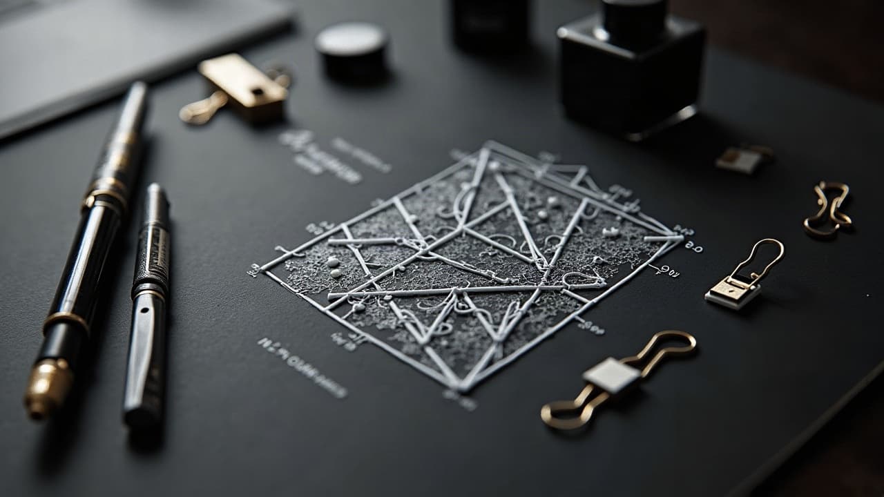
The cleanest AI tattoo outcomes rarely happen on the first try. In studio tests, the strongest concepts usually surface between 20 and 60 iterations, once you tighten variables and react to what the model gives you. Iteration does not mean guesswork, it means building a repeatable loop that nudges the model, captures happy accidents, and translates them into tattooable lines, shading, and negative space.
Adopt the iteration mindset: mood to motif, then constraint
Great AI tattoo prompts start broad on feeling, then narrow into constraints the skin will respect. Lead with an emotional anchor and a clear subject, then specify scale, shape language, and technical limits like line weight or maximum detail density. This trims model ambiguity and saves you cycles later when you need clean stencils.
Tools matter. If you are working in Midjourney, Stable Diffusion, or DALL·E, keep the same model version across a run. Stability lets you compare outputs honestly. If you need a refresher on controlling complexity, bookmark our prompt complexity playbook for parameter baselines that pair well with this guide.
- State the mood first, then the subject: “serene, lunar botanicals” reads stronger than “moon flowers,” which invites generic clip art.
- Add tattoo constraints: “single needle look, 2–3 mm line weight, minimal cross-hatching” keeps outputs stencil friendly.
- Fix composition early: “oval frame, 2:3 aspect ratio, left-justified focal” avoids later cropping that kills balance.
- Protect negative space: “breathing room around knuckles, no micro-fill above 1 mm” stops mushy shading.
Build a base prompt that actually iterates
Your base prompt is a scaffold you reuse across dozens of micro-variations. Write it like a recipe, not a paragraph. Start with subject and symbolism, then style tags, technical tattoo notes, and finally guardrails that exclude what you do not want.
A good base prompt example: “calm red fox curled in maple leaves, Japanese composition, visible fur flow, bold outlines, limited palette 3–4 colors, no photorealism, no tiny text, fits inner forearm 7 cm x 14 cm.” Keep it neutral and modular so you can swap parts without breaking the structure.
- Subject and action: animal, plant, myth, gesture, or object hierarchy, written once.
- Style lane: “neo-traditional, ukiyo-e influence, etched crosshatching, watercolor edge bleed.”
- Tattoo constraints: line weight, needle look, size in centimeters, and body area adjacency.
- Exclusions: “no gradients in micro areas, no full black fill, no hyperreal pores.” Use negative prompts here.
Change one variable at a time, and track it
Creative chaos feels fun, but single-variable changes reveal what actually works. Lock your seed and aspect ratio, then run small swaps like color palette, lighting cue, or background geometry one at a time. The point is to isolate the lever that moves your design toward readability on skin.
Name your runs. I use short codes like “F0” for base, then “F1a warm palette,” “F1b cool palette,” “F2 halo light,” “F3 remove background.” If your model supports it, keep CFG at 6–8 for balanced adherence, and steps 25–35 for line clarity without unnecessary noise.
- A/B micro-variations: swap one tag such as “sunlit” vs “moonlit,” compare edges and depth.
- Palette passes: run “limited 2-color, limited 3-color, grayscale only,” test for contrast at distance.
- Shape study: circle frame vs vertical bar vs ribbon sash, print at 40% scale to judge legibility.
- Detail diet: remove 20% of micro-detail each pass until the silhouette reads clean across the room.
Hold style steady with anchors, references, and color discipline
Consistency across a set, a sleeve plan, or flash sheet comes from style anchors. That means repeating motifs, edge behaviors, and palette rules. Pick one edge language like crisp outline plus minimal whip shading, and stick with it through iterations. Keep a single value hierarchy so focal elements pop without muddy midtones.
Reference a tight color discipline. For example, a triad like rust red, moss green, bone white stays printable and skin friendly on most tones. For a deeper dive into why contrast choices make or break readability, see our contrast and color guide.
Beat creative blocks with structured randomness
When outputs start homogenizing, inject randomness, but inside rails. Use controlled wildcards to shake composition, not quality. Swap one verb, add a metaphor, or roll a 1–6 dice to pick from prewritten style nudges. The trick is to force novelty without losing tattoo fundamentals like negative space and clear silhouette.
I keep a wildcard pack that plugs into the base prompt, things like “storm-bent,” “bone-inlaid,” or “ribbon-knot.” Pair this with a 15 minute sprint rule, then cut anything that does not survive a small-print test. If you use boards or note apps, Milanote or Notion works for tagging sets, while Procreate and Clip Studio Paint help trace silhouettes fast (non-sponsored examples).
- Wildcard verbs: frayed, braided, etched, hammered, scorched, braided, carved. Swap just one per pass.
- Constraint shuffle: lock line weight and size, only vary palette or background geometry for 3 passes.
- Timer sprints: 15 minutes to generate, 5 minutes to cull, 5 minutes to trace silhouettes in Procreate.
- Distance test: pin prints on a wall, step back 2 meters, remove anything with a mushy silhouette.
Personalize for skin tone, placement, and long-term wear
Iterating for creativity does not ignore biology. Darker skin tones often need stronger value contrast and simpler micro-detail for long term readability. Areas that flex or rub, like wrists and ankles, punish ultra-fine detail. Build these truths into the prompt so the model stops suggesting fragile textures where they will blur.
Use prompts that mention tone and wear: “optimized for medium to deep skin, high-contrast silhouette, avoid light yellow fills, no micro-dots under 1 mm.” For placement, write the canvas, “outer calf, vertical flow, no wraparound behind tibia.” For more on tuning to skin characteristics, see our skin type specific prompting.
Health wise, plan for how ink settles. Healing usually takes a few weeks, and outcomes vary with aftercare and skin type. See Cleveland Clinic guidance on tattoo aftercare and healing timelines for patient centered basics you can factor into design density (Cleveland Clinic). The American Academy of Dermatology notes tattoo risks like allergic reactions, especially with certain pigments, which is a good reason to keep large soft fills conservative (American Academy of Dermatology).
Work the parameters: negative prompts, seed lock, ratio, and CFG
Four levers matter most for tattoo iteration across popular models. First, negative prompts prune unwanted textures such as photoreal pores, hair, or random text. Second, a seed lock gives you repeatability across runs, so you can change a single word and see a true delta. Third, fix your aspect ratio to match placement. Fourth, set CFG so the model respects your words without becoming brittle.
Good starting points: aspect ratio 2:3 for forearms and calves, 1:1 for chest and shoulder badges, 3:2 for back pieces. Keep CFG around 6–8 for clarity, then test a low CFG 3–4 pass to capture occasional happy accidents. If your platform supports it, use negative weights for banned elements like hands or eyes when they are not the subject.
Make it tattooable: line weight, simplification, and read distance
AI can hallucinate beautiful textures that do not survive skin. Before you fall in love, enforce a simplification pass. Trace the silhouette, identify primary, secondary, and tertiary shapes, then reduce micro-noise. Push line hierarchy, for example 0.25 mm for interior accents and 0.5–0.8 mm for outer contours in a single needle look.
This is where apps help. Bring outputs into Procreate, Adobe Fresco, or Clip Studio Paint to test line weights on layers, add clean negative space, and prepare a printable stencil (non-sponsored examples). For placement planning, Healthline’s tattoo education content is helpful when thinking about blowouts and wear on high motion spots, which can inform your simplification choices (Healthline).
- Silhouette pass: fill the design black, then shave away until the outline reads instantly.
- Detail cap: set a floor for dot size and a ceiling for hatch density, usually no tighter than 1 mm gaps.
- Contrast map: assign three values only, dark, mid, highlight, to avoid tonal soup after healing.
- Print test: output at actual size, then at 70%, anything unreadable gets simplified again.
Close the loop: test on skin, budget edits, and artist feedback
Once you have 3 to 5 finalists, preview them on your body. Use the AI for Tattoo virtual try-on to check flow on curves and joints, then print and tape at scale. Scale checks save you from overstuffed micro-lines that would blur after a year. If you plan a consult, expect refinement fees around $50–$150, especially for redrawing AI outputs into clean stencils.
Bring your best two options to your artist, not twelve. Ask for a line quality pass and placement advice. Government and medical bodies remind us that inks and pigments are variably regulated, and some colors can be problematic in skin. The FDA offers consumer information on tattoo inks that is worth reading before you lock a color plan (U.S. FDA). For further inspiration and planning, browse our style library and test flows in Explore or jump straight to Try On.
AI tools are now part of mainstream creative workflows. Surveys from organizations like Pew Research Center track how people adopt new tech across art and media, useful context when you weigh how much AI to include in your process (Pew Research Center). No matter the tool, the non negotiables stay the same, clear design, clean stencil, and a placement that respects the body.
Ready to turn smarter prompts into skin tested art? Generate designs in minutes with AI for Tattoo, then preview placement with our realistic Try On. Start a new set or refine a favorite in Create, and use our prompt complexity playbook to keep your iteration loop tight.
Try AI for Tattoo Free