
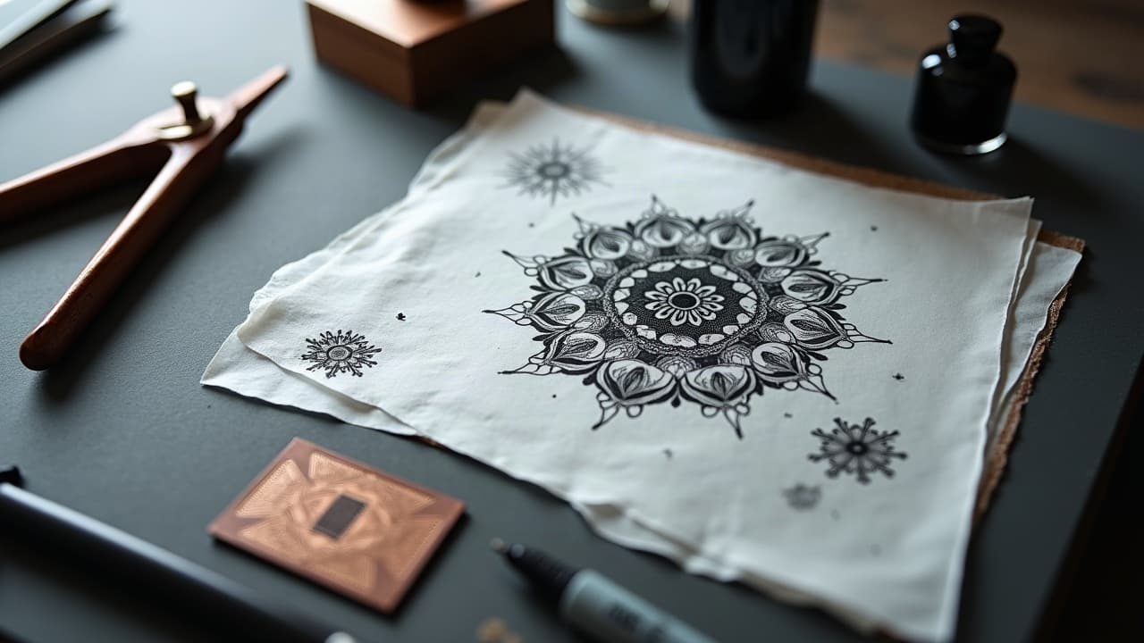
Short prompts tend to produce stock-looking art. Tattoos need composition, hierarchy, and technical constraints the model will not infer on its own. If you want a design an artist can actually stencil, prompt complexity is not fluff, it is the bridge between your idea and a readable tattoo. The good news, you do not need paragraphs of poetry. You need a clear blueprint, a few style anchors, and a method to iterate without losing the soul of your concept.
What Prompt Complexity Means for Tattoos
In tattooing, complexity is not just more adjectives. It is a stack of constraints that answer how the design will live on skin. A well-specified AI prompt names the subject, the tattoo style, the composition, the line weight, and how the piece should read at 1–2 meters. That last part matters. Skin moves and heals, and tiny flourishes that look sharp on a monitor can blur on a forearm after a year.
Different generators interpret structure differently. Models like Stable Diffusion, Midjourney, DALL·E, and Adobe Firefly handle style cues well, but none understand needle sizes or scar tissue. That is on you to specify. When you add practical constraints like single needle vs 7RL, high contrast, and negative space padding, your AI results stop looking like wallpaper and start looking tattooable.
- Think in layers, specify foreground, midground, background, and what gets priority in the focal stack.
- State the placement and scale in centimeters or inches, for example forearm outer, 18 cm tall.
- Call out the line hierarchy, for example bold outline 7RL, inner detail 3RL, no micro-hatching.
The 10-Part Prompt Blueprint
Use this scaffold to prevent oversimplification. You can compress wording, but hit each segment. It keeps the model honest and gives your tattooer a credible starting point.
- Subject and action, for example red fox curled around peony, tail forms a ring.
- Tattoo style, for example neo-traditional, bold lines, limited palette, subtle gradation.
- Composition, center-weighted V shape, clear focal point at the fox’s eye.
- Placement and size, outer forearm, 18 cm x 9 cm, vertical orientation.
- Line strategy, outline 7RL, interior detail 3RL, no stipple fields.
- Value plan, high-contrast silhouette, preserve negative space around whiskers.
- Palette, black and grey with 3 reds, no pastel, heal-friendly saturation.
- Texture language, smooth fur blocks, minimal micro-lines, readable at 2 meters.
- Cultural or symbolic notes, fox as guardian, peony for resilience, avoid kitsune mask.
- Model controls, seed 1234, aspect 2:3, stylize low, CFG 6–8 for accuracy.
Style Language That Actually Works
Vague art terms confuse models. Concrete tattoo styles perform better. Use tags like American traditional, Japanese irezumi, blackwork, ornamental, illustrative, fine line, or Chicano lettering. You can reference painters or tattooers as compass points, but keep it ethical and use them as influences, not copy targets. If you want hybrid styles, pair them with clear constraints so the model knows which system governs lines and which governs color.
Controlling finish terms matters too. Words like matte shading, hard edge, crosshatch, halftone dot, or washy watercolor edges change the render more than adjectives like beautiful or stunning. If you are blending, define the boundary, for example neo-traditional linework with watercolor splashes restricted to background only. For more on hybridization, see our style blending techniques.
- Use two style anchors maximum, choose one to lead, for example blackwork-led with surreal accents.
- Name a print method if relevant, woodcut texture for shading, keep outlines clean.
- Set a detail ceiling, for example no textures under 1 mm, to avoid over-noisy renders.
Composition and Readability on Skin
Skin is curved and mobile, so composition must anticipate distortion. A good prompt defines the shape language relative to the body. For example, bicep placements benefit from S-curve flow that wraps but does not pinstripe. Back pieces can support radial compositions with a central medallion. Forearms and calves like vertical ovals that keep elbows and knees clear. Protect breathing room, do not let the model fill every gap. Learn more structure in our negative space guide.
Distance readability is non negotiable. If the design collapses into mush when you zoom out, simplify and increase value contrast. You can prompt for a thumbnail test, for example include small preview in corner, high readability at 128 px. While that exact thumbnail will not appear, the hint nudges the model to strengthen silhouette and edge clarity.
- Set aspect ratio, for example 2:5 for spine, 3:2 for chest panel, to prevent awkward crops.
- Declare a dominant axis and flow direction, shoulder to wrist, top-left to bottom-right.
- Reserve a 5–8 mm buffer of empty skin around outer contours for healing and movement.
Color, Skin Tone, and Longevity Constraints
Pigment and melanin interact. High-key pastels can read weak on darker skin and reds can flare during healing for some people. Your prompt should set a palette that respects the wearer’s tone and the long game. Ask for high-contrast palettes, bold blacks, and avoid super thin pale tints unless the artist approves. The American Academy of Dermatology notes that reactions and readability vary by skin type, so it pays to design conservatively and test placement. See the AAD for general tattoo safety and skin considerations at aad.org.
Be explicit about the finish. Saturated color blocking lasts better than smoky watercolor fields on high-friction zones. Black and grey with strategic skin breaks is dependable across tones. If you are designing for Fitzpatrick IV–VI, ask for higher contrast edges and avoid very light yellows or pastels as primary information carriers. Always run medical concerns by a professional and consult reputable resources like the Cleveland Clinic for tattoo risk overviews at clevelandclinic.org.
- State palette limits, for example black, two cool greys, one saturated red, no neons.
- Call out avoid colors if you have sensitivity history, for example avoid cobalt blue.
- Use skin tone-aware contrast, push silhouettes darker than midtone skin for clarity.
Technical Reality Checks: Line Weight, Scale, Detail
AI will happily draw hair-fine webs that will not survive healing. You need to tell it what is printable on skin. For most body areas, keep the smallest enduring line at 0.3–0.5 mm healed, think 3RL work at minimum, and save single needle for small, low traffic placements with an experienced artist. Overpacked micro detail can blur into a gray patch. Health sources also warn about blowouts when ink travels under the skin, which are more common with aggressive lining and thin skin zones. For a plain-language explainer, see Healthline at healthline.com.
If longevity is your north star, tell the model to avoid crosshatching fields under 1 mm, to cluster detail into readable blocks, and to reinforce the outer silhouette with bold outline where style allows. For risk references and aftercare basics, government and medical sources like the FDA discuss tattoo inks and safety at fda.gov, and dermatology journals such as JAMA Dermatology provide complication data at jamanetwork.com/journals/jamadermatology.
- Minimum line plan, smallest 0.35 mm detail lines, outlines 0.8–1.2 mm for anchors.
- No micro text, set letter height ≥ 6–8 mm or it will blur.
- State detail zones, concentrate texture at focal point, simplify periphery for breathability.
Iteration Strategy: Feedback, Versions, and A/B Prompts
Great customs come from versioning, not a miracle one-off. Work in tight loops. Lock a seed when you like the overall shape, then branch two or three A/B prompts that change one variable at a time, for example shift line weight or swap palette. Use model controls like CFG scale or stylize to dial accuracy versus flair. When you critique outputs, reference the blueprint fields so your changes are surgical, not vibes.
Document as you go. Save the strongest two versions and feed clear feedback back into the tool, for example increase negative space around the head, reduce background detail by 30 percent, raise contrast on silhouette. For structured iteration tips that play nicely with AI generators, read our prompt feedback guide and try theme reuse ideas in our recurring themes prompts.
- Change one lever per trial, palette or line plan or composition, not all three.
- Keep a kill list of traits to avoid, for example no feathers, no halos, no mandala fills.
- Name the non negotiables, for example focal fox eye, oval frame, readable at 2 meters.
From AI Render to Artist-Ready Stencil
A crisp PNG is not a stencil. Before you ever book time, translate your favorite render into line hierarchy and value blocks. Export a 300 DPI image at print size, convert linework to vector (SVG) if possible, and separate outline vs interior detail on layers. Hand it to your artist with a note about the needle equivalents you planned in the prompt, then be open to their adjustments for anatomy and flow.
Software can help, but keep it simple. Procreate, Adobe Illustrator, and Affinity Designer are great for cleanup and vectorization (non-sponsored examples). Ask for a black-only stencil layer, a greyscale shading map, and a palette swatch if using color. If you plan multiple sessions, label what is first pass lining and what can wait. You will save your artist time and potentially $150–$400 in extra concepting.
- Deliverables, SVG linework, layered PSD or Procreate file, and flat JPEG for reference.
- Include a 1–2 meter readability check thumbnail to validate silhouette strength.
- Attach your final 10-part prompt so the shop sees the intent behind each choice.
Ready to put a real brief to the test, not just a caption prompt? Use AI for Tattoo to generate with structure and preview placement before you commit ink. Start in Create for controlled prompts, then use Try On to see how your design reads on body in seconds.
Try AI for Tattoo Free