
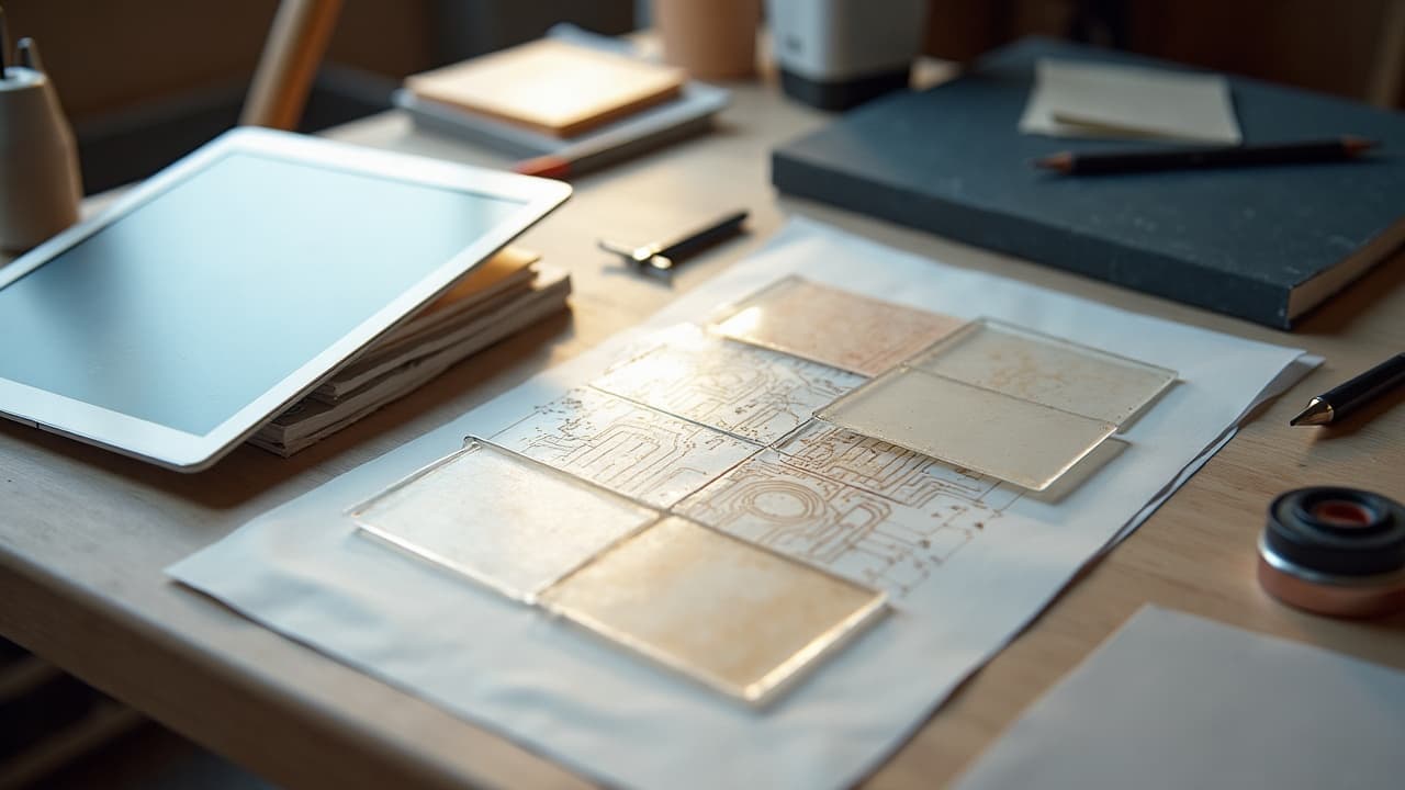
Most AI tattoo mockups that look perfect on a white canvas fall apart on real skin. The usual culprits are scale drift, detail hallucination, and texture mismatch. Skin is not paper, it is a living surface with microrelief, hair, oil, and undertones that change how lines and color read. AI generators lean on priors from glossy imagery, not the way ink heals under dermis. That gap is why realism slips.
Two facts keep this honest. First, skin tone and reflectance vary widely across Fitzpatrick types I–VI, which affects perceived contrast and color fidelity, as clinical sources note from the Cleveland Clinic and American Academy of Dermatology. Second, tattoo pigments and their behavior are regulated and researched, see the FDA’s tattoo and permanent makeup page and reporting in JAMA Dermatology. If you want photorealistic previews that survive first contact with skin, you need workflows built for these realities.
Why AI struggles to look real on actual skin
Most image models were trained on flat, evenly lit photos. Skin has anisotropic highlights, pores, vellus hair, and vein coloration that warp thin lines and low-contrast shading. The model’s learned texture often fights the real one in your photo, which is why “perfect” gradients turn noisy or plastic when overlaid on an arm or ribcage.
Color is another trap. Melanin and blood volume shift how ink appears through the epidermis. Reds can skew brown, whites can chalk or disappear, and yellows often drop a value step. These shifts are documented in dermatology guidance from the AAD and consumer summaries like Healthline’s coverage of tattoo complications. If your generator pushes contrast to compensate, you may get halo artifacts and over-sharpened lines that no artist would stencil.
The three big failure modes to watch
Every realism problem I troubleshoot for clients maps to one of three buckets. Name them early and you save hours of re-runs and edits. Here is what to look for and how to respond before you commit to a design review.
- Detail hallucination: filigree, fur, or micro-text looks crisp at 100 percent, then crumbles when scaled to 60–120 mm. Solution: specify line weight and feature size in millimeters, and simplify edges in your prompt.
- Scale drift: a tiger that fits a forearm in the generator renders too dense for a 130 mm span in reality. Solution: constrain height in mm, request negative space, and test-print at 100 percent.
- Texture mismatch: the model paints fake pores and gloss on top of real skin, breaking believability. Solution: lower denoise strength, use inpainting to follow contours, and shoot better reference photos.
Get your canvas right: reference photos that actually work
Before you blame the model, check your input. A clean, consistent reference photo improves realism more than any magic prompt. You want even light, true scale, and minimal glare so the generator reads the skin as a stable surface, not a puzzle to solve.
- Shoot with diffuse light, not flash. A cheap ring light or softbox at 45 degrees kills glare without flattening form. Look at continuous options like Neewer or Godox $30–$120 (non-sponsored examples).
- Use a focal length around a 50 mm equivalent to avoid warping limbs. Stand back, then crop. Phone users, pick 2x or 3x telephoto to reduce distortion.
- Include a ruler or a 10 mm grid card adjacent to the placement. This anchors scale so you can map pixels to millimeters later without guessing.
- Moisturize lightly to remove ashiness, but avoid a wet shine. A fingertip of Hustle Butter or Aquaphor works, then blot with tissue to keep highlights under control (non-sponsored examples).
- Kill color casts. Turn off phone “vivid” profiles and auto HDR. If you own one, include a ColorChecker in a frame for later white balance.
- Stabilize the surface. Relax the limb, breathe out, and photograph on a neutral pose that matches how the tattoo will sit most days.
Prompt frameworks that deliver stencil-friendly realism
Realistic AI tattoos are built on prompts that encode tattoo constraints, not just art style. Speak the model’s language, but specify what a human needle can execute. If it cannot be lined, shaded, or saturated by a person, the preview is a false promise.
- Use a structured pattern: SUBJECT, STYLE, PLACEMENT, SCALE in mm, LINE WEIGHT, NEGATIVE SPACE, SHADING METHOD, and INK PALETTE. These anchors stop model drift and keep details printable.
- Example that works: “Red-crowned crane, fine-line black and gray, inner forearm, 120 mm tall, 0.25–0.35 mm lines, 20 percent negative space, whip-shaded feathers, limited blackwash, no skin-gloss overlay.”
- Example that fails: “Hyperrealistic crane sleeve, crisp details, photoreal, perfect lighting.” The model invents microtextures, ignores scale, and adds skin-like highlights that will ghost over real pores.
- Name tattoo-native techniques: single-needle, pepper shading, stippling, solid fill, negative space bands, dot gradient. This lures the model away from photo tricks and toward executable marks.
If you plan to collaborate with an artist, flag intent early. “Artist will simplify linework, keep form read at 2 meters,” or “Ready for stencil output, no photobash textures.” This tells the model not to chase hyperreal skin or reflections that will never transfer.
Parameters that consistently improve realism
Each platform names knobs differently, but the principles rhyme. You want enough steps to settle edges, moderate guidance so style cues stick, low noise when compositing over skin, and tools that respect curvature. Start here and fine tune per result.
- Guidance strength: set CFG 5–7. Lower than 5 drifts, higher than 8 often over-sharpens and adds halos around lines on skin overlays.
- Sampling steps: try 30–50. Below 25 you get soft edges, above 60 yields diminishing returns and can overfit fake microtexture.
- Denoise strength when inpainting over a skin photo: 0.35–0.55. This preserves pores and hair while allowing the tattoo to adhere to form.
- Hi-res fix or upscaler: on, but reserve for final export. If available, sharpen with a low-radius 0.2–0.4 px to avoid crunchy lines.
- Face or skin restoration models: off for tattoo overlays. They smooth real pores, which makes the tattoo look like a sticker.
- Tiling: off. Tattoos are placed once, not tiled. Use seam-aware inpainting to wrap around curves like calves and forearms.
If you need a clean canvas render before a try-on, generate the design separately, then composite it onto your skin photo using the platform’s overlay tool. In AI for Tattoo you can generate the art, then try it on your own photo with placement controls, see our Try-On.
Locking scale and placement so the preview is honest
Realism dies when the design is the wrong size. Tattoo detail lives in millimeters, not pixels. Convert intentionally, then test-print. A believable mockup and a happy session both start with accurate measurement and a hard stop on how small features can go.
- Measure the site with a soft tailor’s tape, noting maximum height and usable width between anatomical landmarks. Write a target like 110 mm H x 70 mm W.
- Set design canvas to a print DPI, usually 300 DPI. A 100 mm tall design equals 1181 px at 300 DPI. Use this to sanity-check prompt outputs.
- Set a minimum feature rule. Hair, filigree, or serif accents under 0.3–0.4 mm will blur or drop out on skin. Tell the model and enforce it in post.
- Test-print at 100 percent on paper, trim, and tape in place. Photograph and compare to the AI try-on. Adjust 10–15 percent if the read at distance is off.
For a quick on-body preview, use printable temporary tattoo paper or a handheld temp printer. Brands like Silhouette Printable Tattoo Paper and Prinker run $15–$300 and give you a reality check before a deposit (non-sponsored examples).
High‑risk subjects: hands, faces, microtext, and dense fur
Some subjects push AI and human technique to the edge. If your generator nails the look but the form will collapse at tattoo scale, you need to simplify before you fall in love with the mockup. Here is how I approach the usual suspects.
- Hands and fingers: reduce line count, increase line weight to 0.35–0.5 mm, and add breathing room between marks. Movement and healing soften everything here.
- Faces under 70 mm: prioritize planes and cast shadows over pores and eyelashes. Ask for bold silhouettes and three-value shading so the face reads at a glance.
- Microtext: anything under 8 pt or 2.5–3 mm cap height will muddle. Request all caps, sans-serif, and expanded tracking so letters do not fuse over time.
- Dense fur or feathers: specify clumped groupings and negative space streaks. Avoid literal hair counts. Suggest pepper shading and whip shading for believable texture.
Color on real skin: getting hue and value to read
Ink does not sit on top of skin the way pixels sit on a screen. It lives under a translucent filter that changes contrast and hue. Darker skin types often require stronger value separation and clearer silhouettes so colors read cleanly at distance.
- Limit palettes to 3–5 inks plus black. Over-mixed palettes look muddy once filtered by epidermis and melanin. Keep warms and cools separated when possible.
- On deeper tones, lean on negative space, solid black, and saturated primaries. Pale yellows and pastels can disappear or shift. This aligns with cautions seen in AAD and clinic resources.
- White ink highlights should be strategic, not global. They often heal down quickly and can chalk on certain tones. Reserve white for micro-accents you can live without.
- Always preview on your skin tone. In AI for Tattoo you can upload your own photo for an on-tone try-on, then tweak with a value ladder before saving, see our Create tool.
If you want a deeper read on adapting style to personal features like tone, freckling, or scar tissue, bookmark style adaptation principles in this guide. It pairs well with the realism tactics here.
From mockup to stencil: what survives and what changes
A truthful AI mockup sets expectations, but a human still translates it into linework, shading passes, and packing strategy. That handoff is where realism becomes a plan. Know what transfers 1:1 and what your artist will reinterpret.
- Transfers well: macro composition, silhouette, line hierarchy, negative space planning, and approximate value map. These are the backbone of readable tattoos.
- Gets simplified: microtextures, specular skin highlights, and eyelash-level details. Expect a conversion to dots, lines, or soft shading that your artist can sustain.
- Budget a tweak pass. Many studios charge $50–$150 for design refinement. Bring your print, scale notes, and AI files so changes are fast and productive.
- Aftercare still shapes the final look. Healing affects edge crispness and saturation. See AAD basics and Mayo Clinic hygiene reminders, then follow your artist’s protocol.
If your concept references specific art, keep it ethical and collaborative. Credit sources, request transformation, and brief for originality. Our team covers AI prompt ethics in detail here, see ethical considerations and guidelines.
Ready to stress test your concept on real skin? Generate the art, set scale in millimeters, and preview it on your own arm or rib with placement controls. Start in Create, then do a photo-based Try-On to see what holds up before you book.
Try AI for Tattoo Free