
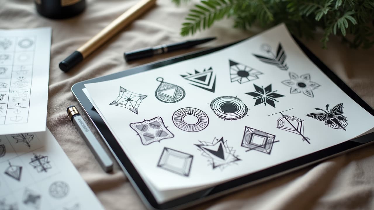
Most AI tattoo concepts are 80% right and 20% wrong for the person wearing them. Personalization is where the magic happens. Tattoos are durable body changes, and that permanence is why careful adaptation matters. The American Academy of Dermatology notes that tattoos can take 2 to 4 weeks for surface healing and may raise long-term questions about sun, color change, and touchups, so front-loading design clarity is worth it (AAD). With nearly 32% of U.S. adults reporting at least one tattoo, according to Pew Research Center, standing out with intent is not optional anymore (Pew Research Center).
Why personalization matters with AI tattoos
AI is great at style mimicry and fast iteration. It is not great at your story. Left untouched, many AI outputs skew toward trending motifs, exaggerated contrast, or impractical placement. The U.S. FDA reminds consumers that tattoo inks are not risk free and can behave unpredictably over time, which is another reason to vet colors and line density before committing (U.S. FDA on tattoo inks). Clinical literature, including JAMA Dermatology, documents complications from allergies to infections, so choosing readable, maintainable design choices is not just aesthetic, it is practical (JAMA Dermatology).
Personalization is not about adding random symbols. It is about tightening style to reflect your identity, body map, and daily life. That includes placement-specific scale, line-weight discipline, and color contrast that stays legible on your skin tone five years out. Done right, you turn a generator’s style into a signature.
Build your personal spec sheet before you prompt
Before typing a single word, write a spec that anchors what the AI should not miss. This keeps each round of adaptation honest and efficient. A good spec covers meaning, body constraints, maintenance, and budget.
- Story anchors: dates, initials, coordinates, a single object that represents the theme. Keep it to 1–3 primary symbols so the design reads clean.
- Placement and scale: wrist at 2–3 cm, inner bicep at 6–12 cm, scapula at 10–18 cm. Note movement, sun exposure, and clothing edges.
- Skin and contrast: undertone, hair density, scar zones. Decide if you need high-contrast blackwork or can support muted color blends.
- Longevity constraints: opt for minimum 0.2–0.3 cm negative space in fine-line clusters and avoid micro text under 8 pt equivalent.
- Pain and session tolerance: aim for 1 session under 2 hours if you pace poorly. If you are fine at 5–6/10 pain, larger formats open up.
- Budget range: set a ceiling like $250–$500 for small to medium, or hourly $150–$300. This steers complexity choices early.
- Cultural boundaries: motifs you will or will not use. If in doubt, park it and research before you prompt.
If you need help translating ideas into inputs, start with our prompt guide and combine it with how to avoid AI prompt bias. That pairing stops the generator from drifting into stereotypes and gives you levers to express nuance.
Prompt techniques that actually shift style
Most prompts are too vague. To adapt style, you need explicit style controls, weight balance, and exclusions. Think of your prompt as a recipe with percent-like emphasis and strict do-not-use clauses. These micro-adjustments move an output from generic to personal fast.
- Style anchor plus deviation: “fine-line botanical, 80 percent realism, 20 percent geometric framing.” Adjust the split until the vibe matches your wardrobe and existing ink.
- Weighted symbols: “primary symbol raven (weight 2), secondary symbols fern and moon (weight 1).” This prevents the generator from burying your main icon.
- Material language: specify single-needle look, stippling, halftone shading, or bold 7M shader. The tool does not know your artist’s toolbox unless you teach it.
- Exclusions: “no clocks, no pocket watches, no roses.” Hard nos stop cliché creep and make space for personal elements.
- Placement preview tags: “fits forearm inner, 8 cm tall, vertical orientation, 10 percent wrap allowance.” AI respects constraints if you feed them.
- Color constraints: “black plus desaturated rust red only” or “cool grayscale, no pure white highlights.” Locking palette simplifies long-term maintenance.
Example, adapting a neo-traditional fox to your story: “neo-traditional fox head, 70 percent realism, 30 percent ornamental filigree, primary symbol fox (weight 2), secondary hops flowers (weight 1) for brewer heritage, black plus muted amber, no daggers, inner forearm 10 cm.” You just taught the model what to prioritize and what to ignore.
Composition frameworks for adaptation
Style is one axis. Composition is the other. To keep readability high, build variants on a grid and compare spacing, balance, and skin break. The goal is a design that breathes at the chosen scale and still holds from 2 meters away.
- Thumbnail matrix: generate 9–12 micro-comps, each with a different focal weight. Label A, B, C and note why each works or fails on your placement.
- Symbol stacking: test top-heavy, center-weighted, and bottom-weighted arrangements. On calves and forearms, bottom-weighted comps often read cleaner.
- Negative space mapping: draw contour voids that mimic muscle flow. Protect at least 3–5 mm of clean skin around micro-details.
- Wrap simulation: print to scale, tape on, and mark where lines bend at 15–25 degrees. Ask AI for a second pass that anticipates that wrap.
- Mini case: memorial compass for wrist. Version A pure line, B line plus dotwork halo, C line plus one accent star. The C variant reads best at 3 cm.
Style-specific strategies that hold up on skin
Different AI styles age differently once they leave the screen. Use these field-tested adjustments so your chosen lane stays readable and healable. Where possible, simplify, separate, and reinforce edges that matter most.
- Fine-line microrealism: lock a minimum 0.25 mm line look and add dotwork shading instead of micro crosshatch. Reserve true micro text for touchable zones, not ankles.
- Blackwork and geometric: widen repeated lines to 0.3–0.5 mm look and bake 2–3 mm spacing. Add one soft gray pass for depth without losing the bold read.
- Neo-traditional: simplify color count to 3–5 inks and pick one keyline weight. Overly busy palettes muddy on medium to dark skin.
- Watercolor: anchor splashes with inked silhouettes or fine hash borders. Free-floating watercolor without anchors bleeds into mush at year three.
- Japanese-inspired: respect flow by following sine-wave movement around limbs. Avoid isolated stickers. Stitch pieces with windbars and water bars for sleeves.
- Script and lettering: keep x-height generous and tails clean. Avoid ultra-thin hairlines that will blur to gray. Test readability at arm’s length.
Color and skin tone, making contrast work for you
Contrast decisions are not cosmetic fluff. They determine if your tattoo reads from a distance and during the mid-heal haze. On melanin-rich skin, saturated warms and deep cools tend to outlast pastels. The Cleveland Clinic emphasizes realistic healing windows and the importance of aftercare for clarity, which includes protecting color from sun in the early weeks (Cleveland Clinic).
- High-contrast palettes: black plus one accent like rust, teal, or violet stay legible across undertones. Avoid relying on white for highlights.
- Swatch tests: ask AI for 5 mini swatches on your approximate skin tone. Print and compare in sun and warm indoor light before locking choices.
- Fade planning: plan for year-2 touchups if you choose watercolor or pastels. Mark where soft blends need a future re-kiss.
- Sun logic: shoulder caps and forearms get UV. If you work outdoors, bias toward black plus limited color to reduce long-term maintenance.
- Allergy caution: reds can trigger reactions more often than some hues. If you have a history of sensitivities, discuss ink choices with your artist and consider patch strategies.
Early aftercare sets the trajectory. Keep your artist’s protocol, and remember outer layers close in about 10–14 days, while full settling can take longer. Sources like the American Academy of Dermatology and Cleveland Clinic outline timelines and hygiene fundamentals that protect line crispness and color (AAD, Cleveland Clinic).
Placement, sessions, pain, and cost math
Adapting style includes respecting your body map, your pain ceiling, and your wallet. A calf piece that looks perfect on screen may collapse if you compress it to wrist size. Translate AI art into human parameters and you will book smarter sessions.
- Session planning: many small to medium pieces land in 1 session of 1.5–3 hours. Sleeves fragment into 4–8 sessions to manage swelling and clarity.
- Pain bands: ribs and sternum can hit 8–9/10, outer arm often 3–5/10. Keep complex micro details away from high-movement, high-pain zones.
- Budgeting: shops commonly charge $150–$300 per hour or flat quotes like $250–$800 per piece. Complexity, color count, and body area drive price.
- Collection logic: thinking in panels? Read our gallery integration guidelines to future-proof flow from day one.
- Wrap allowance: increase negative space by 10–15 percent on curved placements to prevent crowding when the stencil bends.
From AI mockup to artist-ready stencil assets
Bringing a pixel-perfect screenshot to a consult is not enough. Clean the concept for needles and export in formats artists can edit. Focus on line hierarchy, shading zones, and print scale. That prep earns faster consensus at the shop and better results on skin.
- Line cleanup: import to Procreate or Clip Studio Paint, separate layers for keylines, secondary lines, and shading. Mark stitch points and breaks.
- Vector option: rebuild edges in Adobe Illustrator, Affinity Designer, or Vectornator for SVG/PDF delivery and lossless scaling (non-sponsored examples).
- Export pack: include 300 dpi transparent PNG, print at target centimeters, and grayscale reference for shading intent.
- Needle realism: tag looks like 3RL lines, 7M soft shade, or 5RS dots so the artist reads technique, not just pixels.
- Aftercare nudge: if your shop suggests specific wraps, products like Saniderm, Aquaphor, Hustle Butter, or Mad Rabbit can be part of plans your artist controls (non-sponsored examples).
Culture, ethics, and originality checks
AI can remix sacred motifs without context. That is on us to fix. If you are not from a culture, avoid lifting closed designs. Instead, adopt structural ideas like flow, negative space, or storytelling arcs and pair them with your biography. When in doubt, commission a cultural consultant or pick a different lane.
Use AI to prototype, not to copy. Replace direct artist-name prompts with period or movement prompts. For broader thought starters, read our pieces on design patterns across cultures and tattoo narratives and cultural influences. Ethical prompts make better tattoos and better studio conversations.
Personalizing an AI concept is easier when you can see it on your body. Use AI for Tattoo to generate variants and preview placement with the virtual try-on. Spin up your concept in minutes at Create, then check scale and wrap with Try On. Lock your spec sheet, export your pack, and walk into your consult confident.
Try AI for Tattoo Free