
Roughly one in three adults in the United States has at least one tattoo, yet very few pieces actually read like a story at first glance. Mythology gives you built-in narrative power, but it only works if the symbol, style, and placement are aligned with a clear arc. I approach myth tattoos like book covers that have to communicate plot in a single image, and I design them to read left to right across the body’s natural flow so the eye lands exactly where the story turns. That is how a phoenix stops being a bird with flames and becomes a chapter about rebirth you can actually feel when you look at it. For context on how broad tattooing has become, see Pew Research on tattoo prevalence.
Start With the Story, Not the Symbol
Before picking a myth, write a myth brief. In one paragraph, define your protagonist, conflict, and transformation. If you want Athena, is it wisdom after chaos or strategy over brute force? If you want Amaterasu, is it emergence from darkness or leadership by light? This shapes everything from focal point size to line weight. I also recommend a 3-beat arc on skin, especially for forearms and sleeves: Set up near the wrist, confrontation at the center mass, and resolution toward the elbow or shoulder where you naturally pause the gaze.
- Build your myth brief: one sentence on theme, one sentence on why now, one sentence on how you changed. Keep it under 60 words so it fits on a stencil note.
- Define your symbol’s verb, not just its noun: a phoenix that rises, Odin who sees, Anubis who weighs. Verbs map to pose, angle, and composition.
- Choose one focal point and two supporting motifs. Anything beyond three, reduce or move to background texture so the story stays legible.
Research With Respect: Cultural Significance and Permissions
Not every mythological mark is available for everyone. Some symbols are sacred, clan-specific, or require ceremony. For example, Polynesian tā moko and certain Indigenous North American iconographies carry protocols that deserve more than Pinterest research. If a client’s story can be told with adjacent motifs rather than restricted ones, that is both respectful and often more original. I direct clients to talk with community members or choose universal elements like constellations, animals, or natural forces tied to that myth instead of restricted deity visages or family-specific pattern sets. For a deeper framing of identity and symbolism, see our cultural identity tattoos guide.
- Ask: Is this symbol restricted, sacred, or clan-specific? If unsure, default to non-restricted motifs that still honor the narrative.
- Clarify why this culture and not another. If it is aesthetics only, consider cross-cultural neutrals, like laurel, waves, or sun rays.
- Use the language of the style, not a copy of a ceremony mark. Translate theme into pattern logic, spacing, and line rhythm.
Visual Hierarchy That Reads Like a Myth
A myth tattoo should be readable from 3 meters. Lead with a dominant focal point, then secondary symbols, then background negative space that breathes. I set the focal point at 40–60 percent of the total footprint, draw the eye with contrast and directional flow, then let textures serve as atmosphere. On a forearm, I angle the composition so the story rises toward the elbow, which makes growth and ascension feel literal. On a calf, I run vertical flow lines along the gastrocnemius so movement sits on muscle, not against it. This is how a Medusa face at 4–5 inches with serpents at 1–2 inches tells a hierarchy without shouting.
Style Matching: Use the Right Visual Language
Match the culture’s visual grammar to your technique. Greek and Roman myths often sing in blackwork with laurel, meander borders, and engraving-style hatching. Norse stories read clean in woodcut line and rune circle layouts. Japanese yokai and dragons demand Irezumi logic, large shapes, and windbars that wrap joints. Celtic and Insular motifs prefer interlaced knotwork and dotwork shading. If you mix, do it with intention, like neo-traditional color on a Hellenic bust with fine line florals. To get language and style prompts right, see our style context guide. For reference points, study Horiyoshi III for classical flow, Dr. Woo for micro fine line, and Sasha Masiuk for ornamental symmetry.
Symbol Pairing and Motif Systems
Good pairings make a single panel feel like a chapter. Use a lead symbol that carries the verb, then supporting motifs that clarify setting, attributes, or consequences. Keep them consistent in style and scale so they read as one voice. If a deity image risks crossing lines, switch to the myth’s attributes: animals, tools, plants, and cosmic markers. This keeps narrative punch without misusing sacred imagery.
- Athena: bust or owl as focal, with olive branch and small spearhead accents. Add a meander border as quiet frame.
- Amaterasu: rising sun disk, sun rays as flow bars, distant torii silhouette in background texture.
- Anubis: jackal head 4–6 inches, small scales and a restrained ankh as secondary, desert dunes as soft stipple.
- Odin: profile with Huginn and Muninn, a runic circle halo, and restrained spear implied by negative space.
- Phoenix: central bird, embers as texture, a faint laurel or lotus underline depending on rebirth flavor.
Placement, Scale, Session Time, and Pain Reality
Placement decides how the story breathes. Upper arms and thighs handle large focal points, while wrists and ankles suit minimal icons. Plan reading direction with the body. Left forearm fronts can read wrist to elbow for ascent. Back panels can arc center spine outward so the reveal happens as someone walks behind you. Budget for time and pain realistically. A detailed 5–6 inch focal with two secondary motifs typically runs $300–$900 in most cities and takes 4–7 hours across one or two sessions. Ribs, sternum, and ankle bones sit around 7–9/10 pain, upper arm and calf around 3–5/10 for most people. For a medical overview on pain and healing, see Cleveland Clinic on tattoo care.
Color Codes, Inks, and Longevity
Color has meaning and chemistry. Reds often signal power or danger, blues depth or protection, golds divinity. Practically, high-saturation reds and yellows can fade faster in sun and some reds have a higher chance of reaction for certain people, as noted by Healthline on red ink allergies and the AAD on tattoo risks and aftercare. Black-and-grey blackwork generally ages clearest for symbolic designs because contrast stays readable over decades. Use SPF 30+ daily once healed to extend color life. The initial heal runs 2–4 weeks, while dermal settling takes roughly 3 months. If the client has a history of dermatitis or keloids, proceed cautiously and discuss placement, or consider grayscale alternatives. For safety and regulation updates on pigments, see FDA guidance on tattoo inks.
Aftercare directly impacts how myth lines age. I like breathable dressings for the first 24–48 hours and light occlusives after. Simple routines win: gentle wash, pat dry, a thin layer of ointment, repeat. Popular products include Saniderm, Bepanthen, Aquaphor, Hustle Butter, and Mad Rabbit (non-sponsored examples). Avoid picking, heavy gym friction, and baths until the flake stage passes. The AAD also emphasizes sun protection and moisturization once healed.
Line, Texture, and Depth: Make Symbols Legible
Techniques tell stories quietly. Use line weight hierarchy to prioritize beats, stipple shading for atmosphere around divine or ghostly elements, and crosshatching for classical gravitas. Whip shading handles smoke, breath, or wind around dragons without muddying edges. Keep white highlights sparing and placed on high points so they do not blow out over time. Remember that negative space is a character too. If you are stacking motifs, separate planes by value steps: focal at 100 percent contrast, support at 70 percent, background at 30 percent. That 100-70-30 rule makes a story read at a glance.
Drafting, Prototyping, and Iteration
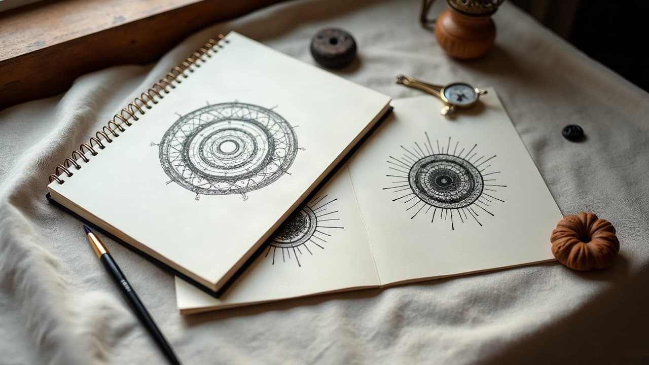
Paper thumbnails come first. Then test scale on body with a quick stencil fit check and photos in motion. If the arc does not read, adjust angles or trim motifs until the eye lands where you want it. When a client wants to audition multiple myths or placements, quick digital comps in Procreate or a virtual try-on save hours and prevent tattoo regret. You can generate strong starting sketches in minutes and see them on your body shape before you ever book a deposit. If you are mixing styles, keep a single value key and line language across drafts so it still reads as one story. For clients who want creative prompts that respect cultural context, point them to our style context guide and our broader Library for style references.
Ready to see your myth read clearly on skin? Use AI for Tattoo to generate story-led concepts, then preview scale and flow with our virtual try-on. Start with a focused prompt in Create and test placements in minutes: Generate your design and try it on.
Try AI for Tattoo Free