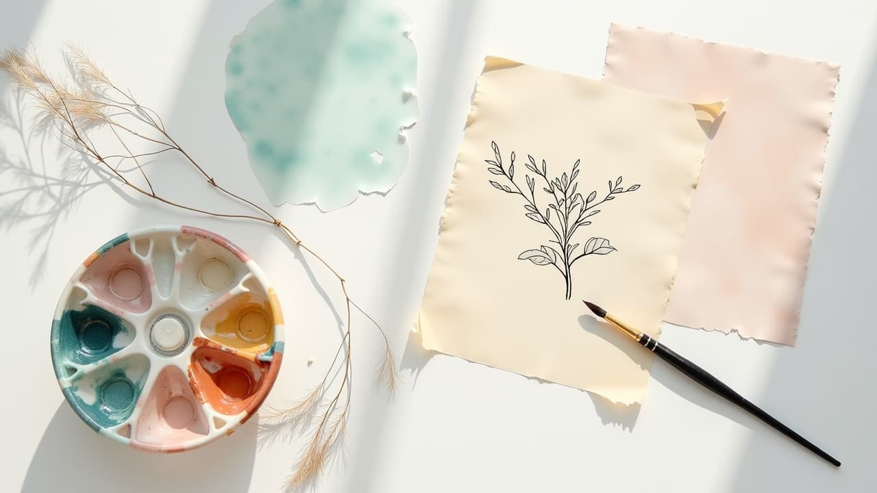
The most convincing watercolor tattoos are built in 3–5 translucent passes, not one heavy fill. Proper layering shapes value, directs the eye, and protects color from turning muddy. If you love painterly flow without hard outlines, understanding how ink stacks in skin is the difference between a soft blur and real depth and dimension.
What layering really means on skin
Ink sits in the dermis, below the epidermis, so every additional pass is a semi-transparent filter over the last. Think glazing on paper, only your canvas is living tissue that swells, weeps, and changes tone during the session. The goal is controlled translucency, not saturation at all costs. The American Academy of Dermatology explains that tattoo pigment lives in dermal cells and can shift as skin heals, which is why gentle passes and patience matter (AAD).
Layering in watercolor style means you map values first, then drift into tattoo gradients and glazes to push some areas forward and let others fall back. You will deliberately leave lost edges and negative skin for the airy, painterly effect people love from artists like Ondrash and Sasha Unisex. A stacked build, thin to thick, is what keeps color luminous instead of flat.
Underpainting and value mapping come first
If your light and dark are wrong, no amount of fancy color blending will save the piece. Start with an underpainting in muted cool grays or desaturated complements. I like a faint pepper-shade with a 9-11 magnum at low voltage to mark shadow masses, not outlines. Keep this pass 20–30 percent lighter than you think you need, since every glaze darkens it.
Sketch your value map over the stencil and lock in two anchors: your darkest accent and your largest soft light. Everything else rungs between those poles. For airy florals or abstract pools, plan where edges will be hard, soft, or lost before touching ink to skin. If you work digitally first, build two layers, value and color, so you can toggle forms without guessing. For planning palettes, see [our color prompting techniques](/blog/ai-tattoo-color-prompting-advanced-techniques) for fast digital trials that translate well to real skin.
Gradients and glazes without mud
Watercolor tattoos live or die on color blending. Mud happens when complements meet too wet or when you pound saturated pigment into swollen skin. Work from light to dark, and thin to thick. In early passes, favor glazes that tint rather than cover. I cut my inks with sterile distilled water or witch hazel to keep flow smooth and sting low. Health educators note that trauma and overworking increase bleed and healing time, so the motto is light, rest, layer, repeat (Cleveland Clinic).
- Test a 1:5 dilution for airy tints, ideal for first-pass skies and floral petals.
- Use 1:3 dilution for mid glazes that steer hue without burying texture.
- Reserve 1:1 dilution for focal accents and edges that need to pop.
- Feather gradients with whip shading or pendulum motion, never stall the needle.
- Let each micro-area rest 2–3 minutes before the next glaze to reduce blowout risk.
- Blend complements indirectly, for example glaze blue over green rather than straight into orange.
Avoid swabbing with dry gauze. A dry drag lifts pigment. Use a very light swipe with a diluted green soap or distilled water, then a thin film of Hustle Butter as a buffer before the next pass. This keeps your tattoo gradients clean and prevents tearing.
Edge control, the painter’s depth lever
Edges organize space. In watercolor style we rely on soft and lost edges to imply form without outlines. Hard edges should be rare and placed at the focal point. A crisp petal tip, the rim of a moon, the eye of a bird, those moments anchor the piece so the rest can stay atmospheric.
To build soft edges, back away a millimeter, lower pressure, and drag the magnum diagonally to the edge so pigment disperses into clean skin. For a lost edge, glaze beyond the form into a matching skin tint so the boundary dissolves. If a hard accent is needed, switch to a 3-5 round liner and pull a micro-line within the wash, never around the entire shape.
Palette strategy, transparent vs opaque behavior
Not all pigments behave equally in skin. Transparent inks stack like stained glass and are perfect for glazes. Opaque pastels can chalk out when layered too thick, especially on deeper skin tones. On medium to deep complexions, lean on transparent warms and deep cools for contrast, and keep pastel highlights minimal so they do not gray out after healing.
Classic watercolor palettes love analogous runs, like teal to blue to purple, because they glaze cleanly. Save complements for late accents so they do not mud the base. For repeatability, test swatches on synthetic skins, then on healed clients before promising ultra-delicate yellows or pinks. Color fade is real, driven by UV and time, and health publishers consistently flag sun exposure as a top culprit, so plan bolder at the focal point (Healthline).
Needles, stretch, and voltage for silk washes
Your machine setup controls texture. For broad glassy washes, use 7–11 curved magnums with bugpin 0.30 mm or 0.25 mm. Curved mags save the edge from gouging and allow feathered rolls. A 3.0–3.5 mm stroke with moderate give keeps needles hitting soft. Voltage varies by machine, but most artists glaze between 6.5–8.0 V on rotaries and go slower rather than deeper.
- Go-to wash setup, 9 curved mag, bugpin 0.30 mm, 3.5 mm stroke, 7.2 V, slow pendulum.
- Detail glaze, 7 curved mag, 0.25 mm, 3.0 mm stroke, 6.8 V, micro-ovals into the midtone.
- Accent pop, 3 round liner, 0.30 mm, 3.5 mm stroke, 7.5 V, quick snap for edge hints.
- Large field, 11 curved mag, 0.30 mm, 3.5 mm stroke, 7.6 V, broad whip to avoid tramlines.
Always keep a clean three-point stretch, especially on curved anatomy where watercolor pooling can buckle. If the canvas moves, your gradient breaks. Short, overlapped passes beat long drags for keeping pigment even without chevrons.
Skin tone, placement, and longevity
Layering must respect the base canvas. On fair skin, cool glazes show fast. On deeper tones, prioritize high-chroma warms and crisp value separations so the design reads from a few feet away. Avoid relying on white for highlights, since many whites heal down and can shift in tone. For sun-exposed zones like forearms, plan slightly higher contrast to hedge against fade.
Dermatology sources note that tattoos settle during the first 4–6 weeks, then continue to age with UV and immune activity over years (AAD). Government guidance reminds clients that pigments are not risk free, and some colors carry higher allergy potential, especially reds, so patch tests and honest histories matter when selecting palettes (FDA). Place your most delicate watercolor effects where fabric or shade protects them, inner arm over outer, upper thigh over shin, ribcage over shoulder cap.
Healing that keeps layers luminous
You can paint a perfect gradient and still lose it in healing. Keep trauma low during the session, then guard those glazes for two weeks. I favor a 24-hour dry wrap, then switch to either second-skin or a light balm. If using a bandage like Saniderm or Derm Shield, follow manufacturer timing, usually 3–5 days if the seal stays clean. If going open, thin layers of Aquaphor, Bepanthen, or Hustle Butter twice daily maintain slip without suffocating the skin, and newer creams like Mad Rabbit can help color look conditioned during the flake phase (non-sponsored examples). For evidence-based timelines on scab, peel, and itch cycles, consult medical overviews while adapting to your client’s skin response (Cleveland Clinic).
- Wash gently with lukewarm water and fragrance-free soap twice daily, pat dry.
- Moisturize thinly, avoid thick gloops that trap sweat and ink.
- Skip soaking, no pools, baths, or ocean for at least 14 days.
- Avoid intense sun, wear UPF sleeves or loose cotton if you must be out.
- No heavy workouts on large fresh watercolor pieces, sweat and stretch lift pigment.
- If redness, swelling, or rash worsen after day 3, contact a clinician promptly.
Overworked skin looks muddy after healing, and poor aftercare speeds fade. Thin layers, clean wipes, and respectful rest periods keep layering techniques visible for years.
Plan the stack, mockups, stencils, and smart revisions
Watercolor looks effortless, but the planning is not. Build your design in layers before you ever set up the tray. I draft a value layer, a color layer, and a focal-edge layer. On paper or tablet, test tattoo gradients at the exact size they will live on skin. If you work with AI tools, generate multiple colorways and decide where transparent glazes will overlap. For structured composition principles that keep fluid pieces balanced, see [our symmetry techniques guide](/blog/tattoo-design-symmetry-techniques-principles).
You can pressure-test palettes and opacity digitally with AI for Tattoo. Use [Create](/create) to spin variations with cooler shadows or warmer lights, then [Try On](/try-on) in real scale to confirm edges and flow against your anatomy. For abstract watercolor ideas and prompt structure, check [our abstract prompts guide](/blog/crafting-ai-tattoo-prompts-for-abstract-designs). Planning saves needle time and reduces trauma, which helps pigment settle clean and keeps those delicate glazes crisp over the long term.
A quick note on safety and expectations. Skin biology affects outcomes. Some pigments can trigger sensitivities, and certain medications thin skin or affect healing. Major medical sources emphasize informed consent, realistic expectations, and sun strategy to extend vibrancy over time (Mayo Clinic). Build that into your consult so your client understands why you layer the way you do.
Ready to design watercolor layers that read from across the room, and still look fresh up close? Use AI for Tattoo to build value maps, test glazes, and preview placement. Generate refined options in **[Create](/create)**, then scale and **[Try On](/try-on)** your final colorway before you book.
Try AI for Tattoo Free