
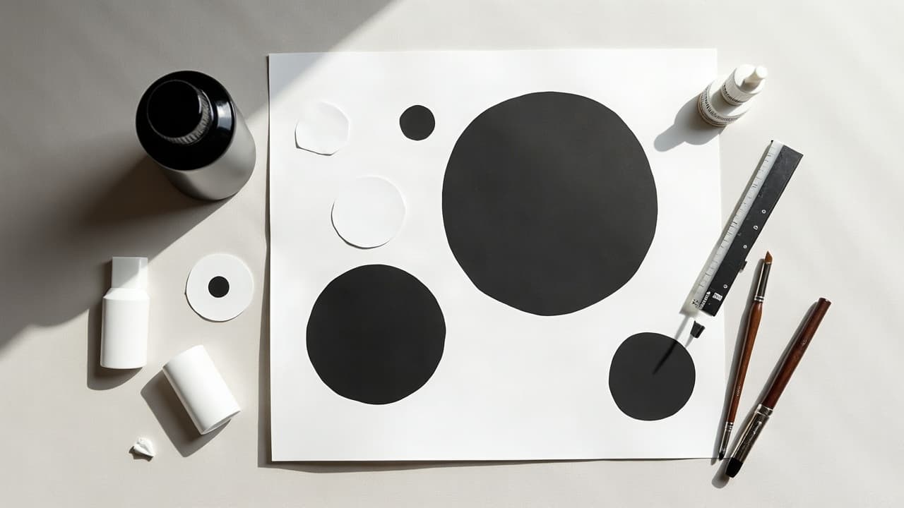
Negative space is the only part of a tattoo that costs nothing and delivers the highest contrast. When you design the skin as a shape, not just a background, your work reads cleaner from across the room and ages with fewer muddy patches. The trick is planning. Spatial tattoo designs live or die by the composition, flow on the body, and how cleanly you protect the empty skin during lining and shading.
What Negative Space Really Does In A Tattoo
Think of negative space as an active ingredient. It is not a gap. It is a defined shape made by everything around it. Done well, it gives immediate legibility, builds hierarchy, and lets the eye rest. Done poorly, it looks accidental and fills in over time. Spatial tattoos rely on two forces: contrast and edge control. Contrast is your light-dark ratio, which you can tune with line weights, black fills, and textured shading. Edge control is how crisply you protect the skin breaks. If the edges fuzz or creep, the whole idea collapses. For design fundamentals on tonal balance, read our contrast guide.
Artists known for using space brilliantly include Chaim Machlev (DotsToLines) for geometric flow, Balazs Bercsenyi for ornamental balance, Kenji Alucky for dotwork textures, and Dr. Woo for fine negative silhouettes. Study how they stage big open shapes next to controlled detail. The lesson is simple: the larger the intended empty shape, the more supporting contrast it needs to read as intentional.
Planning Spatial Composition On A Real Body
Start with the anatomy. The most successful spatial pieces wrap and breathe with movement. Map bony landmarks and muscle lines, then sketch the negative shapes first. Treat the skin like paper you cannot repaint. I like a grease pencil or skin-safe marker to block big voids, then add the inked elements that carve that space.
- Test scale early. Shrink your mockup to phone-lock-screen size. If it is not readable at 3 to 5 meters, it is too intricate or the empty shapes are too small.
- Plan overlaps. Use foreground silhouettes and background textures to stage depth. Keep at least 2–3 mm of clean skin between layers to avoid merging as it heals.
- Respect curvature. On calves, forearms, and ribs, curve the negative shapes with the limb to prevent distortion when viewed straight on.
- Design for aging. Avoid hairline gaps. Make empty shapes slightly larger than you think so they still read after 5–10 years of softening.
- Prototype on-body. Use a temporary stencil or marker pass and take photos from multiple angles, both flexed and relaxed.
Digital tools help. Generate shape studies, invert blacks, and mock wraparounds before you commit. If you are building from prompts, try single subject + silhouette + environment texture. Our AI prompt integration playbook outlines clean prompt structures you can adapt to spatial work.
Techniques That Carve Space: Lines, Shading, And Masks
You are not filling an image, you are sculpting a void. Everything you do with the machine is in service of that. Prioritize crisp edges, staged contrast, and texture that supports the read at a glance.
- Line weights: Combine 3RL or 5RL for inner detail with 7RL–9RL for framing edges. Heavier lines next to negative space lock the boundary visually.
- Black planes: Use purposeful solid black to punch the void. Pack with 9M–13M soft mags, slow passes, and cross-hatching only where needed.
- Textures: Dotwork, stippling, and whip shading create gradients that make empty skin glow. Build up slowly to avoid closing gaps.
- Edge control: Pull lines away from the empty shape. Leave a 0.5–1 mm buffer when shading toward negative space, then feather back in.
- Stencils and tape: For long straight edges, some artists mask with sterile tape or stencil borders. The cleaner your guide, the cleaner the void.
Avoid leaning on white ink to rescue edges. White can look great as a highlight, but on many skin tones it heals down and can blur the concept. The safer path is stronger black adjacency and smarter line weight. If you do add white, keep it minimal and expect more touch-ups than with black.
Choosing Motifs That Love Empty Skin
Some ideas simply read better with space. Think in silhouettes, high-contrast geometry, and shapes that remain iconic when reduced. The goal is a design that works as a black-and-skin poster before any details are added.
- Silhouette wildlife: Wolves, birds, koi, or sharks defined by the background. Add texture fields like waves or clouds to carve the form.
- Botanical lace: Ferns, palms, and peonies where leaves are inked and the petal voids are skin. Pair with ornamental linework for structure.
- Geometric fields: Concentric forms, sacred geometry, or isometric grids that frame empty hexagons or triangles as the star.
- Lettering in reverse: Instead of black letters, ink the surrounding panel and keep the letters as skin. Works best with bold sans or serif shapes.
- Double exposure: Portrait silhouette as negative space filled with landscape textures around it. Crisp profile edges are everything.
If you are browsing styles to match your idea, start with categories that lean on contrast, like blackwork, ornamental, and geometric in our styles library. Then refine with balanced empty shapes that fit your chosen body area.
Placement, Scale, And Readability Over Time
With spatial designs, placement is half the art. On rolling surfaces like forearms or calves, negative shapes can elongate the limb and improve flow. On flatter spots like the upper arm or thigh, you can run bigger voids that stay legible. High-motion or high-friction zones require more generous spacing to survive blur.
- High stretch areas: Ribs and stomach shift with breathing. Keep negative shapes larger and simpler to avoid distortion.
- High wear areas: Wrists, hands, and ankles fade faster. Use thicker outlines and avoid hairline gaps near joints.
- Sun exposure: Upper arms and calves see sun. Plan for SPF 30+ long term so edges do not soften prematurely.
- Melanin and contrast: On richly melanated skin, prioritize bold black adjacency over white ink to preserve clarity.
- Hair growth: Forearms and shins can obscure fine gaps. Make skin breaks wider if body hair is dense.
If you want proof of legibility, take a photo from 2–3 meters, convert it to grayscale, and reduce it to 25–30 percent size on your phone. If you still read the shape immediately, you are in the clear.
Contrast On Different Skin Tones Without White Ink
The most reliable way to make negative space sing on any skin tone is to increase the strength of what surrounds it. That means heavier line weights, denser black fills, and clearer gradients. White ink is optional. According to the American Academy of Dermatology, color pigments like red are more prone to allergic reactions than black, and any pigment can trigger issues, so restraint pays off in safety and longevity too. See the AAD’s guidance on tattoo safety and reactions here: American Academy of Dermatology resources.
For extremely subtle ideas on darker skin, consider texture-only fields that define the shape through change in pattern rather than a thin tonal jump. Dotwork density shifts can outline a skin shape without harsh borders. If you are not sure, consult portfolios of artists who regularly show healed results on skin like yours, and use our artist communication guide to align expectations.
Session Flow, Pain, And Budget For Spatial Work
Spatial designs are often faster than full-color fills, but the edges demand focus. Expect 1–3 hours for small to medium pieces with moderate detail, and 4–7 hours for large wraparounds with multiple texture fields. Most studios price by the hour at $150–$300, or a flat for small flash. Negative space does not mean cheaper if the plan is complex, but you will likely spend less time on heavy packing.
Pain depends on placement. Forearms and outer thighs land around 3–5/10, upper arms around 4–6/10, ribs and sternum 7–9/10, and ankles or wrists 6–8/10. If you are considering numbing, products like TKTX exist, but always follow your artist’s policy and do a patch test. For many, breaks, proper breathing, and hydration are enough. Keep caffeine low and arrive well rested to help with line stability.
Healing And Aftercare For Open-Skin Designs
Even though there is less inked coverage, the edges and black planes still need strict aftercare. A clean heal preserves the negative space you worked so hard to design. Initial healing typically takes 10–21 days, with full settling over several weeks. For medical-grade guidance on timelines and irritation signs, see Cleveland Clinic dermatology advice at Cleveland Clinic and the American Academy of Dermatology at aad.org.
- First 24 hours: Use a sterile wrap like Saniderm to reduce friction on edges. Change as directed by your artist.
- Wash routine: Lukewarm water plus unscented soap, gentle pat dry. Apply a thin layer of Aquaphor or Bepanthen for days 2–4.
- Switch to lotion: Move to a non-greasy balm like Hustle Butter or Mad Rabbit once peeling starts. Thin layers only.
- Hands off: Do not pick flakes along edge lines. That is how you lose crispness in negative space.
- Sun and soak: No pools, hot tubs, or direct sun until fully healed. After that, use SPF 30+ daily to protect edges.
Know the limits of ink. The FDA notes that tattoo inks and pigments are not formally approved for injection, and contamination can occur in manufacturing or dilution. Read their safety brief here: U.S. FDA on tattoo inks. If you have a history of keloids, be cautious with large framing lines and discuss scar risk in advance. The Mayo Clinic has accessible information on keloids and who is more prone to them at Mayo Clinic.
Avoid These Common Negative-Space Mistakes
Most failed spatial tattoos share the same culprits: timid contrast, undersized gaps, and fuzzy edges. You do not fix those with a little white ink at the end. You fix them at the plan stage and the first pass of lines.
- Undersized voids: If a gap is smaller than 2–3 mm, it is a candidate to close up after healing. Enlarge or remove micro-gaps.
- Inconsistent framing: Thick outer lines and whisper-thin inner lines make the void look unintentional. Unify line weights around key shapes.
- Texture overload: Over-shading near the edge fills the space visually. Leave a halo of lighter tone adjacent to the negative shape.
- Poor body mapping: Flat mockups that ignore curvature will warp on limbs. Always wrap-test before you commit.
- White ink dependence: Use it sparingly. Build clarity with black adjacency first, then add white only as a final accent.
For a second opinion before you book, generate a mockup and try it on your own body at real scale. If you can still read it after squinting and stepping back, you are close to done.
Ready to see how your idea holds up in real space? Use AI for Tattoo to generate high-contrast mockups, push and pull the negative shapes, and preview them on your body with our virtual try-on. Start from blackwork, ornamental, or geometric templates in Styles, build your own in Create, then drop it onto your arm or ribs in Try On before you book.
Try AI for Tattoo Free