
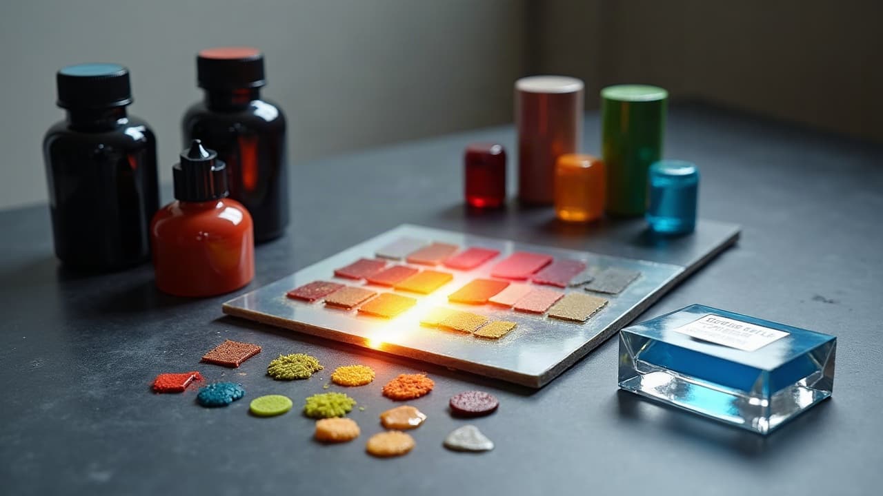
Good AI tattoo prompts do more than name a subject. They specify palette, surface, and finish so color and texture read like ink on skin, not glossy digital paint. If your prompt does not mention skin tone, undertone, lighting, and application method, the model will default to saturated, specular artwork that is tough to stencil and ages poorly as a tattoo.
Lock the surface first, then the art
Models draw what you describe. If you do not define the skin tone, undertone, and finish, you will get studio-lit chrome instead of believable ink. Start by naming the surface: Fitzpatrick scale, ambient light, and a matte, low-gloss finish. That single block of detail often fixes 70 percent of odd color behavior. I also calibrate my screen. A cheap, uncalibrated monitor makes you overcook reds and underexpose browns. Use a color calibrator like X-Rite ColorChecker or Datacolor SpyderX to keep your preview honest (non-sponsored examples).
- Prompt scaffold: “portrait of a fox, tattoo design on Fitzpatrick IV skin, golden undertone, overcast daylight, matte finish, mild film grain, no specular highlights.”
- Add location cues when relevant: “inner forearm, slight skin texture pores, healed 30 days.”
- For paler skin, control glare: “softbox lighting, polarized, no hot spots.”
- For deeper tones, anchor the value key: “preserve shadow detail, avoid crushed blacks, bias midtones +10 percent brightness.”
Color language models actually obey
Vague phrases like “vibrant colors” yield candy gloss. Precise palette instructions keep designs tattooable. Use hex codes, limited palettes, or Pantone names to anchor hue and saturation. Models respond well to concrete numbers and short lists. When I want cohesive color stories, I cap the palette at 3 to 5 colors and allow tints only. That prevents muddy blends that are hard to pack with ink. If you prefer brand references, asking for a “Pantone Solid Coated range” nudges saturation down to print-realistic territory.
- Hex example: “palette #0F1C2E indigo, #E4572E orange, #F3A712 ochre, #293241 blue-gray. No additional hues.”
- Pantone example: “use Pantone 485 C, Pantone 7729 C, Pantone 7406 C, tints at 20–60 percent only.”
- Gradient control: “two-step gradation from #1B1B1B to #6A6A6A, hard stop, no airbrush.”
- Saturation caps: “global saturation -15 percent, skin-safe contrast, matte ink finish.”
Texture that inks, not digital plastic
Texture words should map to a needle technique. Ask for stippling, dotwork, pepper shading, crosshatching, or whip shading and you will get grain that translates to needles. Avoid “bokeh,” “glass,” or “chrome,” which create specular highlights that fight stencil clarity. If you sketch in Procreate or Photoshop, match your AI output to brush sets you would actually use. Grain like 8-bit halftone, paper tooth, or light film grain reads as matte and printable. Digital tool sets like True Grit Texture Supply or RetroSupply can mirror these surfaces later in refinement (non-sponsored examples).
- Texture-ready prompt: “dotwork mandala, stippling, pepper shading, micro crosshatching in shadows, matte paper grain.”
- Implied needles: “linework 3RL, shading 7CM pattern, avoid soft airbrush.”
- Line discipline: “primary lines 0.8–1.2 mm, secondary 0.4–0.6 mm, consistent negative space.”
- No speculars: “zero specular highlights, no glass, no chrome, no reflective gels.”
Control saturation, contrast, and gloss for how tattoos age
Bright on-screen does not equal readable on skin. Compared to paper, skin scatters light and mutes chroma. Prompts that ask for subdued saturation and matte finish get you closer to healed reality. Reds can over-index in AI, and they are also the most likely to irritate skin in real life, which the American Academy of Dermatology notes in its guidance on tattoo reactions. Fading happens. Government and medical sources like the FDA and Healthline explain that pigments settle, UV breaks bonds, and lighter hues fade faster than black. The Cleveland Clinic also points out that certain colors, especially greens and blues, can be harder to remove than blacks, which is a good proxy for how stubborn they are in skin. For prompts, this means biasing toward darker anchors and controlling the overall contrast so details do not vanish at 1–2 meters.
- Prompt controls that help: “overall saturation -10 to -25 percent, matte, no bloom, preserve midtone details.”
- Value map: “limit shadows to 80 percent black, highlights no brighter than #EDEDED, no pure white except catchlights.”
- Aging preview: “simulate 1-year fade, 10 percent desaturation, UV exposure mild.”
- Edge clarity: “avoid feathered edges, prefer crisp transitions with dot screen or hatching.”
Light the scene like a studio, not a game engine
Lighting bloats contrast and shifts hue. If the model thinks the piece is lit by neon or HDR sun, it will inject glow and speculars. Anchor it with photo terms: overcast daylight, north light, softbox, or diffused window. Add “polarized” to tame oily hotspots, which makes colors read more like ink under real shop light. When designing for darker skin, increase fill so shadows retain color information. The goal is not to wash out the skin tone, it is to keep your design’s midtones from collapsing. Small wording changes in your prompt make a big difference.
- Lighting scaffold: “overcast daylight, softbox bounce, no rim light, polarized, exposure to preserve midtones.”
- Avoid glow terms: “no neon, no volumetric fog, no HDR glare.”
- Environment color: “neutral gray background D65, reduce color cast from surroundings.”
- Finish cue: “tattoo healed, 30 days, matte, slight skin texture pores visible.”
Style scaffolds that consistently work
Every style needs slightly different color and texture rules. Set the skeleton once, then swap subject nouns. Keep palettes tight, edges disciplined, and lighting neutral. Use technical terms your machine learning model knows, and exaggerate just enough to survive reduction to stencil lines. Below are style frameworks I use daily. Fill the brackets and keep the controls intact. You will spend more time picking references and less time debugging glossy skin.
- Watercolor: “{subject}, watercolor tattoo, grainy paper texture, palette #0E7490 teal, #F59E0B amber, #EF4444 crimson, wet-on-dry edges, no plastic shine, matte.”
- Neo-traditional: “{subject}, neo-traditional, bold 1.2 mm linework, palette 4 colors max, muted saturation -15 percent, hatching in shadows, matte, no gradients wider than 1 cm.”
- Black and grey realism: “{subject}, black and grey, dotwork + whip shading, 80 percent shadow cap, paper tooth grain, no pure white except 1–2 spec highlights.”
- Japanese irezumi: “{subject}, irezumi, palette anchored to indigo, vermillion, gold ochre, limited tints, matte, cloud and wave patterns with dot screen transitions.”
- Illustrative: “{subject}, illustrative, 0.8 mm primary, 0.4 mm secondary, crosshatching, palette triadic, #1B1B1B keylines, matte.”
Negative prompts and guardrails save hours
Most cleanup is removing things you forgot to forbid. Tell the model what not to do, and it will stop inventing oily highlights and rainbow fog. Set resolution, color count, and texture restrictions as negatives. For text and micro-detail, be ruthless. AI loves 0.3 mm filigree that vanishes in stencil. If you cannot line it with a 3RL, it probably does not belong.
- Useful negatives: “no airbrush, no specular highlights, no gloss, no chrome, no lens flare, no bokeh, no neon, no vignettes.”
- Complexity caps: “no micro text, no sub-0.5 mm details, max 5 colors, no gradients longer than 1 cm.”
- Texture bans: “no plastic skin, no gel highlights, no velvet rendering.”
- Edge control: “no feathered edges, avoid soft bloom, prefer crisp hatch or dot screen.”
Iterate with discipline, not chaos
A good prompt gets you close. A good process gets you finished. Lock your seed, change one variable at a time, and log outcomes. A two-column A or B test with only saturation or palette size changing will teach you more than a full rewrite. See our prompt iteration guide for a tighter protocol. If your tool exposes knobs like CFG/guidance scale, steps, or sampler, tune them after your wording is stable. It is easier to compare apples to apples when the language stays fixed.
- Protocol: set seed, render 4–8 options, pick 2, tweak one control, re-render.
- Change log: copy prompt, append “v1.1 saturation -10 percent,” “v1.2 palette 3 colors,” etc.
- Guidance tips: lower CFG for looser texture, raise slightly for line discipline. Small moves, ±1–2.
- Crop tests: preview at 1:1 print scale, confirm details survive at 50–80 cm viewing distance.
From AI art to stencil and real-skin preview
Even perfect prompts still need production polish. Flatten heavy gradients into hatching or dotwork, bump key lines to 0.8–1.2 mm, and snap negative spaces clean. Print at 300–600 ppi on matte paper to preview value before committing to stencil. For hardware, I trust a pigment printer like Epson P700, a pen display like Wacom Cintiq, and a color target like X-Rite ColorChecker to keep screens and paper in sync (non-sponsored examples). To visualize healed look, add a faint 10–15 percent desaturation layer and a light grain pass. If you plan to discuss aftercare visuals with clients, reference common products like Saniderm, Bepanthen, Aquaphor, Hustle Butter, or Mad Rabbit to explain finish changes during days 1–14 of healing (non-sponsored examples). You can also study color stacking logic in our color layering primer to translate AI gradients into tattooable passes.
- Export routine: duplicate, desaturate 10 percent, add film grain 5–10 percent, clip highlights to #EDEDED.
- Line pass: thicken primaries to 0.8–1.2 mm, secondaries 0.4–0.6 mm, test stencil legibility.
- Print proof: matte paper at 300–600 ppi, neutral D50 viewing light, mark edits in red pencil.
- Try-on: composite on a skin photo with polarized lighting, keep finish matte, avoid fake gloss overlays.
Ready to see these prompt controls in action on your own subject? Generate with tight palettes and tattooable textures in our studio, then preview on real skin in seconds. Start in Create, test A or B variants, and use Try On to place the design on your arm, leg, or chest before you book.
Try AI for Tattoo Free