
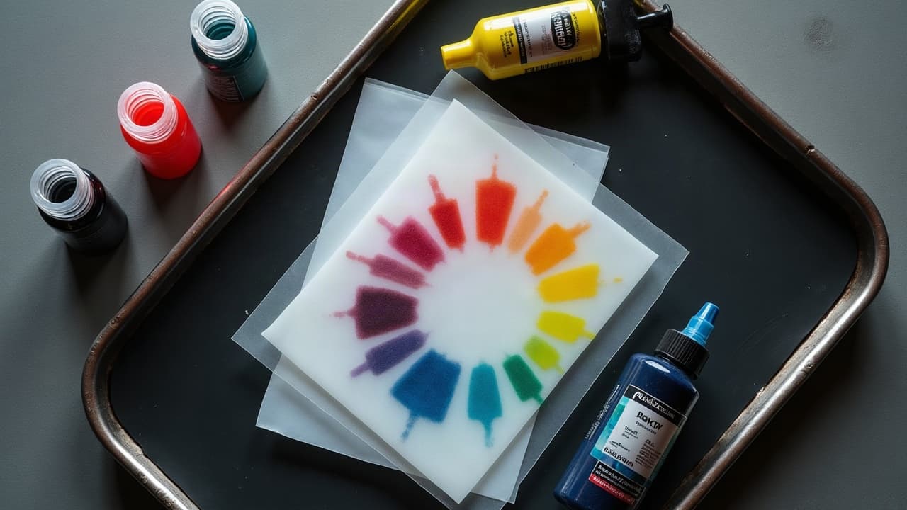
The richest color tattoos you see on stage winners and in close-up studio shots are rarely single pass. They are stacked. Even a thin glaze, roughly 10-20 percent transparent pigment over a healed base, can pivot hue, add dimension, and make edges read cleaner. Artists like Nikko Hurtado showed color realism fans how a muted underpainting plus smart glazing beats brute-force saturation for depth that holds up after healing.
The color stack, from underpainting to glazing
Think like a painter, but commit like a tattooer. A reliable stack starts with a value map, not a rainbow. You block shapes, lock contrast, then tint. The big idea is simple, the first layers carry structure, later layers carry temperature and chroma. That separation keeps pieces readable at 2-3 meters and still juicy up close.
- Linework and value base: set crisp lines, then build a black and gray underpainting using soft washes to place your shadow shapes and midtones.
- First pass color: choose 50-70 percent saturation for base hues so there is headroom for later passes, avoid overworking a fresh dermis.
- Heal fully: wait 4-6 weeks between major color passes to avoid muddied mixes and scarring, longer for large or high-coverage zones.
- Second pass glazes: use transparent inks or cut your color with mixing solution, feather with mags to steer hue without blowing out edges.
- Accents and edges: finish with opaque lights and selective white highlights, keep them sparse so they stay special after healing.
Build depth with value first, then add color
Color sits on top of value. If the grayscale read is weak, no palette will save it. Map your piece on a 0-10 value scale, with a clear 0-2 anchor for shadows. Use peppered midtones so later glazes have tooth to grab, think 1:3 or 1:5 wash ratios to sketch form without chewing the skin. On day one, aim for smooth, low-trauma shading that heals fast and flat, because your second pass depends on it.
- Choose your key light: even in fantasy palettes, a single light direction keeps volumes believable and prevents flat fills.
- Hold back saturation: if you push every area to 100 percent pack, you lose room for optical mixing later.
- Stage your contrast: reserve the darkest darks for focal points, then tint those with cool glazes to sink them further.
Transitions and edge control that make colors read clean
Layered color looks best when transitions are intentional. Your goal is to decide which edges are hard, soft, or lost. For soft transitions use whip shading, a tight pendulum stroke, or slow circular packing with curved mags. For lost edges, glaze a midtone across both shapes to fuse them. Keep needle time low on delicate spots to avoid texture that scatters light and dulls color.
- For glassy blends, run 7-11 curved mags at 6.5-8.5 volts on a rotary with a 3.0-3.6 mm stroke.
- Feather direction follows form, pull blends along the long axis of the muscle or object, not across it.
- Stage blends in two passes, first a low-chroma bed, then a transparent temperature glaze to steer warm or cool.
Palette strategy, complements, and controlled neutrals
Color theory is your compass, not a cage. Complementary relationships create snap, but you do not need pure complements side by side. You can sneak them in as glazes. A muted green glaze over a red-brown shadow cools it just enough to make nearby warms pop. Use split complements to avoid cartoonish contrast, and keep one dominant temperature so the eye knows where to rest.
- Reliable glaze pairs: transparent magenta over golden ochre, phthalo blue over cool gray, olive over raw umber to neutralize hot shadows.
- Push depth with temperature, warm advances, cool recedes, so warm glazes on foreground planes and cool over background planes.
- Mix with solution, not water, to keep pigment load consistent and avoid chalky heals. Aim for 10-30 percent dilution for tinting layers.
- Be mindful of red-sensitive clients, some red pigments trigger higher allergy rates, always discuss history and test small areas. See Cleveland Clinic’s tattoo safety overview for allergy basics.
Know your inks. Tattoo pigments and carriers are not uniform between brands, and regulatory oversight varies. The FDA notes that tattoo inks can contain different colorants and contaminants, which can impact reactions and fading profiles. Read batch data and supplier specs when available. Review the agency’s consumer updates at the U.S. Food and Drug Administration.
Needles, machines, and passes that keep layers clean
Hardware choices shape how your layers stack. For bases, a 11-15 mag packs fast without overworking. For glazes, a 7-9 curved mag at lighter hand lays smoother tints. On rotaries, a 3.5-4.0 mm stroke favors packing, 2.8-3.5 mm favors buttery blends. Keep depth consistent, around the superficial dermis, and watch stretch. Saturation improves with good tension, not brute force. If you are lining through healed color, slow down and wipe often so you are reading true tone, not surface ink.
- Set two machines, one for packing and one for glazing, so you do not chase voltage and stroke mid-piece.
- Use mixing solution to pre-cut glazes in caps, label ratios 1:4, 1:6, so you can repeat results across sessions.
- Limit needle time per zone, build color with multiple light passes instead of one traumatic grind, this protects texture for future layers.
- Wipe with a gentle, fragrance-free soap solution, harsh astringents raise irritation and make blends blotchy.
Skin tone, undertones, and why opacity matters
Every color you drop must pass through skin, so what you see in the cap is not what you see healed. On deeper complexions, higher melanin means more light absorption in shorter wavelengths, so opaque light colors and high-chroma warms read better than dusty pastels. On lighter complexions, subtle transparent glazes can carry a lot of mood. Learn your client’s undertone, cool, warm, or neutral, then bias glazes to harmonize rather than fight it.
For general skin dermatology and healing timelines, the American Academy of Dermatology offers accessible guides that align with what we see in the chair. Their resources on wound healing and sun safety are a good baseline for planning sessions and aftercare. Browse the American Academy of Dermatology.
If you are designing digitally first, you can simulate undertones and value windows to predict outcomes. We covered this in depth in our skin type design adaptation guide and in our contrast and color planning piece. Both will save you hours on palette choice before you touch skin.
Session timing, pain, and budget planning for layered color
Stacked color is a marathon. Large color realism or neo-traditional backs often need 2-4 sessions at 3-6 hours each. Typical shop rates run 150-250 USD per hour, so plan a 800-2500 USD budget for medium pieces, more for complex cover-ups. Pain usually lands 4-7 out of 10, spiking on ribs, knees, or inner arm. Keep sessions productive by staging goals, day one value and base color, day two glazes and accents.
- Leave 4-8 weeks between heavy color passes so epidermis and dermis settle. The AAD notes skin healing is a multi-week process, see the American Academy of Dermatology for context.
- Use numbing creams like TKTX only after client discussion and spot testing, some anesthetics or carriers irritate skin. See Cleveland Clinic’s guidance on skin reactions.
- Keep sessions warm and fueled, low blood sugar makes pain worse. Hydration steadies the hand and the client.
- Clients, map your costs ahead with our tattoo budget guide so you do not compromise the plan mid-project.
Aftercare that protects color layers and longevity
Your second pass is only as good as your first heal. Film wraps like Saniderm can reduce friction and contamination in the first 3-5 days, especially on color-packed pieces. After the film period, use a thin layer of Aquaphor, Bepanthen, or a dedicated balm like Hustle Butter or Mad Rabbit to keep the surface supple without suffocating it (non-sponsored examples). Keep showers short, avoid soaking, and wear loose clothing so glazes do not scuff.
- Protect from UV, sun eats saturation. Use SPF 30+ daily once healed. Photoaging research in JAMA Dermatology and advice from the American Academy of Dermatology back this up.
- Expect epidermal healing in roughly 10-14 days, full remodeling takes longer. Patience before the next pass yields cleaner color.
- Avoid heavy workouts and abrasion for 7-10 days, sweat and friction raise irritation risk and can haze blends.
- Watch for unusual redness or swelling that persists. If concerned, seek medical advice. The FDA’s tattoo ink page and Cleveland Clinic outline red flags.
One more longevity note, pigment chemistry and placement depth both affect fade rates. Yellows and some reds can fade faster with sun. Cool your warms with complementary glazes and lock contrast early so even a paler palette reads from across a room over time.
Preview how layered palettes play on your skin before you book time. Use AI for Tattoo to generate variants with underpainting-first compositions, then glaze digitally until the contrast clicks. Build and compare options in the creator, drop them on your body with the virtual try-on, and browse more approaches in styles. When the stack looks right on screen, it is much easier to repeat in the chair.
Try AI for Tattoo Free