
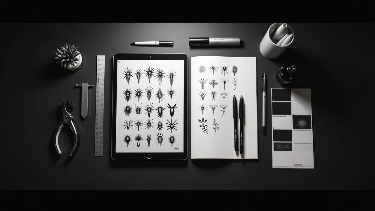
Cohesive tattoo sets follow a simple truth, repeatable patterns beat one-off flashes. Keep 3 to 5 colors, 1 to 2 line weights, a consistent light direction, and a recurring motif vocabulary, and your work will read unified at a glance. AI can help you hold that discipline, if your prompts specify it like a design system, not a wish list.
What Visual Consistency Means On Skin, Not Just On Screen
Visual consistency is more than a matching vibe. On skin it means repeated decisions about hue temperature, value range, line weight, texture grain, motif scale, and negative space. Those choices need to survive healing and aging, not just look cool in a render. Think like a tattooer: translate screen instructions into needle outcomes. If your prompt says thin lines, imagine how a 0.25–0.35 mm single-needle look translates next to a bold 7RL outline look, then decide which one rules the set. Pick one.
Color is similar. Highly saturated neons can be fun in mockups, but many neons have limited ink availability and may age unpredictably. The American Academy of Dermatology notes that certain pigments, especially some reds, are more likely to trigger reactions and persist in skin for years. See AAD guidance on tattoo ink allergies. Pair that with FDA information on tattoo inks for a reality check on pigments that actually exist and are regulated. See FDA information on tattoo inks.
Locking Style With Stable Tokens, Seeds, and References
A unified style starts with rules you can repeat. Build a reference sheet before you prompt: five to eight anchor images that represent the look you want printed or saved locally. When writing prompts, include a short, constant style lock phrase you reuse every time, like: “minimal blackwork, 0.6 mm consistent lines, soft stipple shading, neutral cool gray palette, overhead soft light.” Keep it short and repeat it across prompts. Consistency loves concise anchors.
- Use a fixed seed for initial batches, then vary content only. Same seed plus small content edits preserves rendering decisions like edge crispness.
- Call out model or style references with neutral language, for example “inspired by 1970s botanical etchings” instead of vague “vintage”.
- Specify camera and light analogs for shading, for example “overhead soft light, low contrast, no rim light” across all prompts.
- Freeze materials language: “matte ink look, no glossy highlights, paper-etching texture” so skin previews do not swing between plastic and chalky.
If your concept leans organic, pair this guide with our dedicated deep dive on shaping structure using flow lines and biomorphic edges in our bio-organic prompt guide. For troubleshooting weird artifacts, bookmark our error correction playbook.
Color Palettes That Hold Together Across Pieces
Color drift ruins sets faster than anything. Decide a palette up front, note it in hex codes or ink names, and bake it into every prompt. Keep the palette limited (3–5 hues) plus one neutral. For black and grey sets, define the value ceiling (for example, “no pure black, max 85 percent”). For color sets, define saturation like “muted, earthy desaturation, no neons.”
- Palette tokens that behave: “black and grey only, cool undertone, warm skin contrast” or “desaturated earth triad, sage #9CAF88, rust #B1583C, slate #5A6770, bone #E3D9C8”.
- Call out ink analogs that exist in shops, for example “Dark Cool Grey, Warm Grey 3, Alizarin Crimson” so the artist can map to brands later.
- Set consistency clauses: “all pieces share the same cool-grey wash, identical highlight values, no color gradients, only block fills and stipple.”
- If you plan bright reds, read up on reaction risk via the Cleveland Clinic tattoo aftercare overview and keep skin safety in mind when finalizing hues.
Remember that final on-body color is influenced by melanin, healing, and aftercare. What reads like cool grey on screen may heal warmer on skin. Good care products, like Bepanthen, Aquaphor, Hustle Butter, Mad Rabbit, or Saniderm (non-sponsored examples), help preserve your intended value range during healing, but the palette still has to be sturdy. When in doubt, reduce chroma and simplify.
Line Weight, Shading Grain, and Texture Discipline
Treat line weight like typography. Pick one primary stroke and optionally one accent. In prompts, write it plainly: “0.6 mm line weight throughout, no sketch lines, no crosshatch, fine dotwork shading only, uniform grain.” Avoid language that invites variation like “hand-drawn” or “sketchbook,” unless you define the grain tightly. If you must mix, say “primary 0.6 mm, secondary 1.2 mm outlines for frames only.”
- Name the shading method: “soft stipple, 30 percent density, no whip shading, no smooth airbrush.”
- Lock edge behavior: “closed contours only, no feathered edges, no painterly smudge.”
- Define fill styles: “solid black fills only in motifs, no gradients, hatch at 45 degrees when used.”
- Include aging-aware notes: “avoid micro-text under 3 mm, minimum negative gap 1.5 mm,” so lines do not merge later.
Motifs, Ratios, and Negative Space As Your Grammar
Cohesion needs a motif grammar. Pick 2 to 3 core shapes that recur. For example, “botanical leaves with serrated edges, thin orbital rings, and small compass ticks” across multiple placements. Lock aspect ratios too: use a dominant 1:2 portrait tile and a secondary 3:4 vignette so pieces relate. Define a negative space grid like “5 to 8 mm gutters around motifs” to keep breathing room consistent on skin.
- Prompt anchors: “recurring circle halo 18–22 mm, identical leaf vein pattern, micro tick marks every 10 degrees.”
- Scale rules: “no element smaller than 4 mm at final size, icons at 12–16 mm, primaries fill 60 percent of tile.”
- Space rules: “preserve 6 mm perimeter margin, no background texture, white skin gaps retained.”
- Theme rules: “all animals as side profiles left-facing, all celestial motifs thin ringed, no solid black backgrounds.”
Orientation, Flow, and Placement Notes In Prompts
Bodies are not flat, so your prompts should talk like they understand flow. Include orientation and pose language, such as “left-facing heron, beak pointing distal,” or “vines follow forearm flexor line, upward sweep.” Add light direction notes, for example “top light at 30 degrees, shadows fall inferior,” so shading reads the same across pieces. These small phrases keep a set visually synchronized when you rotate your arm or shift posture.
- Placement-aware tokens: “fits outer forearm, 45 by 110 mm tile, vertical flow, no wrap beyond 30 degrees curvature.”
- Directional consistency: “subjects face medial for inner arm, lateral for outer arm, heads up toward shoulder, tails toward wrist.”
- Joinery planning: “reserve connector bands 8–12 mm wide, simple line rings that can link separate pieces later.”
- Proof with on-body previews using our virtual try-on to catch rotation and spacing issues before booking.
Reusable Prompt Templates For Cohesive Sets
Templates save your taste from wandering. Write one master prompt with slots you can swap. Keep the style lock, then parametrize subject words. Repeat the same negative prompts to prevent drift. Below are field-tested bones you can adapt. Keep them short and consistent, then change only the nouns that matter.
- Minimal blackwork master: “subject, 0.6 mm consistent line weight, closed contours, soft stipple at 30 percent, cool grey wash only, overhead soft light, 5 to 8 mm negative gutters, no gradients, no brush texture.”
- Muted color mini-set: “subject, desaturated earth triad sage #9CAF88, rust #B1583C, slate #5A6770, bone #E3D9C8, balanced 60-30-10, matte ink look, no glow, no neon.”
- Geometric add-ons: “subject simplified into isometric shapes, 1:2 tile, single thin halo at 20 mm, no background noise, alignment grid preserved.”
- Shared negatives: “no photorealism, no painterly blends, no watercolor bleed, no sketch lines, no drop shadows.”
Test, Rate, and Iterate, Then Reality-Check With Ink
Batching is your friend. Generate 6 to 12 variations per subject using a constant seed and your master prompt. Tag results by palette adherence, line fidelity, and spacing. If one variable drifts, adjust only that clause, do not rewrite the whole prompt. Keep a scoring rubric so choices stay objective and taste does not wobble between days.
Before committing, consult sources that discuss what actually survives in skin. The FDA reminds consumers that inks and pigments are not risk free and that reactions can be delayed. Read the FDA’s consumer information hub. Pair that with AAD guidance on tattoo ink allergies to choose safer pigments and with the Cleveland Clinic tattoo aftercare overview to protect consistency during healing. Your AI lookbook should be ambitious, but the final plan must fit skin reality.
When you and your artist are ready, preview fit with our AI try-on and keep a change log. If errors appear, like unintended shading or texture noise, use targeted fixes from our error correction playbook. In the studio, share printouts with exact millimeter sizes, line weights, and color swatches. This is where your prompts graduate to a stencil and an ink cap set.
Handoff Notes, Ink Mapping, and Set Maintenance
Translate your digital palette to real bottles. Ask your artist which brands match your hex targets most closely, then rewrite your palette card using brand names. Maintain the same wash recipe across sessions, for example “2 drops black to 8 drops distilled” for a cool mid wash. Keep minimum text sizes and negative space gutters on the job sheet so future additions slot right in without surgery.
Aftercare influences consistency too. A cloudy heal on one piece will shift perceived value versus its neighbors. Keep your routine stable across sessions, and stick with products your skin tolerates well, for example Saniderm, Bepanthen, Aquaphor, Hustle Butter, or Mad Rabbit (non-sponsored examples). If you are sensitive to certain pigments, bring a history or patch test results to consultations. A simple, consistent plan keeps a set reading as one family over time.
Ready to build a cohesive set, not just a folder of one-offs? Use AI for Tattoo to generate with a style lock, test your color palette, and preview fit on your body. Start with Create, then sanity check flow with Try On. When your rules click, every new piece will snap into place.
Try AI for Tattoo Free