
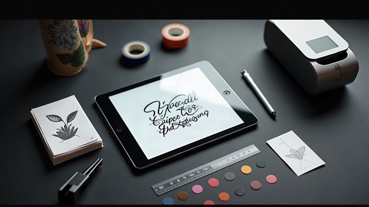
AI tattoo prompts are drafts, not destiny. A tight testing loop turns unpredictable renders into consistent, tattooable designs you can hand to your artist with confidence. In practice, that means writing prompts like specs, running controlled batches, and judging outputs the way tattooers judge stencils, not like a mood board. Follow this field-tested workflow and you will spend less time guessing and more time approving.
Decide what “success” means before you type a prompt
Most prompt problems start with fuzzy goals. Define acceptance criteria upfront so you can say yes or no without arguing with your own taste later. Write it down. Treat it like a mini brief you would send to a studio. Specify style, composition, must-include elements, must-avoid elements, and placement size in cm or inches. If color matters, lock palette limits and background treatment. Testing is only meaningful if the target is stable. Tool-wise, I keep a one-page brief in Notion or Google Docs, then track runs in Google Sheets or Airtable (non-sponsored examples).
- Define non-negotiables: subject, pose orientation, and count of elements, for example one wolf, frontal, no background.
- Lock style words: blackwork, illustrative, fine line, or neo-traditional, not all of them.
- Set output constraints: aspect ratio 2:3, white or transparent background, no text.
- Pre-approve a palette: black and gray only or muted earth tones, avoid pure white highlights.
- Decide size and placement: 13 cm forearm vertical, or 4 in ankle, to steer proportion early.
Structure your prompt like a spec, not a vibe
A solid prompt reads like a shot list. Front-load subject and action, then style, then constraints. Use weighted terms, negative prompts, and style-lock language so the model knows what to favor and what to suppress. If your platform supports it, add seed control and a clear aspect ratio. Name your reference style in a way that is respectful. Instead of chasing living artists’ names, describe attributes, for example bold contours, limited palette, high contrast shadows. For editing, I annotate test images in Procreate or Photoshop on an iPad Pro or Wacom Intuos to mark issues before the next run (non-sponsored examples).
- Template: Subject and action first, for example heron standing in reeds, then style and line language, then constraints.
- Use negative prompts for deal-breakers, for example no watercolor splashes, no extra limbs, no lettering.
- Lock composition with camera words, for example centered, full body, straight-on or three-quarter view.
- Specify rendering style precisely: blackwork, stipple shading, single-needle look, no color.
- State print intent: tattoo-ready linework, clean silhouette, no background, high-res PNG.
Control randomness: seeds, batches, and A/B tests
One great render is luck. Reliability shows up when a batch of 8–12 hits your acceptance criteria most of the time. Use seed values to make re-runs comparable. Change one variable per batch so you can isolate what helped. Track your runs. I log prompt, seed, and pass or fail notes in a simple table. When two variants feel close, do an A/B test with matched seeds and compare like a spot-the-difference. This is also where you pressure-test color and background rules to see what slips through under randomness. Screenshots with overlays in Figma make side-by-side comparisons painless (non-sponsored examples).
- Run controlled batches, for example 10 images per variant, same seed range.
- Change one variable: swap stippling to hatching, keep everything else identical.
- Score each image 0 or 1 for each criterion, then tally a pass rate.
- Keep a shortlist of best seeds. Reuse those to re-test small wording tweaks.
- When stuck, split-test opening nouns: phoenix vs firebird may steer models differently.
Judge tattooability, not just aesthetics
Beautiful does not equal tattooable. Evaluate the output for line hierarchy, readable silhouettes, and black placement that will age well. Think in needles and skin, not in pixels. If the outline will be executed with 3RL to 9RL groupings, the design needs consistent contour priorities you can actually line. Zoom out to thumbnail size. If the design dies at 2–3 cm on screen, it will struggle from social distance on skin. Watch for pseudo-textures that only exist because of pixel noise. Replace them with stipple, crosshatch, or solid fill callouts in your next prompt. I flip and re-check in Procreate to catch skewed anatomy before ink (non-sponsored example). For aging concerns and sunlight, read the American Academy of Dermatology guidance.
- Check silhouette at 10 percent scale. Must stay readable with eyes squinted.
- Limit micro-details smaller than a 3RL line can hold for your placement.
- Favor high-contrast shapes over midtone mush for longevity.
- Watch out for fake glows or spray effects that will be muddy when healed.
- If you see fuzzy edges, re-prompt for crisp edges and clean negative space.
Color and skin tone reality checks
Color reads differently on different skin tones. Mock your design on a range of Fitzpatrick I–VI tones and reconsider palette contrast. Many AI models overuse low-opacity whites or desaturated pastels that will not show on Fitzpatrick IV–VI. Ask for heavier black anchors and bolder warms if needed. For testing, drop the design on tone swatches in Affinity Photo or Procreate. When in doubt, prepare a black and gray fallback. For long-term vibrancy and care, see Cleveland Clinic on tattoo complications and care and the AAD’s sun advice, including SPF 30+ recommendations. If you prefer measured reference, the Pantone SkinTone Guide helps nudge palette decisions toward contrast (non-sponsored examples).
- Test on at least three skin tones adjacent to your client’s tone.
- Drop simulated SPF 30+ glare and see if highlights still read.
- Avoid relying on pure white ink for key edges.
- Use black and near-black to lock contrast before adding color.
- If color fails, shift to black and gray with selective color pops.
Placement mockups and wrap distortion
Flat renders lie. Before you commit, preview the design on the actual body area. Use a virtual try-on or a photo of the limb, then warp the design to match curvature. This shows what disappears around the side and what crowds bony landmarks. Upload a well-lit arm or leg shot and perspective-match the design using Photoshop Warp, Procreate Liquify, or the AI for Tattoo virtual try-on. Check flow with muscle lines and crease points. If a key motif will wrap into a blind spot, split the composition into panels or rotate the focal direction. For blowout and placement risks, Healthline’s overview of tattoo blowout causes is a useful refresher before you finalize line density on thin skin.
- Test both standing and flexed poses for sleeves and calves.
- Align flow with deltoid curve, forearm tendon lines, or rib arcs.
- Avoid placing micro-text on high-movement zones like wrists and ankles.
- Print a true-scale paper stencil to confirm size.
- Use our virtual try-on for quick fit checks before booking.
Feedback cycles that actually improve results
Random comments expand prompts until they break. Run a short, structured review with the client and one trusted peer. Ask targeted questions, record answers on a 1–5 scale, then translate only the failing items into prompt edits. Keep the brief sacred. Share a single page of finalists, each labeled with seed, prompt version, and size. Tools like Figma, Miro, or Frame.io keep notes attached to images so nothing is lost in chat scrolls. If the client wants stylistic shifts, link them to our prompt psychology guide so feedback maps to intent, not adjectives.
- Use three questions max: readability, likeness to brief, tattooability.
- Force trade-offs, for example more texture or cleaner silhouette.
- Convert only low-scoring items into precise prompt changes.
- Limit revision rounds to two cycles before you lock.
- Archive rejected seeds to avoid repeating loops.
Ethics, spelling, and safety due diligence
Text, symbols, and red pigments are the classic tripwires. Run automated spell-check on any lettering and verify language with a native speaker. For symbols, check at least two neutral sources to avoid accidentally using hate symbols or sensitive marks. On materials, remember inks are not fully standardized. The FDA on tattoo inks and pigments notes oversight limits and reports of reactions. Red dyes are frequent offenders in allergic responses according to the American Academy of Dermatology and clinical reporting. If your client has a history of sensitivities, flag it early and consider avoiding heavy red saturation. This is part of design validation, not just aftercare. For ethics of stylistic borrowing, see our take on prompt flexibility and style adaptation.
- Spell-check all text and run a native speaker review.
- Research symbols with at least two sources before you commit.
- Avoid heavy red areas if the client has pigment sensitivities.
- Disclose AI use and get consent in writing for client portfolios.
- Keep a record of final prompt and seed for accountability.
Finalize a design package your artist can trust
When the winner emerges, package it like a pro. Export linework-only, black and gray, and full-color versions. Include a stencil guide with suggested needle groupings, for example 3RL outline, 9M soft shade, and notes on solid black areas. Save a high-res transparent PNG and a vector or layered file if available. Add a one-pager with final prompt text, seed, approved size, placement photo mockup, and palette notes. If scheduling around healing is part of the plan, remember the AAD’s typical healing window of 2–4 weeks for surface recovery and plan vacations or work around that timeline. For aftercare product familiarity, many clients recognize Saniderm, Hustle Butter, Aquaphor, or Bepanthen (non-sponsored examples), so note any finish or texture that benefits from specific care.
- Deliver three files: linework, B&G, color.
- Include a scale bar and exact dimensions on exports.
- Attach the approved placement mockup and seed value.
- Provide negative prompt items so the artist knows what to avoid.
- Store everything in a shared folder and lock edits after client sign-off.
Where AI for Tattoo fits into your testing loop
You do not need a dozen tools to do this well. Start and stay inside a workflow you will actually maintain. Use AI for Tattoo to generate targeted batches, refine your prompt spec, and preview on body photos fast. When you need deeper composition control, move to Procreate or Photoshop for paint-overs, then circle back for one last controlled batch of 8–12. Explore house styles to find consistent baselines in our styles library and validate intent with the psychology primer mentioned above. If you want more reading on symmetry choices for complex layouts, bookmark our guide to creating harmonious symmetrical designs. Once the final passes your rubric, package and hand off to your artist with confidence.
Ready to pressure-test your idea without guesswork? Generate a controlled batch in minutes with AI for Tattoo, then preview real placement with our virtual try-on. Lock your prompt, save your seed, and walk into your appointment with a design you trust.
Try AI for Tattoo Free