Here is the unglamorous truth: most geometric tattoos that age beautifully follow a few strict layout rules. Lines that look effortless were measured, ratios were chosen on purpose, and the pattern was mapped to the body like a tailored suit. Tattoo ink sits in the dermis and spreads slightly over time, so line weight, spacing, and symmetry are not just style preferences, they are structural choices that keep your geometry legible. Skin is not paper. It stretches, curves, and tans. Good geometric work anticipates that. Below, I break down the practical math behind designs that sit straight, wrap smoothly, and survive movement. I will point you toward tools and products that make a difference, plus the decisions that prevent blowouts and muddy shapes. For background on skin layers and why tattoos live in the dermis, see patient education from the [Cleveland Clinic](https://my.clevelandclinic.org/) and the [FDA tattoo inks overview](https://www.fda.gov/cosmetics/cosmetic-products/tattoos-permanent-makeup).
Symmetry That Reads Clean on Skin
Symmetry is the backbone of geometric tattoos, but different bodies favor different axes. On flat zones like the sternum or upper back, bilateral symmetry lands clean. On joints and rounded forms, radial symmetry or translational repeats are more forgiving to motion. I place centerlines with a level and skin-safe markers, then confirm anchors with mirror checks or a phone grid overlay. The more your geometry references reliable anatomy landmarks, the less it will drift as the client moves. For deeper reading on how abstraction and symmetry communicate meaning, see our piece on [meaningful abstract tattoo designs](/blog/meaningful-abstract-tattoo-designs).
- Bilateral symmetry, best for the spine, sternum, and throat, creates a single visual axis clients can align in the mirror. Use navel, jugular notch, and spine as consistent anchors.
- Radial symmetry, ideal for knees and elbows, distributes error. A centered mandala tolerates flexion better than a strict grid because rotation reads natural on a joint.
- Translational symmetry, repeats that step across the skin, works on ribs and thighs. It hides small distortions if you maintain tile spacing and keep seams off focal angles.
Ratios, Grids, and the Golden Spiral
Compositions feel stable when scale relationships are consistent. I use root-2, root-3, or Golden Ratio 1.618 intervals to size tiles, circles, and negative gaps. On the body, these ratios function like a rhythm track, helping the eye sort near, mid, and far detail. A practical trick: rough in with a rule-of-thirds grid to place the focal shape off center, then switch to your chosen ratio for inner detailing. Fibonacci spirals nest naturally inside radial pieces while keeping a readable flow to an elbow or shoulder cap. If you want to explore ratio-driven composition in the concept phase, check [our AI tattoo prompt crafting guide](/blog/ai-tattoo-prompt-crafting-guide) and [AI design optimization techniques](/blog/ai-tattoo-design-optimization-techniques) to iterate different grid logics quickly.
Line Weight, Needles, and Minimum Spacing
In geometric work, line hierarchy is your punctuation. Thick outer frames, medium dividers, and thin internal accents let the viewer read structure at a glance. On real skin, tiny hairlines pack too tightly and blur as collagen remodels and ink diffuses. A conservative starting point is 0.8–1.2 mm for primaries, 0.5–0.7 mm for secondaries, and 0.3–0.4 mm for accents, with 1.5–2.0 mm minimum negative gaps between parallel lines. Tattoo needles puncture into the dermis, where ink later spreads slightly according to skin type and placement. The American Academy of Dermatology notes that UV exposure accelerates fading and skin changes, which is why underbuilt lines lose contrast faster on sun-exposed zones. See the [AAD sun protection resource](https://www.aad.org/) for prevention guidance. Tooling matters. Crisp geometry comes from stable machines, steady voltage, and predictable ink flow. Below is a practical setup to translate line plans into skin with fewer surprises.
- Needle groupings: 3RL or 5RL for accents, 7RL or 9RL for primaries. Taper choice should match skin thickness, with longer tapers on delicate areas for smoother entry.
- Machine and power: a steady direct drive or pen with consistent 6.5–8.0 V for linework minimizes wobble. Test on practice skin to lock in your hand speed.
- Inks and stencil: saturated Dynamic Black and neutral gray sets like Eternal Ink Neutral Gray keep value steps even. Use Spirit Thermal Stencil Paper for crisp transfers (non-sponsored examples).
Negative Space and Body Flow
Geometry breathes through what you do not ink. Negative space should not be an afterthought, it is a designed shape that curves with the body and separates detail layers. I sketch body flow lines first, along deltoid arcs, rib slopes, and calf teardrops, then cut channels of clean skin that guide the eye. On high movement zones, negative bands work like expansion joints in architecture. They absorb stretch and keep adjacent motifs from colliding. If you are new to designing the empty parts, bookmark [our negative space guide](/blog/tattoo-negative-space-design-guide) for practical spacing diagrams. Clients who want dense patterning end to end still need breathing room. If your smallest islands of skin are larger than 5–7 mm, they will read as intentional shapes instead of accidental holes.
Tessellations, Seams, and Wrap Strategy
A perfect grid on paper turns into a puzzle on a cylinder. Forearms and calves are not true cylinders either, they taper and twist. That means your tessellation must flex without obvious drift. Before I commit ink, I mark a low-visibility seam line along the ulnar forearm or posterior calf and design the tile to die gracefully at that seam. Hexagons and triangles wrap better than squares because they distribute error in more directions. Penrose-style aperiodic tiling looks stunning but demands a clear focal pause so the viewer’s brain does not fatigue. Plan a rest zone, often near a bone landmark, to break pattern without feeling like a mistake.
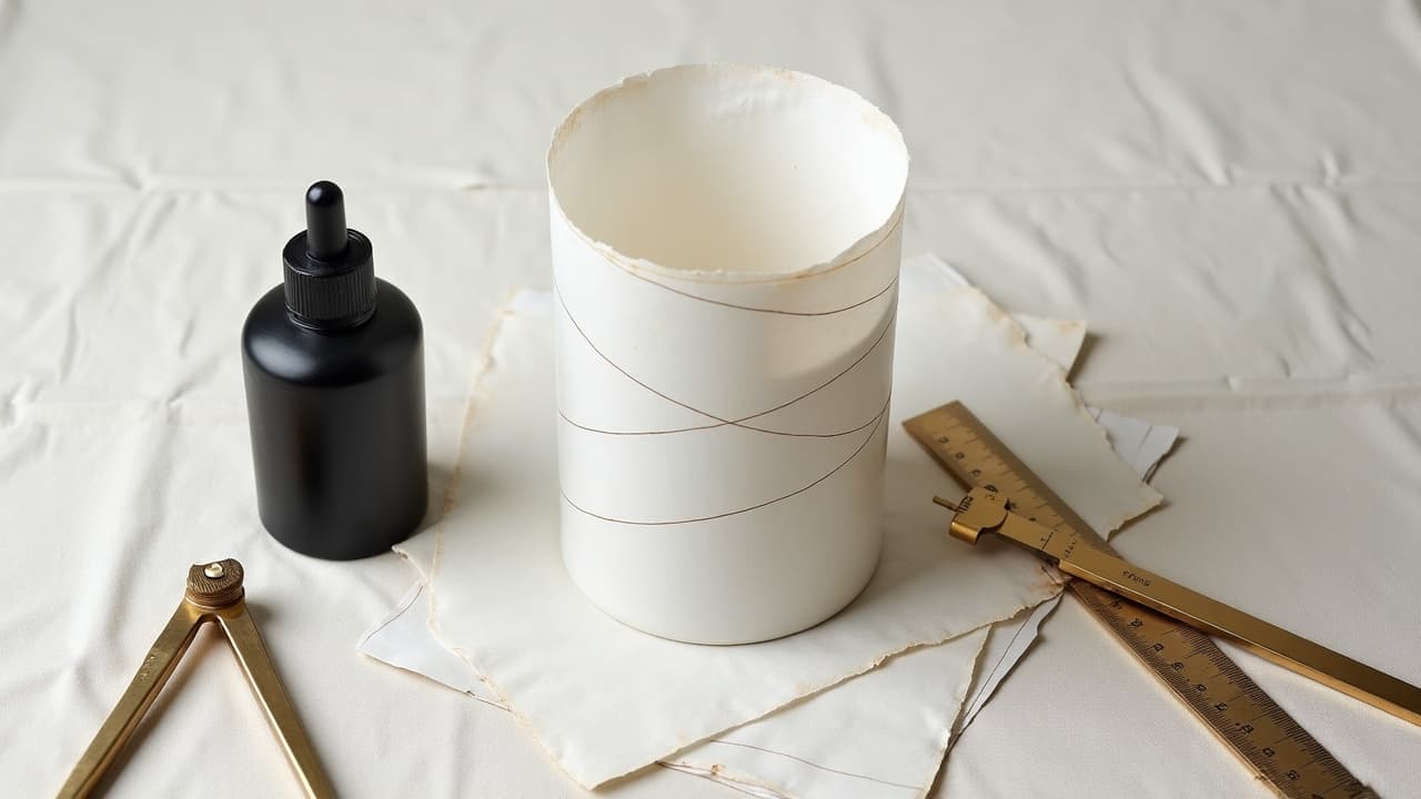
- Create a paper mock sleeve at 100 percent scale and tape it around the limb. Draw where the pattern visually drifts and move the seam to a shadowed angle.
- Use taper compensation. Shrink tile width by 2–4 percent as you approach the wrist or ankle so the pattern does not balloon on the wider half of the wrap.
- Avoid seam collisions. End motifs on the seam with solid fills or dot fades so slight misalignments hide inside texture, not across hard line junctions.
Working on Curves Without Distortion
Flat geometry mapped to convex surfaces will flare if you do not account for curvature. Think like a cartographer. A spherical deltoid behaves like a globe, so radial elements near the pole should widen, while equatorial bands stay narrower to read straight. I freehand adjustments over the stencil with a skin caliper and flexible curve ruler. On knees and elbows, I place anchors in neutral bend, then test full flexion and extension to catch shape creep before linework. For complex surfaces like hips, split one large shape into nested panels that interlock visually, rather than forcing a single rigid frame over multiple planes. If you use digital tools, scale your design on a photo of the body in multiple positions. Apps like Procreate, Adobe Illustrator, and iPad Pro with Apple Pencil help visualize curvature and ratio tweaks on the fly, while preserving your base math (non-sponsored examples).
Value, Color, and Contrast in Geometry
Blackwork reads the clearest because high value contrast survives distance and aging. If you add color, treat it like an accent rather than a fill, or you risk flattening the hierarchy that makes geometry pop. Keep value steps distinct, for example 90 percent black, 60 percent gray, 20 percent stipple, and skin. UV is geometry’s enemy, since sun exposure accelerates fading and line spread over years. The [American Academy of Dermatology](https://www.aad.org/) recommends daily SPF 30+ broad spectrum sunscreen and shade. Saturated blacks still shift if they bake all summer. Protective habits matter more than any brand of ink for long-term crispness. For healing itself, use simple fragrance-free aftercare and avoid heavy occlusion beyond the first day unless advised. Overworking lines during touchups is a common reason fine patterns turn muddy. General safety resources from [Healthline](https://www.healthline.com/) and regulatory notes from the [FDA](https://www.fda.gov/cosmetics/cosmetic-products/tattoos-permanent-makeup) are good refreshers.
Planning Sessions, Budget, and Longevity
Geometry rewards patience. A forearm wrap with tessellation and radial focal can run 6–10 hours across 2–3 sessions, and many studios price at $150–$300 per hour depending on region and artist experience. Expect a planning deposit for complex mapping, plus time for accurate stenciling. Session one, I prioritize primary lines and any anchor fills. Session two, I build secondary structure and dots. Final passes add micro accents only if the skin tolerated round one well. Light-handed approaches age better than aggressive packing on day one. For itch, swelling, or any reaction, see basics from [Cleveland Clinic](https://my.clevelandclinic.org/) and our [aftercare for sensitive skin guide](/blog/tattoo-aftercare-for-sensitive-skin). If you notice raised or spreading lines months later, it may be a blowout or scar tissue, which deserves a professional evaluation.
A Working Toolkit for Crisp Geometry
Tools do not replace design thinking, but they remove friction. A predictable setup frees your brain to watch angles, pressure, and spacing. I keep redundancy for stencils and line groups, plus a small suite of digital aids for pre-draw. If you want to workshop motifs and symbol choices to personalize geometry, cross reference our culture deep dives and workflows, like [traditional and tribal influences](/blog/traditional-tribal-tattoo-culture-meaning-global-practices) and [meaningful abstract tattoo designs](/blog/meaningful-abstract-tattoo-designs).
- Stencil and transfer: Spirit Thermal, Electrum Transfer Gel, and Stencils Stuff for clean placement that resists wipe-off during long line pulls (non-sponsored examples).
- Machines and grips: Bishop Wand, Cheyenne Sol Nova, with comfortable 32–40 mm grips to steady geometry lines over longer spans without death gripping (non-sponsored examples).
- Digital planning: Procreate, Illustrator, and a soft measuring tape to translate ratios onto photos, keeping a library of root-2 and 1.618 grids for fast reuse (non-sponsored examples).
Ready to map your own geometry with clean ratios and body flow before you book time? Use AI for Tattoo to draft pattern logic, test wraps, and preview on skin in minutes. Generate concepts in **[Create](/create)**, then drop them on your body with the **[virtual try-on](/try-on)** to confirm scale, symmetry, and seams before you commit.
Try AI for Tattoo Free