Abstract tattoos age well because they rely on shape, balance, and flow, not tiny readable details that blur over time. When you strip away literal icons, every line and color choice has to work harder, which is why strong composition is the backbone of meaningful non-representational ink. The win is personal, lasting symbolism without telling the viewer exactly what to see.
If you want a tattoo that communicates feeling, not a picture, focus on three levers: how the piece sits on the body, how elements relate in space, and how color temperature guides emotion. Below is a working toolkit I use in studio, plus what the skin itself will accept over the long haul. For ink safety and healing fundamentals, consult the American Academy of Dermatology and your artist’s aftercare plan, then layer your taste on top. See also our deeper dive on sensitivities in our allergy guide and how to shape space in our negative space guide.
How Non-Representational Tattoos Carry Meaning
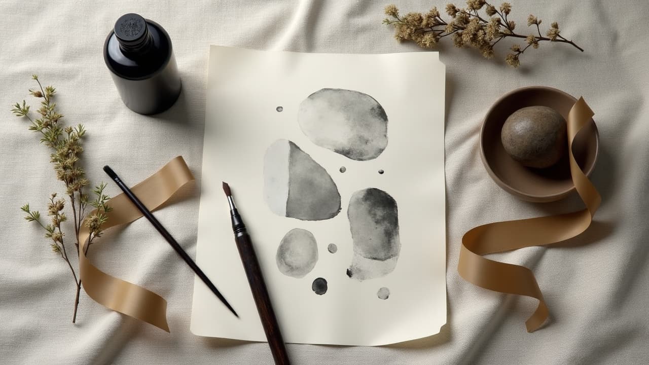
Meaning in abstract work lives in relationships, not objects. Viewers read weight, pacing, and contrast the same way they hear rhythm in music. A well-placed thick stroke can feel grounding, while a scatter of fine dots feels like static or breath. If you can describe the mood in a sentence before you draw it, you can convert that sentence into form.
Start with a short brief you write for yourself: one emotion, one tempo, one anchor. Example: steady, slow, anchored at the hip. That becomes a low-contrast palette, wide spacing, and a heavier shape that starts at the iliac crest. A non-representational tattoo should still have a subject, it is just energy and structure instead of a rose or a tiger.
- Translate a feeling into form: calm equals open spacing and soft edges, urgency equals tight spacing and sharp intersections.
- Limit your vocabulary: choose two gestures, for example brushstroke arcs and dot fields, then build variations to stay coherent.
- Decide the read order: top-left to bottom-right on arms, or spine to rib on torsos, then make one visual anchor the first stop.
Tools that help: digital sketching in Procreate or Adobe Fresco, skin-safe test transfers with Hectograph paper, and wearable previews using our try-on before you commit to scale and flow.
Compositional Frameworks That Communicate
Abstract tattoo design succeeds when viewers can feel hierarchy without labels. Use contrast, proximity, and repetition as your grammar. I rough-in three values of tone, three sizes of shape, and one clear resting space. That keeps improvisation honest and readable on skin.
- Balance: pair one heavy mass with two light accents to avoid mid-tone soup. Think 70/20/10 weight distribution for clarity.
- Rhythm: stagger similar marks in odd counts to keep the eye moving, for example 3, 5, or 7 dot clusters.
- Hierarchy: create one unmistakable primary, one secondary, and supportive texture layers so the story reads in one glance.
- Tension vs release: compress spacing near joints, open it across flats like the forearm or thigh for a breathing effect.
- Negative space as shape: carve purposeful voids that are as designed as the ink, not just leftover.
For deeper planning across multiple pieces, see our flow guide. It shows how to connect abstractions across sessions without turning your limb into noise.
Lines, Textures, and Mark-Making You Can Feel
Your mark-making is your voice. Thin 3RL lines read as whisper and lace, 7RL or 9RL create confident edges, and a 9M or 13M magnum can lay buttery gradients that feel atmospheric. Dotwork, whip shading, and brushstroke packs each translate emotion differently and age differently on skin.
- Dotwork: meditative, granular, great for slow fades. Low trauma when spaced, better longevity on medium to large scales.
- Whip shading: directional energy with visible grain. Reads like motion, pairs well with angular motifs and arcs.
- Brushstroke effects: organic taper and texture, feels expressive. Keep strokes oversized so texture survives healing.
- Scars and texture mapping: avoid high-relief scars with heavy lines, switch to soft stipple that respects the terrain.
- Gloss vs matte: dense black feels glossy, open stipple feels matte. Use both to make the piece breathe.
If your skin is reactive, stock gentle aftercare like Bepanthen, Aquaphor, or Hustle Butter (non-sponsored examples) to cushion those textured fields during the first 7–14 days of healing. The Cleveland Clinic emphasizes sun protection and moisturization during healing, which keeps edges crisp over time. See their guidance at Cleveland Clinic.
Color Choices, Emotion, and Ink Realities
Color is the loudest instrument in abstract work. Warm palettes, amber to carmine, feel near and emotional. Cool palettes, teal to indigo, recede and calm. High value contrast reads decisive, low contrast reads contemplative. Limit your palette to 2–3 hues so the piece plays like a band, not a crowd.
Know the skin science. The FDA clarifies that tattoo inks and pigments are not FDA approved for injection, and compositions vary widely, especially in reds and yellows. Read their consumer updates at U.S. FDA. The American Academy of Dermatology notes that reactions, most often to red pigment, can include itching, swelling, or granulomas. See general risk information at AAD.
- If you are sensitive, bias to black and muted cools and keep colored zones large and simple for easier monitoring.
- Anchor color with black structure so the tattoo still reads if a color fades faster in sun-exposed areas.
- Test a tiny spot with a temporary transfer or micro patch session if you have a history of dye reactions.
Peer-reviewed dermatology literature documents disproportionate reactions in reds compared to other hues, so plan accordingly. For an overview of current research, browse JAMA Dermatology at JAMA Dermatology.
Build a Personal Symbol System Without Literal Icons
You can encode meaning without a single recognizable object. Think in systems, ratios, and rules. When a client says, I want resilience, we decide what resilience does in space. Maybe it persists as a rising repetition, or it survives pressure as compressed marks that re-expand.
- Timeline bands: one band per year, thicker during high-impact periods, thinner during rest. Spaced along the forearm.
- Coordinates to moments: convert latitude and longitude into angles and offsets, not numerals.
- Breath maps: inhale equals expanding arcs, exhale equals contracting arcs. Alternate four cycles to symbolize practice.
- Constraints as vows: choose one rule you never break, for example no closed shapes, as a stand-in for a commitment.
- Numerology quietly: encode a favorite number by making that many repeats per motif, no visible digits.
If you still want a tether to tradition, weave protective motifs into abstraction. Our primer on cultural protective marks, symbols of protection, can inform shapes without going literal or appropriative.
Placement, Scale, and Movement on the Body
Abstract work is choreography. Let the piece ride tendons and bone landmarks so it moves on cue. A longitudinal flow along the forearm reads steady and directional. A radial flow around the shoulder reads orbit and embrace. On ribs or thigh, scale up so the smallest marks are still visible in 5–10 years.
- Forearm, 3–6 inches: articulate arcs that cue wrist rotation, pain 3–5/10 for most clients.
- Outer thigh, 6–10 inches: huge canvas for gradients, pain 2–4/10, excellent for soft mag texture.
- Ribs, 4–8 inches: expressive breathing canvas, pain 7–9/10, simplify marks so they heal clean.
- Back, 8–16 inches: best for multi-layer abstracts with negative space corridors that read at distance.
Session logistics matter. A focused abstract in this style often takes 2–4 hours, usually $300–$800 depending on studio and city. Larger body flows may split into two sittings to preserve skin and ink saturation.
Layering, Negative Space, and Depth
Depth in abstraction is a design choice, not a 3D render. Use overlap, opacity shifts, and smart negative space to stack planes without clutter. I design voids as shapes with names, like channel, gate, or rest field, so we protect them in stencil and session.
If you are new to carving out emptiness, study our negative space guide. It shows how to make white skin feel like an intentional pigment. In practice, I often map voids first, then add ink until the silence feels tuned.
- Overlapping rules: never let three edges meet at a point, stagger joins to avoid visual knots that blur with age.
- Opacity rhythm: alternate solid black, soft stipple, and bare skin so the eye can rest.
- Edge variety: pair hard cuts with feathered fades to prevent monotony and telegraph depth.
From Sketch to Skin: Test, Stencil, Heal
Great abstract tattoos look spontaneous, but the best ones are rehearsed. I iterate on tablet, print a 1:1 paper mock, then do a skin-safe stencil. We preview scale using our try-on so you can see the piece in motion, then we lock composition before needles enter the chat.
- Adhesive film: use Saniderm or Tegaderm for the first 24–72 hours to reduce friction on textured fields.
- Aftercare: switch to thin layers of Bepanthen, Aquaphor, or Mad Rabbit balm (non-sponsored examples) for 7–14 days.
- Sun control: SPF and shade are non-negotiable. The Cleveland Clinic stresses UV avoidance to reduce fading and irritation.
- Allergy watch: monitor red or yellow zones closely. See the AAD guidance and our detailed allergy guide.
Remember, tattoo pigments vary. The FDA maintains consumer information on inks and recalls at U.S. FDA. When in doubt, ask your artist what brand and color families they prefer and why. That conversation is part of the art.
Collaborate, Iterate, and Use Smart Tools
Abstract is a dialogue. Bring three references that show gesture, spacing, and palette, not single tattoos to copy. We will remix them into your ruleset. Digital tools and AI can speed exploration without locking you in. See how to tune prompts and constraints in our AI optimization guide.
I also recommend mocking variations with Procreate, exporting cutouts into Canva or Figma for body mapping, and previewing with our create tool. The goal is confident, symbolic abstract tattoos that feel inevitable when they land on skin.
If you want a clinical safety backbone for your process, lean on the American Academy of Dermatology for skin reactions, the Cleveland Clinic for wound care basics, and JAMA Dermatology for deeper reading on pigment-related reactions. These sources align your art with skin reality.
Ready to translate feeling into form? Use AI for Tattoo to generate composition studies, set palettes, and preview placement on your body in minutes. Start a concept with [Create](/create) and check scale and flow with [Try-On](/try-on) before you book your session.
Try AI for Tattoo Free