
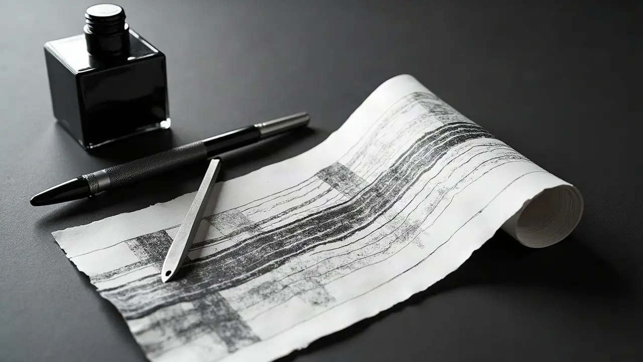
Your eye reads edges first. That is why tattoos with a clear line hierarchy grab attention faster, stay readable from 6–10 feet, and keep their story intact as they age. Strong contrast is not only about black vs skin, it is about how weight, spacing, and rhythm guide a viewer from the focal point to the fine details without confusion. Whether you love ultra-fine details or bold traditional frames, the best pieces combine macro-contrast you can read across the room with micro-contrast that rewards a closer look. If your design looks crowded at arm’s length, the fix is rarely more detail. It is smarter contrast choices. Below is the playbook I use in studio to make linework pop, heal clean, and age with integrity.
What Linework Contrast Actually Means on Skin
Contrast in linework lives in three levers: weight, spacing, and edge priority. Weight is the thickness range you deploy, from a whisper of a single-needle to a punchy 14RL outline. Spacing is the air between lines and shapes, the negative space that lets forms breathe. Edge priority is your hierarchy of which contours command the eye first. On real skin, oil, pores, and movement soften edges, so lines that looked distinct on paper can melt together after healing. Building in separation up front is non-negotiable. I recommend thinking in two distances. The room read is what someone sees at 2–3 meters: big silhouettes, major curves, and primary overlaps. The hand read is what unfolds at 15–30 cm: feather barbs, leaf veins, fabric texture. If your room read is muddy, no amount of micro-detail will rescue it. Start with a bold, simple silhouette, then layer smaller rhythms inside it.
Choose Your Line Weights With Intent
Most designs land strongest with either a two-weight or three-weight system. I favor a three-tier approach for depth: primary contours in a bold liner, secondary forms in a mid-weight, and textures in a fine line. On needles, that often means mixing a 9RL or 11RL for outer silhouettes, a 5RL or 7RL for inside structure, and a 3RL or single-needle for texture. Cartridge diameter matters too. A 0.35 mm grouping runs bolder than a 0.25 mm bugpin at the same configuration. Keep the same ink, stretch, and speed consistent to avoid accidental weight changes mid-piece.
- Floral sleeve triad: 9RL outer petals, 5RL mid ribbing, 3RL leaf veins. Use 1–2 mm skin breaks around petal tips for light.
- Anime portrait: 7RL jaw and hair silhouette, 5RL facial features, single-needle eyelash and fabric thread lines.
- Geometric stack: 11RL frame, 5RL secondary polygons, dotwork textures in the fields for soft depth.
- Neo-trad animal: 14RL outer mass, 7RL inner fur clumps, 3RL whiskers and eyelid creases with minimal crosshatch.
Edge Hierarchy That Builds Story and Depth
Linework contrast is composition. Give the eye a clear path. I use a 70-20-10 rule for edges. About 70% of your visual weight sits on the main silhouette, 20% on structural lines that explain form, and 10% on micro-texture that rewards close viewing. Start with the biggest contour and exaggerate overlaps that matter to the story. On a dagger-through-rose, push the dagger edge slightly bolder, taper petal overlaps where they duck behind the blade, and let the rose texture stay lighter. For realistic depth without gray, rely on tapered pulls, whip lines, and staggered hatching. Avoid outlining every interior fold at the same thickness. Equal weight everywhere equals no hierarchy, which is how readable designs get noisy and flat.
Negative Space, The Boldest Contrast You Are Not Using Enough
Skin is your brightest ink. Controlled negative space keeps shapes crisp and creates highlights without pigment. Plan white areas, do not leave them to chance. On tight compositions, a slim 1–2 mm buffer around the focal point stops edge bleed during healing and makes elements pop. You can also carve light with broken edges, un-inked highlights in hair, or leaving slight gaps where two dark forms meet so they do not fuse. Think of it like kerning for lines. If you would not set two letters without space, do not park two dark edges without a skin slice between them.
- Reserve skin breaks along top-lighted edges to imply sheen without white ink.
- Create air channels between overlapping leaves or armor plates so shapes read separately.
- Use halo lines around micro-details you want to preserve after healing.
- Let background dot gradients fade into skin to avoid hard cutoffs that box in the piece.
Style Pairings That Amplify Contrast
Strategic style mixing can turbocharge contrast. Pair fine-line details with a bold neotrad frame to protect them. Use dotwork fields behind heavy contours for soft atmospheric depth. Contrast geometric scaffolds with organic subjects so the eye catches the difference in rhythm. Artists like Dr. Woo are known for hyper-fine lines, while traditional specialists keep outlines thick and confident. You can borrow both ideas in one design. If you love single-line motifs in a busy body area, seat them inside a thicker border so movement does not erase them. Remember, contrast is not only thickness. It is also texture vs smooth, matte vs open skin, straight vs curved. The right friction of opposites creates the unforgettable look you want.
Placement, Scale, and Movement Zones
Body terrain changes how linework heals. Joints flex, ribs stretch on every breath, ankles and wrists rub on clothing. In high-motion zones, fine lines can blur faster and blowouts are more likely if technique is off. Health editors note blowouts happen when pigment spreads under the skin due to depth or movement, so placement and needle discipline matter. See the tattoo blowout overview at Healthline for a plain-language explanation. Build in thicker primaries on moving areas and keep micro-detail clustered near bone where the skin is taut. When in doubt, go slightly larger and bolder for long-term readability.
- Wrists and ankles: favor 5RL+ for primaries, reduce tiny script, mind watch and sock friction.
- Ribs and stomach: stretch aggressively, simplify interiors, keep negative space wider to survive expansion.
- Elbows and knees: avoid micro-hatching across bends, anchor with bold frames that cross joints cleanly.
- Upper arm and thigh: safe for fine textures, still use a two-weight minimum for depth at distance.
Machines, Ink, and Speed Control For Clean Lines
Your kit affects contrast. A rotary with a 3.5–4.2 mm stroke and a steady hand speed keeps lines uniform. Coils hit harder, which can help bold outlines if your stretch is consistent. Work with a dedicated lining black for crisp edges. Popular staples include Dynamic Black, Eternal Lining Black, and Silverback Stupid Black (non-sponsored examples). Keep passes minimal. Overworking turns clean contrast into swollen mush that heals thick. For stencils, Stencil Stuff or Electrum hold fine geometry tight so your micro-contrast lands where you planned it (non-sponsored examples). If you use numbing products, patch test first and follow medical guidance. For general safety advice on tattoos and skin reactions, start with Cleveland Clinic’s health resources and the U.S. FDA guidance on tattoo inks.
Healing for Maximum Contrast Retention
Even perfect lines soften during healing, so plan your aftercare to preserve edges. Keep the tattoo clean, lightly moisturized, and out of the sun during the first 14–21 days. Excess scabbing or picking can widen lines. Avoid soaking, tight friction, and heavy gym sweat in week one. Once flaking ends, protect the piece with SPF 30–50+, since UV dulls black and raises long-term blur risk. Dermatology organizations emphasize sun protection and gentle cleansing as the pillars of healing. See the American Academy of Dermatology’s guidance at aad.org for authoritative skin-care basics, and always consult your artist on specifics for your skin type.
- Use a film dressing like Saniderm for the first 24–72 hours if your artist recommends it, then swap to light ointment.
- Moisturize with Bepanthen, Aquaphor, Hustle Butter, or Mad Rabbit in a thin layer, 2–3 times daily (non-sponsored examples).
- Skip pools, long baths, and tight gear that rubs edges during the first 2 weeks.
- Apply SPF 50+ daily once healed to protect line contrast, especially on arms and legs.
If you ever see unusual redness, swelling, or drainage, consult a clinician promptly. Reactions to tattoo pigments and aftercare products can occur. The FDA tracks reports of allergic responses and contamination in inks, and dermatology clinics outline warning signs worth acting on early. For context and safety tips, see U.S. FDA tattoo and ink information and the skin-health overviews at Cleveland Clinic.
Compose a Visual Narrative, Not a Line Dump
Contrast is how you tell the story. Decide your focal point first, then direct to it with S-curves, leading lines, and thicker edges where forms overlap toward the viewer. Keep secondary moments quieter, then finish with micro-notes only where they add information. If you add texture out of habit, remove half and check the read again. For large work, repeat a motif line across panels, like a consistent border weight or recurring hatch angle, so the piece feels intentional. Treat empty space like a character. A quiet background can make a single bold line feel thunderous.
Proof Contrast Before You Commit Needle
Test your line hierarchy before stencil. Print the design at actual scale and at 50% size for the distance read. Squint and check if the silhouette still lands. Convert to grayscale, invert it, or add a quick Gaussian blur to simulate healing softness. If two edges merge on paper, they will fuse on skin. For digital prep, run iterative passes and solicit one round of outside feedback so you catch blind spots. If you are working with references or prompts, structure notes and versions with our tattoo design revisions guide. If you are building contrast in color-heavy concepts, see our color grading prompts guide for controlling value steps that protect line clarity. Want to see how it reads on your body shape before booking? Use our instant try-on tool to check scale and placement.
Editorial note on health sources: For evidence-based tattoo safety and skin healing, consult dermatology organizations like the American Academy of Dermatology and reputable medical editors like Cleveland Clinic. For ink and pigment safety, review the FDA’s consumer pages at fda.gov. These resources back up the healing and risk points mentioned here.
Ready to stress test your line hierarchy before you book time? Generate black-only comps, switch line weights, and preview placement with AI for Tattoo. Start a concept in Create, browse high-contrast ideas in Explore, then try on your final pick with Try-On to make sure it reads at a glance and holds up on your body.
Try AI for Tattoo Free