
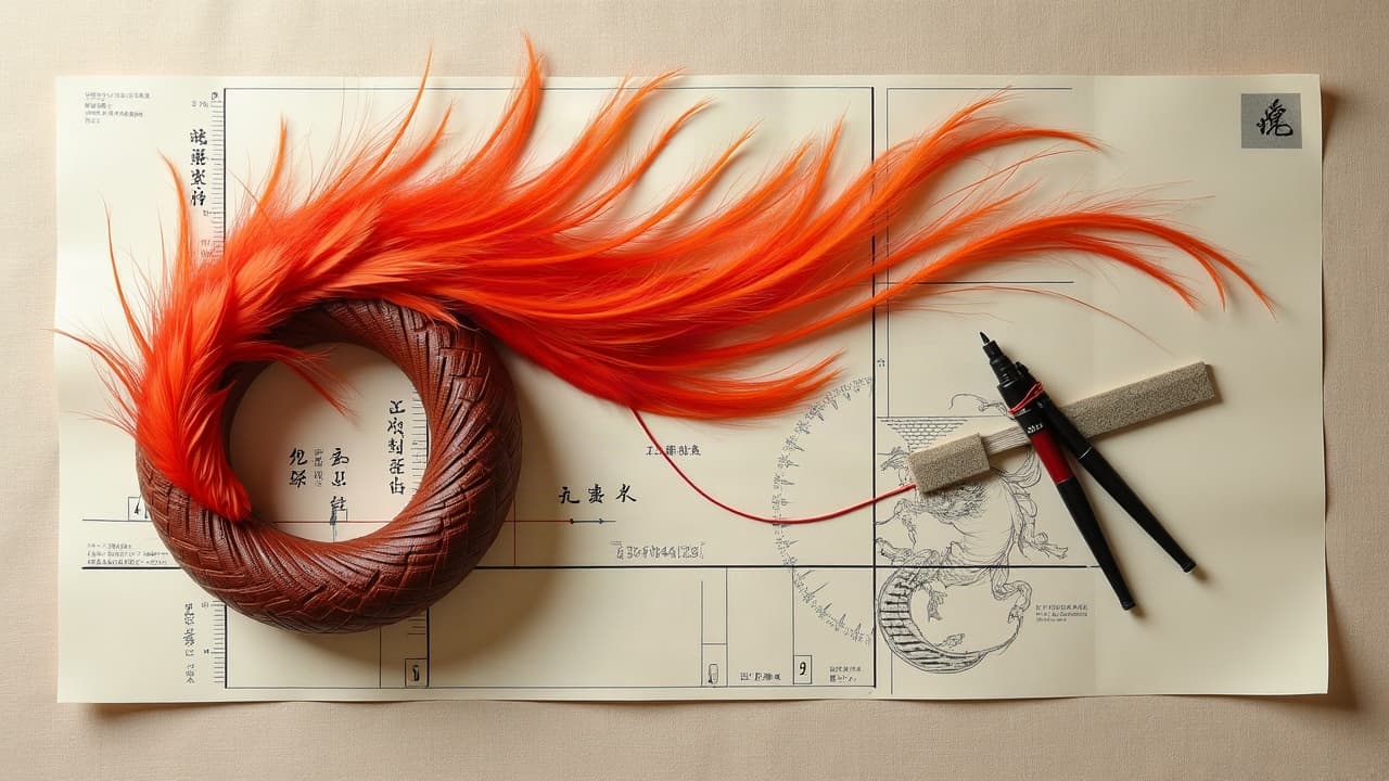
Great creature tattoos are won in the sketchbook, not the chair. If you sort the symbolism, body flow, and line weight before stencil, your dragon or phoenix stays readable from 6 feet and still wows up close. This guide breaks down techniques artists use daily so your mythical concept becomes a tattoo that actually holds up on skin.
Choose the Creature, Choose the Meaning
Mythical creatures carry baked‑in narrative. Pick the one that mirrors what you want to say, then tune pose, expression, and iconography so the meaning reads at a glance. Respect cultural origins and avoid mixing symbols that clash without intent.
- Dragons signal power, guardianship, and change. Eastern dragons read as wisdom and rain, Western as fire and conquest. Horn shape and whiskers can point East or West without heavy exposition.
- Phoenix embodies rebirth. Use ascending S‑curves and rising embers. Warm palettes, gold to crimson, push the renewal theme without extra props.
- Kitsune and oni play trickery and shadow. A three‑tail kitsune whispers youth, nine tails suggest mastery. Oni masks tilt meaning from protection to reckoning by brow angle.
- Griffin and qilin pair nobility with stewardship. Heraldic chest fronts and feather crests add regality. Hoof or claw direction subtly cues defense or pursuit.
If you need structured prompts, see our guide to not choosing in the moment to clarify story before you lock a creature. For cultural context, skim tattoo ceremonies and symbols so references land respectfully.
Style Matching: What Each Approach Gives You
Different styles give different storytelling tools. Japanese irezumi thrives on large shapes and negative water, perfect for dragons and koi companions. Neo‑traditional sharpens silhouettes, adds bold line weight, and simplifies feathers or scales into clean, graphic stacks. Blackwork and dotwork lean on negative space and texture for basilisk or kraken themes with mood. Realism pushes iridescence and translucency on phoenix flame or mermaid fins, while watercolor softens edges and can suggest motion if you anchor it with line.
When in doubt, combine an illustrative outline with painterly fills. You get decades of readability from the outline and atmosphere from glazing. If you plan complex depth, read our depth and focus mapping guide for foreground, midground, and background stacking that avoids mud.
Flow and Pose: Make the Body Do the Work
Creatures look best when they borrow the body’s own lines. Run a gesture from trapezius to hip for a coiling dragon, or ride the lat to tricep sweep for phoenix wings. Avoid chopping joints at seams. Let one major curve carry the piece, then echo it with smaller curves to keep rhythm.
- Back pieces: Anchor a spine‑parallel S‑curve so the creature breathes with shoulder blades. Reserve negative space near the scapula for wing spread.
- Sleeves: Spiral movement around the ulna keeps claws or tails visible from multiple angles. Plan wrap points to avoid awkward breaks.
- Ribs and hip: Use a C‑curve that settles into the iliac crest. Expect 7–8/10 pain spikes around the ribs, so streamline tiny texture here.
- Thigh and calf: Vertical creatures read tall and powerful. Keep kneecap and hamstring crease free of micro‑detail that will blur with motion.
Quick anatomy note. Foreshorten wing arms, not feathers, and stagger feather groups in three tiers for believable volume. Dragon necks read best with alternating compressions and stretches, like a real serpent, not evenly spaced humps.
Texture Toolkit: Scales, Feathers, Fur, and Fire
Texture cheats keep sessions efficient. For scales, map diamonds in bands, then offset each row so the centerline never creates a zipper. Pop edges with whip shading from a 3RL and glaze shadows using a 9RM or 7M. Feathers read clean when you mass the shape first, then flick barbs inward, leaving a negative quill highlight. Fur should clump into three values, not a thousand strands.
For elemental effects, push contrast. Flames get a bright core highlight and darker, cooler edges. Water needs soft pendulum shading and clean cutaways where fins overlap. Save white ink for the top 5 percent of accents so it ages gracefully. If you plan saturated color, review our multicolor ink starter so blends stay luminous instead of chalky.
Color Strategy, Ink Choices, and Safety Notes
Limit your palette. Two complements plus a neutral, or a warm triad, keep mythical designs legible. Dragons love cool greens vs warm brass, phoenix sings with crimson, saffron, charcoal. Pack color with tight, even passes, then let it rest. Expect $150–$250 per hour in many studios for large color work, with extra time for color packing and glazing.
- Ink brands to discuss: Eternal, Fusion, World Famous (non‑sponsored examples). Test small spots if you have sensitive skin.
- Red and yellow pigments trigger more reactions per the American Academy of Dermatology; build with caution on large oni masks.
- UV and neons fade faster. Put them in accent zones, not the whole creature.
- Gloves on safety: ask about sterile setup and single‑use needles. It is basic, but not optional.
For safety reading, the American Academy of Dermatology details allergic and photo‑reactive risks, especially with red pigment. The FDA’s page on tattoo inks explains pigment oversight and why reactions can appear months later. For healing expectations and why sun matters, see Cleveland Clinic tattoo aftercare and Healthline on tattoo blowouts and line clarity. If you want peer‑reviewed context on skin reactions, browse JAMA Dermatology.
Linework That Lasts: Readable Today, Crisp in 2036
Longevity lives in edges. Creature tattoos need hierarchy: a bold keyline, a mid‑weight secondary outline for major forms, and fine interior lines for scales or feather splits. On most skin, keep the thinnest lines above 0.25–0.30 mm and float them inside bolder shapes so they are protected as the tattoo softens over years.
- Use negative space to separate claw tips from background rather than stacking three inks in a 2 mm gap.
- Break long lines near joints into tapered segments to avoid blowouts and distortion with movement.
- Dotwork scales: vary dot density by 30–50 percent between light and shadow to keep shimmer without filling solid.
If you are uncertain about micro‑detail, preview at 25 percent zoom. If it muddies on screen, it will blur on skin. Plan to refresh fine white and micro‑lines in 3–5 years if they anchor the look.
Placement, Size, Pain, and Motion Planning
Match the creature’s motion to your anatomy. Back for wings, thigh for forward lunges, forearm for coils. Size matters. A gryphon head under 3 inches loses beak texture. A full phoenix needs 10–14 inches of vertical to show tail rhythm and feather stacks. Pain varies by site. Ribs often hit 7–8/10, outer bicep 3–5/10, calf 4–6/10. Break big pieces into sessions to protect saturation.
Healing is typically 10–14 days for the surface, then 6–8 weeks for ink to settle. Minimize stretch and compression during that window so scales and feathers heal smoothly. If you plan a staged sleeve, keep edges inside clothing lines so adhesive or seams do not lift early scabs.
Cultural Respect and Iconography Accuracy
Dragons are not all the same. A Chinese lung with cloud pearls and whiskers reads very differently from a European drake with wings and a hoard. Kitsune tails and mask motifs carry Shinto references. Research primary imagery before combining symbols, or reinterpret without sacred elements. If you want structure without missteps, start with regional motifs, then swap pattern vocabulary rather than religious icons.
When collaborating with your artist, bring references and be open to edits. The goal is a piece that honors the source while fitting your body and story. If you need a research kickstart, scan our library and the piece on universal tattoo symbols.
Aftercare for Saturated Color and Fine Detail
Highly saturated phoenix tails and micro‑lined scales need calm, not scrubbing. Consider a medical adhesive bandage the first days if your artist approves. Keep it clean, lightly moisturized, and out of sun. Once flaking starts, let it fall. No picking, no tight gym wear over healing edges.
- Bandage and balms: Saniderm, Bepanthen, Aquaphor, Hustle Butter, Mad Rabbit (non‑sponsored examples). Use a thin film, not a gloss.
- Shower, do not soak. Pat dry. Apply moisturizer 2–3 times daily during peel.
- SPF matters. After 4 weeks, daily SPF 30+ preserves color. UV is the biggest long‑term fade driver.
For sensitive skin, see our aftercare products by skin type. For fading realities and how to plan refreshes, read how to manage tattoo fading over time. Health references from the American Academy of Dermatology and the FDA on inks align with these basics.
Ready to build a dragon that fits your back like armor, or a phoenix that actually breathes with your stride? Generate variants with AI for Tattoo, test color palettes, and preview placement on your body with our virtual try‑on. Start fresh concepts in seconds at Create, browse motifs in the Library, then check scale and flow on your skin at Try‑On.
Try AI for Tattoo Free