
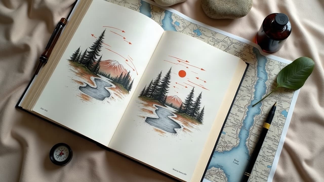
Great landscape tattoos do not succeed because of microscopic pine needles or photoreal cloud tips. They work because the big shapes, value hierarchy, and flow match your anatomy and your story. Think of the design like a map that guides the eye from foreground to horizon, with personal landmarks placed exactly where your body moves. When you get those fundamentals right, the smaller textures become seasoning, not the entire meal.
Start With Your Map: Personal Landmarks and Motifs
Before composition, pick the places and elements that carry weight. Your childhood coastline, the trail where you proposed, the mountain you summited after a tough year, or a night sky from a date that changed you. Filter references by feeling first. Write a one-line brief: “Cold alpine dawn, relief, path forward.” That sentence becomes a compass for every design choice, from color temperature to line weight.
Sketch loose “legend” icons, one per meaning: a switchback path for persistence, a lone pine for resilience, cirrus clouds for calm, orcas for family, a moon phase for cycles. Drop these into a rough layout using digital tools like Procreate, Adobe Fresco, or Affinity Designer on an iPad Pro or Wacom Cintiq (non-sponsored examples). Your goal is not detail, it is a readable story spine in three to five shapes.
Build Readable Composition: Foreground, Mid, Background
Landscape tattoos are depth puzzles. You need a clear foreground anchor, a midground that bridges, and a background that sits back. Use frameworks artists rely on for fast legibility at 6–10 feet viewing distance. Keep at least 20–30 percent negative space so the scene can breathe when the skin moves.
- Rule of thirds, place the primary landmark, such as a peak or lighthouse, at a power point to pull the eye naturally.
- S-curve or river path, creates movement from bottom to top, perfect for forearm or calf wraps.
- Triangular grouping, stack foreground rock, tree, and mountain into a stable triangle that resists distortion.
- Horizon placement, high horizon favors foreground storytelling, low horizon highlights sky and weather.
- Framing devices, arching branches or canyon walls guide the gaze and hide seams around joints.
- Silhouette logic, one dark shape against one light shape beats ten midtones that mush together.
For a deeper visual strategy on clarity, study our guide to contrast and narrative and pair it with this depth primer. The combo keeps your landscape from turning into a midtone soup.
Fit the Landscape to Anatomy
The same valley scene composes differently on a forearm than on a ribcage. You are not printing a poster, you are designing for a cylinder that flexes, compresses, and twists. Use your body’s lines of force to set the scene’s flow and reserve hinge zones for lower-detail transitions.
- Forearm, run rivers or roads along the brachioradialis for a natural S-curve, place the focal peak near the proximal third.
- Upper arm, circle horizons into the deltoid cap, save the biceps inner seam for mist, clouds, or soft gradients.
- Calf, stack vertical depth, foreground rocks low, mid trees center, peak high, wrap path gently around the lateral side.
- Ribs, keep shapes large and simplified, use wind, waves, or cloud bands to cross the widest span with minimal distortion.
- Back, commit to a centerline spine element, waterfall or path, then mirror-support with flanking trees or cliffs.
Trace the major muscle edges on a photo of your body, then compose over it. Quick test, take a video while flexing and rotate your arm. If the focal shape still reads in motion, you mapped it right. If not, shift the anchor until it does.
Depth With Value and Edges
Depth is not a filter, it is value grouping and edge control. Group your foreground into your darkest 20–30 percent values, keep your background in the lightest 20 percent, and reserve a clean mid band for the bridge. Use soft edges for distance, crisp edges only where you want the eye to land. In black and gray, push atmospheric perspective with diluted washes and leave negative space for sky glare.
- Convert your sketch to grayscale early and squint check readability on a phone screen at arm’s length.
- Limit hard outlines to focal items, tree trunks or lighthouse silhouette, soften distant treelines with whip shading.
- Stack contrast, dark foreground against light midground or vice versa, never dark against dark unless separated by glow.
Tools help, but do not replace judgment. In Procreate, toggle a black-and-white adjustment to test values. On paper, hit highlights with a Uni-ball Signo white pen and see if they actually matter or if they are just noise.
Symbols in Nature, Chosen With Intention
Every natural element carries built-in symbolism. Pick one or two meanings, then echo them quietly rather than shouting with ten icons. Reducing symbol count is a longevity technique, since fewer micro-details mean less risk of muddiness as the tattoo settles over 2–4 years.
- Mountains, endurance and clarity, best as bold silhouettes with snow caps as sparse highlights.
- Rivers and paths, progress and time, great S-curve device that can hide seam lines.
- Pines and cedars, resilience and rootedness, design in clusters with varied heights, not a picket fence.
- Desert forms, patience and stark beauty, use big rock planes and sky halos for graphic punch.
- Skies, mood dial, storm breaks for catharsis, aurora or Milky Way for awe, avoid over-spangling stars.
Blend symbols with restraint. One lone tree on a ridge can say more than twenty. If you are still building the vocabulary, browse our library and save three references per element, not thirty.
Color Strategy, Season, and Skin Tone
Pick a season and stick to its color temperature. Alpine dawns push cool blues with a warm rim light. Autumn forests lean into warm ochres and deep greens. On richer skin tones, reach for high-chroma warms and simplified palettes so the design reads through melanin. Broad planes of color age better than peppered micro-gradients.
Sun is the biggest threat to color. The American Academy of Dermatology recommends daily broad-spectrum SPF 30+ to protect skin from UV damage, which also protects tattoo pigments AAD sunscreen guidance. The Cleveland Clinic notes UV exposure is a key driver of tattoo fading and aging, especially in color work Cleveland Clinic on tattoos and skin. For pigment safety context, the U.S. FDA regulates tattoo inks but does not pre-approve pigments for injection, so artists rely on reputable brands and batch documentation FDA tattoo and permanent makeup.
- Test palettes on your photo, drop transparent color blocks over a grayscale comp to preview contrast.
- Favor temperature contrast, warm light against cool shadow or vice versa, over tiny hue shifts that vanish with time.
- Limit to 3–5 inks for legibility, think “dawn blue, slate green, warm gray, bone white,” not the whole rack.
Texture and Line Choices for Longevity
Texture sells realism, but it should be selective. Reserve bark grain, wave foam, or scree detail for foreground zones and simplify everything else. Use line weight hierarchy so important contours survive time, thick-to-thin tapers pull the eye and resist softening. In color, paint forms with large passes, then add micro-texture sparingly.
- Outline only what needs protecting, foreground rocks, lighthouse, tree trunks, not the fog and distant ridge lines.
- Use heavier liners for anchors, 7–9RL, slimmer liners for accents, 3–5RL, and packs of mag shaders for skies and gradients.
- Break lines at light strikes to avoid cartoon outlines, let planes meet with value instead of ink fences.
If your skin is sensitive, discuss line and fill strategy in advance. Healing protocols affect texture visibility. See our aftercare guide for sensitive skin for adjustments that keep scabbing low and edges crisp.
Reference Workflow and Ethics
Good landscapes usually blend references. Build a mood board, then draft a unique composition rather than collage-copying someone else’s tattoo. Use your own photos when possible and supplement with public domain sources. For structure checks, pull an overhead from Google Earth, then design your ground-level view from that geometry.
- Collect 6–10 images max, your photos first, then public-domain archives, Library of Congress or Unsplash PD.
- Reduce each reference to three shapes, light, mid, dark, and keep only the shapes that serve your story.
- Block a one-inch thumbnail set, 6–8 options, pick the clearest, then scale to body photos for flow tests.
- Print a stencil test on paper, tape it to your body, record a 10-second flex video, adjust seams and overlaps.
- Archive sources and make notes, dates, locations, lens, so the design remains ethically yours.
If you are collaborating with a team or testing prompts to explore directions, consider structured ideation like our prompt workshops. It can speed up the ugly-iteration phase without locking you into any one image.
Session Planning, Budget, and Aging Well
Landscapes reward patience. Expect 3–5 sessions for a forearm or calf wrap, more for a backpiece. Budget $300 to $1,500 depending on size, color, and artist reputation. Build recovery time between sessions so values settle and you can re-balance contrasts next pass. Use gentle aftercare to safeguard edges and preserve negative space.
Typical skin healing lands around 2–4 weeks for surface layers, with deeper settling over months. For general timelines and skin considerations, see the Mayo Clinic wound and skin care resources Mayo Clinic skin health. Aftercare staples include Saniderm, Bepanthen, Aquaphor, Hustle Butter, and Mad Rabbit (non-sponsored examples). Long term, sunscreen and moisturizers keep colors truer. For multi-appointment strategies, read our sessions planning guide.
- Book color last, finish structure and value so hues sit on a stable base.
- Photograph healed stages in consistent light to track contrast drift and plan corrections.
- Schedule seasonal work, large color fills in cooler months reduce sun exposure during healing.
Ready to map your own coastline, peak, or night sky onto skin? Use AI for Tattoo to sketch options that fit your anatomy, swap seasons and palettes, and try on the design before you book. Start with Create to generate concepts, then use Try-On to preview placement and flow.
Try AI for Tattoo Free