
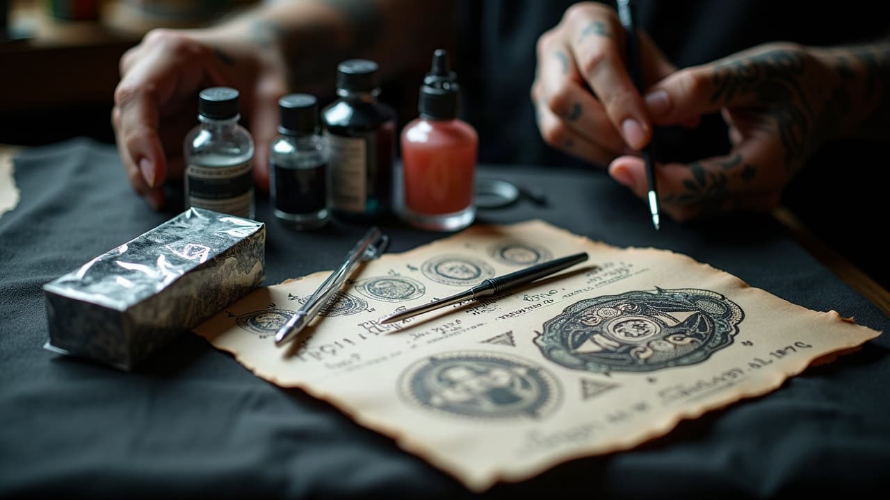
A tattoo with strong contrast can be read from six feet away, even after years of wear. That single truth separates designs that whisper from designs that speak clearly. Contrast is not just black next to white. It is a stack of choices, from value contrast and line weight to color temperature and negative space, that guides the eye and supports the story. Whether you are sketching a small fineline piece or a full sleeve, learning to control contrast is how you make a visual narrative work on living skin.
What Contrast Means in Tattooing, Not Just in Art
In tattooing, contrast is how different elements separate and relate so the viewer instantly knows what to look at. We use several levers. Value contrast is the light to dark range created by black, gray wash, and open skin. Color contrast comes from hue and saturation choices, like warm against cool or complements. Line contrast is the hierarchy of thick, thin, and tapered lines. There is also contrast in scale, texture, and edge softness. Skin itself contributes to contrast, since melanin filters certain wavelengths and shifts how colors read. That is why bold silhouette, clean edge control, and protected highlights matter on every skin tone. For deeper dives into black and gray readability, see our blackwork contrast guide.
Value Contrast: Black to Skin Is Your Workhorse
If a design must survive time and distance, start with value. Packed black shapes and controlled midtones create separation even when color fades. Anchoring focal areas with solid black and protecting small highlights as untouched skin gives you a reliable light-dark map. Build gradients with gray wash that steps clearly between tones, not mushy zones. Edge quality is critical. Keep focal edges crisp, then soften away with whip shading or stipple so forms roll without losing silhouette. Avoid flooding every corner with mid-gray. Let negative space breathe so the eye can rest and the story beats land.
- Pack blacks with a rich formula like Dynamic Black or Eternal Maxx Black, then protect skin breaks around key shapes for clean value reads (non-sponsored examples).
- Map a 3 to 5 step gray-wash set, label caps, and test on paper to prevent accidental midtone bloat inside focal areas.
- Prioritize silhouette. If a form reads without interior details, you can add texture later without risking overall clarity.
Color Contrast That Actually Heals Well
Color contrast is powerful, but only if value stays separated after healing. Pair complements like blue-orange or red-green, then make sure one side is darker so the edge does not collapse. Push warm-cool temperature shifts around faces or flames to signal depth. Outline or edge-reinforce color masses with black or deep plum for longevity, especially on darker skin where low-value yellows can get lost. UV and time will desaturate pigments, so plan palettes with a value anchor. The FDA notes that pigments and carriers vary and are not preapproved, which affects stability and reactions. See the FDA on tattoos and permanent makeup for safety context. For sun behavior and skin guidance, the American Academy of Dermatology emphasizes sun protection to reduce fading and skin damage.
- Build color stacks with a dark key, a mid chroma, and a small high-chroma accent. Keep the accent under 15 percent of the area to avoid visual noise.
- Use desaturated neighbors as buffers. A gray-violet next to orange reduces clash while preserving contrast and a soft blend edge.
- For melanin-rich skin, lean into rich blacks, burgundy, forest green, and cobalt, and define small color notes with crisp outlines.
- Protect color with SPF 30 to 50 daily. Products like EltaMD UV Sport SPF 50, Neutrogena Sheer Zinc, and Supergoop! Play help reduce photo-fade (non-sponsored examples).
- Confirm aftercare basics with medical sources. See Healthline for readable summaries on fading and care, and consult the AAD for dermatology-backed advice.
Line Weight and Edge Hierarchy
Great narrative tattoos use line weight like a soundtrack. Heavy lines around primary subjects, medium for secondary, and thin or implied lines for texture. This tells the eye where to land first. Try a bold 9RL or 14RL for main silhouettes, a 5RL for interior shapes, and a single-needle only where the design can afford delicacy. Tapered ends and micro-breaks add life without muddying form. If you love fineline, give yourself backup by reinforcing overlaps with shadow lines rather than more outline. When you switch to shading, carry the same hierarchy by using a 7M1 magnum to sculpt major planes and a soft corner to feather transitions.
Size, Scale, and Proportion to Tell a Story
Contrast in scale is how you create rhythm. Big-to-small relationships generate depth and timing, like a close-up flower against tiny bees leading away. Oversize a hero element so it claims space, then miniaturize supporting icons to push them into the background. Keep a measurable ratio, often 3:1 between primary and secondary, so the hierarchy stays obvious after healing. Use negative space bands to separate chapters in a sleeve or to frame text so it remains legible over time. If you expect to expand later, maintain clear borders so new work can integrate without flattening your story. For large projects, see our guide on planning multi-session work.
- Design with a single bold focal shape per panel. Do not split attention equally between two equally sized heroes.
- Use scale jumps to imply depth. Tiny birds around a large moon feel distant even without detailed perspective.
- Carve breathing lanes of skin between clusters. These gaps act like gutters that prevent value masses from merging.
Texture and Pattern Contrast: Stipple, Crosshatch, and Whip
Texture contrast helps different materials read fast, like fur versus steel. Alternate stipple for soft gradients, crosshatch for structured planes, and whip shading for smoky transitions. Limit yourself to two dominant textures per area so the surface does not turn into static. A bugpin magnum can lay tight grain for skin or stone, while a round shader can dot-stipple foliage. Always check read distance. If two adjacent textures share the same value, the edge will still vanish, so add a slight value step or a selective hard edge. Keep textures aligned with form, not sprayed randomly, so the story remains clear from any angle.
- Assign textures to specific story elements. Example, stipple for atmosphere, crosshatch for armor, so motifs do not compete.
- Switch needle groupings for tactile contrast. 7M1 for velvet gradients, 9RS for dotted bark or gravel.
- Reserve micro-texture inside secondary zones. Save the cleanest planes and edges for main characters or symbols.
Skin Tone, Placement, and Long-Term Contrast
Contrast must be planned for the canvas you are on. Melanin absorbs and scatters light differently across Fitzpatrick I to VI, which shifts how color shows. On deeper tones, high-value colors like pale yellow may disappear, but rich blacks and deep jewel hues hold power. Placement matters for longevity. Areas with daily sun or friction, like forearms and hands, fade and blur faster. The Cleveland Clinic emphasizes diligent aftercare and sun protection for better healing and reduced fading. See their tattoo aftercare advice for fundamentals, and rely on AAD guidance for skin of color considerations. Framing with strong silhouette and leaving clean highlights will keep the story readable as ink settles and skin renews.
Compositional Contrast: Framing, Flow, and Narrative Beats
Composition is where your contrasts coordinate into a narrative. Use flow lines that follow muscle curves so the piece moves with the body. Establish a clear focal path with value, line weight, and color, then insert quiet pauses of negative space so the viewer can process the scene. Framing devices like arches, laurels, waves, and smoke separate time or locations inside a sleeve. Place micro-beats, such as a bright moth or a coin, near major transitions to bridge chapters. For idea refinement and critique patterns, see our piece on prompt evaluation for better designs.
- Block in composition values first, three tones max, then add color accents only where it supports the focal path.
- Aim your main light from one direction to avoid conflicting shadows that flatten form and dilute edge hierarchy.
- Use a rule-of-thirds anchor for the hero element, and echo its shape rhythm across secondary motifs for unity.
Tools, Inks, and Workflow That Support Contrast
Good contrast is easier with predictable tools. Run liners that suit your hand speed so you can pull clean single passes, then shade with mags that blend without chevroning. Reliable blacks and washes are your contrast foundation. Brands like Dynamic, Eternal, and World Famous are common shop staples. Keep a consistent gray-wash recipe so healed values match your intention. Do not forget aftercare to lock in your work. Daily SPF 30 to 50, gentle cleansers, and neutral moisturizers protect contrast. For medical background on skin aging and UV, see the Mayo Clinic and AAD. The FDA also maintains resources on pigment safety and reported issues, useful for informed choices.
Ready to test value maps, palette choices, and line hierarchies before you book time? Use AI for Tattoo to prototype contrast. Generate options in minutes on our creator, then see them on your body with the virtual try-on. Explore style references and story cues in our library and styles hub to refine your narrative.
Try AI for Tattoo Free