Your best predictor of tattoo satisfaction is not price or follower count, it is the quality of the portfolio. A focused 10-minute review of the right details will reveal whether an artist’s skills align with your vision, long before you send a deposit. I assess portfolios every week, and the same handful of cues consistently separate reliable professionals from risky bets.
This guide shows you exactly what to look for, from linework consistency and color saturation to healed results, composition, and professional signals like hygiene and pricing. Where needed, I cite medical sources on healing and ink safety so your decision is grounded in more than vibe. The goal is simple, pick an artist whose strengths make your idea shine, then let time do the talking.
Start With Style Match, Not Clout
Ignore follower counts for a minute and check style alignment. Portfolios often feature a range, but great artists typically lean into a lane. You should quickly recognize a clear voice, whether that is blackwork, fineline, traditional, Japanese, realism, neo-traditional, or illustrative. If your concept is a botanical in fine black lines, a gallery full of high-contrast color realism is a mismatch, even if the work is excellent.
- Find 3 to 5 recent pieces that match your subject and scale, for example small florals or palm-sized animals. If they do not exist, the artist may not be the right fit today.
- Ask yourself if you like their weakest recent piece in your target style. If the answer is no, you will not love an average day in their chair.
- Be cautious of portfolios claiming they do every style equally well. Most careers show a specialty, and focus tends to yield better long-term results.
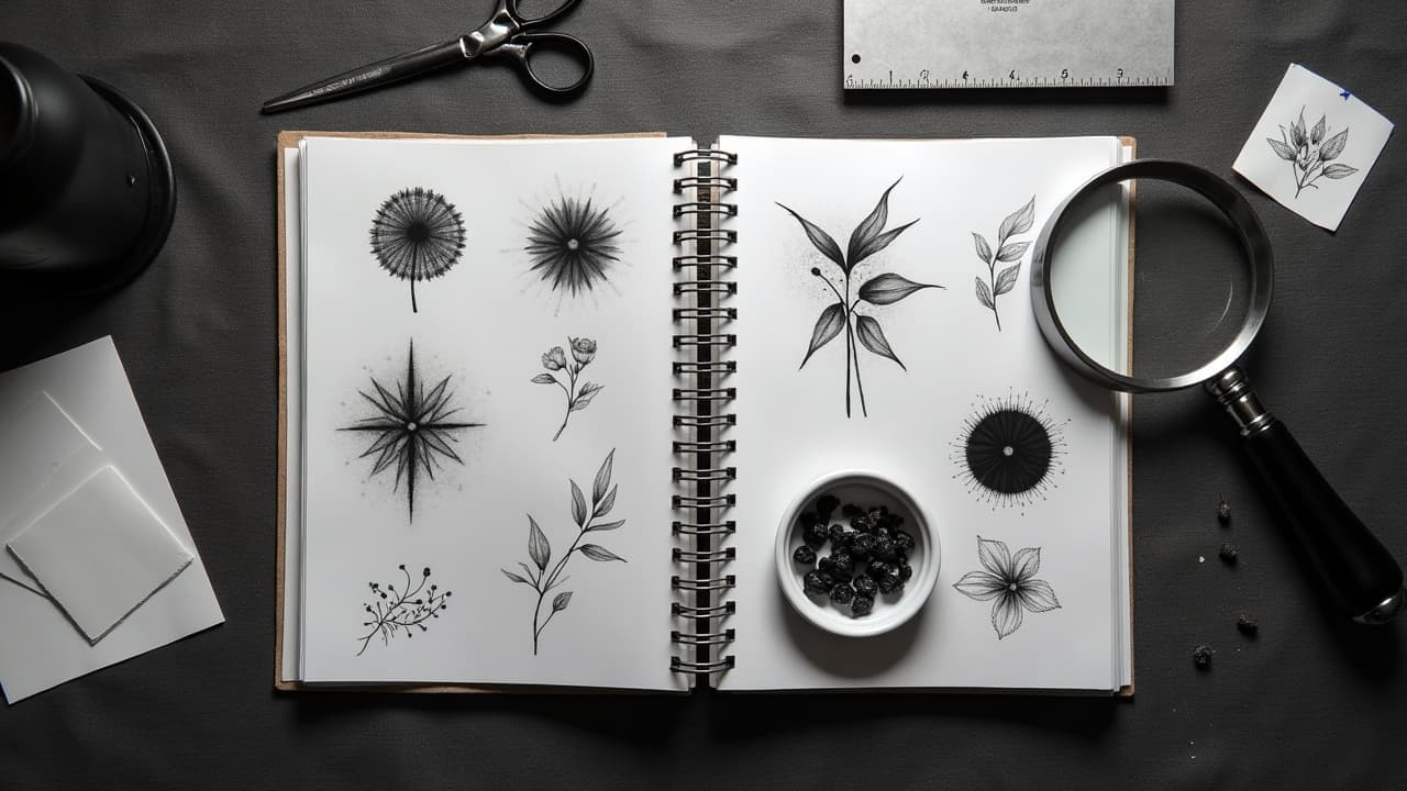
Linework: Consistency, Weight, and Flow
Line quality is the foundation. Look for consistent line weight within a piece, confident long curves with no visible wobble, and clean corners where lines meet. Tiny script and hairline details should be legible and balanced, not shaky or overworked. Zoom in. Fresh redness can hide flaws, but you can still spot clipped corners, double lines, or needle blowouts that creep under the skin.
- Edges should be crisp, with no fuzzy halos or shadowing outside the contour. Persistent haze can signal blowouts or overworking.
- Parallel lines, such as borders and geometric frames, should stay parallel across curved body surfaces. Warping shows poor stencil placement or control.
- Check healed versions of line-heavy pieces. Thin lines should soften but remain readable. If everything melts together, the artist pushes lines too tight for longevity.
If you are unsure what blowouts or overworked skin look like, compare multiple examples and read a primer from a medical source. See Healthline on tattoo blowouts and scarring for basic visuals and causes. A little research goes a long way in protecting your skin.
Saturation, Color Packing, and Blackwork Density
For color pieces, demand solid saturation. You should not see patchy areas, striping, or skin peeking through flat fills. Transitions should be blended, not polka dotted. In blackwork, large fills should be dense and even, with no tiger-striping. For black and gray, smooth gradient shading should carry the form, and negative space should be intentional, not accidental gaps.
- Compare fresh and healed shots of the same piece. If rich reds or blacks turn chalky after healing, either the packing was light or aftercare failed.
- Look at tricky colors like yellow and white. They should be placed sparingly and anchored by darker values so they age gracefully.
- Check that darks are truly dark. Weak blacks mean low contrast, and low contrast equals a flat tattoo in 6–12 months.
Shading and Contrast That Age Well
Great shading is not just smooth, it is structured. A strong tattoo reads from across the room because it has clear contrast and a full value range. That means proper darks, protected midtones, and purposeful highlights. Tattoos fade with sun and time, so lower initial contrast leads to faster visual collapse. See Cleveland Clinic guidance on tattoo reactions and care for general points on sun exposure and maintenance.
If every piece in a portfolio looks softly gray with no pop, expect quiet healed results. On delicate styles like fineline florals, the solution is not more ink, it is smarter use of negative space and placement where skin movement is gentle. Artists who plan for aging, not just the day-one photo, are worth your time.
Healed Results: The Portfolio Most Artists Skip
A professional portfolio should show healed photos, ideally at 4–8 weeks and again at 3–6 months. Fresh tattoos are swollen, shiny, and forgiving. Healed skin tells the truth. Lines thicken slightly, colors settle, and any trauma shows as scars or texture. If an artist never posts healed work, ask to see it privately. The best artists are proud of how their tattoos mature.
- Healed lines should look even and unbroken. Gaps or pits suggest overworking or poor aftercare.
- Healed color should look a touch softer than day one, not washed out. Patchiness means weak saturation or rushed technique.
- Ask what aftercare they recommend. Products like Saniderm or SecondSkin, and ointments such as Bepanthen, Aquaphor, Hustle Butter, Mad Rabbit can influence outcomes (non-sponsored examples).
For healing timelines, the top layer often closes in 2–3 weeks, while deeper settling takes longer. Review American Academy of Dermatology guidance on tattoo healing for clinician-backed basics. For ink ingredients and safety notes, see the FDA tattoo ink safety overview. Both are useful context when you evaluate how healed work should look.
Skin Types, Placements, and Technical Range
A serious portfolio shows tattoos on diverse skin tones and body sites. Color reads differently on melanin-rich skin, and linework behaves differently on areas with more movement like fingers or ankles. If an artist only shows one skin tone or only forearms, ask for examples beyond that lane. You want proof they can adapt needle groupings, voltage, and pigment choices to the surface they are working.
- High-motion spots like sides of fingers, palms, and feet are notorious for fast fading. Good portfolios explain limits and show realistic healed outcomes.
- Curved surfaces like shoulders and calves demand flow. Motifs should wrap gracefully, not abruptly stop at the edge of the stencil.
- Large projects should show session planning, for example 2–4 sessions with coherent healed checkpoints, not a jumble of disconnected passes.
Composition, Symmetry, and Readability at Scale
Great composition respects body landmarks and reads at multiple distances. Zoomed-out photos should show a clear silhouette. Zoomed-in crops should reveal intentional texture and calm areas for the eye to rest. With geometry and mandalas, look for axis alignment and equal spacing. A portfolio full of front-facing photos only can hide how designs deform around limbs.
For a deeper dive into planning shapes and balance, read our guide to tattoo design symmetry techniques and how to place work using composition landmarks. Those principles help you judge if a design will still make sense when you move, sit, or age.
Professionalism: Hygiene, Pricing, and Booking Signals
Technique matters, but so do professional habits. Look for clean setup photos, fresh barrier film on machines, new needles opened at the station, and a posted aftercare sheet. Many artists mention bloodborne pathogen training or shop licensing in their highlights. If there is no trace of hygiene awareness, pass. Safety is non-negotiable. The FDA tattoo ink safety overview explains why sterile practice and known pigments matter.
- Transparent pricing is a green flag. Expect $150–$300 per hour or $800–$1,800 day rates in many cities, higher for top specialists.
- Normal deposits range $100–$300, usually nonrefundable but transferrable with reasonable notice. No-deposit bookings are a red flag.
- Chronic same-day openings, constant discounts, and no healed photos are warning signs. Solid artists are usually 2–8 weeks out, some 6–12 months for large projects.
For health risks and allergic responses to pigments, review JAMA Dermatology research on tattoo complications and AAD resources. In short, you want an artist who respects limits, documents healed results, and communicates when a request carries elevated risk.
Communication and References: Testing Fit Before You Commit
How an artist communicates is part of the portfolio. Read captions for how they explain choices, healing, and expectations. During inquiry, look for clear timelines, deposit terms, and revision boundaries. Ask for 2 to 3 references from recent clients if you are booking a large project. A quick message to confirm comfort, pain management, and healed satisfaction is valuable perspective.
- Book a paid consult or start with a small piece to test chemistry, responsiveness, and aftercare support before committing to a sleeve.
- Bring printed references and measurements. Our consultation preparation guide outlines exactly what to bring so the design phase starts fast.
- If you are unsure about scale or placement, preview the idea on your body first, then verify the artist’s portfolio shows similar placements that healed well.
When you evaluate with this structure, trends and filters lose power, and the craft speaks. If the style, linework, saturation, healed outcomes, composition, and professional signals all check out, you likely found the right partner. If two or three categories wobble, keep looking. Time is cheaper than cover ups.
Make a shortlist, then pressure test fit visually. Use AI for Tattoo to generate **three style variations** of your idea, compare against the artist’s strengths, and preview placement with a **virtual try on**. Build references in minutes with [Create](/create), then size and view them on your body with [Try On](/try-on) before you book.
Try AI for Tattoo Free