
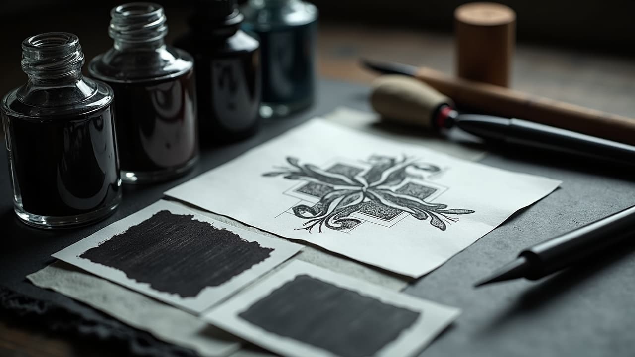
Contrast, not complexity, is what makes a tattoo readable at a glance. If a design pops from three meters away, it is almost always because of strong value contrast, purposeful line weight variation, and disciplined negative space. Details are dessert. The main course is structure you can still see after healing, swelling, and sun. The tips below are the same ones I use when planning large pieces and cover-ups: build edges that survive, then layer style.
Think in value first, then add color
Start every concept in grayscale. If the design reads in black, gray, and skin, it will read in color. Map a three-tier value plan: dark anchors, midtone transitions, and bright highlights. Treat black as a structural material, not a color. Most healed tattoos look a touch lighter than day one, so plan for 5–10% apparent contrast loss after peeling. The American Academy of Dermatology notes that UV exposure and skin biology affect tattoo appearance over time, so give your design a value buffer you can afford to lose without losing form. See their guidance here: AAD dermatology resources. When in doubt, add a black or deep neutral understructure before chroma. You can always glaze with color, but you cannot easily rebuild collapsed edges without a touch up.
Color contrast that survives healing and sun
Skin is a warm, reflective surface. That means cool shadows vs warm lights tend to pop, and complementary pairs like blue–orange are easy wins. Prioritize contrast in three dimensions: hue, saturation, and value. Low-value warm colors, like maroon or olive, can sink into midtones on medium to deep complexions, so punch their edges with cooler or darker neighbors. For a deeper dive into hue choices and case studies, bookmark our color contrast guide. Also remember longevity: according to broad dermatology guidance from Healthline and the AAD, lighter pigments tend to fade faster than black, so anchor key shapes with deeper values. Sunscreen matters for saturation retention. The Cleveland Clinic advises SPF 30+ and routine reapplication for skin and tattoo health, see Cleveland Clinic. Color is a choice, but contrast is a commitment. Make both.
- High-contrast color pairs that usually read well: blue–orange, teal–coral, violet–gold, or black–pastel for haloing around forms.
- On fair to medium skin, push warmth with cool accents for edge clarity. Use muted neighbors to avoid chaos and keep the subject forward.
- On medium to deep skin, lean on value contrast plus saturated cools like teal, cobalt, or magenta, and outline key edges with rich black.
- When using yellow, lime, or peach, protect edges with darker framing or micro-drop shadows to prevent low-contrast melt after healing.
- Test swatches digitally in grayscale first, then color. If the grayscale fails, the color scheme is doing too much work and will fade fast.
Line weight variation builds hierarchy
Good line hierarchy is like good typography. Use primary outlines to define the subject, secondary contours for forms inside the subject, and tertiary textures for hair, foliage, or fabric. On tools, a 9RL or 7RL for primaries creates durable silhouettes, 5RL or 3RL handles secondary beats, and 3RL or single needle can sprinkle texture. For shading, a 7M or 9M with soft whip builds smooth transitions you can glaze over with color. Expect healed line widening of 0.1–0.3 mm on most skin, so design with spacing, not guesswork. Thin everything and you risk visual mush. Without hierarchy, even precise microline looks flat. For fine-line styles popularized by artists like Dr. Woo, the solution is contrast through negative space and value pockets instead of chunky outlines. That keeps elegance without sacrificing readability.
- Primary edges: 7RL–9RL at deliberate speed, moderate stretch, minimal overworking. Keep corners rounded to dodge blowouts.
- Secondary edges: 3RL–5RL with slightly lighter hand. Leave air between planes to prevent healed bridging.
- Texture: single needle or 3RL, short strokes, break lines into dotted rhythms so they do not congeal during healing.
- Shading: 7M–11M in pendulum or circular passes. Build midtones first, then pack darks at the very end for crisp edges.
- Spacing: hold 1–2 mm between adjacent fines to survive 5–10 years of diffusion on high-motion areas.
Use spatial contrast and negative space like a frame
Space is a design element, not an absence. If everything is inked, nothing is important. Carve negative space to separate planes and to create aerial perspective. Hard edges in the foreground, softer in the back. On curved anatomy, offset negative space to follow muscle flow, not the stencil grid. For rib, thigh, and shoulder cap work, preview how the design wraps and where the visual resting zones live. Avoid smothering a focal point with busy backgrounds. If you need large coverage, use texture contrast instead of full saturation behind the subject. For body planning across multiple pieces, see how to customize a design for your body and unique placement strategies. Clean space now is legibility later.
- Frame the subject with skin breaks that mirror its silhouette. Edge the break with stipple or light whip to imply depth without clutter.
- Use gradient backgrounds that fade toward joints. High-motion zones are where ink migrates fastest, so keep contrast simple there.
- Create resting zones near text or faces. A quiet area next to a complex area tightens the read like punctuation.
Texture contrast: dotwork, whip, and grain
Texture is another contrast lane. Dotwork scatters light and reads matte, packed black reads glossy and hard, and whip shading lands in between. Mix them to split planes: dotwork backgrounds, packed-black anchors, soft whip transitions. Artists like Thomas Hooper use dense pattern fields that still breathe because the macro shapes are clean. The trick is to vary frequency. If everything is tight frequency, you get moiré and mud after healing. Use a coarser dot in the distance, finer near the subject, and break long runs with smooth gradients. For color realism, micro-grain under warm glazes gives skin pores and fabric texture that sell the illusion without muddying the silhouette. Keep needle angles consistent to avoid silvering that can flatten contrast when light hits healed skin at a grazing angle.
Black and gray underpainting makes color safer
If your color palette is exotic, anchor it with black and gray underpainting. Block shadows and half-tones first, then glaze with color to taste. The result is stable edges and believable form even when chroma fades. Black absorbs light and defines edges better than any single pigment, a practicality echoed in patient education from Mayo Clinic. Use cool black or a deep blue-violet before oranges and reds to avoid dull browns when they meet. In color realism styles popularized by artists like Nikko Hurtado, a value-first map keeps portraits readable long after the pinks and yellows mellow. Regulators also flag pigment variability across brands. See the FDA overview of inks and safety at U.S. FDA tattoos and permanent makeup. Structural value first, flavor second.
Contrast for different skin tones and ages
Melanin shifts perceived contrast. On deeper tones, saturation and value do the heavy lifting, so rely on rich blues, teals, magentas, and confident blacks. On fair skin, manage flush by cooling your shadows to prevent red-on-pink melt. Aging skin has more texture and less elasticity, so space fine lines further apart and use thicker primaries to withstand micro-spread. The Cleveland Clinic and the AAD both emphasize sun as a major factor in appearance changes, so bake SPF 30+ into aftercare habits for every tone. For cultural color meanings and how hue reads emotionally, cross reference our cultural color guide. Contrast is not one-size-fits-all. Tailor your palette, line weights, and spacing to the canvas, not just the reference photo.
Designing for time: UV, aftercare, and refresh cycles
A great contrast plan ages gracefully. Pack blacks cleanly, avoid stacking low-contrast colors, and shield the piece from UV. The AAD and Cleveland Clinic recommend daily SPF 30+ broad-spectrum sunscreen on exposed tattoos and covering during peak sun hours. Pigments and carriers vary, and safety updates happen, so check the FDA resources for recalls or advisories at FDA tattoos and PMU. To protect saturation and edges, keep aftercare simple: breathable film for 3–5 days if your artist approves, then a light, unscented moisturizer. Typical supplies include Saniderm, Bepanthen, Aquaphor, Hustle Butter, or Mad Rabbit (non-sponsored examples). Numbing creams like TKTX can affect skin tension and hand feel, so apply only as directed and tell your artist. For evidence-focused complication discussions, browse JAMA Dermatology. A conservative refresh cycle every 3–7 years for high-sun areas keeps contrast alive without overworking the skin.
Digital prep: preview contrast before you commit
Pro workflows simulate contrast at multiple distances and in grayscale before needles ever touch skin. Print your design in three sizes and tape them to the placement area. Squint test, then flip to grayscale. If the focal point vanishes, your value plan is off. For flow across anatomy, mirror and wrap the art to match curves and see where negative space should live. If you are experimenting with palettes that are new to your skin tone or style, mock up SPF wear and healed desaturation by reducing saturation 10–20% in your preview. Pair that with our library of style references and culture notes to keep meaning and aesthetics aligned.
Want to see how your contrast holds up before you book? Generate variants in grayscale and color with AI for Tattoo, then preview placement with our virtual try-on. Build a value-first version, swap palettes, and check read distance in minutes. Start with a clean base at Create or load references from Explore, and test it on your body with Try On.
Try AI for Tattoo Free