Compass tattoos age more gracefully than many tiny motifs because circular geometry and bold cardinals stay readable as the skin changes. Done right, even a 3 cm compass can stay legible after 10+ years, especially in black and gray with confident lineweight. They are also a shorthand for direction, survival, and personal values. Whether you are marking a move, honoring military service, or setting your true north, a compass can carry more meaning per square centimeter than most symbols.
Compass Tattoo Meaning, From Survival Tool to Personal North
A compass tattoo reads in seconds. It says you value orientation when life gets noisy. That core compass tattoo meaning has spun through history, from wayfinding to inner guidance, without feeling cliché when the design is thoughtful. Common threads I hear in consults align with a few buckets. Pair one or two themes, not ten, so the design stays focused and timeless. If you want to go deeper into motif layering, see our broader symbolism guide.
- Guidance and values, your true north. Keep the needle pointing to a chosen heading to lock meaning. Some add a degree marker that references a decision date, not a place.
- Protection and safe return. Mariners wore compasses for luck, often with a star. A subtle nautical star behind the rose keeps the read clean.
- Travel and curiosity. Pair with a minimal map contour or airport code, not a busy globe. The compass should stay the hero.
- Family or relationship anchors. Latitude and longitude of a birth city or meeting place, tucked into the outer ring as micro type.
- Service and discipline. Many soldiers and first responders opt for blackwork compasses with unit numbers or grid coordinates in the bezel.
Style Variations and Techniques That Hold Up
You do not need a literal mariner’s rose. The geometry adapts to almost any style. The key is contrast, spacing, and a hierarchy that survives at arm’s length. For more geometry-forward thinking, see symbolic geometry in tattoo designs.
- Linework and dotwork, crisp and timeless. Use a 0.25–0.35 mm liner for inner ticks, heavier 0.45–0.60 mm for the outer ring. Dot shading keeps it breathable.
- Black and gray realism, strong if you want metal textures. Anchor the piece with solid black in the bezel so highlights pop for 10+ years.
- Neo-traditional, with bold outlines and muted palettes. Think Eternal Ink or Solid Ink navy and bone hues, plus a Dynamic Black keyline for longevity (non-sponsored examples).
- Geometric or sacred geometry, using overlapping circles and triangles. Keep at least 2–3 mm negative space between elements to prevent visual mush.
- Watercolor accents, applied behind the rose. Keep washes out of the cardinals so legibility survives. Fade is natural in color, so plan a touch-up at 3–5 years.
Designing the Details: What Actually Carries Meaning
Two compasses can look identical yet mean completely different things. The power lives in a few small, decisive choices. Sketch these before you ever worry about color. If it is your first large design, walk through these choices with your artist or use our first tattoo meaning guide to clarify your story.
- Needle orientation. Lock to a heading that matters, not always north. 045° for an east-northeast career pivot reads cleaner than a random point.
- Cardinal letters vs symbols. If letters, use a simple grotesk or small caps serif. Keep type sizes above 0.25 cm height for healed legibility.
- Bezel details. Minute ticks every 5° make sense on big pieces, but on micro tattoos keep only the cardinals and a simple outer ring.
- Coordinates or dates. Slot them into the inner ring so they age inside protected linework, not in the open field.
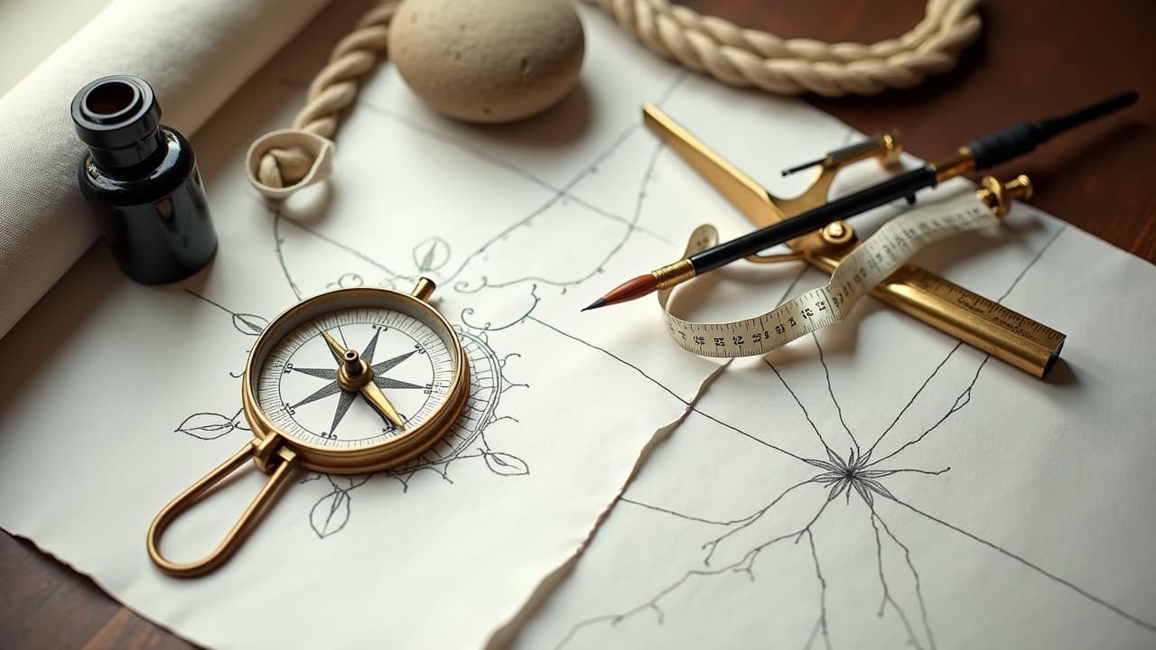
- Background choices. One accent only, like a nautical star, rope, a minimal map grid, or a single bloom. Avoid stacking all four.
Smart Placement: Where Compasses Read Best
Circular designs love flat or gently curved planes. You want breathing room around the ring so it does not look pinched. For a deeper dive on one of the best canvases, check our scan-friendly forearm tattoo design tips.
- Outer forearm, classic. Pain 3–5/10, great visibility, works from 4–10 cm diameter. Budget $250–600 depending on detail and city.
- Inner biceps for privacy. Pain 4–6/10, less sun exposure, good for 5–8 cm. Curvature needs careful stencil alignment so the ring stays round.
- Chest or sternum centerpiece. Pain 6–8/10, but perfect for 10–16 cm with script or coordinates. Expect two sessions for refined shading.
- Shoulder cap. Pain 4–6/10, the curve suits round geometry if you size to the deltoid. Avoid wrapping past the seam into the chest unless it is a larger project.
- Calf or side of calf. Pain 3–5/10, long vertical read, great for a compass above a small map strip.
- Hand or side of wrist. Pain 6–8/10, high fade and blur risk. Keep it minimal and accept faster touch-ups.
- Neck or behind ear micro. Pain 6–8/10, readability drops quickly below 2 cm. Consider a simple north arrow instead.
Sizing and Readability: Keep It Crisp in Year Ten
Compasses punish over-detailing at small sizes. The guardrails are simple. Think in contrasts and preserve air. When I design, I ask what a passerby reads from two meters away, not in a macro photo.
- Lineweight hierarchy. Outer ring heaviest, cardinals mid, inner ticks lightest. This survives normal softening over 5–10 years.
- Negative space buffers. Keep at least 1.5–2 mm between tick marks at 5–7 cm size. On micros, drop minute ticks entirely.
- Black saturation where it counts. A dark bezel and cardinal triangles keep the read, even if lighter grays mellow.
- Avoid micro text under 0.25 cm height. It will soften to a blur, especially on inner wrist or fingers.
- White ink only as accents, not outlines. It is the first to fade on most skin types.
Color, Black and Gray, or Mixed: What Ages Best
Black-based designs are the most resilient to sun and time. Color can be beautiful, but plan for maintenance. Some pigments carry higher reaction risks, and sun accelerates fade. For medical context on tattoo reactions, see the AAD guidance on complications at the American Academy of Dermatology. The FDA publishes consumer safety updates about pigments and recalls at the FDA site. Peer-reviewed overviews and case reports appear in JAMA Dermatology.
- Black and gray for maximum longevity. One pass of solid black where needed, then layered gray wash. Lowest maintenance, easiest to freshen.
- Muted color accents behind the rose. Ochre, navy, smoke green age better than neons. Expect touch-ups at 3–5 years if sun-exposed.
- Be cautious with heavy reds if you have sensitive skin. Allergic reactions are uncommon but documented by AAD and FDA sources.
- Always patch-discuss history with your artist. If you have reactions to cosmetics or metals, review pigments before session. See our tattoo allergy facts.
Healing and Care: Keep Lines Sharp
Clean healing preserves detail. Plan for 10–14 days of surface healing and 4–6 weeks of deeper settling before heavy workouts or sun. General care guidelines are supported by clinical resources like the Cleveland Clinic’s aftercare advice and consumer explainers at Healthline. Pair those with your artist’s studio protocol.
- Use a breathable second-skin bandage like Saniderm for 3–5 days if your artist recommends it, or dry-heal with light washes and thin ointment.
- Wash with fragrance-free soap twice daily, pat dry, and apply a rice-grain of Bepanthen, Aquaphor, or Hustle Butter for the first week (non-sponsored examples).
- No soaking, sun, or heavy sweat until peeling ends, usually day 10–14. Compasses have fine ticks that scab if overworked.
- After week two, switch to a plain unscented lotion and daily SPF 30+. Sun is the number one fade driver for color.
- If redness, rash, or oozing persists beyond 72 hours, contact a clinician. See AAD’s complication overview for red flags.
Time and Budget: What to Expect
Transparent numbers help you plan. Prices vary widely by city and artist reputation, but geometry rewards patience. Anything with clean rings and micro ticks needs methodical execution. For skin-care product specifics across budgets, bookmark our tattoo skin care products guide.
- Micro compass 2–3 cm, minimal ticks. 45–90 minutes, $150–300 in most mid-size cities.
- Small 4–6 cm with cardinals and light shading. 1.5–3 hours, $250–600.
- Medium 7–10 cm with bezel detail and coordinates. 3–5 hours, $500–1,000. Often split if skin gets tender.
- Large chest or shoulder 11–16 cm with background. 5–8 hours, $900–1,800 across one or two sessions.
- Optional numbing creams like TKTX can reduce discomfort, but review ingredients and patch history with your artist first, and follow Cleveland Clinic guidance on topical anesthetics.
Work With an Artist: Checks That Prevent Regret
Compasses expose shaky fundamentals. Choose an artist comfortable with circles and type. Ask to see healed photos of rings and tiny lettering. In consult, align on lineweights, negative space, and the exact heading. Use a brief like this and bring two or three references, not twenty. If you want a structured question set, save our consultation checklist.
- Confirm stencil scale on body. Have your artist print two sizes and photograph from 2 meters to judge readability.
- Agree on needle orientation and whether the north on your arm should match magnetic or symbolic north. Silly misalignments happen in a rush.
- Proofread all coordinates and dates twice, once on paper and once on skin.
- If mixing styles, decide a single visual priority. The compass should win over rope, florals, or maps.
- Ask for a simple aftercare card before you leave. Good healing is part of good design.
Preview your compass at real scale before committing. Use AI for Tattoo to generate variations with your heading, coordinates, and style, then place them on your actual arm or chest with the **virtual try-on**. Start in minutes at [Create](/create) or drop a design into [Try On](/try-on).
Try AI for Tattoo Free