
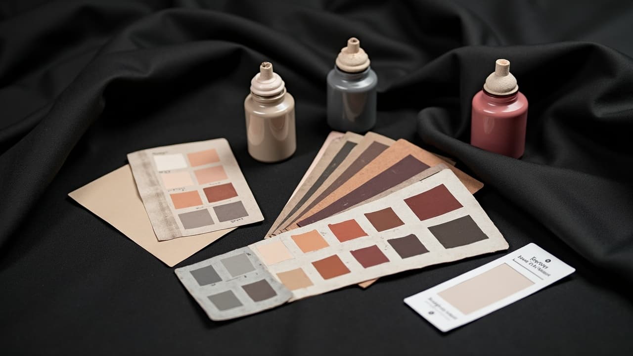
Great color tattoos are not about picking prettier reds or brighter blues. They are about value contrast first, then hue and saturation. If the design reads in grayscale, it will still hit hard in color. I build every color piece on a dark-to-light map, then use complementary pairs and temperature shifts to push the focal point. The result is clarity from across the room, and nuance up close. If you test your mockup in black and white and it still pops, you are doing it right. Planning digitally helps here, so does reference discipline. If you are prototyping with prompts, see our prompt consistency guide for keeping palettes coherent before you ever hit skin.
The four contrasts that do the heavy lifting
Think of contrast as four dials: value, hue, saturation, and temperature. Value is the backbone. Hue is which color family. Saturation is how intense or muted. Temperature is warm versus cool. Aim for clean value separation between foreground and background, then use hue and temperature to steer emotion. A cool background will push a warm subject forward, and vice versa. Keep at least one area of near-black to anchor the composition, even in light styles. When in doubt, test the design in grayscale. If the silhouette collapses, increase value spread before adding brighter inks. That discipline is why color realism by artists like Nikko Hurtado reads from 10 feet away.
- Grayscale check, convert your mockup to black and white and see if shapes separate without color help. If not, deepen shadows or lighten highlights before choosing brighter hues.
- Squint test, step back 2 to 3 meters, squint, and decide if the focal point is obvious. If the eye wanders, adjust value contrast around the subject.
- Limit the palette, start with two dominant hues plus a neutral. Add accents later, not before your value map holds together.
Skin tone is the canvas, design to it
Ink sits under skin, so your canvas hue and melanin level shift every color you lay down. On deeper skin, aim for higher value contrast and clean edges. Strong black lining and cool highlights like teal or electric blue can read clearer than pale pastels. On fair skin, watch oversaturation. Super-bright warms can blow out contrast if there is no dark key. Whatever the tone, avoid relying on pure white for contrast, it heals down and can chalk over time. Planning your palette to the body is as important as the art itself, and placement matters too. For more placement strategy, see our body-shape customization guide.
- Fair to light skin, anchor with cool blacks and mid-value greens or violets, then hit accents with warm reds or corals to avoid everything feeling icy.
- Medium to tan skin, choose rich jewel tones like sapphire, emerald, and garnet. Keep backgrounds one to two values darker than the subject.
- Deep skin, emphasize Dynamic Triple Black or similar for outlines, then lean on cobalt, magenta, and gold accents, which hold saturation and visibility after healing.
Complementary strategies that read from across the room
Complementary pairs create instant pop. Red vs green, blue vs orange, purple vs yellow are the classics. You do not have to use them at full blast. Try split-complement or triadic harmony to avoid color fights. Control ratios with the 70/20/10 rule, 70 percent dominant tone, 20 percent secondary, 10 percent accent. Keep your blacks and neutrals outside that ratio so you still have headroom for edges and shadows. Study painters, not just tattooists, for how they hold a focal path without rainbow chaos.
- Blue-orange build, indigo shadows, muted teal background, then burnt orange accents for heat at the focal center. Keep orange under 10 percent for restraint.
- Red-green build, desaturate the greens into olive and sage so the red subject can sing without Christmas vibes. Lean on black key to separate forms.
- Purple-yellow build, push violet shadows and mustard lights. Add a cool gray wash behind to avoid dueling primaries overwhelming small details.
Value mapping and edge hierarchy, the clarity engine
Before you think about color, chart your black placements, mid-tones, and highlights. Decide which edge is the star and make that edge the sharpest. Everywhere else, soften. Use negative space, drop shadows, and rim light to carve forms. A single light edge against a dark field beats five competing bright colors. Even watercolor styles need a small framework of darks, or the piece will fade into itself after healing.
- Thumbnail first, create a five-value study on paper or tablet. Keep the focal area a full two values lighter than its immediate surround.
- Key your blacks, place true black in a few strategic shadows. Do not smear it everywhere or you lose hierarchy and depth.
- Soften the rest, use whip shading or pepper shading to graduate edges. Reserve crisp outlines for the focal shape.
- Carve with light, add a rim light or negative cut so the subject edge reads clean against a dark mass.
- Recheck in grayscale, if your highlight and mid read the same, darken the background wash before changing hues.
Saturation and texture control for believable depth
High saturation everywhere kills depth. Place high-chroma accents only where you want the eye. Desaturate backgrounds with complementary glazing or a touch of neutral. Texture contrast helps too, smooth subject versus grainy background. For inks, I keep Dynamic Black, Eternal Ink Neutral Gray, and a muted set like World Famous Portrait Set on the tray for control, then pop accents with Fusion Power Reds (non-sponsored examples). Think painterly. A satin finish in the focal zone and matte around it will make colors look richer by comparison.
Style-specific contrast plays that consistently work
- Neo-traditional, bold black lines and opaque pastel fills work best when you keep backgrounds two steps lower in value. Artists like Hannah Flowers prove that peach skin tones need cool shadows for balance. - Japanese irezumi, reserve dense black in the background waves and wind bars so koi or peonies can glow with vermilion and indigo. Look at Jess Yen for edge discipline. - Watercolor, limit the palette and use a subtle graphite key or micro-lining to lock edges. Artists like Ondrash show how a single turquoise vs sienna contrast can carry the design. - Color realism, set your black, then ride temperature contrast. Nikko Hurtado’s portraits often pair cool shadows with warm skin lights so faces do not flatten in photos or under warm bulbs. If your style leans illustrative, consider opaque grays like Eternal Ink Neutral Gray to stage your subject without muddy color fights.
Placement, read distance, and scale
Contrast must match where the tattoo lives and who will view it. A calf piece seen outdoors needs heavier value steps than a forearm that lives under office light. Big surfaces like backs can absorb more subtlety because people get closer. Small zones demand fewer hues and harder edges. Think about clothing frames too. A collar or cuff cuts compositions in half, so keep your focal area well inside those boundaries and reinforce it with near-black anchors.
- Large back or thigh, use soft gradients for travel and punctual blacks to mark the focal stop. Save high-chroma for the center third.
- Forearm or calf, three-hue rule and clear line weight. Push background one to two values down so the subject reads while moving.
- Chest or collarbone, body curvature can break edges. Add a rim light or negative cut where anatomy turns to prevent the image from folding visually.
- Hands or fingers, tiny canvas, go graphic, big shapes, hard contrast, and minimal palette. Expect faster wear, so plan bolder blacks.
Keeping contrast alive, healing and maintenance
Fresh, everything looks louder. After 10–14 days of surface healing, colors mute and your true contrast shows. Protect that investment. UV is the number one killer of saturation. The American Academy of Dermatology recommends broad-spectrum SPF 30–50 for daily protection, which filters around 97–98 percent of UVB when applied thickly and often AAD guidance on sun protection. For healing timelines and what is normal swelling or peel, see the Cleveland Clinic overview Cleveland Clinic on tattoo aftercare and healing. Ink chemistry matters too, and pigments are not fully regulated in the United States. Read the FDA notes on tattoo inks and potential risks before committing to unusual pigments FDA information on tattoo inks. For practical aftercare routines and sunscreen picks, Healthline maintains clear, up-to-date guides Healthline’s tattoo aftercare and sunscreen overview.
- Use Saniderm for the first days or go classic with thin coats of Bepanthen or Aquaphor, switching to light lotions like Hustle Butter or Mad Rabbit once sealed (non-sponsored examples).
- Avoid white-heavy highlights early. Whites can push out if overworked. Let the piece settle 4–6 weeks before any brightening pass or small color correction.
- Daily sunscreen, broad-spectrum SPF 30–50, reapply every two hours outdoors. On healed color, I like La Roche-Posay Anthelios or Neutrogena Ultra Sheer for a dry finish (non-sponsored examples).
- Touch-ups, if a contrast pocket dies after healing, deepen the nearest shadow first instead of just adding brighter ink. Darker neighbors make existing color appear brighter.
Want to test palettes, value maps, and complements on your actual skin tone before booking? Generate color concepts and virtual try-ons with AI for Tattoo, tune your 70/20/10 ratios, and preview contrast on placement. Start in the studio at Create or load a photo and Try On. Add references from Explore and lock your plan before the first line goes in.
Try AI for Tattoo Free