
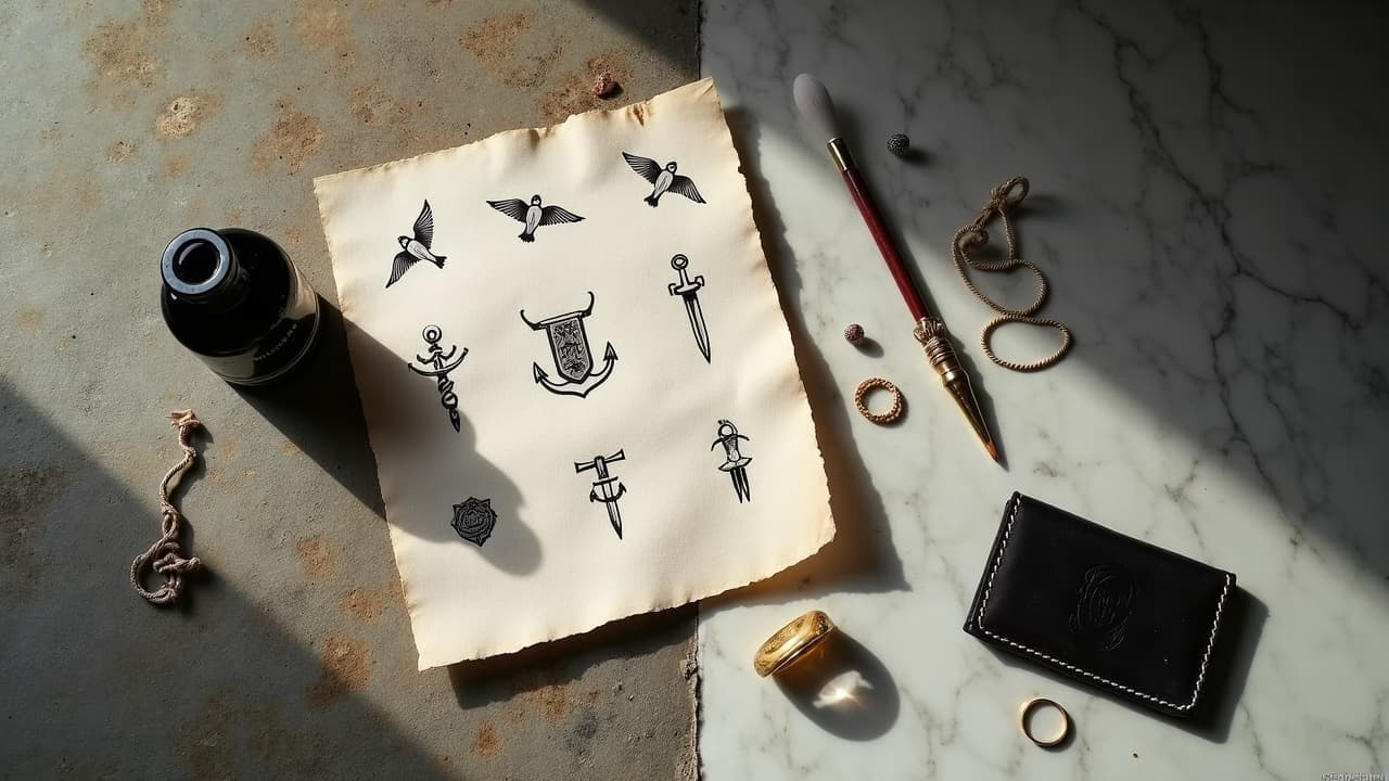
In surveys of U.S. adults, roughly 32 percent report at least one tattoo, yet who wears which tattoo still maps to class, culture, and job norms more than people think. The same anchor on a wrist can read as dockworker pride, a fashion nod, or a sailor lineage mark, depending on scale, line quality, and where you show it. The social reading is not random, it follows patterns. If you understand those patterns, you can choose designs that say what you mean and avoid signals you do not want to send.
From stigma to status: a quick timeline of tattoo class codes
For most of the 20th century in the West, visible tattoos were read as working class or subcultural. Sailors, dockworkers, bikers, carnival workers, and prison populations built robust visual languages, often bold and black heavy for durability. Fine art tattooing existed too, but it circulated in small scenes. By the 1990s to early 2000s, television, celebrity culture, and safer studio standards widened adoption, moving tattoos from stigma to a kind of accessible luxury. A crisp, well-placed micro tattoo started to function as a restrained, tasteful signal, while large scale blackwork could signal high subcultural capital.
- Pre-1950s, Western tattoos read as maritime or criminal marks, functional and legible at a distance.
- 1970s to 1980s, punk and biker iconography hardened the outsider read, but also established powerful in-group codes.
- 1990s to 2000s, mainstream studios professionalized, price points rose, and celebrity tattoos reframed ink as lifestyle.
- 2010s onward, fine-line, single-needle, and cosmetic-level placement made tattoos legible in white-collar spaces.
None of that erases deeper lineages. Ta moko in Aotearoa, irezumi in Japan, and Kalinga hand-tapping in the Philippines long predate Western trend cycles. If you are working with heritage symbols, read beyond fashion. A good primer is our guide to tribal symbols and spiritual meanings.
Working-class marks, elite signals, and the messy middle
Class signals ride on three axes, visibility, finish quality, and icon literacy. A small, healed-fine micro tattoo on the rib can read as expensive minimalism, while a bold forearm piece says availability to physical work or a workplace that allows visible ink. Neither is better, just different messages in different rooms. Price also plays a role. High-demand artists in major cities routinely charge $200 to $400 per hour, and multiday Japanese bodysuits can run $10,000+, which reads like couture. Meanwhile, a flash special for $100 on Friday the 13th is an accessible ritual that reads community-first.
- Finish quality as signal: saturated color, smooth blends, and healed crispness suggest budget for touch-ups and vetted aftercare.
- Icon literacy: classic sailor motifs by lineage artists like Sailor Jerry read tradition, while meme imagery reads contemporary and casual.
- Placement hierarchy: hands, neck, and face are still high-visibility markers, often read as blue-collar tolerance or creative field freedom.
- Scale: large cohesive work reads intent and resources, scattered micro-tattoos read personal scrapbook and trend fluency.
Race, gender, and intersectional readings of the same tattoo
The same design lands differently across bodies. A delicate script on a Black forearm may require heavier line weight to remain legible, which changes the aesthetic code. Some communities face stricter workplace scrutiny for visible ink, so coverability shifts from style choice to survival tactic. Dermatology data also matters. Keloid risk and pigment reactions vary, which shapes style choices and color palettes across skin tones. For safety guidance that translates to design, check the AAD guidance on tattoo complications and the Cleveland Clinic overview on tattoo safety.
Bias is real. People of color and women often report higher stakes for the same visibility level, especially in customer-facing jobs. Counter this with planned placement, careful artist selection, and documentation of cultural meaning if that context helps you in professional environments. Remember, reading a tattoo is always a two-way street, intent plus audience.
Cultural heritage, appropriation risks, and how to show respect
Heritage tattoos sit at the intersection of identity and public reading. A Kalinga pattern learned in session with Whang-od or her apprentices signals lineage and pilgrimage. A ta moko belongs to Māori, with meaning mapped to genealogy. Japanese irezumi by masters like Horiyoshi III sits inside a teacher-student lineage that is both art and code. Appropriation happens when powerful images get stripped of context and worn for aesthetic clout. That usually reads poorly to insiders and increasingly to outsiders.
- Ask, who is authorized to wear this, and who is authorized to tattoo it. Seek artists rooted in the tradition.
- Document meaning for yourself, dates, names, stories, especially if you may need to explain it in formal settings.
- If you love the geometry, commission a culture-neutral pattern inspired by, not copying, protected motifs.
- Revisit color symbolism. Start with the significance of tattoo colors.
Professional life: hiring bias, coverability, and strategy
Workplaces have loosened, but not evenly. Finance and law often expect low-visibility placements, while tech, media, and hospitality are more permissive. Studies and HR polls show attitudes softening as prevalence rises, a trend mirrored in Pew Research Center data on tattoo prevalence. Still, a visible hand or neck piece can invite assumptions about role and reliability in risk-averse sectors. That is a reading problem, not a character problem, and you can design around it.
- Prioritize coverability for first tattoos if you are still building your career, upper arm, thigh, ribcage, or shoulder blade.
- Use negative space to break large concepts into modular pieces that hide under sleeves.
- If needed, invest in cover products like Dermablend or airbrush kits, plus Saniderm and Bepanthen for clean healing (non-sponsored examples).
- Plan sessions before vacations or remote weeks. Healing needs 10 to 14 days before tight dress shirts or long shifts.
Prison, military, and gang iconography as social scripts
Certain marks carry heavy social weight. Military unit insignias, prison tally marks, or gang numbers can function like uniforms, with rules about who may wear them. If you have lived experience, you already know the code. If you do not, avoid borrowing signals that others cannot opt out of. In some regions, specific numbers, stars, or crowns are read immediately and could put you at risk or create misunderstandings.
- Research regional meanings, the same icon can be benign in one city and loaded in another.
- If you want the grit aesthetic, consider texture-driven blackwork or abstract lineplay instead of coded numbers.
- If a symbol references service or incarceration, clarity is your friend, add dates, names, or unit text to prevent misreads.
Health context matters too. inks and pigments are regulated unevenly. For safety and allergy awareness, see U.S. FDA information on tattoo inks and scan recent JAMA Dermatology research on tattoo reactions. Safety is classed only by access and knowledge, not by style. A careful aftercare routine communicates responsibility in any room.
Trend cycles, micro aesthetics, and the price of looking effortless
Micro styles can be quiet and powerful, but they are not automatically neutral. Fine-line and single-needle reads as boutique studio work, often with waitlists and minimums around $200 to $400. Ignorant style and hand poke read art-school adjacent or DIY, depending on finish. Heavy blackwork and ornamental geometry can read craft devotion and hours of chair time, which is its own status marker. Trend fluency is a class code just like sneaker literacy or wine talk.
- Budget signals: a healed sleeve by a known artist can quietly say thousands invested in one narrative.
- Time signals: multi-session bodysuits suggest control over schedule, a common white-collar privilege.
- Scarcity signals: artists with 6 to 12 month books closed add social cachet to simple symbols.
- Longevity: very fine lines may soften faster, accept that touch-ups are part of the look.
Meanings in placement, scale, and visibility
Where you put it often shouts louder than what it is. A small heart on a finger is a louder public statement than a large back piece you only show at the beach. Visibility rules sort themselves by season, clothing, and movement. If your livelihood depends on conservative reads, master your canvas zoning and think in layers.
- Hands, neck, face, constant exposure, high stakes, often read as 8 to 10/10 visibility.
- Forearms and calves, seasonal exposure, moderate stakes, 5 to 7/10 visibility.
- Upper arms, thighs, ribs, selective exposure, low stakes, 1 to 4/10 visibility.
- For more options, map your canvas with unique placement strategies.
Choosing your symbols with intent, artists and ethics
Treat your design like a resume line that follows you into rooms you have not entered yet. Name the roles you care about, parent, craftsperson, artist, caregiver, analyst, then pick symbols that sit honestly with those. When you interview artists, ask how they think about public reading. A veteran artist will flag accidental signals and help you redirect. If you need a starting workflow, use prompts to draft, then bring them to a human pro.
- Shortlist artists by lived experience with your theme, military, heritage, motherhood, subculture.
- Ask for healed photos, that is where finish quality reveals class-coded reads.
- Budget upfront, many city studios have $150 to $250 minimums. Multi-session work spreads cost and visibility risk.
- Prep for consults with notes and reference boards. See how to prepare for an artist consultation.
Ready to test how your idea reads on your body. Use AI for Tattoo to design and fine-tune symbols that match your roles, then preview placements you can live with. Start in the editor at Create and sanity-check visibility with a quick Try-On before you book.
Try AI for Tattoo Free