
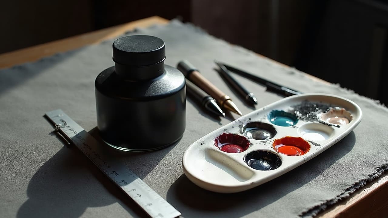
Most standout tattoos are not complicated, they are clean contrast decisions stacked correctly. If a design reads at a glance from six feet, then value, line weight, negative space, and color temperature were chosen with intent. That is how you get unique visuals that stay legible as they age, even on different skin tones and placements.
Value first, always: mapping light and shadow
Value contrast, the spread from light to dark, is the backbone of readability. Before worrying about hue, build a value scale (0–10) for your design and decide where the deepest black saturation lives. A solid silhouette with two to three clear value steps reads faster than a rainbow with none. In practice, lay in your darkest planes early, then climb into midtones and highlights without flattening the form.
- Do a three-step thumbnail: pure black, mid grey, and skin. If it reads as a clear shape at arm’s length, your macro contrast is working.
- Keep a high key vs low key decision. Bright, airy palettes require tight dark accents. Dark, moody pieces need crisp highlights to avoid mud.
- Pack blacks deliberately. Use slow hand speed and consistent stretch for dense black packing, not scratchy passes that heal chalky.
Test your draft in grayscale on a phone. If the story holds with color stripped, your visual narrative is durable. This matters for clients with color vision differences too, since about 8 percent of men have some color deficiency according to the National Eye Institute data on color vision deficiency.
Line weight hierarchy that directs the eye
Line contrast is not just thickness, it is a hierarchy that tells the eye what to prioritize. A bold outline can anchor a figure against busy background texture, while single-needle (0.25–0.30 mm) micro lines whisper secondary information. When you vary edges intentionally, you create rhythm and depth without over-shading.
- Use a 9RL or 11RL for primaries, a 5RL for secondary contours, and a 3RL or single-needle for filigree. That triad keeps forms separated cleanly.
- Feather edges inside the silhouette. Tapered line weight toward light sources blends structure into shading more naturally than hard stops.
- Switch groupings for function, not habit. Crisp geometry benefits from cartridges like Cheyenne or Kwadron, while organic motifs love mixed rounds and magnums.
Texture contrast: smooth blends vs intentional grain
Texture is flavor. Smooth magnum blends make skin look soft, while stipple and crosshatch build grit and atmosphere. The trick is assigning textures to different narrative roles. Portrait skin, glass, and clouds deserve calm gradients. Rock, bark, and fabric love pepper shading and whip shading to pop against those soft zones. Leave crisp skin breaks to breathe around both.
Try alternating micro-texture against large flats. A speckled shadow under a flat black crow wing gives movement without stealing the scene. Texture contrast also saves time. You can suggest volume with directional hatching faster than overworking midtones into a mush.
Color contrast: hue, saturation, and temperature
Color makes emotion, but value carries the read. Start with hue families that separate clearly on skin, then check value. Use complementary pairs like red vs green or blue vs orange sparingly as accents, not wall-to-wall opposition. Aim for a dominant temperature and a counterpoint. For example, a cool blue scene with warm highlights on focal points guides attention without shouting.
- Chase saturation contrast, not just loud pigments. A muted olive forest makes a neon ember feel brighter than competing neons everywhere.
- Mind color temperature shifts. Warm light, cool shadows is classic. Flip it thoughtfully for surreal moods, but keep values honest.
- Test palettes on skin swatches. Melanin alters perceived saturation and hue, so proof your set on similar tones when possible.
Remember accessibility. Some viewers will not perceive red and green separation the same way. Grayscale checks keep scenes legible for more eyes, and for long-term fading. Sun and time reduce saturation, so value structure keeps the story intact, as noted by the American Academy of Dermatology advice on sun and tattoo fading.
Scale, spacing, and negative space that breathes
Contrast also means size relationships. Big shapes next to micro detail create scale contrast that reads from the doorway and rewards close viewing. Use a 1/3–2/3 dominance rule so one scale clearly leads. Guard negative space like gold. Clean skin channels separate motifs far better than thin halos once everything settles.
- Preview at 2–3 meters. If your focal shape vanishes, simplify background and widen skin breaks.
- Use shape grouping. Merge small leaves into one mass behind a bold flower so the bloom owns the spotlight.
- Keep proximity consistent. Tiny gaps look accidental. Commit to intentional breathing room or tight overlap, not the uneasy middle.
Placement matters too. Flowing along the clavicle, rib curve, or forearm brachioradialis can amplify contrast through motion. For ideas on meaning by body area, see our guide to positional meaning by body area.
Placement and body flow: contrast that moves
The body is not flat paper. Use flow lines that agree with muscles and joints, then create contrast by opposing a few key axes. Angling a dagger slightly against the forearm line builds tension. Wrapping a serpent with coils that open over the triceps and tighten at the elbow creates motion seams you can hit with darker values and heavier lines.
Map how the viewer will encounter the piece. A thigh tattoo reads top to bottom when seated, but side to side when standing. Put high-contrast anchors where the eye enters. If you are mixing botanical with geometry, place the crisp geometry on flattest planes and let leaves flex around curves. For motif ideas that balance organic and precise edges, check our non-sponsored writeup on floral elements integration tips.
Contrast that lasts: ink choice, healing, and maintenance
A design that reads today needs help to read in 5–10 years. Choose stable pigments and pack them properly. Reputable blacks like Dynamic, Eternal, or Solid hold value better when saturated cleanly. Use thicker lines on small details that must survive, and avoid relying on tiny white lines to outline everything. Whites and light pastels desaturate fastest in sun.
- Shield color with SPF 30+ daily, even in winter. UV breaks down pigment, and consistent sunscreen slows visible fading according to the American Academy of Dermatology advice on sun and tattoo fading.
- Consider aftercare that keeps contrast crisp. Saniderm 3–5 days, then light lotion like Bepanthen, Aquaphor, or Hustle Butter supports clean healing (non-sponsored examples).
- Know the biology. Ink sits in the dermis and can migrate slightly. Harsh overworking widens lines. The U.S. FDA information on tattoo inks and pigments covers pigment and safety basics.
If you or your client has a history of keloids, plan line weight and placement carefully. Raised scars can swallow fine detail. The Cleveland Clinic guidance on keloids and scarring is a good starting point for risk awareness. For aftercare routines that support clean outcomes, you can also reference general overviews like Healthline on tattoo aftercare basics.
Building visual narratives with contrast
Contrast is not only a readability tool, it is storytelling. Use opposing values, edges, and temperatures to encode meaning. Light against dark can signal hope against struggle. Razor crisp geometry beside weathered organic textures suggests order versus nature. Cool exterior panels with warm internal glows can hint at inner life beneath armor. For longer arcs across multiple pieces, see our visual storytelling guide.
- Assign contrast roles to characters. Protagonist gets bolder lines and higher local contrast. Supporting elements drop a step.
- Use time contrast. Older memories in muted, low-saturation palettes, present moments in vivid, higher saturation within the same value map.
- Split temperature by theme. Sacred motifs run warm, mechanical motifs run cool, then bridge them at key intersections with neutral grays.
Workflow: planning, proofs, and collaboration
Lock in contrast early with small proofs. Do a value-only sketch, a flat color pass, and a texture pass. In Procreate or paper, keep layers separated, then merge only when the hierarchy holds. Share grayscale and color previews with the client so they understand why a simplified background might make their focal moth sing.
Set expectations on time and budget. Strong contrast can shorten sessions because you are not noodling midtones endlessly. For context, a medium forearm piece with clear value control often lands in 4–8 hours at $600–$1,800, depending on size, style, and studio rates. Transparent planning prevents scope creep and preserves the hierarchy you designed.
Tools and technique pairings that support contrast
Match tools to tasks. For smooth planes, magnum shaders (7–15M) with gentle pendulum motion lay soft gradients. For crisp edges, tight liners at lower give settings keep wobble down. When stippling, lighten hand pressure and widen your pendulum to control grain size. If whites are accents, seat them last into fully saturated edges so they do not bleed into mush.
- Products artists often trust for saturation and glide include Dynamic Black, Eternal Ink, Fusion Ink, and Hustle Butter Deluxe balms (non-sponsored examples).
- Technique names worth practicing: whip shading, pepper shading, crosshatching, negative carving, and glaze passes for subtle temperature shifts.
Preview contrast decisions before you commit. Use AI for Tattoo to generate grayscale and color variations, adjust line weights, and see how the piece wraps on your body. Start in the editor, then use the virtual try-on to check readability at distance and in motion. Create your draft now at Create and test placement with Try On. For more style ideas, browse Explore.
Try AI for Tattoo Free