
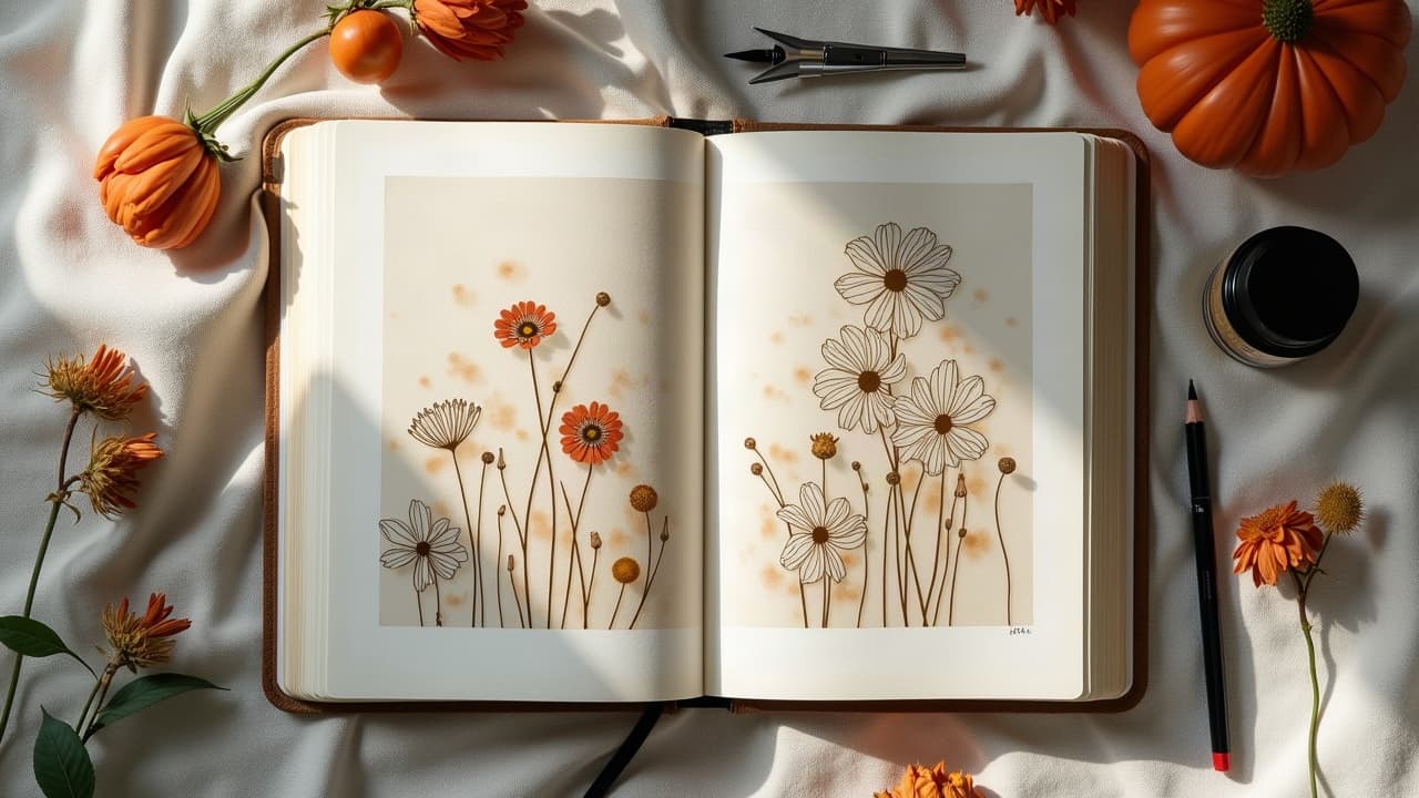
Floral tattoos read clean when the silhouette and flow lead the design, not the petals. Nail those two, and even a small sprig can anchor a complex sleeve without clutter or tangles. The secret is planning for the body first, then the bloom. Build around movement lines, choose a limited palette, and structure your line weight so the eye lands where you want. This guide breaks down the exact moves I use in consults and on skin to make florals feel intentional, not pasted on.
Start With the Spine: Flow, Silhouette, and Negative Space
Think of your floral as a living object that grows along the body’s highways. The spine of a good design is a strong S-curve or C-curve that hugs joints and directs the eye to your focal bloom. Sketch the silhouette as one continuous shape first, petals last. Reserve negative space like it is ink. Clean air around edges creates the crisp read you see from two meters away. I block in a bold outer contour, then carve channels of skin between leaves so the composition breathes under movement and lighting. If you are adding flowers to an existing piece, mirror the host tattoo’s primary angle. A geometric forearm piece that tilts 30 degrees pairs best with stems and leaves that echo that slant, not fight it.
- Use a long S-curve to cross flexible zones like ribs and outer thigh so petals do not pinch when you twist.
- Build a bold silhouette first. Trace the outside shape as a single shadow before you draw any petal detail.
- Place negative space intentionally between clusters. Think 3 to 6 mm skin gaps to prevent visual mush.
- Aim the bloom face where you want attention. Center line is a safe default for chest and sternum placements.
- For motion, pair a main curve with a minor counter-curve so the eye loops rather than exits the design.
Scale and Placement: Macro vs Micro Florals
Scale decides whether your flowers read as confident or fussy. On big canvases, go macro. A hand-sized peony on a thigh anchors the flow and leaves room for future add-ons. On fingers and ankles, micro blossoms work only if line economy is ruthless and the silhouette is simple. Respect movement zones. Over elbows and knees, avoid petal micro-detail where lines blur from flex. Let leaves or stems cross the joint, and place focal blooms just above or below the crease for a cleaner long-term read.
- Upper arm and shoulder cap: macro blooms 8 to 12 cm across, leaves wrapping behind the deltoid for depth.
- Forearm panels: medium blossoms with stems following the radius bone line, heads turning inward toward the wrist.
- Ribs: vertical vine climbs with 2 to 3 bloom stops, negative space to keep breathing room under stretch.
- Lower leg: diagonal flow from lateral calf to medial shin, larger heads on the meat of the calf for stability.
- Hands and fingers: micro florals with bold, simplified petals. Expect faster fade at extremities and plan for touchups.
Style Compatibility: Match the Flower to the Language
Flowers translate into almost any style if you keep the grammar consistent. In neo traditional, push simplified shapes, fat lines, and a controlled analogous palette. In black and gray realism, drop outlines, stack soft value, and let edges dissolve into skin where the light falls. For Japanese irezumi, prioritize flow and seasonal storytelling. Chrysanthemum with waves, peony with wind bars, plum blossoms with snow. Use petals and leaves as bridges between background motifs so the whole panel moves as one. Artists like Horiyoshi III set a high bar for cohesive floral flow. If your base piece is geometric or script, let florals act as softeners. Repeat angles or letter slant in the stems, then round it out with leaves that arc through open fields so nothing looks taped on. Keep texture language consistent, stipple with stipple, smooth shade with smooth shade.
Line Weight and Value: Hierarchy Makes It Read
Hierarchy is everything. Use line weight to declare what is foreground, midground, and background. I run a bold keyline around the focal bloom, a mid-weight on supporting petals, and whisper-thin lines on veins and serrations. Then I push black packing behind select leaves so the bloom pops. Value carries a floral even in low light. Decide your light source in the sketch, group shadows, and keep at least one petal face nearly skin-bright for contrast. If you are new to weight control, bookmark our linework guide for drills that translate cleanly to petals and leaves.
- Focal outlines: 0.35–0.45 mm needles or equivalent cartridge grouping for strong read on medium pieces.
- Support outlines: 0.25–0.30 mm so petals do not compete with the main contour.
- Interior detail: single needle or 0.18 mm micro liners, used sparingly to avoid noise.
- Shadow massing: soft black gradients under petals, plus selective black packing behind leaves to carve depth.
- Texture match: stipple in dotwork pieces, smooth whip shading in realism. Do not mix textures without intent.
Color Harmonies that Last on Skin
Skin is not paper. Undertone, melanin, and vascularity shift how inks read, which is why a tight limited palette outperforms a rainbow. For a rose, pick one dominant hue, one shadow hue that is cooler or darker, and a single accent for stamens or thorns. Safer reds and warm pigments can still provoke reactions in a small subset of people, especially older formulations. The American Academy of Dermatology notes that allergic responses are more common with certain red inks and metals, so discuss skin history and test areas when needed (AAD overview).
- Analogous palette: magenta to violet for peony depth, leaves in blue-green. Harmonious and low risk of clash across skin tones.
- Complementary pop: dusty rose with muted green leaves, keep saturation controlled so the pair does not vibrate harshly.
- Monochrome plus accent: sepia or cool gray florals with a single golden pollen accent for quiet sophistication.
- Triadic but muted: coral flower, teal leaf, soft violet shadow. Drop chroma 20 to 40 percent for adult balance.
- Sun care is design care: daily SPF 30+ on healed tattoos keeps color from chalking out. See broad overviews at the Cleveland Clinic and Healthline on UV impact and aftercare (Cleveland Clinic, Healthline).
Ink chemistry matters. Pigments behave differently under light and time. For clients concerned about ingredients and permanence, point them to the U.S. FDA resource pages that explain what tattoo inks contain and how they are regulated in practice (FDA information). Product callouts that help color longevity after healing include breathable wraps and sunscreen. Saniderm, Derm Shield, Mad Rabbit Defend SPF 30, and EltaMD UV Clear are common studio choices for healing and UV defense (non-sponsored examples). Always follow your artist’s aftercare, and remember most tattoos surface-heal in about 10 to 14 days, with deeper settling over several weeks per clinical overviews from major providers like the Cleveland Clinic.
Seamless Connectors: Tie Flowers to Other Motifs
When a floral shares space with animals, geometry, or script, use connectors so elements talk to each other. The safest connectors are the most natural: stems, leaves, wind bars, water, smoke, and filigree. They wrap, taper, and point where you want the eye to track. Repeat one motif two or three times instead of sprinkling many. If your anchor is a chrysanthemum, echo petal shapes in background curls and let geometry peek through leaf windows. This builds cohesion without clutter. For narrative builds, see how connectors support story in our anthology guide.
- Flow bridges: vines that arc between a bird and bloom so the beak meets a leaf edge, not empty skin.
- Framing bars: soft wind bars or water waves around petals to stage a koi or tiger without hard boxes.
- Texture echoes: repeat line angle or dot density from a geometric piece inside leaf shading.
- Lettering mates: stem curves that follow script slant, leaves tucked into capitals for a single read.
- Micro separators: 2–4 mm skin gaps between motifs where needed to keep each voice audible.
Cover-ups and Extensions: Florals as Problem Solvers
Florals excel at hiding or unifying. For cover-ups, pick species with dense petals like peony, chrysanthemum, or dahlia. Use opaque gray and deep greens to neutralize the old tattoo, then float brighter petals on top. Test swatches reduce surprises on stubborn blues. Ink selection helps. Highly loaded blacks and dense colors cut better through old lines. Many studios rely on Dynamic Triple Black, World Famous, Eternal, or Fusion for saturation and reliability in cover-ups (non-sponsored examples). Expect multi-session planning for large reworks.
- Overprint strategy: sink the darkest parts of the old tattoo under packed black leaves and deep shadow masses first.
- Petal stacking: place overlapping petals where old lines are busiest so the brain stops reading the original edges.
- Edge relief: soften the outer border with leaf fade-outs to avoid a hard cover-up box shape.
- Color over scars: keep saturation lower and use soft shading. Discuss risks, and follow medical advice for compromised skin.
- Budget planning: large cover-ups often run $600–$1,500 over several sessions depending on size, density, and artist demand.
Workflow: From Sketch to Stencil to Session
A clean workflow prevents muddled florals. I start with a thumbnail silhouette sheet, then a value study, then color notes. Digital tools make iteration painless. Procreate, Clip Studio Paint, and Adobe Fresco let you rotate the canvas to test flow around a limb and toggle leaves on or off (non-sponsored examples). On stencil day, print two sizes and wrap the body to spot stretch points. Use Stencil Stuff or Electrum to lock it down, then block shadows first so details ride on a consistent value bed. During the session, track swelling and lighten pressure at flex points to keep lines consistent.
- Build three options: macro, medium, and micro to audition scale before commitment.
- Test harmony: drop your palette saturation by 20–40 percent on screen to mimic skin absorption.
- Stencil twice: one hard edge for outside contour, one light map for leaf and petal groups only.
- Glide selection: keep Hustle Butter Deluxe or Inkeeze Green Glide handy for smooth passes and clean wipe-downs (non-sponsored examples).
- Photograph under soft light at the end, then map any gaps for a tight second pass if booked.
Longevity and Maintenance Inform Design
Design choices should respect how tattoos age. High traffic spots like hands and feet fade faster, so simplify petal detail there and thicken outer lines. Mid body zones hold detail better. Regular UV exposure chalks colors and softens blacks over time. Plan higher contrast if the tattoo lives in the sun. Allergic reactions and sensitivities to certain pigments are rare but real. The American Academy of Dermatology and major medical systems outline common reactions and management, often highlighting reds as higher risk categories (AAD overview, Cleveland Clinic home). For ingredient questions, point to the FDA’s consumer pages (FDA information). For sun-prone clients, pair design with lifestyle in mind and review targeted care like aftercare for sun sensitive skin.
Ready to audition flow, palettes, and placements before you book? Use AI for Tattoo to generate cohesive floral concepts and test scale on your body. Spin variants in /create, then use /try-on to see real fit in seconds. Start with a strong silhouette, refine color harmony, and walk into your consult with confidence.
Try AI for Tattoo Free