
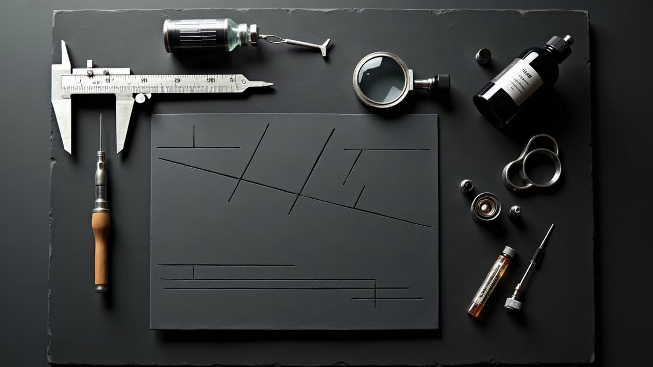
Crisp tattoos survive time because their linework is engineered for scale. Lines can look a hair thinner on stencil day, then read slightly thicker after healing, and they keep evolving with sun and movement. Building clarity starts with the right line hierarchy, needle grouping, and contrast plan, then it is protected by smart aftercare. Get those choices right and your design stays legible on a wrist at 2 inches or on a shoulder at 8 inches.
Start With Line Hierarchy, Not Just Thin or Thick
Think in layers. A clean tattoo reads because the eye locks onto primary lines, then drifts into secondary contours, and finally notices micro detail. If everything is the same weight, nothing is emphatic. For small pieces, exaggerate hierarchy so the tattoo stays readable when it shrinks in photos or when viewed at a distance.
- Primary outlines for small tattoos: favor a bold 5RL–7RL or a 9RL if the design is under 2 inches and high contrast is needed.
- Secondary forms: 3RL–5RL keeps shape definition without overpowering the main silhouette.
- Micro texture and hatching: 1RL–3RL used sparingly, never as structural lines on high‑movement skin.
- Lettering baseline: anchor with a thicker spine than the hairlines, so script stays legible after healing.
Before you book, sanity check the silhouette from 6 feet away on screen. If the primary outline disappears, upscale the weight. If you are exploring options, use our design library and compare versions with thicker primary strokes to see how clarity changes.
Choose Needles and Machine Settings That Support Clean Lines
Crisp lines come from stable groupings and consistent hand speed. Common choices for clean outlines are 5RL or 7RL for most medium pieces, with 3RL for filigree accents. On very small tattoos, resist the urge to use a single needle as your main outline on mobile skin. It looks dainty for a week, then softens too much to anchor the composition.
- Power and speed: keep voltage steady so your hand speed matches the hit. Too slow causes blowout, too fast causes broken lines.
- Stretch: a firm three‑point stretch prevents buckling and wobble on curved or mobile areas.
- Ink flow: run a slightly wetter mix for long pulls, but avoid flooding thin skin like wrists and ankles.
- Cartridges: stick with reputable membranes to reduce ink backflow and maintain consistent stroke.
If you want to audit an artist’s line control before booking, study healed photos at 3–6 months. Our primer on assessing artist quality walks through what to look for in healed linework and spacing.
Design Line Joins, Corners, and Tapers Like Lettering
Bad corners fatten when healed. Treat joins like typography: avoid abrupt T‑junctions, build miters and tapers, and allow micro‑gaps where two heavy lines meet so capillary spread does not fuse shapes. Curves should breathe as they approach a join, then taper to a clean exit.
- Feather the end of a long contour with a 5–10 mm taper to avoid a blunt stop that looks like a dot later.
- Split heavy intersections into stepped overlaps so the viewer reads which line passes in front.
- Use negative slivers at tight inside corners to prevent fill‑in over time, especially on small geometrics.
- For hair and fur, stack staggered micro‑tapers instead of parallel hairs to avoid moiré and blur.
A clean join does more for long‑term clarity than any single needle size choice. Practice drawing joins at print scale, then zoom out to phone‑thumbnail size to verify they still read.
Place With Movement, Not Just Flat Anatomy
Lines wrap and stretch with life. Areas like wrists, elbows, knees, and ankles multiply tiny distortions. For micro tattoos on high‑motion zones, you need thicker primaries, fewer micro details, and a design that reads even when the skin bunches.
If you must place fine linework on a joint, rotate the stencil through the full range of motion and check for buckling. Reserve 1RL ornament for flatter planes like the forearm, upper arm, outer calf, or upper back. For pain planning and durability tradeoffs, see our pain chart guide.
Use Negative Space as a Line, Not Just Empty
Negative space can hold edges as powerfully as ink. A 1–2 mm buffer between dense lines creates air and keeps shapes from fusing. When designs are scaled down, those light channels become the reason your subject still reads as intended.
Build contrast around the silhouette, then let interior details float with strategic gaps. For composition drills and examples, skim our guide to creative negative space and test several silhouette‑first versions before adding texture.
- Carve light lanes between parallel hatching groups so they do not merge after healing.
- Float small icons in a halo of skin tone rather than locking them to heavy borders.
- Use spot blacks to frame a face or object instead of stacking more lines in tight zones.
Black vs Color Lines, UV, and Long‑Term Readability
Black lines age best because carbon pigment is dense and high‑contrast. Color lines are beautiful, but typically need heavier weight or a black understroke to survive distance and time. Sun exposure is the top clarity killer over years, regardless of ink color.
Dermatology sources note that tattoos heal over 2–4 weeks, and UV can accelerate fading and blur if unprotected. See the American Academy of Dermatology for sun‑safety basics and aftercare timelines (AAD overview). The Cleveland Clinic explains how over‑working skin or going too deep risks blowouts and muddy edges (Cleveland Clinic guidance). Healthline has an accessible explainer on tattoo blowouts you can skim before booking (Healthline explainer).
- For outdoor lifestyles, plan a SPF 30+ routine to protect contrast from day one.
- If choosing color lines, upsize to 5RL–7RL and support edges with spot blacks nearby.
- Reserve single‑needle color lines for art‑forward areas with low friction and low sun.
Healed Size Math: What Reads at 1.5, 3, and 6 Inches
Some features simply do not survive shrink. At 1.5–2 inches, aim for a bold silhouette, 3–4 interior shapes max, and eliminate tiny type. At 3–4 inches, secondary contours and light hatching start working. At 6+ inches, you can layer textures without muddying the form.
- 1.5–2 inches: 5RL–7RL primaries, minimal micro detail, high negative contrast.
- 3–4 inches: 3RL–5RL secondary lines and selective hatching become viable.
- 6+ inches: local texture with 1RL–3RL is safe if framed by bold anchors.
When in doubt, prototype variations on screen. Our AI prompt iteration tips show how to test alternate line hierarchies quickly, then use print‑to‑scale mockups before you commit.
Aftercare Habits That Keep Lines Crisp
Early aftercare decides a lot about edge quality. Over‑moisturizing can soften scabs and blur, while under‑moisturizing can crack lines. Use breathable, thin layers and avoid soaking. Healing usually sits around days 3–14 for flake and 2–4 weeks until the surface settles, but deeper layers keep remodeling for months.
Look for tattoo‑safe thin ointments or fragrance‑free lotions. Examples include Saniderm, Bepanthen, Aquaphor, Hustle Butter, and Mad Rabbit (non-sponsored examples). Follow your artist’s protocol and consult medical guidance when needed. For evidence‑based basics, the American Academy of Dermatology and Cleveland Clinic both offer practical healing advice. Track normal vs abnormal healing signs with our aftercare progress guide.
- Wash gently with lukewarm water and unscented soap, pat dry, then apply a rice‑grain thin layer of moisturizer.
- Skip swimming and long baths for 2 weeks, reduce friction from tight cuffs and straps.
- Use SPF 30+ on healed tattoos to preserve line contrast long term.
Safety, Allergies, and Why Line Clarity Is a Health Issue Too
Ink chemistry and skin response affect edge quality. Allergic reactions, over‑working, or contaminated inks can cause raised lines, scarring, or spreading that permanently changes clarity. The FDA provides consumer information on tattoo pigments and potential risks, including reactions that can alter texture and appearance (FDA tattoo inks safety overview). JAMA Dermatology regularly publishes studies on tattoo complications and healing variables you can browse if you want the deeper science (JAMA Dermatology).
If you have a history of contact allergies or keloiding, tell your artist up front. Choose simpler line maps with fewer dense intersections, avoid high‑movement placements, and consider a test dot. Clarity is not just aesthetic, it is about keeping the skin calm so lines heal flat and stay readable.
Prototype at Multiple Sizes Before You Tattoo
Design in layers, then test. Export your art with expanded strokes at 100 percent, 75 percent, and 50 percent. Print at real size, tape to the placement, and step back to 6–8 feet. If it does not read, adjust the primary weight, open more negative space, or reduce micro details.
Digital fittings save you from expensive reworks. Preview placements with our virtual try‑on, compare line hierarchies side by side, then confirm scale before sitting. For inspiration, browse styles and test variants from our Explore section until the silhouette feels bulletproof.
Ready to pressure‑test your linework for real clarity at any size? Use AI for Tattoo to generate variants with thicker primaries, cleaner joins, and smarter negative space, then try them on your body in minutes. Start with Create to iterate line maps, switch to Try‑On to check readability on placement, and walk into your appointment with confidence.
Try AI for Tattoo Free