
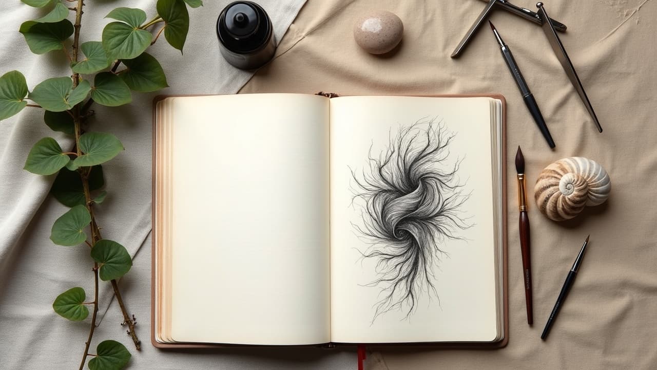
Bio-organic tattoos live or die on anatomical flow. If the forms fight your shoulder line or ignore the rhythm of your forearm extensor, the tattoo feels "stuck on" instead of grown in. The best pieces look like they were always there, a mesh of organic motifs, pores, tendons, and membranes that breathe with your movement. This guide maps the design elements that keep bio-organic work legible, dynamic, and coherent at every distance.
What Bio-Organic Means, Not Just Biomech
The bio-organic lane pulls from biology and abstraction, not just gears and pistons. Think bio-organic tattoos as sinew, cartilage, membranes, tendrils, chitin, and vascular textures arranged with deliberate design logic. It sits near biomechanical, but where biomech shows machine parts, bio-organic suggests life forms, coral reefs, fungal webs, and bone plates. Artists like Guy Aitchison, Aaron Cain, and Nick Baxter popularized the vocabulary: flowing sinew ribbons, veined tendrils, plated ridges, and soft tissue pockets that compress and expand around the body. The result is motion, harmony, and a believable visual coherence that wraps, climbs, and anchors to real anatomy.
- Common bio-organic motifs: sinew bands, membrane folds, bone plates, chitin ridges, tendril clusters, and pore fields that scale from macro shapes to micro texture.
- Visual DNA: S-curves and C-curves, layered plates, soft-to-hard transitions, and tendons that “tension” toward joints to imply pull and growth.
- Mood spectrum: from bioluminescent coral and soft tissue to carapace and spines. You can dial between serene growth and predatory armor, then keep the style consistent.
Map Flow To Your Body First
Start with anatomical flow. Your body already carries S-curves along the deltoid, spiral lines across the biceps, and long lanes down the ulna toward the wrist. Strong bio-organic compositions ride those vectors. I sketch motion lines on the body, then stack forms along them like river rock. Joints get compression forms, long muscles get ribboned sinew, and flat planes get membrane fields. The aim is predictive motion: when you flex, the tattoo should look like it tightens. When you rest, the negative pockets relax. This is how you get that living, breathing effect without literal realism.
- Trace anchors: clavicle sweep, deltoid cap, biceps spiral, inner forearm channel, hip crest to thigh sweep, calf gastrocnemius split. These are natural flow lanes for ribbon and plate elements.
- Articulation zones: elbow, wrist, knee, and ankle want compression forms and shadow pockets that read as hinge points rather than straight lines that snap when you bend.
- Breathing areas: ribs and obliques prefer membranes and soft gradients that can stretch without distorting crisp geometry or high-detail focal points.
Balance Organic Curves With Geometric Structure
Bio-organic is strongest when it has a spine. Adding restrained geometry gives scaffolding to your organic motifs so the chaos reads as intentional. Hex fields, isometric nets, or subtle radial grids can sit under or between tissue forms, like a ghost structure that the body grew over. Keep the geometry softened, partially eroded, or wrapped so it never flattens the body. This organic-versus-geometric tension is a proven way to add visual coherence and avoid mushy midtones. If you love this contrast, study our contrast techniques guide for scale and value pairing that keeps both sides legible.
- Use geometric underlays at low contrast, then surface sinew and plates at higher contrast to create depth without fighting the anatomy.
- Erode geometry with negative space fissures so shapes feel absorbed, not stickered on. Let tendrils break the grid in controlled spots.
- Bridge styles using bevel lighting and consistent light source so edges, whether organic or geometric, catch the same highlight logic.
Focal Points, Hierarchy, And Negative Space
Big bio-organic wins come from clear hierarchy. Choose one primary form per panel, then support it with mid-size elements and micro textures. The primary form, often a sinew cross, a bone plate, or a membrane bloom, should own the highest value contrast and cleanest edges. Everything else either points to it or frames it. This is also where negative space becomes a tool, not an accident. Skin breaks act like breathable valves and depth separators. Use them rhythmically, pushing busiest detail away from joints and stacking contrast where the eye lands first. For advanced use of empty space, see our negative space techniques.
- One primary focal per view, two secondary accents, then texture fields. This 1-2-10 ratio keeps read clarity at close and far distances.
- Reserve your crispest line weight and whitest highlights for the focal. Let peripheral forms soften so they support, not compete.
- Cut negative space lanes that follow your flow lines. They ventilate the design, prevent mud, and create depth without extra ink.
Line Weight, Texture, And Shading That Read From 6 Feet
Texture is vocabulary. Use line weight shifts to describe material, from soft tissue to carapace. Tapered 3RLs can make delicate tendrils, while broader 9RLs and 11Mags define plates and shadow shelves. Stippling, dotwork, and whip shading add pores and grain without over-inking. The goal is a texture stack that reads from 6 feet, then rewards close inspection. Hard edges should be strategic, not everywhere. Commit to a single light source, so your bevels and membranes agree on where highlights and drop shadows live. That unity makes complex surfaces believable even when they are abstract.
- Material cues: smooth membranes get soft gradients, chitin plates get chiseled edges and micro-nicks, sinew cords get tapered lines that suggest tension.
- Edge logic: reserve hard edges for silhouette and focal planes, keep internal transitions softer with pepper shading for roundness.
- Readability rule: if a patch looks noisy at arm’s length, simplify values, widen line weight, and let negative space separate layers.
Color Logic, Light, And Long-Term Legibility
Color can either unify or scatter a bio-organic piece. Start with a complementary palette or analogous trio, then assign temperatures by material: warm cores for soft tissue, cool rims for carapace edges. Keep your light source consistent so highlights and rim lights agree. For longevity, favor strong midtone anchors, not just delicate highlights. Sun care matters for saturation and crisp edges, and the American Academy of Dermatology notes that broad-spectrum SPF and moisturization support healthier-looking tattoos over time, see AAD guidance on tattoo aftercare. Ink selection and pigment safety are evolving topics, so review FDA information on tattoo inks and pigments if you have sensitivities. Placement also affects blowout risk and readability, covered in this Healthline overview of tattoo blowouts and placement. For value planning that keeps color from turning muddy, revisit our contrast techniques guide.
- Palettes that behave: blue-green-violet for bio-luminescent calm, or red-orange-teal for high color contrast with controlled complements.
- Healing support: light ointment early, breathable films like Saniderm, then SPF. Products like Aquaphor, Bepanthen, Hustle Butter, Mad Rabbit can help, non-sponsored examples.
- Evidence cues: monitor for unusual reactions and consult pros, as tattoo complications are documented across peer-reviewed sources like JAMA Dermatology.
Placement And Scale: Sleeves, Panels, And Wraps
Bio-organic thrives on wrap. Sleeves and back pieces let you stage big focal arcs with micro-texture runs in between. If you are starting small, plan panels that can grow in the same direction. Forearms love longitudinal sinew with plate breaks near the wrist and elbow. Thighs carry heavy plates and membrane fields without warping. Ribs reward patient shading and generous negative space for breathing room. Keep scale honest: tiny pores look great, but your big reads must be clear at social distance. Expect multi-session builds, often 15–30 hours, and stack sessions where your hierarchy makes sense.
- Forearm: fast read with strong S-curves. Use plate caps near the wrist, compress forms at the elbow for hinge logic.
- Upper arm and shoulder: ideal for a primary plate bloom that waterfalls into the biceps spiral, great stage for a sleeve anchor.
- Back and ribs: enormous canvas for membrane fields and void corridors. Save high-detail micro-texture for flatter zones.
Brief Your Artist With A Clear, Useful Vocabulary
The cleanest consults use design language, not just vibes. Come in with 3 to 5 references, then describe what you like in terms of flow, texture, edge quality, and focal hierarchy. Tell your artist which body lines to emphasize, which to avoid, and how bold you want the value contrast. If you want geometry in the mix, state it and specify whether it should sit underneath as scaffolding or surface as an accent. For structured prompt language that translates taste into visuals, see AI tattoo prompt strategies and prep for the meeting using our consultation guide.
- Flow request: “Follow the deltoid cap into an S-curve that lands a focal plate on the outer biceps, keep negative space lanes toward the inner arm.”
- Texture brief: “Hard chitin plates at the shoulder, softer membrane folds at the triceps, stippling pores near the elbow compression zone.”
- Geometry note: “Low-contrast hex underlay peeking through sinew, broken by tendrils, one crisp radial accent near the primary focal.”
Ready to audition ideas in minutes, not months of guesswork? Use AI for Tattoo to generate bio-organic studies you can iterate with your artist. Build flow on your actual body with virtual try-on, test color logic, and compare geometry blends before you book. Start a concept in the Create tool, then preview placement with Try On. Generate a bio-organic concept and see it on your body today.
Try AI for Tattoo Free