
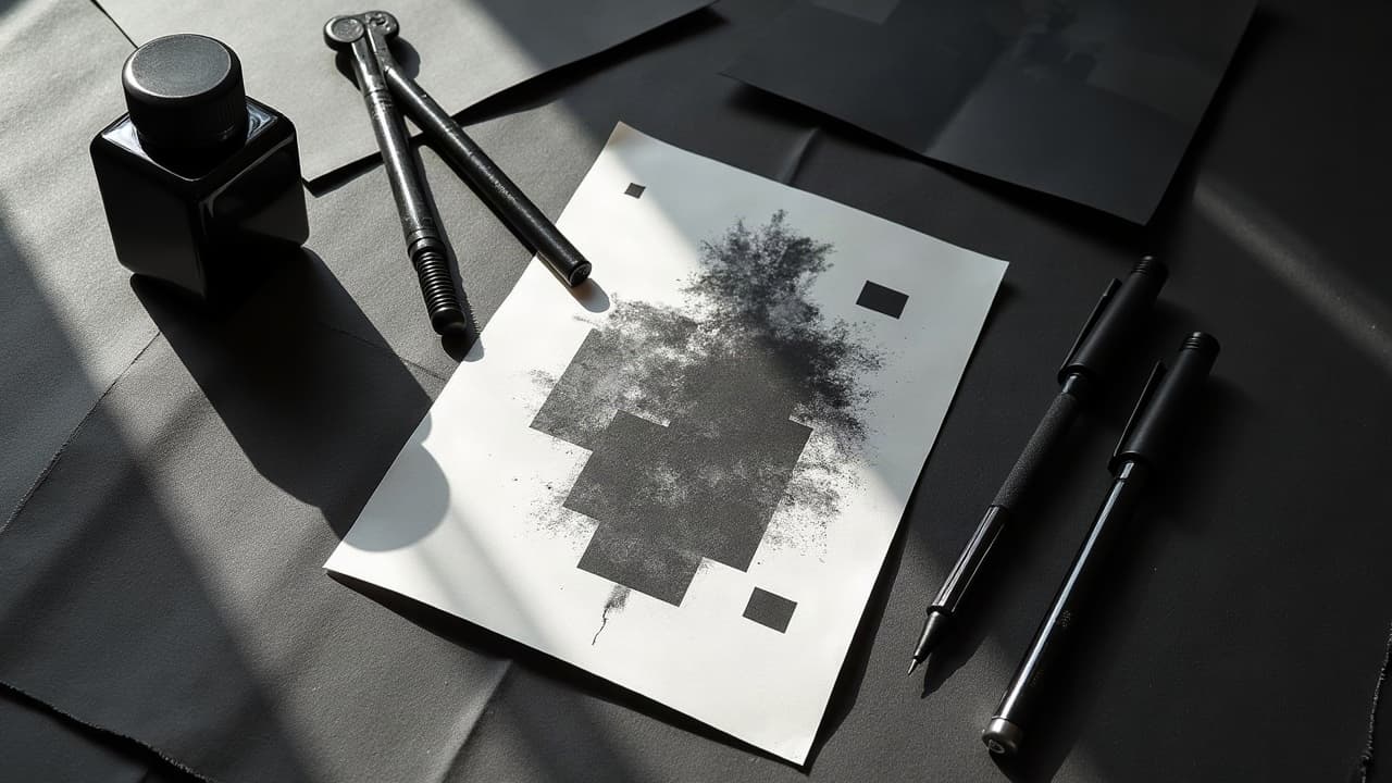
Blackwork rewards discipline. The difference between flat and jaw-dropping often comes down to a few controllable moves, like intentional line weight, clean negative space, and true solid black that stays black. You do not need tricks, you need a repeatable system that keeps contrast and depth consistent from stencil to finished piece.
Contrast is the Currency: Plan It Before You Ink
Start your design pass in grayscale, not color, and map your value hierarchy before you choose needles. Identify three buckets only: solid black, mid-texture, and open skin. This restriction keeps your blacks black and your highlights clean. Print the design at 50 percent, 100 percent, and 200 percent scale. If it reads at phone size and poster size, your contrast is doing the work. Mark your no-ink zones so you do not “accidentally” graywash your light source out of existence. Overfill is the enemy of depth in blackwork.
- Circle all negative space with a light pencil, then outline it with a faint broken line on stencil, a visual stop sign that prevents crowding.
- Group black masses into shapes larger than a quarter so they do not spot out or read as noise from 6–8 feet away.
- Lock a single light direction, typically top-left or top-right, and delete any shadows that fight that direction.
Line Weight: Build Depth With Strokes, Not Guesswork
In blackwork, line hierarchy sells depth before shading does. Use a thick-to-thin system: foreground outlines get bold 7–9/10 visual weight, midground sits 4–6/10, background detail lives 2–3/10 or disappears entirely. On skin, that often means pairing a 9RL or 11RS for primary silhouette, a 5RL for mid detail, and a 3RL for internal texture. Keep corners open by tapering into the turn to avoid ink bulge. If you are new to heavy lines, slow your hand speed slightly and reduce voltage a notch to let pigment seat clean without chatter.
- Silhouette edges: 9RL or 11RS, slow hand, deliberate pull, wipe often to ensure crisp edges.
- Secondary forms: 5RL, float 1 mm inside the silhouette so swelling does not merge lines.
- Detail texture: 3RL, lower stroke length and speed to avoid peppery tear-outs on thin skin.
Solid Black That Stays Black: Packing and Saturation Control
Depth dies when blacks heal patchy. Prioritize even saturation, not speed. Use a 9M or 11M for fields and a 7CM for curved zones. Work in small, overlapping ovals with minimal torque. Stretch the skin in three directions, slow your passes, then cross-pass at a 90-degree angle only where needed. Keep your bottle caps clean so you do not drag diluted ink into fields meant to be jet. For ink, industry-standard workhorses like Dynamic Black, Eternal Ink Maxx Black, and Panthera XXX deliver consistent density (non-sponsored examples).
- Pack toward the light source edge last, so you preserve the crisp negative border without soot bleed.
- Feather the edge with a single pass of 5M to avoid a mechanical, sticker-cut edge where softness is needed.
- Budget time realistically, a palm-size blackout takes 60–90 minutes if you want true saturation.
Negative Space: Your Brightest Ink Is Untouched Skin
Blackwork contrast depends on negative space treated like paint, not accident. Reserve highlights early and protect them at wipe time. Build shapes that interlock, think yin-yang rather than outline-only. If you must reclaim a highlight, do it with texture subtraction instead of erasing lines. Use dot density falloff or broken hatching to imply a soft edge and keep the skin pristine. Over time, healed skin is your highlight and your midtone, so leave more open skin than you think you need by about 10–15 percent.
Shading Without Graywash: Stipple, Whip, and Pattern Dithers
You can create convincing midtones in blackwork with texture, no diluted ink required. Stipple shading with a 3RL or 5RL gives you a predictable falloff, just keep your dot spacing consistent and your hand floating. Whip shading with a small magnum, flicking out of the black mass, gives a suede gradient that reads softly at distance. Pattern dithers like checker, herringbone, or broken crosshatch generate optical gray. The trick is scale. If your pattern is too small, it moires and muddies. Aim for repeat units of 3–5 mm on forearms, 5–8 mm on thighs.
- Dotwork gradients: increase needle height minutely and widen spacing every 5–10 mm to keep a natural fade.
- Whip from black into skin with a steady wrist hinge, not a shoulder pull, for consistent needle exit speeds.
- Break patterns at form turns, never wrap a uniform grid over a cylinder if you want believable depth.
Texture and Pattern Stacking: When to Add, When to Quit
Texture is seasoning. Use too little, your piece feels flat. Use too much, it turns to static. Pick one primary texture per region, not three. For botanical blackwork, combine solid silhouette, vein linework, and selective stipple only where form turns away from light. For geometric work, alternate solid fields with open lattices and reserve a full negative-space band to let the eye rest. Remember readability tests: if you squint and cannot find the subject in 2 seconds, reduce pattern density by 20 percent in the busiest quadrant.
Composition and Flow: Make It Read From Six Feet
Great blackwork follows the body. Anchor focal points on high-visibility planes, then let curves ride tendons and muscle lines. Use S-curves and C-curves to move the eye. Create contrast rhythm: black, rest, black, texture, rest. Photograph your stencil and flip it horizontally to check tangents and trapped shapes. For sleeves, vary motif scale, a 1:2:4 ratio of large, medium, small keeps rhythm. If you are covering old ink, plan your heavy black where you need concealment, then let negative space streaks break up the mass. For cover-specific tactics, see how to choose the right tattoo cover up techniques.
- Block in three focal masses first, then thread smaller connectors after you see the read from 6–8 feet.
- Keep elbows, knees, and armpits cleaner, swelling here can crush delicate patterns on heal.
- Use paneling, separate motifs with 3–6 mm gutters of skin to prevent visual mergers after swelling.
Skin Tone, Placement, and Longevity: Design for Real Life
Contrast is relative to skin tone and sun exposure. On deeper tones, prioritize larger negative shapes and clean silhouettes over micro texture. On high-movement zones like fingers, keep your minimum line weight heavier and avoid ultra-tight stipple. Protect your healed work from UV. The American Academy of Dermatology recommends broad-spectrum sunscreen and sun avoidance to reduce skin damage, which also helps tattoos maintain contrast, see AAD sun protection advice. Expect superficial healing in 10–21 days, with contrast “settling” by 6–8 weeks. Keep new tattoos out of direct sun and pools per Cleveland Clinic guidance on tattoo risks (Cleveland Clinic).
Tools That Help: Machines, Cartridges, and Aftercare
Good tools do not replace skill, but they reduce variables. For consistent black packing and crisp lines, reliable machines like Bishop Rotary Wand, FK Irons Flux, and Cheyenne SOL Nova paired with Cheyenne Craft or Kwadron cartridges provide predictable stroke and tip geometry (non-sponsored examples). Stock two blacks, a thinner for lining and a syrupy black for packing. Keep Saniderm or Derm Shield for clients who prefer a film-style heal, and classic ointments like Bepanthen or Aquaphor for traditional aftercare (non-sponsored examples). Educate clients on risks and pigment facts, the FDA overview of tattoo inks and pigments explains ingredients and regulatory status, see FDA tattoo ink information.
- Wipe discipline: use distilled water and witch hazel, avoid alcohol-heavy wipes that can irritate and blur your read.
- Glide sparingly near negative space, excess balm drags soot into highlights and fakes midtone during work.
- Check needles under loupe, a bent tine wrecks line weight control before you even start.
Pricing, Session Pacing, Pain, and Client Communication
Blackwork runs on time and patience. Dense fills and texture stacking add hours. Be transparent about rate and pacing. Typical studio pricing runs $150–$250 per hour in major cities. For heavy black packing, expect 2–4 hours per forearm panel. Pain varies by placement, but most clients rate solid packing 6–8/10 on bony or tendon-rich areas. Stage large projects to protect contrast, finish one region completely instead of sprinkling progress. Share aftercare basics in writing. For allergic reaction signs and what to do, point clients to reputable sources, including our aftercare guide for allergic reactions and medical overviews like JAMA Dermatology reports on tattoo reactions (JAMA Dermatology).
Design Smarter With References and Previews
Reference like a pro. Build a folder of blackwork masters, note how they handle foreground silhouettes and mid-textures. Test your motif at multiple scales on the body before you commit. If you are experimenting with abstract or unconventional motifs, prompt inspiration engines can help you escape ruts, see our AI tattoo prompts for unconventional styles. Then refine by hand, reduce textures, and lock your value map again. When in doubt, cut ink, not skin. Remember, in blackwork, restraint is a technique.
Preview how your blackwork contrast reads on real skin before you book. Use AI for Tattoo to generate concepts, place them on your body with the virtual try-on, and pressure-test line weight and negative space at multiple scales. Fine-tune composition in minutes, then take a confident, print-ready plan to your artist.
Try AI for Tattoo Free