
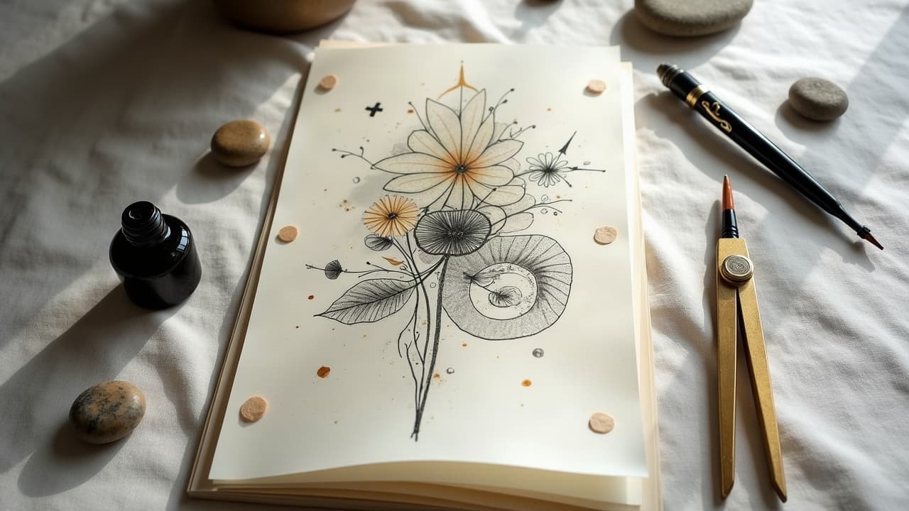
Great complex tattoos do not happen by accident. They read clearly at three distances -- across the room, at a handshake, and nose-close -- because the artist built them in layers with a defined story spine, value hierarchy, and body-driven flow. If you learn to stack themes intentionally, your piece will look composed, not crowded, even as it grows over years.
Build the story spine first, then add layers
Before sketching, write the tattoo like a logline. Who or what is the subject, where does it live, and what is the tension or change? Translate that into a primary motif (hero), supporting symbols (context), and environmental texture (mood). For a maritime narrative, the ship is hero, compass and rope are supports, waves and storm clouds set tone. Keep the backbone short and repeatable so you can check every element against it.
- Use a one-sentence brief: “A journey from chaos to clarity, guided by memory.” Keep it taped to your sketch so every add-on earns its spot.
- Assign roles: one hero element, two to three supporters, and a texture field. If you add a fourth supporter, demote something, or it will feel noisy.
- Pick a time cue. Sunrise to imply beginnings, moon phases for cycles, fall leaves for change. See our symbolism notes for nature motifs that read fast.
Narrative clarity matters for longevity too. High-contrast focal points withstand softening over time, while tiny equal-weight details merge. Dermatology voices, including the American Academy of Dermatology, routinely note that skin remodels and pigments settle with healing, so make your hierarchy unmistakable on day one.
Design in depth: foreground, midground, background
Depth is what keeps a complex design readable. Split your canvas into foreground, midground, and background planes. Give each plane its own scale, line weight, and value range. Foreground gets the boldest outlines and tightest detail. Midground supports with medium lines and simplified shapes. Background should be soft edges, open shading, and generous negative space to keep air in the piece.
- Foreground: thick line weight, high-contrast black, micro-textures in key zones only, about 60–70 percent black or deep color coverage around the focal.
- Midground: medium lines, broken contours, simplified forms, about 30–40 percent coverage with softer shading to avoid competing with the hero.
- Background: no outline or hairline only, broad gradients, stipple or whip shading, 20 percent or less coverage to preserve breathing room.
If you color, separate temperatures by plane. Warm in the foreground, cooler in the back, or vice versa. For more color-specific tactics, borrow from our color layering guide so chroma supports depth instead of flattening it.
Let anatomy drive the flow
Your story reads left to right or top to bottom depending on placement. Use tendons, muscle bellies, and bones like the clavicle as rails. Diagonals across the forearm, S-curves around the calf, and arcs over the shoulder cap keep the eye moving. Shape your visual flow so the hero sits at a natural resting point, like the outer upper arm or upper forearm, where people look first.
- Map three anchor points on the body, then connect them with a soft S-curve. Build motifs along that path so the piece never dead-ends visually.
- Use negative-space arrows. A wedge of skin tone pointing to your focal can do more than another drawn arrow or ribbon.
- Respect flexion. Avoid spanning high-motion folds with hard geometry that could warp. Health sources like the Cleveland Clinic note movement affects healing stress, so plan edges away from high-crease zones.
If your theme uses water, smoke, vines, or filigree, let those forms do the connective work. They function as transitions between planes and let you add chapters later without hard seams. For contrast concepts, see our piece on contrast and color influence.
Blend styles with line and edge rules
You can mix realism with geometric or neo-traditional with Japanese, as long as the edges agree. Pick one dominant edge language. If the hero is realism with soft edges, let geometric supports use dotwork or thin single-needle outlines, not heavy new-school lines that will shout. If the hero is graphic, keep realism as a low-detail cameo with lost-and-found edges so it recedes.
- Set a line-weight palette. For example: 9RL for hero contours, 5RL for mid details, 3RL for background hints. Consistency sells the mix.
- Choose one black strategy. If you deploy solid black fills, do it in the same plane across themes, or it will punch holes in your depth.
- Unify with texture. Stipple, crosshatch, or smooth pepper shading can be the shared fabric even when motifs differ.
If you are working across skin tones, remember that contrast is king. The Mayo Clinic and other medical resources emphasize melanin variation across individuals. On darker skin, prioritize larger shapes, higher value separation, and bolder edges so the layered story stays legible.
Color, value, and texture: build depth that lasts
Plan color like stage lighting. Use color temperature shifts to push or pull planes, and lock in value contrast first so the design reads in grayscale. Reserve saturated color for focal accents, not every object. Keep background temperatures unified and slightly grayed to avoid noise. Texture should taper with distance -- crisp pores and scales in foreground, dithered texture midground, implied texture in back.
Sun is the great equalizer, and it will flatten weak value maps. Routine medical sources like Healthline remind clients that UV accelerates fading. Build a value map with enough black and midtone so when color softens, the story still holds. Shield with SPF 30+ daily once healed to protect your narrative for the long haul.
Symbolic imagery without clutter
Symbols are your adjectives. They should be legible in silhouette and tied to the story spine. If your theme is resilience, maybe it is a koi changing to dragon, a sprouting seed, or a lighthouse. Choose three symbolic families max and repeat shapes at different scales rather than introducing new ones that dilute the message.
- Shape echoes: repeat triangles via mountains, shark fins, and compass needles to bind disparate motifs.
- Time markers: moon phases, an hourglass, tree rings, or rust textures can quietly imply cycles and age.
- Personal codes: initials in rope twists, dates in Roman numerals, or star positions tied to an anniversary. Hide, but do not crowd.
When symbols cross cultures, research respectfully. A good studio will source from reputable references and ask context questions. If you have allergies or sensitive skin, the FDA and AAD caution that pigments or adhesives can trigger reactions. Keep symbolic decals like gold leaf or metallic foils out of the plan unless your skin history supports it.
From stencil to needle: technical sequencing for layers
Technical order keeps layered themes clean. Stencil the main flow line, then the hero, then midground supports, and freehand background transitions last so they adapt to the body. Start tattooing with linework hierarchy first, then pack your deepest blacks, then midtones, then color. Work clean to keep planes from cross-contaminating.
- Prep with Stencil Stuff, Spirit Classic Transfer Paper, and a thin Hectograph pencil for freehand edits (non-sponsored examples).
- Use graywash sets to stage depth, from extra light to dark. Keep one needle grouping per plane to avoid muddy edges.
- Seal sessions with Hustle Butter or Aquaphor and a Saniderm-style bandage if appropriate, then brief the client on plane-specific aftercare intensity (non-sponsored examples).
Healing affects how layers settle. Medical guidance like the Cleveland Clinic’s aftercare overview and the American Academy of Dermatology put standard healing at roughly 10–14 days surface and several weeks beneath. Do not stack high-saturation color over fresh black in the same day if you want crisp separation later.
Plan sessions, budget, and pain windows for complex work
Narrative pieces take time. A half sleeve with three planes and color often runs 3–4 sessions of 3–5 hours each. Expect $800–$2,500 for black and gray, $1,200–$3,500 with color depending on studio and city. If you are building over years, decide the add-on roadmap early so each new chapter clicks into a reserved space.
- Session 1: flow line + hero linework + key blacks. Session 2: midground + background textures. Session 3: color accents. Session 4: polish + micro-contrast.
- Pain varies by placement, but layered sleeves average 4–7/10. Plan breaks. If you are sensitive, discuss numbing creams like TKTX and timing with your artist.
- Heal between sessions at least 2–4 weeks. Sources like the AAD emphasize full dermal recovery takes longer than skin looks, which protects crisp edges.
Budget time for concept feedback too. If you are experimenting with palettes or motifs, iterate with references, or use AI mockups to preview foreground dominance and flow before committing. It is cheaper to move a wave in a mockup than to laser out a rope later.
Test your narrative with thumbnails and try-ons
Make ten value thumbnails at postage-stamp size. If the story reads in black and white at one inch, it will sing at full scale. Then test on-body. Wrap a print on your arm or use digital try-on to see how curvature affects overlaps. Kill or demote anything that competes with the hero at five feet.
You can also rehearse color decisions digitally. Try warm-foreground cool-background, then flip it, and screenshot both. Reference our guide on color layering techniques to choose which scheme supports your theme and skin tone with the least risk.
Ready to stack your themes the smart way? Generate layered concepts with focal, mid, and background passes, then preview on your body. Use AI for Tattoo to create narrative-ready designs and try on placements so your story flows before a single line is permanent.
Try AI for Tattoo Free