
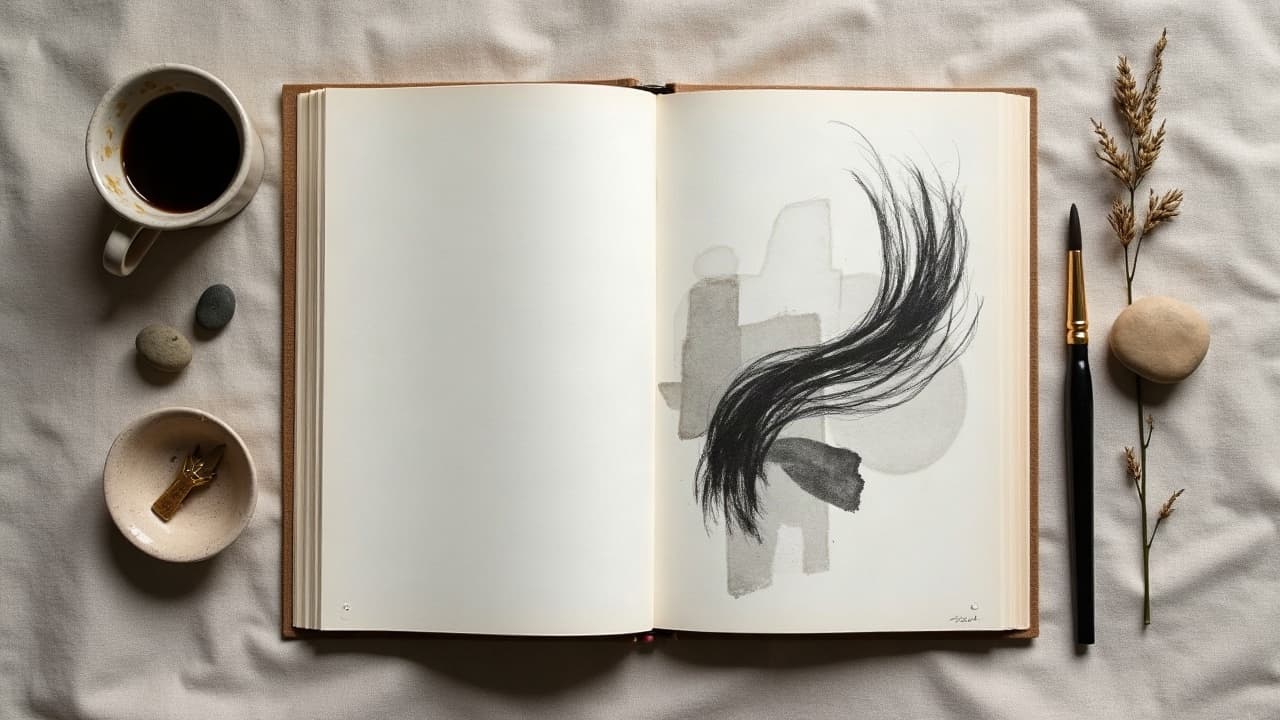
The strongest abstract tattoos pass the three-second test at six feet, they read immediately and still hold your story when someone looks closer. That happens when meaning, composition, and color are chosen with intention for your skin and placement, not just for a sketchbook page. As a studio lead, I treat abstract work like visual music, motifs and rhythm over lyrics. This guide breaks down how to build that song, from personal symbol mapping to ink choices that heal clean and stay readable for years.
How Abstract Tattoos Carry Meaning Without Literal Imagery
Meaning in abstract tattoos comes from relationships, not realism. A circle is calm until you slice it, a line is steady until you bend it, a blue wash is cool until you punch it with orange. I frame every abstract brief using four layers: motif (shapes and marks), gesture (direction and motion), structure (balance and weight), and palette (hue, value, saturation). Think of Chaim Machlev’s long line networks, they communicate continuity and discipline through disciplined flow, while loose brush textures suggest release or change. Your biography fits inside those decisions: grief as fractured geometry, growth as climbing arcs, a new city as interlocking grids. For clients who like words, I often translate a sentence into three design moves, one for each clause, then tune spacing and contrast until the piece reads in one breath.
Build Your Personal Symbol Library First
Before sketching, collect raw material. Abstract does not mean random. I ask clients for five nouns, five verbs, and five contradictions from their story. We convert those into shape families and movement cues. If your life feels split between order and impulse, the design might pair a precise lattice with chaotic ink flicks. If it is about endurance, we might stack repeated marks that climb the limb. Two fast exercises: 1) thumbnail 20 two-second shapes that match a feeling, 2) rank them by clarity on your planned body area. For extra clarity on intent, see our prompt psychology guide and how prompt flexibility adapts style.
- Translate five life themes into three visual levers each, one shape, one motion, one contrast. Keep the list lean to avoid visual noise on skin.
- Pull 8 to 12 reference images from art and architecture, not just tattoos. Kandinsky, Brutalism, textile weaves. Abstract reads stronger when sources are varied.
- Test symbols on tracing paper over a body photo. Shrink to 50 percent and step back 2 meters. If it muddies, simplify the mark or increase contrast.
- Note cultural meanings you do or do not want. A triangle can imply stability or hierarchy. Add or subtract context with orientation and repetition.
Composition For Skin, Not Canvas
Skin moves and has landmarks, so tattoo composition has to ride anatomy. I build around three anchors: a dominant flow line that follows the muscle, a counterbalance shape that locks the eye, and a breathing zone of negative space for readability. On limbs, run the main gesture with the bone line to lengthen and slim. Across ribs or hips, arc around the soft tissue so compression does not collapse the design. If you love symmetry, keep it flexible, bodies are near-symmetrical, not perfect. For tactics on mirror balance, see our piece on symmetrical techniques creating harmony.
- Forearm flow templates: long oblique lines from wrist to inner elbow, anchored by a weight at the proximal third for effortless read in daily gestures.
- Upper arm: stack vertical motifs between deltoid cap and biceps groove. Use a soft wrap at the rear to avoid a hard seam in selfies.
- Back and scapula: triangle of motion between spine, scapula border, and trapezius. Let the design breathe near the spine for healing comfort.
- Thigh to knee: descending arcs that rotate slightly medial to lateral. Keep high-contrast marks above mid-thigh to limit sun fade at shorts line.
Color Theory For Tattoos That Read On Your Skin
On skin, value contrast beats exotic hue every time. Mid-value reds on mid-brown skin will flatten, while deep burgundy against warm tan pops. For high-melanin skin, aim for high-value separation, saturated warms, and strategic black for edge clarity. For fair skin, cool desaturated grounds with a single hot accent read crisply. Always test with a 1 cm swatch before full commit. Want a deeper dive on how tones and undertones change color perception, see our guide for different skin tones. Sun is the great leveler, bright pigments shift faster than black, so design with UV exposure in mind. Health sources like Healthline on tattoo fading and sun exposure back what artists see daily, protective aftercare and SPF slow fade significantly.
- Two-ink power pairs: black plus vermilion, indigo plus mustard, forest plus bone white. Each uses value separation for legibility.
- Analogous calm sets for chest or back: blue–teal–green or rose–rust–sienna. Keep one dark anchor to avoid pastel washout.
- Fire and ice contrast: a cool ground wash with a hot micro-accent. Place the accent at the composition’s focal beat for story emphasis.
- Blackwork-first strategy: build the piece in black and gray, then add 10–20 percent color as punctuation. Easier long-term maintenance.
Line, Texture, and Technique Choices
Abstract designs shine when line and texture do the storytelling. For disciplined energy, use single-pass long lines with a rotary, then contrast with stippling or pepper shading for atmosphere. Want paint-like movement, add watercolor washes or dry-brush needle groupings for broken edges. On pain, most clients rate clean lines at 3–6/10, stipple at 4–7/10, and rib or sternum placements at 7–9/10. Heavier packing on solid color blocks demands slower passes, so budget more time and sensation. If you are considering numbing, products like TKTX exist, but always discuss timing and ingredients with your artist and review medical guidance from sources like the American Academy of Dermatology on skin reactions.
Translate Emotions Into Visual Grammar
Abstract is ideal for complex feelings that literal icons cannot hold. Map emotion to action. Restlessness becomes repeated marks that never quite align. Relief becomes a heavy block dissolving into soft fog. Commitment becomes a line that travels the limb without breaking. I often run narrative in three beats, tension, pivot, resolution. Tension sits near a joint where movement keeps the eye circling. The pivot is a sharp directional change. Resolution is a calmer field where marks open and negative space expands. If you journal, bring three sentences that summarize the chapter of life you want inked. We will convert clauses into shape motifs and choose one color accent that marks the turning point.
Placement, Scale, Sessions, and Longevity
Placement decides readability and aging. Areas with stable skin thickness, outer arm and calf, hold edges longer. High-motion or high-sun zones blur and fade faster. Small abstract details below 1.5 mm can soften within a year. Plan scale to survive time, not just the mirror today. Costs for custom abstract vary by market, but as a working range expect $150–$600 for small to medium pieces, and $1,800–$4,000 for multi-session work by sought-after artists. Healing is typically 10–14 days for surface closure and 4–6 weeks for full settle. Evidence-based aftercare matters, sources like Cleveland Clinic guidance outline infection signs and when to seek care. Sun accelerates fading, as noted by Healthline on tattoo fading and sun exposure, so plan SPF and wardrobe around your design’s future.
- Session planning: abstract linework sleeves usually take 2–4 sessions of 2–5 hours. Add time for color packing and texture.
- Cost control: reserve 70–80 percent of the budget for the main composition, then add accent modules later without rushing the core.
- Longevity tips: avoid micro-details on hands or feet, shift contrast upward, and place focal elements away from high-crease zones.
Workflow: From Concepts to Stencil to Skin
I run a three-phase workflow. Phase 1, discovery and symbol mapping with thumbnails. Phase 2, body mockups on photos or a quick virtual try-on to check flow in everyday posture. Phase 3, stencil and freehand blend so the design hugs anatomy. Digital tools like Procreate help isolate value and scale checks. In studio, I often freehand the main gesture with skin-safe markers, then apply a light stencil for anchors. That hybrid method keeps spontaneity without losing structure. If you are still deciding between directions, our platform’s AI previews can accelerate iteration so you show up for your appointment already aligned on shapes and palette.
Ink Safety, Allergies, and Aftercare That Protects Color
Abstract often uses saturated color and larger fields, so safety and healing are non-negotiable. The FDA notes that tattoo inks and pigments are not formally approved for injection and composition varies by brand, read their overview at the FDA on tattoo inks. The AAD reports that allergic reactions occur more often with certain reds, so patch testing small accents is smart, see AAD guidance on tattoo risks. Keep aftercare simple and consistent: wash gently, moisturize thinly, avoid heavy sun and soaking. Good barrier films like Saniderm, and ointments like Bepanthen, Aquaphor, Hustle Butter, or Mad Rabbit (non-sponsored examples) help many clients, but apply sparingly. If redness spreads or you develop fever, follow clinical advice from sources like Cleveland Clinic guidance.
- Aftercare kit: fragrance-free soap, a thin-layer moisturizer, and a sterile film for 24–48 hours if your artist recommends it.
- Healing windows: expect peeling at days 3–7, itch from days 4–10, and color clarity improving over weeks 3–6 with SPF on healed skin.
- Product check: look for ingredient lists you understand and avoid new products during healing to reduce contact dermatitis risk.
Inspiration Sources That Age Well
Abstract references that translate to skin usually share two traits, clear value structure and rhythmic repetition. Study architectural shadows, textile patterns, and mid-century printmaking. Look at how artists like Chaim Machlev or painters like Agnes Martin build tension from restraint. When in doubt, reduce the number of voices in your design. Two or three technique families perform better over time than a kitchen sink of effects. If you are building a cohesive set for future additions, keep a limited palette and a stable direction line so every new piece clicks into the same visual sentence. For minimalist tactics that double as abstract discipline, see our guide on why less is more.
Ready to see your abstract story on skin before you book time, Generate concepts with AI for Tattoo, then preview placement with real-scale virtual try-on. Start with Create, test placements in Try-On, and browse live style references in Explore.
Try AI for Tattoo Free