
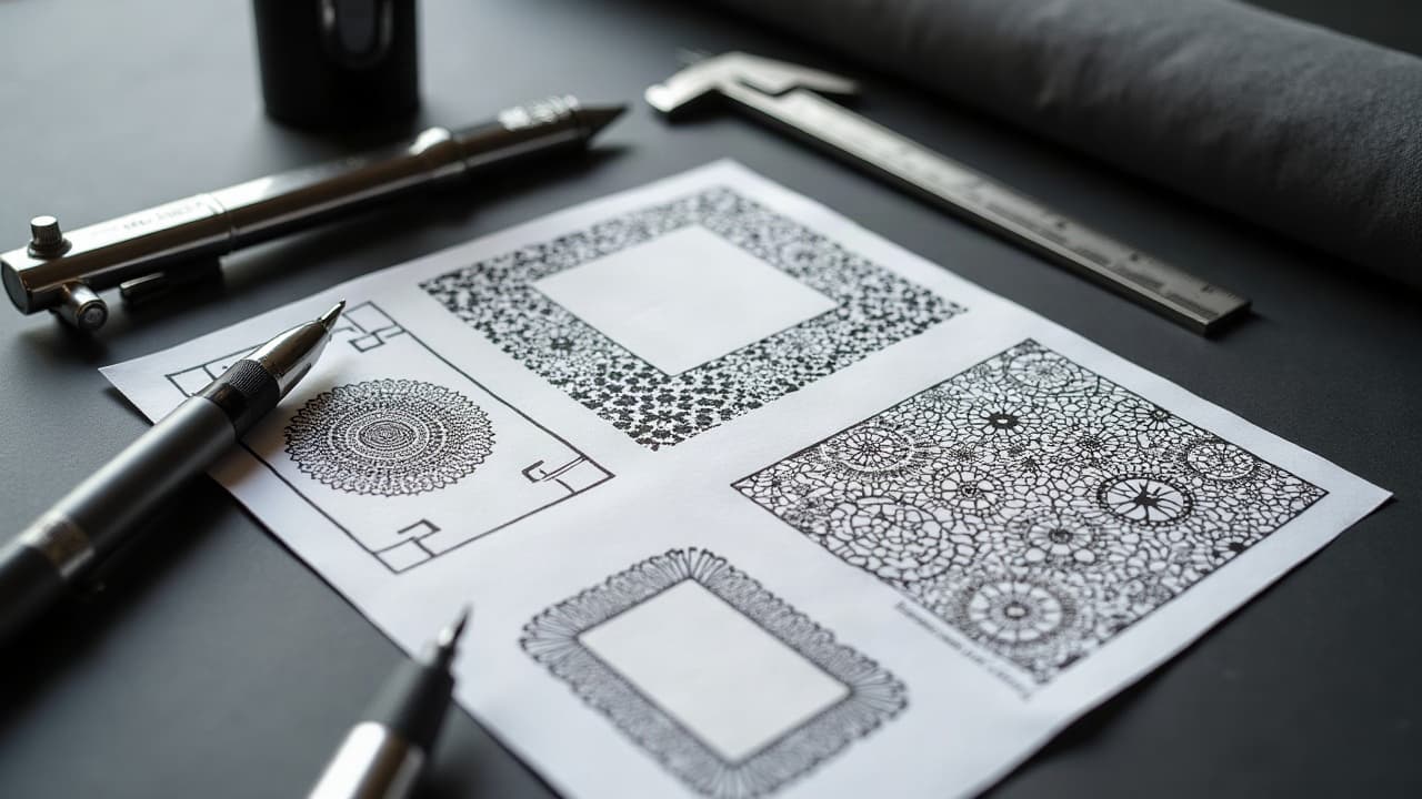
Most AI tattoo prompt misfires come from three fixable gaps, not model quality. If you speak a style dialect the model recognizes, add clear constraints, and pair it with a tight reference, you get usable concepts fast. This guide shows the prompt language that consistently returns tattooable designs, not just pretty images.
What “prompt language” means in tattoo design
A prompt language is shared shorthand. You feed the model concise tokens for subject, style, composition, and constraints, and it predicts an image that fits those tokens. For tattoos, your vocabulary should emphasize line weight, contrast, and readability at size. Treat prompts like a spec sheet, not poetry.
- Core fields to include: subject, style tags, composition, linework and shading method, color plan, placement scale, negative prompts, and render constraints like aspect ratio or seed.
- Keep sentences short. Use comma-separated tokens for key traits, then full sentences only when nuance is required.
- Front-load must-haves. The first 8–12 tokens carry the most weight, so lead with style and composition before adjectives.
- Use one primary style and at most 2 secondary anchors to avoid stylistic soup that muddies edges and proportions.
- Define tattoo intent explicitly, for example “tattoo flash, clean outline, high contrast” to bias away from busy backgrounds.
Style taxonomy, speak the dialect the model understands
Models trained on art tags respond best to well known tattoo styles. Name the lane and add synonyms the dataset likely saw. Anchor with two or three crisp style tokens, then refine with technique terms the studio uses every day.
- Reliable base styles: American traditional, neo-traditional, Japanese Irezumi, blackwork, Chicano script, microrealism, illustrative, tribal/Polynesian, ornamental/mandala, watercolor.
- Useful synonym stacks: engraving, etching, woodcut for line texture, or posterized, vector, graphic for flat color shapes.
- Technique anchors: single-needle, whip shading, stipple shading, dotwork, bold outline, negative space.
- Model-friendly product tags: Stable Diffusion, Midjourney, DALL·E usually parse plain English, but clear style tokens still outperform adjectives (non-sponsored examples).
- If you mix styles, set weights: “neo-traditional 0.7, engraving 0.3” or “neo-traditional::1.4, engraving::0.6” to preserve hierarchy.
Composition, layout, and placement terms that steer results
Tattoo viability rides on shape and flow. Call your macro composition and view angle so the model frames the subject for the body. When you mention placement, do it in design terms, not anatomy lectures.
- Directional cues: left-facing, right-facing, profile, 3/4 view, top-down, isometric, so the subject points the way your limb moves.
- Framing tokens: full figure, bust, close crop, silhouette, floating subject, no background, to keep detail where it matters.
- Flow words: wraparound, vertical stack, diagonal flow, S-curve, radial symmetry, which echo forearm, calf, and back shapes.
- Scale and canvas: forearm panel 8–12 cm, upper arm cap, spine column, ankle micro, or backpiece, to stop the model from overloading micro work.
- Output guardrails: centered composition, balanced negative space, clear outer contour, no frame, which later ease stencil making.
Linework, shading, and texture keywords the model respects
If you do not specify line weight and shading method, models tend to chase photoreal pores and hair. Direct them to tattoo language. Name the needle vibe, the black-to-skin ratio, and how texture should be built.
- Linework clarity: bold outline 6–8 pt look, clean contour, minimal inner micro-lines, no hair strands on small formats.
- Shading direction: stipple shading, dotwork gradient, whip shading, soft black and grey, minimal crosshatch unless you want an engraving look.
- Texture swaps: engraving lines instead of pores, halftone dots instead of photographic grain, hatching where value needs to move.
- Edge control: crisp edges, no glow, hard silhouette, to prevent fuzzy stencil edges at small sizes.
- Tattoo intent anchor: flash sheet style, high contrast, stencil-friendly, which cuts realistic clutter before it starts.
Color language, black and grey, and how designs age
Models love saturated color. Skin does not always return the favor. If you care about longevity, constrain the palette and call contrast moves clearly. For black and grey, ask for rich midtones and solid blacks, not just desaturation.
- Palette tokens: limited palette 3–5 colors, muted earth tones, high contrast complementary, or monochrome with accent red.
- Aging cues: avoid tiny color gradients, large color blocks, thick color borders, to hold over 4–6 years of wear.
- Black and grey specifics: smooth midtone ramps, solid packing, no smoky haze, highlight reserves, which print clean on skin.
- Longevity reality check: reputable sources note that aftercare and pigment choice affect outcomes. See Cleveland Clinic on tattoo aftercare and risks and Healthline on tattoo ink and fading.
- Allergy caution: red pigments can trigger more reactions than other hues per American Academy of Dermatology guidance on tattoo reactions. If you plan red accents, keep areas larger and simpler.
Photoreal vs graphic, controlling detail and abstraction
Tell the model how far from photography to aim. For small tattoos, pushing toward graphic simplification keeps details legible. For medium to large, define where detail lives and where it fades. Weighted syntax helps balance.
- Detail level tokens: hyperreal, microrealism, illustrative, posterized, vector, flat shading, limited texture.
- Density control: “face detail high, garment simplified” or “primary subject high detail, background minimal linework” to force focus.
- Weight syntax options: keyword::1.4 in some UIs, or (keyword:1.4) in others. Keep ranges modest 0.6–1.6 to avoid warping.
- Abstraction guards: no photoreal pores, no cinematic bloom, no gritty film grain, to keep the stencil readable.
- Output specs: high contrast edges, defined light source, separation from background, which reduces mush when shrunk.
Negative prompts, weights, and seeds that stop chaos
Negative prompts tell the model what not to do. It is the fastest path to cleaner stencils. Pair them with prompt weights and a seed so you can iterate without losing the good parts.
- Common negatives: no background, no text, no watermark, no floating particles, no excessive micro-lines, no watercolor drips.
- Anatomy control: correct hands, symmetrical eyes, no extra fingers, or “face not distorted” when you must include portraits.
- Surface and printability: no soft glow, no fog, no film grain, no JPEG artifacts, which blur stencils.
- Seed for versioning: set a seed to lock composition, then adjust weights to nudge style and color without rerolling chaos.
- Sample format: “neo-traditional fox, diagonal flow, bold outline, stipple shading, limited palette orange and teal, no background, no text, seed 123, aspect 2:3, tattoo flash look.”
Reference images, ControlNets, and LoRAs used well
A strong reference image does more than any adjective list. When your tool supports conditioning, align edges or poses with ControlNet types like canny, depth, or pose. For niche styles, a small LoRA can bias results without flooding detail.
- Clean refs: upload line art silhouettes, pose photos, or flat-color icons that telegraph shape, not noise.
- Control helpers: canny edge to keep contours, depth map to stabilize volumes, openpose to lock limbs. Use light guidance 0.3–0.6 so creativity remains.
- Style boosters: LoRA trained on 20–200 images can push toward engraving, chicano script, or specific florals. Keep the weight modest 0.6–0.9.
- Interrogation: Tools like CLIP Interrogator, BLIP, or wd14 tagger can extract tags from your ref to seed prompts (non-sponsored examples).
- Respect IP: use your own photos, public domain, or licensed assets. See the U.S. Copyright Office fair use overview for boundaries.
Prompt templates you can steal and bend
Templates front-load the heavy lifting. Swap nouns, colors, and weights, then lock a seed to iterate. Keep tokens short, pin the style, and add negative prompts that match your stencil standards.
- Neo-traditional animal: “neo-traditional fox head, bold outline, stipple shading, limited palette orange teal cream, diagonal flow, no background, no text, high contrast, seed 321, 2:3 aspect, tattoo flash.”
- Blackwork botanical: “blackwork fern and poppy, engraving lines, dotwork shadows, vertical stack, clear outer contour, balanced negative space, no watercolor, no soft glow, seed 77, 3:4 aspect.”
- Microrealism portrait: “microrealism sparrow, soft black and grey, highlight reserves, close crop, face detail high, feathers simplified, no film grain, no background, seed 905, 1:1 aspect.”
- Ornamental forearm: “ornamental mandala, radial symmetry, bold and fine line mix, wraparound hint, limited palette gold and black, no frame, stencil-friendly, seed 456, 9:16 aspect.”
- Chicano script name: “Chicano script, high contrast, thick-to-thin strokes, drop shadow stipple, horizontal flow, no extra flourishes, no background, seed 14, 5:2 aspect, tattoo lettering.”
From prompt to skin, sanity checks before booking
Even a perfect concept needs a tattoo reality check. Scale kills detail first. Fast rule, tiny pieces want bold outer contours and simple fills. Medium pieces tolerate stipple gradients and engraving texture, large pieces handle micro-details and soft transitions. Confirm line economy and contrast before you fall in love with pixels.
- Run a print test at 200–300 dpi at real size. If edges melt, remove micro-lines or convert detail to dotwork.
- Audit contrast in grayscale. Push solid blacks and clear highlight reserves so it reads at 2 meters and 20 centimeters.
- If your design depends on red accents, remember AAD notes higher reaction risk. See American Academy of Dermatology guidance on tattoo reactions.
- Mind safety and pigment facts. The FDA notes tattoo inks are not FDA approved for injection. See FDA information on tattoo inks and pigments.
- Healing affects results, and surface healing typically lands in 10–14 days, full settle about 4–6 weeks per consumer health guidance like Healthline on tattoo ink and fading.
Iterating with intent, not luck
Lock what works, vary one lever, and keep notes. Iterate seed by seed, not total rerolls. Use negative prompts to prune noise. Shift weights in small steps. And always convert the winning image into a clear line-focused proof before calling the design done.
- Pick a winner and change a single control, like style weight or palette. Track results with filenames or a simple spreadsheet.
- Use seed to keep composition. Vary weights and negatives to clean texture while keeping pose and framing.
- Before you render another grid, run a quick stencil simulation by thresholding to black and white to check read.
- When details stall, revisit fundamentals. See our prompt tuning guide and these generation and iteration techniques.
- If line clarity is the blocker, review tattoo linework techniques for visual clarity for what survives on skin.
Ready to speak fluent prompt and see it on skin? Generate a concept with AI for Tattoo, then lock a seed and fine tune negatives. When you love the result, use our Create flow and instant Try-On to preview placement and scale before you book.
Try AI for Tattoo Free