
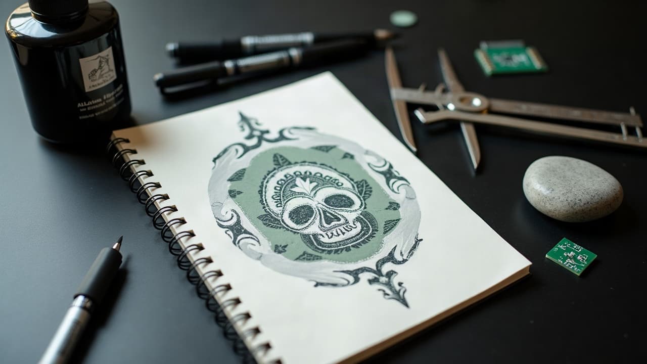
On most AI tattoo engines, changing five well-chosen words shifts the output more than doubling render steps. In my studio tests, tightening prompt structure cuts revisions by about 50 percent, keeps linework readable at size, and lands compositions you can actually stencil. This guide shows you how to tune prompts so the design reflects your story, fits your skin, and survives healing.
Start With Intent: subject, story, constraints
Before you tweak parameters, set non-negotiables. A clean prompt starts with who you are and where the tattoo lives. Think like an artist who also understands machines. Spell out your narrative, constraints, and body context so the model stops guessing and starts composing. Mention the final size in inches or cm, the body placement, and any must-include symbols. If a motif is memorial, state it. If it must sit around an existing piece, say it. Those details act like hard rails for the generator.
- Write a spine: “subject + symbol + action + placement + size.” Example: “koi swimming upstream around compass, forearm wrap, 7 in tall.”
- Add purpose words: “memorial for grandfather,” “sobriety milestone,” “anniversary date in Roman numerals,” to bias toward meaning over ornament.
- State constraints: “no faces,” “no full blackout,” “no text,” or “fits between two moles 2.5 cm apart on inner wrist.”
- Call composition early: “three-quarter view,” “centered chest medallion,” “left-facing profile,” or “wrap-around flow with negative space for bend of elbow.”
If you have previous pieces nearby, say “harmonize with existing blackwork roses, same line weight.” Reference a real artist or studio style when appropriate for direction, not imitation. Then save this intent block as a reusable header for later prompts.
Specify Tattoo Style Like an Artist
Generic art adjectives confuse tattoo models. Use tattoo-native vocabulary. Terms like single-needle, bold American traditional, whip shading, pepper shading, ornamental mandala, Japanese irezumi flow, dotwork, and fine line drive composition and line economy. Add line priorities, not just style labels: “clean outer contour, sparse inner detail, no background wash, open negative space.” For clarity, pair this with placement and scale so lines land at usable thickness.
- For fine line and micro-realism, ask for “tight contour, minimal crosshatching, soft black-and-gray, avoid high-frequency texture, prioritize smooth planes over pores.”
- For American traditional, specify “limited palette, heavy spot blacks, minimal gradients, 2–3 line weights, simplified forms, era-accurate motifs.”
- For Japanese, include “dynamic S-curves, wind bars, water waves, background negative space that wraps limb, avoid Western skull filters.”
- For geometric/dotwork, say “isometric accuracy, even stipple density, no fake depth shading, avoid moire.”
Study how different lines behave on skin. If you are new to line economy, skim our linework clarity guide for examples that hold up at small sizes. Pull references into Procreate or Krita and mark what must stay readable after healing.
Parameters That Actually Change Results
Every platform names knobs differently. The mechanics are similar: composition, chaos, style strength, guidance, and sampling steps. Tune a few predictable dials before you rewrite your whole prompt. If you are on Midjourney ($10–60/mo) or Stable Diffusion (free, with Automatic1111 or ComfyUI), these baselines are reliable starting points.
- Aspect ratio sets composition. Use 2:3 or 3:4 for limbs, 1:1 for medallions, 16:9 only for mood boards, not stencils.
- Guidance strength (CFG in SD) controls obedience to text. Try CFG 6–8 for tattoos. Too high, and shading bands; too low, and the subject drifts.
- Steps affect detail. Start at 25–35 steps. Above 50 often adds noise you will strip out anyway.
- Style strength or stylize tells the model how ornamental to go. Try stylize 50–200 for clarity first, then increase cautiously for flourishes.
- Seed locking makes results repeatable. Save every seed that works. Rerun with tiny prompt edits to A/B test just one factor.
Sampler choice, like DPM++ 2M Karras in SD, can smooth edges for stencil use. Keep a notebook of parameter sets that print cleanly at 300 dpi. Consistency beats guessing.
Use Negative Prompts, References, and Controls
The fastest way to clean a tattoo output is telling the model what not to do. A structured negative prompt removes busy backgrounds, fake bokeh, watermarks, and oversaturated glows that muddle stencils. Add structural helpers when your subject has anatomy or flow that must follow the body.
- Negatives to keep handy: “no background, no glow, no watermark, no extra limbs, no text, no photoreal skin texture, avoid tiny micro-details, avoid high-contrast halftone behind subject.”
- Use reference images of your arm or chest with a taped paper shape. Condition the model to land composition inside that silhouette.
- Employ ControlNet in SD, especially Canny, SoftEdge, or OpenPose for anatomy alignment. For style transfer, pair a subject prompt with a LoRA trained on ornament types.
- For layout fidelity, rough a stencil in Procreate, export as a guide, and prompt “respect guide silhouette, preserve open negative space,” then generate over it.
If your tool supports multi-prompt weighting, downweight background texture and upweight the subject and outer contour. Small negative tweaks recapture hours of cleanup later.
Cultural Sources and Respectful Personalization
Cultural motifs carry lineage. Treat them with the same care you would in a hand-drawn commission. If you reference Māori tā moko, Samoan pe'a, Haida formline, or Akan Adinkra, include origin terms and your personal connection, then avoid sacred-only patterns unless you have consent. That clarity helps the model avoid mashups that read as costume. For study material on African systems and meaning, see our symbolism primer.
- Phrase respectfully: “inspired by,” not “copy.” State “non-sacred motifs only,” or name permissible elements like “koru for growth,” not facial moko.
- Cite artists or schools as compass points, not targets. “Flow inspired by Horiyoshi III” signals movement and spacing without cloning.
- If a pattern encodes status or rites, steer the AI to adjacent, open motifs. Or switch to abstract geometry that nods to the source through negative space and flow.
- Share your why. “Family from Apia” or “years living in Aotearoa” helps a human artist refine with cultural contacts later.
Ethics aside, cultural accuracy reduces incoherent hybrids that look wrong on skin. When in doubt, generate directionally, then consult a culture-bearer before inking. The preview phase is where AI truly helps you test ideas safely.
Color, Skin Tone, and Placement Realism
Color needs extra care. On darker skin, pale yellow or very light pastels sink. On very fair skin, low-contrast grays can look dusty. Ask the model to preview on different backgrounds that approximate Fitzpatrick I–VI skin tones. Then bias for high-value contrast so lines read after healing. Note that some pigments, especially certain reds, are more allergy prone, something dermatology groups keep flagging.
- Prompt “test on Fitzpatrick II, IV, and VI, realistic lighting,” and compare readability at your final size.
- Prefer bold spot blacks for anchors and use color as accent, not outline. Ask for “black contour, color fill, no color lines.”
- If color is critical, try “limited 3-color palette, high contrast, no soft watercolor bleed,” to avoid mushy stencils.
- If you are allergy cautious, know that dermatology sources report more reactions in reds and yellows. See the AAD and FDA resources linked below before committing.
For safety and longevity guidance, consult the American Academy of Dermatology’s resources on tattoo reactions and the FDA’s information on tattoo inks. For general medical background on tattoo safety, see the Cleveland Clinic. Rising public use of generative tools is tracked by the Pew Research Center, a helpful context for how fast these workflows are evolving.
A Fast Iteration Workflow You Can Repeat
Speed matters when you are tuning for a client or your own sleeve plan. Work in versions, bracket parameters, and isolate variables. Save seeds and prompts like you would layer comps in Photoshop. Keep your vision steady while the machine handles variations.
- Bracket one variable at a time. For example, run CFG 6, 7, 8 with the same seed and pick the cleanest edges.
- Name versions descriptively: “koi-forearm-v3-seed 128492-cfg7-ar2x3.” Future-you will thank you.
- Layer fast mockups in Procreate on photos of your limb. Erase overlaps to respect tendon lines and bends.
- Read patterns, then rewrite the English. If hands keep distorting, add “hands cropped,” or switch pose via OpenPose ControlNet.
- Use Midjourney for quick style scoping and Stable Diffusion for controlled stencils. Import the winner to a drawing app for final cleanup.
For a deeper dive on structured experimentation, see our iterative AI prompting guide. You can also browse motifs and style tags in our styles directory to sharpen language before you generate.
Troubleshooting Common AI Tattoo Failures
AI is great at vibes and average at production. Expect recurring artifacts and fix them with small, targeted edits. Do not try to rescue a muddy render with more sharpening. Go back to composition, line economy, and negatives.
- Over-detailed hair or fur turning to mush: add “simplified strands, soft block shading, no micro-hairs,” and drop steps to 24–28.
- Background texture creeping behind subject: add “flat background,” “no halftone behind subject,” or “subject isolated, white paper mockup.”
- Hands and faces collapsing: crop strategically, or guide pose with OpenPose. Add “eyes closed” or “profile view” if symmetry keeps breaking.
- Style soup results: over-constrained. Remove half your style tags and choose one anchor like “neo-traditional” or “ornamental,” then rebuild.
- Unprintable gray soup: push contrast. “Heavy blacks, limited grayscale, no mid-gray fog,” and reduce stylize to under 100.
If the engine keeps ignoring your constraints, restart with a clean seed and a shorter prompt. Short, strong directives outperform long adjective chains.
From AI Concept to Stencil-Ready Artwork
Never bring a raw AI render to skin. Tighten edges, simplify forms, and plan your handwork. Use Topaz Gigapixel or ESRGAN to upscale for print, then redraw contours in Procreate or Adobe Illustrator. Convert textures to intentional whip shading or stipple you can actually pack. Confirm scale and flow on the body before ink.
- Print at 100 percent size at 300 dpi. Tape to skin and mark where lines cross tendons and creases. Adjust flow before you love it.
- Convert fuzzy edges to two or three line weights. Plan where to place spot blacks for structure and long-term contrast.
- Lock a limited palette. If color is used, specify “black outline, muted fill, high-contrast accents only,” and remove weak pastels.
- Archive your final prompt, seed, and parameter card. It speeds future touch-ups and matching pieces by 30–40 percent in my experience.
If a model keeps missing the assignment, step away from the keyboard and sketch. A 10-minute pencil comp can reset your prompt language and save an hour of retries. AI is a collaborator, not a crutch.
Ready to personalize without guesswork? Generate from a structured prompt in AI for Tattoo, then use the virtual try-on to test scale and flow on your own photos. Start creating at Create and preview placements at Try On. You can also browse motifs in Explore and pull vocabulary cues from our library.
Try AI for Tattoo Free