
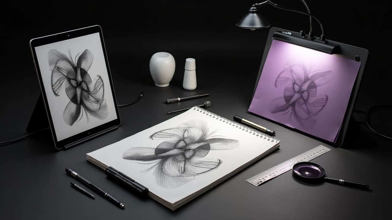
Tattoo ink sits in the dermis about 1–2 mm below the surface, which is why ultra-fine AI linework often needs upsizing to survive real skin. Dermatologists at the American Academy of Dermatology note that tattoos live in the dermis, not the epidermis, so designs must account for healing and gradual softening over time. That screen-perfect 1-pixel whisker will not hold as a 3RL line. If your AI concept collapses at the stencil phase, the missing link is visualization. Pair prompt discipline with body-aware composition, and you turn a cool image into wearable art that reads from three feet, flows with anatomy, and ages with dignity.
Why Screen-Perfect AI Images Fail on Skin
AI excels at making compelling images on a flat canvas, but the body is curved, mobile, textured, and alive. Designs must withstand motion, sun, and scar tissue, plus the realities of pigment spread. Medical sources like Cleveland Clinic dermatology guidance also warn that certain pigments, especially reds, can trigger reactions, which changes how we plan color. Common translation traps show up fast. Use these as a preflight against your next AI concept, especially if you love micro-detail or photoreal blends, and check our deeper notes on AI realism challenges.
- Tiny textures that rely on sub-millimeter lines look crisp on-screen but blur after healing. Aim for minimum line weights around 0.3–0.4 mm, which typically means 5RL–7RL rather than 1RL–3RL for longevity.
- Hyper-smooth gradients in AI require stipple, whip shading, or soft packing on skin. If your reference has airbrushed edges everywhere, plan where you will simplify into clear value blocks.
- Edge-on details placed across joints distort with motion. Wrap forms along flow lines that match muscles and tendons, not straight across elbows, wrists, or ankles where compression is highest.
- Micro-text and serif-heavy fonts collapse below 6–8 mm cap height. Raise size, switch to sturdy sans-serifs, open tracking slightly, and protect letters with negative space so they do not merge.
Prompt Architecture That Respects Skin
Strong outcomes start with prompts that encode tattoo constraints. Whether you use Stable Diffusion, Midjourney, or DALL·E, make your language specific to line, value, and fit, not just subject and style. Add negative prompts to avoid fragile textures, and anchor size and placement in the text so the model trends simpler where needed. A reliable structure I use in briefs and prompt fields looks like this, written as plain English rather than comma soup. Adjust to the generator you prefer and add LoRA or style presets as needed.
- Subject nucleus, then silhouette: “Heron in flight, wings outstretched, clear silhouette, no background clutter.” Keep a recognizable shape visible at thumbnail size.
- Tattoo style and line plan: “Bold single-needle line is not durable, switch to 5RL outline with dotwork shading and blackwork accents.” The generator will bias to thicker edges.
- Placement and scale baked in: “Forearm outer, vertical orientation, 18–22 cm tall, leave 10–12 mm skin gaps between clusters.” Gives the model spatial guardrails early.
- Negative prompts to dodge fragility: “No hair-thin filigree, no micro-text, avoid wispy fog or glass reflections.” This reduces un-tattooable noise the AI likes to spray everywhere.
Targeted Moodboards and a Shared Visual Taxonomy
Moodboards are not for stealing, they are for alignment. Build a small board that shows silhouette clarity, line weight, and value strategy. Label what you like, and what must be avoided. Pin 6 to 12 images max so the brief stays tight. For journaling and review, I like Pinterest, PureRef, or Milanote (non-sponsored examples). To write sharper prompts and keep story beats consistent, see our visual storytelling techniques guide and keep ethics tight with our AI prompt ethics guidelines. The board should make it obvious how the tattoo should read from 3 meters, 1 meter, and 30 centimeters.
- Create three lanes labeled shape, line, and value. Each pinned image must teach one lane. Delete anything that only shows color vibes or fashion poses without structural information.
- Annotate with numbers, not adjectives. “Edge weight 0.5 mm, inner detail 0.3 mm, shadows as dotwork.” Concrete metrics beat moody words and help when you switch to stencil later.
Silhouette to Value: Preflight Checks That Save Hours
Before obsessing over texture, lock the silhouette and value map. If the tattoo fails in black and white at 2 meters, color cannot save it. Use thumbnails, value studies, and shape grouping in three passes. This is where you turn an AI mood image into a readable design that lives on skin, not a rectangle.
- Pass 1, silhouettes only: Reduce the concept to two shapes, subject and background. Adjust poses until the subject reads instantly. Think poster design, not photo retouching.
- Pass 2, three values: Break the subject into light, mid, and dark masses. Commit to where solid black lives, where skin shows, and where you will stipple. Print small and test at arm’s length.
- Pass 3, line hierarchy: Choose primary outlines and secondary interior lines. Reserve your thickest lines for the outer silhouette and interlocking overlaps that need to read from distance.
Map the Design to Anatomy and Movement
Great tattoos follow the body’s lines. Put the design on the actual limb early, not just after final art. Photograph the client with neutral lighting and mark flow lines that run with muscles, not across them. Avoid placing busy micro-contrast on bony knobs or crease zones. Test wraps in augmented previews. Our virtual try-on helps you see distortion and scale in seconds with multiple angles. Start a draft in our try-on, then refine flow and spacing before you sink hours into rendering. For negative space planning across ribs and sleeves, bookmark our guide to advanced negative space concepts.
- Elbows, wrists, knees, and ankles compress and stretch daily. Put simpler shapes across those joints and push detail to calmer zones just above or below the hinge.
- On rounded forms like calves and forearms, let long lines arc with the limb. Avoid wide horizontals that flatten the cylinder. Use rule of thirds vertically to stage focal points.
ControlNet, Inpainting, and Fast Iteration Loops
Steer the generator with structure, not luck. In Stable Diffusion pipelines, ControlNet and IP-Adapter keep pose and contour while you iterate on style. Inpainting lets you surgically edit hands, feathers, or typography without nuking a solid base. You can do similar with Midjourney’s vary-region controls or Procreate overpaints.
- Export a clean body photo mask, then feed it to ControlNet depth or canny so your render hugs the limb silhouette. Keep guidance strength moderate so it respects anatomy without mangling style.
- Block the silhouette and solid blacks first. Inpaint only the problem zones next. Never re-roll the entire image just to fix one beak or finger. Small repairs preserve flow decisions you already nailed.
- Snapshot every second or third pass. Build a 3-up comparison sheet, then A or B with the client. Fast forks reduce debate, lower costs, and maintain stencil-ready simplicity.
Color and Ink Longevity Planning
Color choice is a longevity decision, not just a vibe. Black and muted palettes age most gracefully. Certain reds and yellows are more reactive for some people, and reactions can be stubborn. See Cleveland Clinic dermatology guidance for a plain-language overview of allergic risks, and the FDA on tattoo inks for regulation updates and recalls. Skin safety beats trend urgency every time.
- Keep a limited palette, 3 to 5 inks, with black anchoring shapes. High-contrast designs hold up, while mid-tone soup fades into beige with sun and time.
- Place bright color away from chronic sun zones when possible. The American Academy of Dermatology emphasizes UV protection. Budget for SPF 30+ daily, or plan more blackwork if sunscreen is a non-starter.
- Test spots and small color accents before committing to large fields of red. If someone has a history of sensitivities, patch tests and conservative choices are better than cover-up later.
- Expect softening over years. Health information at Healthline notes blowout and blurring as common issues. Hedge your bets with slightly thicker lines and clear value splits.
From Composite to Stencil and Client Sign-off
Once your AI composite reads on body, translate it into clean linework and value keys. I finalize stencils in Procreate, Clip Studio Paint, or Affinity Designer, then print on Spirit Classic thermal paper and apply with Stencil Stuff or Electrum (non-sponsored examples). Your goal is a stencil that explains itself without color. Before session day, walk the client through size, placement, and value plan. Preview at true scale on the body again to confirm wrap and spacing. If the fit is tight or the client is uncertain, regenerate a downsized version right away. That adjustment now costs $0–$30 in time and paper, not a redo on skin.
- Clean separation layers: Outline, secondary lines, black fills, dotwork zones, and negative space masks each on their own layer. Label with line weights and needle groupings, for example 7RL outline, 5RL interior.
- Print two stencil sizes, a hair under and a hair over target. The bigger one often breathes better in real anatomy. Confirm focal point placement at conversational distance, not mirror selfies only.
- Lock a one-page spec: dimensions, needles, ink set, pain plan, and aftercare basics. Clients relax when the plan is concrete, and sessions run faster with fewer surprises.
Ready to turn your idea into a tattoo that actually fits your body and life, not just your screen? Generate structured concepts in minutes with AI for Tattoo, then preview exact scale and wrap with our try-on. When you are happy, move to stencil-ready lines with create and bring a clear, body-aware brief to your artist.
Try AI for Tattoo Free