
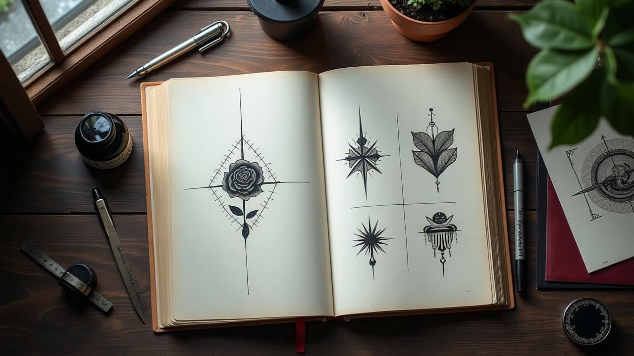
The most readable tattoo stories use fewer symbols, stronger hierarchy, and smarter placement, not more detail. In consults I trim a client’s idea from ten motifs to three, then I let composition and flow do the heavy lifting. Tattoos are common, roughly 32% of U.S. adults have at least one according to Pew Research Center, so clarity matters if you want your piece to stand out for the right reasons. This guide shows how to shape visual storytelling on skin with the same tools filmmakers and illustrators use, only adapted to anatomy, aging, and needle reality.
Start With the Story, Not the Motif
Skip the image dump and write a one sentence story arc first. Example, “I moved across the ocean, built a new career, and found calm.” That single line tells me which symbols, scale, and placement will carry the meaning. For most clients, a short discovery chat plus a reference folder is enough to extract the plot. Expect a consult fee of $100–300, then a pencil or Procreate sketch before we commit to linework.
- Define stakes in plain language, not images. One sentence with beginning, tension, and outcome keeps your personal narrative focused when we start drawing.
- Prioritize three motifs max, one primary and two supporting. More than that muddies hierarchy, especially on small tattoos under 2–3 inches.
- Choose a verb, not just a noun. Climbing, healing, or reuniting tells me to design motion, direction, and rhythm into the composition.
- Note what not to include, like dates or faces, so the story stays symbolic and ages better over 10–15 years of wear.
Symbolism That Works: Building a Personal Lexicon
Symbols work when they are both personal and legible to strangers. Pick objects that already carry public weight, then layer your meaning with variations in color, line weight, and context. If you are borrowing from cultural systems, like sak yant or Indigenous motifs, ask yourself whether you have earned the right to wear them. Read about roots and significance, and consider alternatives if the symbol is sacred to living communities. For historical context, see our look at icons through history.
- Animals with posture cues, a wolf looking back vs forward, shift tone from regret to resolve through gaze direction and body angle.
- Florals tell seasons and temperament. A closed bud, peak bloom, or fallen petal marks time, grief, or growth without text.
- Celestial elements carry cycles. Phases of the moon can frame relapse and recovery, while a single star becomes a fixed waypoint.
- Hands, letters, and tools point to trade and lineage. Rendering them in black and gray vs color shifts nostalgia versus modernity.
- Numbers, coordinates, or constellations code dates and places. Keep scale moderate to avoid blur, think 3–5 mm minimum line gaps.
- Myths and folklore live best as motif families. Pull one emblematic moment, not the entire tale, then use negative space for the rest. See our negative space guide.
Composition Tools That Read Like Grammar
Composition is the grammar of your tattoo, it decides what the eye reads first. I build a clear focal point, guide the gaze with leading lines, and control rest areas with negative space. The rule of thirds works on a forearm the same way it works in photos. Flow should echo anatomy so the piece moves when you do. For more nature-derived structure and flow, see our composition in nature guide.
- Hierarchy, enlarge the protagonist symbol 20–40% over supporting details, or enrich it with heavier line weight and higher contrast.
- Directional cues, use spears, branches, or wind to steer attention across the form, from wrist to elbow or hip to rib.
- Framing, circles, arches, or geometric frames imply chapters. A mandorla around a figure reads sacred or protected.
- Overlap and depth, light occlusion and cast shadows separate foreground from background so the story reads in layers.
- Breathing room, reserve 10–15% of the footprint as negative space. It makes the message louder and prevents mud after healing.
Placement as Plot: How Body Geography Shapes Meaning
Where the tattoo lives can reinforce the message. Pieces on moving parts, like forearm or calf, naturally tell kinetic stories. Static planes, like the sternum or scapula, can read solemn or archival. Consider visibility, clothing, and career. Pain varies, inner bicep and ribs run 7–9/10, outer forearm and calf are around 3–5/10, which can affect session length and detail density, especially if the story asks for fine texture.
- Forearm, a narrative corridor. Arrows, rivers, or roads can run distal to proximal, suggesting movement toward the heart.
- Back and shoulders, a canvas for epics. Use spine as axis, wings or branches can mirror left and right chapters.
- Ribs, intense but intimate. Inside stories, grief or recovery arcs, feel appropriate here, though detail must account for skin stretch.
- Hands and fingers, high visibility and wear. Keep symbols bold and graphic, plan for touch-ups at 2–3 years.
- Ankles and feet, pilgrimage themes or grounding motifs make sense. Test fit shoes to avoid crop points where footwear rubs.
Style as Voice: Matching Aesthetic to Story
Style is your voice. Fine line whispers, neo-traditional declares, blackwork chants. A breakup story in watercolor can feel transient, while the same arc in engraving-style hatching reads historical. If you love a famous artist’s look, like Dr. Woo’s micro-realism or Miryam Lumpini’s color lushness, bring references and we will adapt the tattoo design techniques to your anatomy and the story’s tone.
- Realism for concrete mementos, portraits, heirloom objects, or landscapes, commit to size for longevity, usually 6 inches+ for fine detail.
- Illustrative for fables and myths, line-led drawings hold up well and allow symbol stacking without visual noise.
- Neo-traditional for bold arcs, thick lines and sculpted shading keep clarity at 5–10 years, even on high traffic areas.
- Geometric and sacred forms for order or transformation stories, align to joints for symmetry that moves naturally.
- Blackwork and dotwork for endurance narratives, high contrast reads from 6 feet away and ages gracefully.
Color, Texture, and Line: Emotional Cues That Stick
Color and mark-making are emotional shorthand. Warm palettes push intimacy or triumph, cool palettes calm or distance. Line weight carries voice, hairline lines feel fragile, heavy outlines feel certain. Texture signals time, stipple for dust or memory, crosshatch for grit. Remember that pigments and skin change. The FDA on tattoo inks and pigments notes variability in composition, and some pigments may fade or migrate over years. If you want permanence with low maintenance, black and gray remains the gold standard.
Sequencing and Scale: Telling Time and Change in Skin
You can encode time with panels, repeated motifs, or scale shifts. Three koi at different sizes read as past, present, future. A road that widens from wrist to elbow implies progress. For sleeve narratives, compose chapters that can be tattooed in 2–4 sessions, each complete on its own so the arm looks finished between appointments. If the story will keep growing, leave anchor points and negative space for future additions.
Collaboration, Ethics, and Proofing the Story
Great narrative tattoos are co-authored. Bring your sentence, references, and boundaries. I will sketch, iterate, then stencil for a real size try-on in the mirror. We will also talk consent and culture. Many designs nod to living traditions. Read, ask, and when in doubt choose symbols you own. The American Academy of Dermatology reminds clients that allergic reactions, even years later, are possible, especially with certain reds, so test sensitivity and placement if you plan heavy color. See the AAD’s guidance at aad.org.
Preserving the Narrative: Aftercare, Aging, and Edits
A clear story needs a clear heal. Expect 2–3 weeks for top layer healing and several months for dermal settling. Keep the stencil accurate, then protect contrast during aftercare. Moisturize lightly, avoid sun, and plan for touch-ups if the piece lives on a high friction zone. The Mayo Clinic highlights infection and scarring risk if aftercare is ignored, so follow your artist’s plan and reputable medical guidance, see mayoclinic.org. If you outgrow a chapter, laser fade or cover-ups can edit an arc without scrapping the whole narrative.
- Use breathable dressings for days 1–3 if advised, Saniderm or TegrDerm help reduce friction. Switch to light ointment like Aquaphor or Hustle Butter after, non-sponsored examples.
- Wash with mild soap, pat dry, then a rice-grain of balm, 2–3 times daily. Over-moisturizing blurs flaking and can lift pigment.
- Sun is the main story killer. Apply SPF 30+ once healed, or choose black and gray if you live outdoors year-round.
- Budget for narrative, not just session, typical custom builds run $400–1,200 per medium piece, plus periodic touch-ups.
- Avoid heavy numbing without a plan. Some creams, see Cleveland Clinic guidance, can swell skin and alter line precision. If you use TKTX, patch test first, non-sponsored examples.
Ready to see your story on skin before the needle starts? Use AI for Tattoo to sketch, refine, and preview flow with your body. Generate ideas in minutes at Create, then test placements with Try On. Explore styles and motifs in our Library and Styles to lock the voice before you book.
Try AI for Tattoo Free