
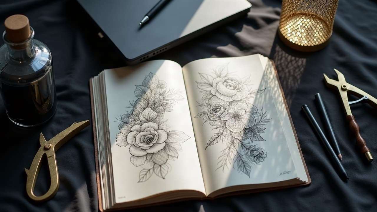
Strong AI tattoo prompts look less like poetry and more like a design brief. Add 5 to 7 concrete constraints and you can produce a studio-testable composition in under 10 minutes, often with only two to three small revisions. That is what autonomous design means here: prompts that steer the model so well the output stands on its own without an artist hovering over your shoulder at every step.
Autonomy does not mean isolation. You control theme, placement, and readability, then hand your best file to a human artist for sizing, flow, and skin-specific adjustments. Keep safety and healing in mind too. Tattoos typically settle over 2 to 4 weeks, and sun protection at SPF 30+ is recommended by dermatology groups like the American Academy of Dermatology. Generative tools are now mainstream, with surveys from Pew Research Center showing that over 20% of U.S. adults have tried AI tools, so it is reasonable to treat prompting as a real pre-visualization step in your process.
What “autonomous” means for tattoo prompts
In this context, autonomous design is about outputs that are compositionally sound without constant correction. You specify style, line weight, contrast profile, placement, size, and content limits, then let the model return options you could feasibly stencil after light cleanup. It is not about replacing your artist, it is about showing up to your consult with a clear visual brief.
A practical target for autonomy is a draft that is 80% there: balanced silhouette, legible focal points at the chosen scale, and shading that can be translated to either black and gray or limited color without guesswork. For best results, preview on your body before you book. Use our virtual try-on to see how flow and negative space read on curves and joints.
The anatomy of a high-performing AI tattoo prompt
Great prompts front-load constraints so the model handles composition, not just vibe. Treat the text like a one-paragraph brief, then add a few control modifiers. Hit these ingredients and you will steer most models reliably.
- Subject and narrative: one sentence that names the main motif and a small secondary element, for example “koi circling a peony”.
- Style and line system: name a tradition and line approach, for example “neo-traditional, bold 7RL outlines, 3RL details”.
- Shading and contrast: specify black and gray, stippling, or soft gradient, and how dark the background should be.
- Placement and size: include body area and inches or centimeters, such as “forearm outer, 6 inches tall”.
- Flow and negative space: add wrap direction, breathing room, and no-fill zones to keep skin breaks intentional.
- Hard constraints: list what to avoid like “no faces, no text, no floating elements, stencil-ready shapes only.”
Template you can paste: “{subject + secondary}, {style + line weights}, {shading method}, {placement + size}, {flow cue}, {palette}, detailed but stencil-ready, no tiny micro-details, no faces, high contrast focal point.” Save this as your prompt template and swap specifics session to session.
Control modifiers that make outputs print-ready
You can nudge models from cool art to tattoo-viable art with a handful of reliable modifiers. These are short phrases that bias toward clean contours, consistent weights, and logical backgrounds. Combine two or three, not ten.
- Stencil-ready, simplified silhouette, unbroken outer contour, white-space breathing room around edges.
- High-contrast focal point, midtone compression, background softened 30 to 50 percent for readability.
- Line hierarchy, bold 7RL outer, 3RL inner, 9M soft whip shading, avoid hair-thin micro-lines.
- Wrap-aware flow, designed for forearm curvature, follows muscle lines, no straight geometry across joints.
- Negative prompts like “no photographic textures, no floating fragments, no drop shadows.”
- Aspect ratio hints, for example 3:4 vertical for limbs or 1:1 for calf and inner bicep placements.
If you are exploring flow and proportional balance, read our design balance guide. When you are ready to iterate progressively, see our progressive customization guidelines for safe step-by-step refinement.
Three autonomous prompt examples that consistently work
- Blackwork flora, “wild thistle with moth secondary,” illustrative blackwork, bold 7RL outer, 3RL detail, dotwork shading, outer forearm 6 inches, 3:4 vertical, wrap-aware, stencil-ready, no text.
- Neo-traditional animal, “red fox framed by maple leaves,” neo-traditional, bold outlines, saturated warm palette, upper arm 7 inches, high-contrast focal face, soft 9M shading, background muted, no micro filigree.
- Minimal geometric, “crescent phases with alpine contour line,” fine-line look, single-needle effect, inner wrist 2 inches, high negative space, no gradients, crisp edges, 1:1 ratio, no photographic textures.
Run each prompt and batch 4 to 8 variations. Discard anything with broken silhouettes or overly dense texture. Keep the version with the cleanest edge control and the most legible focal point at the intended size.
Fine-tune without an artist on call
Autonomous does not mean one-and-done. It means you can drive tight feedback loops yourself. Treat each loop as one constraint change, then regenerate. Use seed locking when available so only your edits vary, not the entire composition DNA.
- Scale check: print at real size or preview with our virtual try-on. If details blur, raise line weight or simplify fills.
- Contrast check: convert to grayscale and squint. If forms melt, increase focal contrast or add a halo of negative space.
- Flow check: mirror the art. If the wrap feels backward on your limb, flip the design or rewrite flow cues like “spine-to-sternum direction.”
- Clarity check: add “stencil-ready” and “no micro-details under 1 mm”, then regenerate. Remove lace-like filigree in small placements.
- Variation check: change one variable at a time, for example switch dotwork to soft whip shading or adjust aspect ratio to 3:4.
When your favorite candidate is locked, export large. Aim for 300 to 600 dpi at final print size. If you need vector edges for crisp stencils, redraw contours in Adobe Illustrator, Affinity Designer, or Procreate (non-sponsored examples).
Avoid the most common failure modes
Most AI-missed shots come from scale mismatches and over-detailing. Small tattoos cannot carry the same line variety as a half sleeve. Be ruthless about readability at size. Call out cultural or sacred motifs explicitly if you use them, and verify meaning before you commit.
- Tiny placements under 2 inches: avoid micro patterns, hairlines, and dense hatching. Choose bolder silhouettes and fewer texture layers.
- Joint crossings: do not run rigid geometry across the elbow or knee. Use wrap-aware flow and break forms at flexion points.
- Overcrowding: cap major elements at 2 to 3 in small-to-medium pieces to keep a clear focal hierarchy.
- Symbol drift: if you reference language, script, or sacred icons, verify meaning with a human expert before the stencil stage.
- Style mismatch: if you love a specific artist’s look, compare it with our style fit guide before booking.
From AI render to tattoo stencil, a clean handoff
Artists love clients who bring legible files. Export the final at PNG or TIFF, 300 dpi minimum, with separate layers for linework and shading if possible. If the model produced fuzzy edges, pass contours through a vector pass and re-expand strokes afterward for a natural 7RL to 3RL hierarchy.
- Deliverables: line-only, line + shadow, and flat silhouette versions. Include exact inch or cm sizing on the canvas.
- Print test: output on paper at real scale and wrap it on the limb with tape. Mark any tangents or pinches before the consult.
- Tooling: Procreate, Illustrator, Krita, Clip Studio Paint, Rapid Resizer for scaling (non-sponsored examples).
Reality checks, skin safety, and color choices
AI can suggest any color, your skin might not keep it equally. Reds and some warm pigments are historically more reactive, so patch-test discussions with your artist are wise. The U.S. FDA notes that tattoo inks and pigments are not without risk and that composition varies by manufacturer. For aftercare norms and healing windows, resources like the Cleveland Clinic and the American Academy of Dermatology underscore basics like gentle washing, fragrance-free moisturizers, and SPF 30+ long term.
One more practical check: what looks like high contrast on a monitor can flatten on deeper skin tones. If you are planning black and gray, bias your prompt toward bolder silhouettes, stronger edge lighting, and reduced midtone clutter. When you are happy, generate a test card and use our try-on to see legibility in real lighting.
When to get a human back in the loop
Use autonomy to explore, then re-engage a pro for the last mile. An artist will dial the wrap, needle plan, and session breakdown. If your concept touches cultural motifs, portrait likeness, or micro-script, book a consult. Bring your file pack and your original prompt text so your artist understands your intent quickly.
If you want a collaborative session, our guide to AI workshop prompts shows how to co-create live in-studio. For solo exploration, hit create to generate batches efficiently, then filter with a simple three-check rubric: silhouette first, focal contrast second, flow third.
Ready to test-drive autonomous prompts on your own skin map? Use AI for Tattoo to generate in Create, preview scale and flow with Try On, and browse Styles for anchor references. Build a tight prompt once, then evolve your custom design with confidence.
Try AI for Tattoo Free