
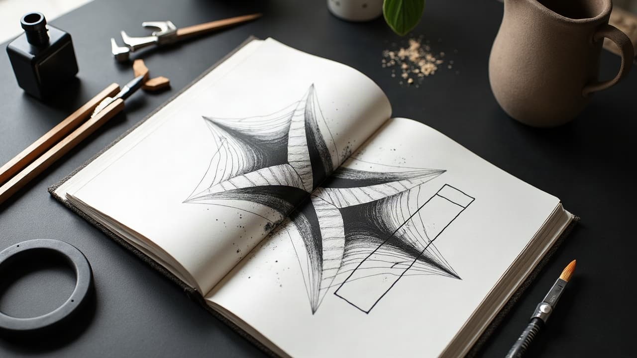
Great tattoos are built, not guessed. On real skin, designs live on curved, moving surfaces, so tattoo balance and proportional composition do most of the heavy lifting. In my studio, most redraws are not about better art, they are about clearer visual hierarchy, stronger anchors, and clean negative space that holds up from 6–8 feet away.
What Balance Really Means On Skin
In tattooing, balance is not symmetry for its own sake. It is the even distribution of visual weight so the eye knows where to land first, then where to travel next. On a forearm wrap or rib panel, the center of gravity shifts with movement, so your design needs clear focal points, secondary elements, and breathing room that does not collapse when the body bends.
I think of balance as three checks: hierarchy, flow, and spacing. If the primary shape reads instantly, the flow lines escort me around the piece, and the negative space stays open from every angle, the composition is carrying its weight. The quick test is simple, shrink your stencil to 20–25% on your phone. If it reads, you are close.
- Balance checkpoints: one bold anchor, two medium supports, many light details. Keep a 60–40 weight split between dominant and supporting halves.
- Do the squint test at 20–25% scale, then again at arm’s length in a mirror to confirm readability.
- Track the eye path with a finger. If you stall or circle, reassign contrast so the path is obvious.
Proportion Systems That Work: Thirds, Golden Ratio, Grids
Design systems keep you from over-tweaking. The rule of thirds is the easiest, split the placement into three bands and let focal points sit at the intersections. For longer canvases, like calves and forearms, the golden ratio 1.618 helps size a hero element against a field of supporting texture. A light grid on your iPad or paper makes alignment visible so you can break rules intentionally.
On curved anatomy, treat thirds and golden cuts as arcs, not straight lines. Wrap your secondary motifs along those arcs so they do not pile up on the same latitude. When in doubt, block shapes with simple silhouettes before lines and shading. If the block-in is balanced, detailing usually behaves.
- Quick proportion tools I keep on hand: Spirit Thermal Paper, Stencil Stuff, and Tombow Mono pencils (non-sponsored examples).
- Tablet grids: 3x3 for small pieces, 5x3 for sleeves, a spiral grid for 1.618 placements.
- Set the hero at a third or golden point. Scale secondaries to 60–70% of the hero. Reserve 15–20% for pure negative space.
Visual Weight, Contrast, and Line Hierarchy
Weight is not only size. It is line weight hierarchy, black density, and edge clarity. A 3 mm flower with a heavy outline can outweigh a 6 mm leaf drawn in whisper lines. Establish tiers, bold for anchors, medium for structure, fine for filigree. Your black should be densest at the focal and taper outward. Study how fat shading and whip shading alter weight across a gradient, then plan your passes. For more on shading control, see our guide to fat shading.
A working baseline for longevity, keep true fine-line outlines at 0.8–1.0 mm minimum on moving zones, and bump to 1.2–1.5 mm on high-friction spots. For solid blacks, pack with an even cadence to avoid patchy weight that confuses the read on healing and at distance.
- Tier your lines: anchor 1.2–1.5 mm, structure 0.8–1.1 mm, detail 0.5–0.7 mm.
- Concentrate black in the focal 30%, reduce density 30–50% as you exit to periphery.
- Match texture scale to distance. Tiny dotwork belongs near the anchor, not in background fog.
Flow With the Body: Landmarks and Movement
Bodies bend, so flow beats static centering. Map S-curves that harmonize with the deltoid wrap, rib sweep, or calf bulge. A diagonal around 30–45 degrees adds energy without fighting tendons. Drop heavy perpendiculars on joints cautiously, they kink when the joint flexes.
Use anatomy landmarks to lock proportion, the acromion for shoulder caps, sternal notch and ASIS for torso panels, gastrocnemius heads for calves. Place your anchor slightly upstream of muscle bulges so motion points the eye into, not away from, the focal. Test wraps with a paper band and a Spirit stencil before committing ink.
- High-motion zones: elbows, knees, wrists. Keep anchors offset from full flex lines by 10–20 mm.
- Use flowing connectors, leaves, clouds, ribbons, to bridge across joints without hard cuts.
- For chest pieces, bias weight to the dominant pectoral and float 10–15% lighter over the sternum.
Scale For Longevity: Aging, Swelling, and Readability
Skin changes. Lines will soften, colors will mute, and edges will blur slightly. The American Academy of Dermatology notes that skin loses elasticity with age and sun exposure, which affects how detail holds over decades. Keep micro-details away from high-friction or high-UV areas and size typefaces generously. Aim for a minimum x-height of 5–6 mm for script if you want it to read in 10+ years. See the AAD's perspective on skin aging at American Academy of Dermatology.
Protection matters as much as planning. UV is the number one external factor that will flatten contrast. Consistent SPF 30+ on healed work improves how long blacks stay black. For general sunscreen guidance, see Cleveland Clinic guidance on sunscreen. During healing, a breathable barrier like Saniderm and moisturizers like Aquaphor, Hustle Butter, or Mad Rabbit can help maintain edge clarity by reducing overworking and scab lift, but do not over-apply. Always follow your artist’s instructions. Product names are non-sponsored examples.
- Healing windows average 14–30 days. Expect softening of ultra-fine texture by 10–20% after peel.
- Budget for touchups, many studios include one within 3–12 months, others charge $50–$150 or $150–$300/hour.
- Avoid blowout risks by keeping dense blacks off very thin skin, see a plain-language overview at Healthline on tattoo blowouts.
Symmetry vs Asymmetry: Creating Stable Tension
Perfect symmetry on asymmetrical anatomy rarely feels natural. Instead, go for asymmetrical balance, a 60–40 weight split that feels stable. Mirror both sides only when the underlying forms mirror, like a sternum mandala, and still, bias one side slightly darker or bolder so it does not look like a sticker.
When building sleeves, set one dominant pole, deltoid head or outer forearm, and counter it with stepping stones of medium motifs. The stepping stones should descend in size or contrast so the eye settles rather than ping-pongs. Micro adjustments in line weight and value are your best shims.
- Symmetry tricks: darken one flank by 5–10%, or rotate a mirrored motif by 5 degrees to avoid stiffness.
- Keep the visual horizon level. Tilt anchors relative to body lines, not to the floor in the chair.
- For chest or back, build a central spine line, then offset hero elements by 5–15 mm around it.
Negative Space Is Structure, Not Leftovers
Most busy tattoos are not over-detailed, they are under-spaced. Treat negative space like ink with an opposite charge. Draw your white shapes first, then fit black around them. On small pieces, preserve 3–5 mm corridors of open skin so edges do not melt together when the tattoo swells during healing.
Reserve big fields of skin to frame your anchor. A shoulder cap looks bigger when a crescent of untouched skin wraps it. When connecting gaps in a sleeve, bridge with light textures, dot fields, water ripples, smoke, to keep space behaving. Remember, the FDA does not approve tattoo pigments for intradermal injection, so packing unnecessary filler pigment is not a neutral choice. Read regulatory context at FDA on tattoo inks and pigments.
- Protect white corridors 3–5 mm minimum on small work, 6–10 mm on medium pieces.
- Let negative space escape to an edge instead of circling it, trapped holes create awkward hotspots.
- Use light textures as bridges, dotwork, smoke, stipple, to keep space intact without solid fill.
Color, Value, and Texture Balancing
Color carries weight. A tiny spot of saturated red can outshout a large patch of muted green. Decide where saturation lives and where muted neutrals keep the piece grounded. Think in values first, black to skin, then assign color families. Complementary accents, orange against blue, red against green, should be small and strategic, usually 10–20% of the area.
Ink selection matters for value consistency. Reputable black like Dynamic Black, and stable color sets like Eternal Ink or Fusion Ink, help you predict fade patterns over years. Pigment composition varies and can affect longevity and reactions, general consumer health information is available at Healthline. For undertone considerations and contrast planning, see our skin tone guide. Product names are non-sponsored examples.
- Map values first, then color. Keep the darkest 10–15% near the focal.
- Use two texture scales max, for example bold scumbles near focal and fine dot haze in the distance.
- Reserve hot colors for micro-accents, 10–20% coverage, so they lift, not overpower.
Plan, Stencil, and Iterate Before You Commit
Iteration saves skin. I work big to small, silhouette, secondary masses, connectors, then details. Print at 100% and 70%, wrap test with Spirit transfer, and mark adjustments with a Skin Scribe surgical pen. If the silhouette feels balanced at every angle, you are ready for linework. If not, adjust the anchor size by 5–10% and reopen corridors of skin.
Digital try-on solves 90% of surprises. Use our virtual try-on to check scale on your own body, then refine prompts with prompt annotation best practices. When you are satisfied, generate multiple balanced comps in AI for Tattoo Create and compare at arm’s length. Planning now prevents heavy-handed corrections later. For session prep, skim how to organize a studio visit.
- Iteration workflow: thumbnail silhouettes, place anchors, route flow, reserve space, then details last.
- Make a mirror pass standing, sitting, and twisting. Confirm 6–8 feet readability.
- Pre-plan aftercare to protect contrast, Saniderm day 1–4, then thin film of Aquaphor or Hustle Butter as needed, per your artist.
Ready to lock in balance before the stencil touches skin? Generate compositions with clear anchors, flow lines, and negative space you can test on your body. Use AI for Tattoo Create to build options, then try them at scale with the virtual try-on. Your proportions, dialed in, no guesswork.
Try AI for Tattoo Free