
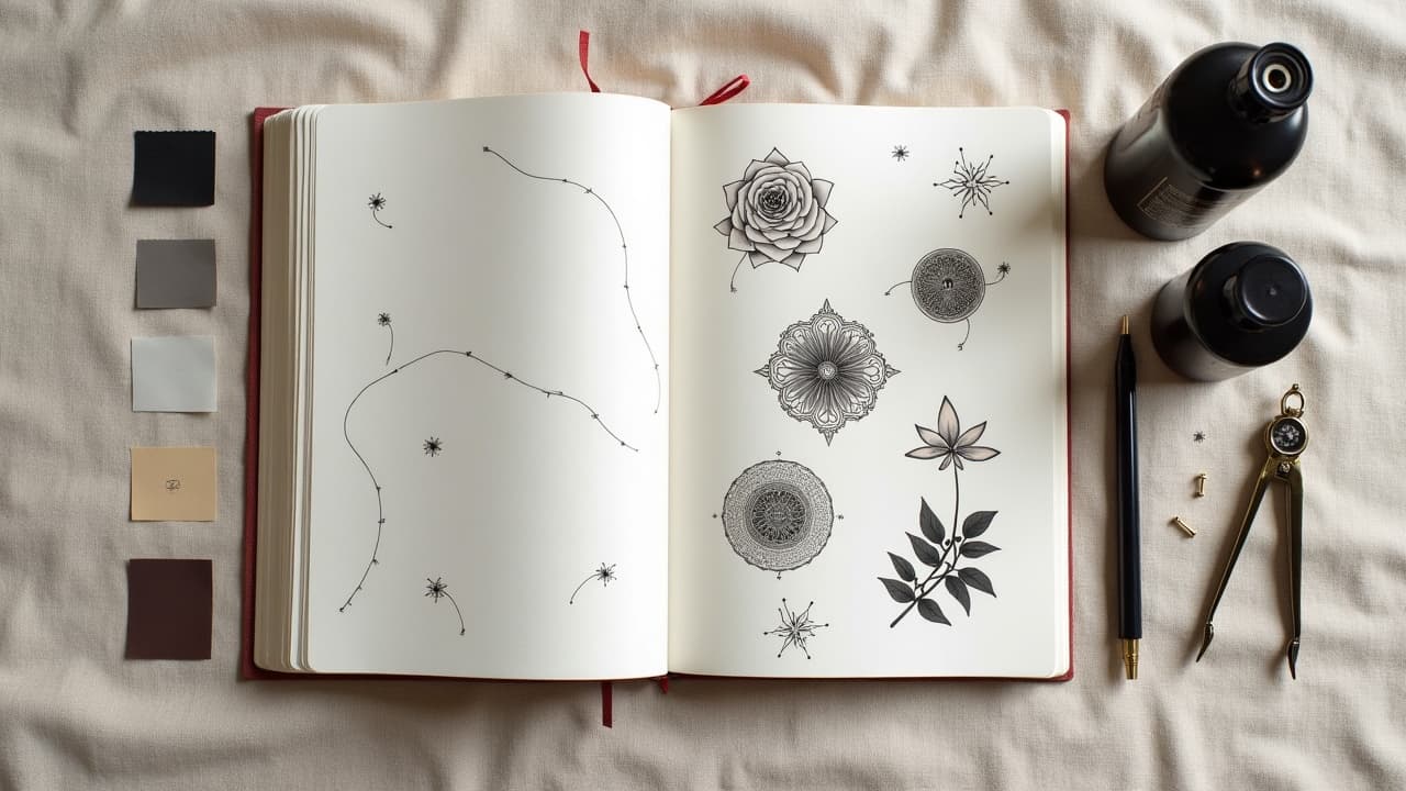
Roughly one in three U.S. adults now has a tattoo, and about one in five has more than one, according to Pew Research Center. That shift matters, because once you collect pieces from different eras or artists, the question becomes how to make them feel like one cohesive design. Good news, mixed-style galleries are not a compromise if you treat them like a single visual system. The same rules designers use for books and interiors apply to skin, control hierarchy, line weight, color, texture, and flow, and your patchwork turns intentional.
Start With Anchors, Then Bridge the Gaps
Every cohesive gallery starts with an anchor piece or two. Anchors are larger works with strong silhouette and value range, they set the tone and scale for everything around them. If you already have multiple small tattoos, you can create a retrospective anchor by designing a new piece that frames or partially overlaps them. Think of anchors as the main chapters, and your smaller tattoos as footnotes that need context. Place anchors where the body has broad real estate, upper arm, outer thigh, shoulder blade, then let smaller pieces flow toward joints and transitions. Keep negative space as a tool, not an accident, so the eye can rest between ideas.
- Choose one or two anchors with a bold silhouette and mid to dark value so they can visually carry nearby fine-line or minimalist pieces without getting lost.
- Scale anchors at 6–9 inches tall for limbs and 8–12 inches for back or chest, which leaves room for bridges like filigree, clouds, or geometric lattices.
- If you own micro tattoos, design a framing element that touches two or three at once, a ribbon, laurel, or wave curl, so they read as one cluster.
- Use anchors to dictate reading direction, for example, top left to bottom right on a sleeve, so the eye knows how to travel across styles.
Unify Line Weight and Shape Language
Clash rarely comes from subject matter, it comes from mismatched line weight and incompatible shape language. American Traditional thrives on 3–5 mm bold outlines and blocky curves. Fine line realism relies on 0.18–0.30 mm hairlines and soft edges. When they touch without a plan, one looks accidental. Your fix is to agree on a baseline weight and a vocabulary of curves. Even when styles differ, echo a few repeated contours, spirals, S-curves, scallops, triangles. If an existing piece uses a whisper-thin outline, add a subtle drop shadow or thin secondary outline around adjacent pieces to normalize the edge intensity.
- Ask your artist to standardize on a medium line band for connectors, e.g., 5RL or 7RL, that can sit comfortably between a 3 mm Traditional outline and a 0.25 mm fine-line edge.
- Repeat two to three core shapes across the gallery, for example, leaf points, cloud puffs, or hexagons, so unrelated motifs still rhyme.
- When in doubt, use soft greyline edging around high-detail realism to cushion it against bold graphic neighbors without thickening the original art.
Color Strategy: Limited Palettes Beat Wild Rainbows
Color is the fastest way to unify styles. Pick a limited palette of 3–5 hues plus black and a single off-white. Decide your temperature bias, warm, cool, or neutral, then stick to it. Even a Japanese dragon, a neo-trad rose, and a geometric mandala will sit together if they share the same reds, greens, and neutrals. Use one brand family across sessions when possible, Dynamic Black, Eternal Ink, World Famous, Fusion (non-sponsored examples), so undertones and saturation match. If you plan gradients between pieces, align your blends with our gradient fundamentals to avoid muddy transitions.
Be mindful of pigments with higher allergy rates, especially some red inks, which dermatology sources note as common irritants. The American Academy of Dermatology and the U.S. FDA both advise monitoring for reactions and sun protection to reduce fading. If you want high color control without risk stacking, limit skin contact of tricky hues to smaller fills or accents and keep larger spans in black and grey.
Texture and Value: How Black, Grey, and Detail Connect
When color differs across pieces, value and texture do the heavy lifting. Balance your overall light, mid, and dark areas so no region crushes another. A sleeve with realism portraits and geometric linework can sync if you add common textures, stippling, whip shading, or crosshatch. Avoid patchy noise by reserving one connector texture for transitions and one for backgrounds. If you already own super smooth realism, bridge to graphic work with soft pepper shading halos that gently step down detail density as you approach simpler art. Keep at least 20–30 percent open skin so the eye can rest.
Motifs, Frames, and Micro-Repeats That Tie It Together
You do not need the same style to tell the same story. Repeating one motif family unifies mixed aesthetics, think waves across Japanese and neo-trad, laurel across realism and script, hex patterns with sci-fi and floral. Frames help too, cartouches, clouds, smoke, filigree, geometric borders. Keep your motif vocabulary to 2–3 families so the gallery reads as curated. For cultural patterns that respect origins and read clean on skin, see our guide to interweaving cultures and techniques.
- Pick a recurring micro symbol to hide in different styles, a small star, eye, or petal, so the viewer subconsciously links parts of the gallery.
- Use consistent frames around mismatched pieces, such as smoke curls or bead strings, to standardize edge behavior without covering existing art.
- Repeat one background field, clouds, dot fade, or geometric tessellation, at low opacity behind unrelated pieces to blend them into the same atmosphere.
Placement, Flow, and Negative Space Planning
Bodies move, so flow matters more than style labels. On limbs, design for directional flow, shoulder to wrist or hip to ankle, and stage transitions at joints with flexible textures like smoke or leaves. Keep intentional negative space bands where skin folds or rubs, inside elbow, armpit, knee ditch, so healing and readability hold up. If you mix busy micro detail with bold iconography, place detail where viewers can get close, inner forearm or calf, and keep bold shapes toward high-motion areas that need readability at distance.
- Treat elbows, knees, and armpits as expansion joints, use clouds or dot fades so distortion with movement does not break the design.
- Map sightlines, from three feet away the gallery should read in two or three big shapes, up close you reveal micro-detail and texture.
- If you are pain sensitive, stage high-intensity zones last, ribs and sternum often feel 7–9/10, outer arm and calf feel 3–5/10, per common studio experience and Cleveland Clinic pain guidance.
Scheduling, Healing Windows, and Aftercare Across Sessions
Cohesion relies on timing as much as drawing. Book sessions so related areas heal together, then adjust connectors on top of reality, not memory. Typical first-stage healing lands around 10–14 days, but you want 2–4 weeks between sessions on the same zone to reduce overworking. Sun protection and moisturization keep tones consistent across pieces. Medical sources like the Mayo Clinic and the American Academy of Dermatology recommend keeping fresh tattoos clean, avoiding submersion until healed, and using fragrance-free moisturizers.
- Use breathable dressings like Saniderm for the first 3–5 days if your artist approves, then switch to light moisturizers, Aquaphor, Bepanthen, Hustle Butter, Mad Rabbit (non-sponsored examples).
- Stage color-matching sessions in similar seasons where possible, winter to winter, to avoid tan-caused value drift that complicates palette cohesion.
- Photograph healed pieces in consistent daylight before designing bridges so your artist can match real-world value and saturation.
One Artist or a Crew, and What It Costs
A single artist ensures consistency, line weight, palette, and flow. A curated crew speeds timelines and pairs specialists, realism, Traditional, lettering, under one plan. Either way, appoint a lead who controls the style guide, line ranges, palette swatches, and connector motifs. Budget matters, cohesive galleries are multi-session investments. Typical U.S. rates run around $150–$300/hour depending on market and reputation, which aligns with public estimates from sources like Healthline. Plan for 4–10 sessions for a full mixed sleeve depending on detail density and color.
- Choose one art director even if multiple artists tattoo you, they set the palette, textures, and spacing rules everyone follows.
- Book test swatches for tricky colors next to existing work before committing large fills, especially reds and purples that may heal unpredictably.
- Use shared reference boards and mockups so every collaborator sees the same line weights, textures, and exact hex or CMYK targets for color families.
Mockups, References, and AI Testing Before You Commit
Before needles touch skin, stress test your cohesion choices with mockups. Build a one-page style guide that lists your line bands, limited palette, texture vocabulary, and motif families. Generate variations and swap-color tests so you can see where a plan breaks. If you are starting from scratch, use our custom prompt tips to generate cross-style concepts that still share rules. Already working with a favorite artist, align on repeatable workflows using our consistency techniques.
When you are ready to see ideas on your body, try a virtual fit before you book a stencil. Upload references, adjust scale, and preview placement using AI for Tattoo's tools. You can generate integrated bridges, tweak line weight, and test flow across poses, then export a clear brief for your artist.
Build your cohesive tattoo gallery with less guesswork. Use AI for Tattoo to generate style-guided concepts, then virtually try them on your body. Start in the editor at Create, preview placement with Try On, and bring a dialed-in plan to your next session.
Try AI for Tattoo Free