
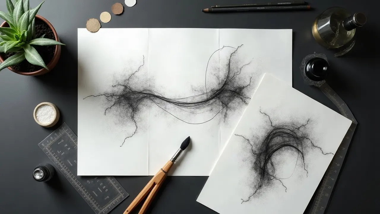
Abstract tattoos read instantly when composition controls contrast, scale, and flow. Without that backbone, you get cool fragments that compete. With it, you get a single visual voice that feels intentional on the body. Roughly one third of U.S. adults wear tattoos, a reminder that clarity and longevity matter in crowded visual spaces, according to Pew Research. Composition is your translator. It tells the eye where to start, what to prioritize, and when to rest. In abstract work that skips literal subjects, your tools are direction, value hierarchy, negative space, repetition, and color temperature. Below are field-tested methods I use to make disparate parts talk to each other on skin.
Set the Story Spine: Motif, Movement, and Mood
Even non-figurative designs need a story spine. Decide three things up front: the motif family you will repeat, the primary movement line on the body, and the mood expressed through edge quality and value. A spine prevents last-minute additions from derailing cohesion. Start by drafting a one-sentence brief, like: “A rising motion from wrist to inner bicep, airy, with open negative space, anchored by three elliptical nodes.” That sentence becomes your filter for every choice. For structure thinking, pair this with our narrative structure techniques to keep beats consistent even without literal imagery. Helpful planning tools include Procreate drawing guides and shape libraries, iPad Pro pencil pressure curves, and printed thumbnail sheets for value mapping. If you prefer analog, fine-liner sets and tracing paper stacks still reign. Procreate, iPad Pro, and fine-liners are mentioned as examples only (non-sponsored examples).
- Define a single directional verb for the piece, like rise, spiral, pivot, or drift, and design everything to reinforce that motion.
- Pick 1–2 motif families, for example ellipses and chevrons, and limit all marks to those shapes to prevent visual clutter.
- Choose a mood through edge decisions, for example soft gradients for calm or hard cuts for tension, and stick to that choice.
Shape Grammar: Using Geometry to Organize Chaos
Abstract composition benefits from a shape grammar that decides how pieces relate. Use rule of thirds, golden ratio spirals, or dynamic symmetry grids to place focal masses and breathing room. You are not chasing math perfection, just proportional relationships that feel inevitable. On curved anatomy, align anchors to landmarks, not paper-friendly grids. Spine, sternum, scapula edge, and ASIS points give real-world coordinates. I rough in geometry on the body using water-soluble pencils before any stencil to see how curves distort. Digital tools help you audition options fast. Procreate’s Drawing Guide, QuickShape, and Symmetry let you build systems instead of one-offs. If you prefer desktop, try Adobe Fresco or Krita for vector-like precision with painterly control. Procreate, Adobe Fresco, and Krita are mentioned as examples only (non-sponsored examples).
- Place the main mass on a third intersection, then counterbalance with a smaller echo shape across the axis.
- Use a spiral arm to suggest flow, but terminate it in negative space so the eye coasts, not crashes.
- Repeat geometry at scaled sizes (for example 1x, 0.5x, 0.25x) to create rhythm without monotony.
Flow With the Body: Placement-Driven Composition
Skin is not flat canvas. Composition should flow with anatomy so the tattoo reads while moving. Plan along lines of stretch and compression. Biceps and calves invite longitudinal arcs, ribs prefer diagonal weaves, and shoulders love radial spreads. Mock placement early. Print scaled transparencies or use wrap tests with low-tack film to preview how elements wrap and breathe. Use light adhesive only to avoid irritation. Transparent dressings like Saniderm can help test motion and wrap length in a hygienic way during planning, but save fresh dressings for healed-skin mockups, not open wounds. Saniderm is noted as an example only (non-sponsored example). Sun exposure and movement affect longevity and clarity. The American Academy of Dermatology highlights that UV can accelerate fading and blur contrast, so plan heavier edges and higher value separation for high-exposure zones. See the AAD’s sun-protection guidance at aad.org.
- Define a primary flow line from joint to joint, then nest secondary flows that never contradict the main vector.
- Use wrap-around connectors at seams, for example inner arm to outer arm, to prevent visual breaks.
- Reserve quiet negative windows over high-crease areas so micro-stretch does not shred delicate textures.
Contrast Stacking: Value, Texture, and Edge Hierarchy
When viewers say a piece looks cohesive, they are noticing managed contrast. Build a value hierarchy where the focal zone contrasts strongest, then taper. Stack contrast types intentionally, for example hard edge plus dark value at the focal, soft texture plus mid-value in support areas. Use reliable pigment sets to map your value scale. For black and gray, many artists rely on Dynamic Triple Black for liners and Eternal Ink Neutral Gray Set for smooth steps. Pair with consistent needle groupings to control edge types. Dynamic and Eternal Ink are examples only (non-sponsored examples). Evidencewise, the FDA notes tattoo inks are mixtures of pigments that can behave unpredictably over decades, which makes strong initial contrast more important for long-term legibility. Read their tattoo and permanent makeup overview at fda.gov.
- Establish a 3-step value plan first, for example 80 percent dark, 40 percent mid, 10 percent light, then paint details within it.
- Use edge variety deliberately, pairing crisp boundaries near the focal with feathered textures in the periphery.
- Let negative space do heavy lifting. A clean cutout reads louder, heals faster, and ages more gracefully than overworked micro-detail.
Rhythm and Repetition: Motifs That Bind Disparate Elements
Repetition turns a pile of marks into a system. Pick signal motifs and repeat them with purpose, varying scale or orientation while keeping interval spacing coherent. Think in beats, like music. Strong, soft, soft, rest. Repeat. Mechanical consistency helps. Rotary machines such as the Cheyenne Hawk Pen paired with stable cartridges keep line rhythm predictable across long sessions. Cheyenne is cited as an example only (non-sponsored example). Patterns that behave: dots, chevrons, ladder lines, and nested arcs. Staggering them along your main flow keeps the eye moving without getting lost or bored.
- Build a motif bank of 5–7 marks and promise yourself you will not invent new ones mid-session.
- Repeat at measured intervals. For example, place ladder lines every 2–3 cm along a curve to imply tempo.
- Introduce one disruptor near the focal, for example a rotated chevron, to create a hook without breaking the system.
Color as Glue: Palettes, Temperature, and Transitions
Abstract pieces often unify through limited palettes. Commit to analogous schemes for harmony or split-complementary for controlled pop. Keep saturation highest at the focal and use temperature shifts to carry movement, for example cool to warm along the flow. Choose consistent brands so mixes behave. Popular pro lines include Eternal Ink, World Famous, and Fusion for predictable chroma and heal. These are examples only (non-sponsored examples). For a deeper technical refresher on light and shade interactions, see our color dynamics guide. Dermatology sources caution that certain pigments, especially reds and yellows, may trigger more reactions in some clients. If you simplify to two or three families, you minimize mixing unpredictability. See overview resources from the Cleveland Clinic at clevelandclinic.org and the AAD at aad.org.
- Map a 3-color plan on paper first, then desaturate a photo to confirm your value hierarchy holds without color.
- Use glazing passes to steer transitions instead of muddy mid-tones made by overmixing in skin.
- Pre-pick temperature anchors. For example, keep warms on convex planes and cools in receding sweeps to amplify form.
Line Strategy: Weight, Speed, and Energy in Abstract Work
Lines are not neutral. Weight, speed, and texture encode the design’s energy. Heavier outer scaffolds hold the piece together, while varied micro-lines add vibration where needed. Move from bold liners at anchors to tapered shaders in drift zones. Needle and ink consistency makes your hierarchy believable. Try Kwadron or Cheyenne Craft Cartridges for predictable groupings like 9RL, 3RL, and 7M. Pair with a reliable black like Dynamic Black for frameworks and a soft graywash set for atmospherics. These products are mentioned as examples only (non-sponsored examples).
- Limit yourself to two line weights and one soft shader on smaller pieces so the hierarchy stays clear.
- Pull longer strokes from the shoulder, not the wrist, to keep abstract arcs smooth.
- Reserve staccato textures for secondary areas so they do not compete with primary movement lines.
Negative Space: The Silent Protagonist
In abstract composition, negative space is not leftover. It is the most persuasive unifier you have. Clean windows create rhythm, reveal flow, and let the skin tone act as a consistent color that ties the whole tattoo. Plan negatives like shapes, not holes. Draw them first on tracing paper, then build marks around them. Commit to hard stops where you want the eye to rest, and soft fades where you want drift. Healing and long-term aging reward restraint. Fewer traumatized micro-areas often means calmer heals. Baseline aftercare guidance from medical sources is clear about infection and irritation risks, which rise with larger raw areas. See general overviews at the Cleveland Clinic and Mayo Clinic at mayoclinic.org.
- Design negative corridors that run the length of the flow to stabilize the read at a glance.
- Keep at least 5–8 mm clearance between dense textures to prevent visual mud after aging and sun exposure.
- Use skin breaks to transition between color families instead of mixing them directly in fragile zones.
From Sketch to Stencil to Skin: A Repeatable Composition Workflow
Great composition is repeatable when your process is. Build a consistent pipeline that tests flow on paper, then on the body, well before needles meet skin. This keeps decisions global, not reactive. Digitally, I sketch thumbnails in Procreate at 10–15 per idea, then scale the winner to placement photos using Liquify to mimic curvature. For stencil, Spirit Thermal Paper and Stencil Stuff deliver reliable transfers that survive multi-hour sessions. Cover healed-skin mockups with SecondSkin or Saniderm to test wrap and movement hygienically. Spirit, Stencil Stuff, SecondSkin, and Saniderm are examples only (non-sponsored examples). If you are building a larger project, write prompts that pre-decide palette, marks, and movement so iterations stay on-theme. For structured prompt-building, see our AI prompt guide for color cohesion.
- Generate thumbnails first, then pick one and reverse it to test bilateral balance.
- Print true-scale mockups and tape to the body to check wrap and reading distance.
- Lock palette and line weights before final stencil so on-skin decisions stay tactical, not existential.
Ready to pressure-test your composition before you commit? Use AI for Tattoo to generate abstract motifs with defined flow, palette, and value plans, then preview placement with our virtual try-on. Build, iterate, and check readability on your body with Create and Try On. Also browse reference in Explore to spark your motif bank.
Try AI for Tattoo Free