
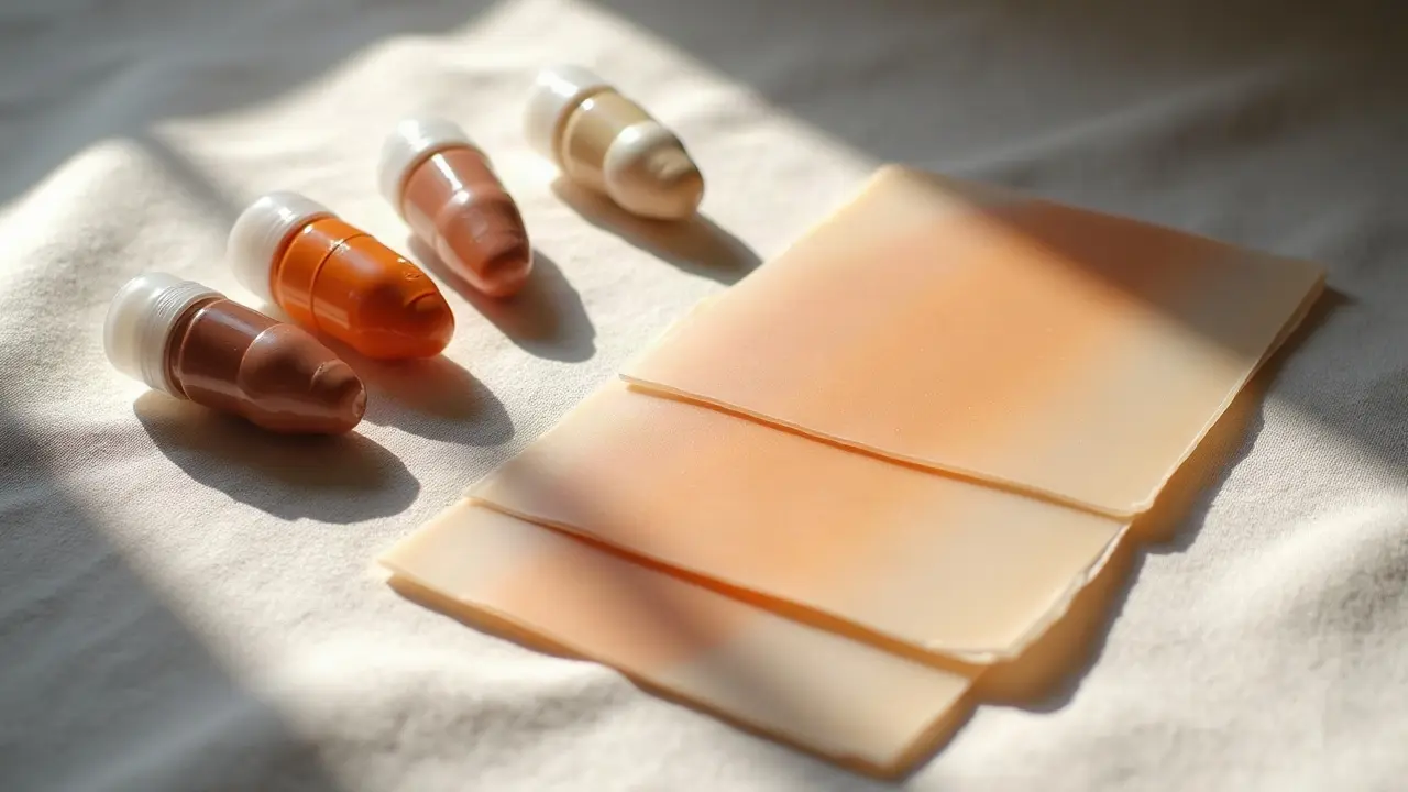
Great color tattoos are built on values, not just hues. If the value structure is right, your piece reads crisp in bright sun, a bar booth, and bathroom mirror light. Most “muddy color” complaints come from weak contrast planning, not bad ink. This guide breaks down tattoo color dynamics the way working artists plan them: light sources, shading methods, pigment choices, and skin tone considerations. You will leave knowing how to preview a palette, where to put your darkest darks, and how to keep saturation looking intentional for years.
Value first: why contrast beats color
Human vision sorts shape by contrast before it notices hue. In tattooing that means value mapping is the anchor, then color is the accent. A sleeve with perfect blues and reds but weak lights and darks reads flat in any room. Start by designing in grayscale. Lock your black saturation zones and your light reserves, then glaze color on top. Aim for a 70–30 contrast rule where roughly 70 percent sits in mid to light values and 30 percent carries your hits of depth. That split survives cluttered backgrounds and low-light bars. If you work color-first, you risk matching values across hues, a common problem where a medium green and medium red neutralize into mud on skin. Lock value separation with line weight and negative space first. Add color last, concentrating chroma in your midtones so the lightest lights and darkest accents maintain read from 3 meters. For narrative-heavy pieces, pair value staging with composition cues from our design structure guide. Even wild color palettes behave when your lights and darks are staged with intention.
Lighting scenarios: how tattoos read indoors vs outdoors
The same tattoo can look warmer, cooler, duller, or sharper based on the bulb above you or the sun angle. Plan for typical viewing conditions and test your stencil and color swatches under varied lights before you commit ink. Three variables matter most: color temperature, color rendering, and angle. Cooler light reveals blues and greens, warm light favors reds and oranges, and overhead glare can erase your light reserves if you do not protect them with line and texture.
- Warm indoor light at 2700–3000K makes cool hues recede and warms neutrals. Expect blue-blacks to read softer and yellow glazes to pop slightly.
- Office LED at 4000–4500K flattens contrast if CRI is low. Use bulbs rated CRI 90+ in the studio to judge saturation accurately.
- Daylight at 5000–6500K boosts cool palettes and exposes weak value separation. If it reads outdoors, it will read anywhere.
- Window side-light creates directional contrast, deepening one edge. Build edge shading deliberately so it does not look accidental.
- Phone screens and social posts boost contrast by 5–15 percent. Do not color for Instagram only, color for real viewing distance and light.
Shading techniques that control depth
Shading is your volume dial. Technique choice changes how pigments stack and how light scatters off healed skin. Dense color packing gives a poster look, while pepper shading and stippling let skin glow through for optical brightness. For blends, slow hand speed and consistent overlap matter more than brand of mag. I build depth with three passes: structure with whip shading, midtone transitions with a soft magnum sweep, then targeted color hits. On darker skin, prioritize texture and edge control over soft fog, since midtone fog can disappear under melanin. Needle choice shifts character too. A curved M1 mag diffuses edges gently, while a bugpin 0.30 mm stacks tighter pigment for velvet blacks.
- Use whip shading to taper values without overworking edges. It reads dimensional in both warm and cool light.
- Reserve negative space for your top highlights. White ink alone is not a highlight plan; it is a spice, not the meal.
- Blend with two inks separated by one value step instead of jumping complements. This avoids the muddy midpoint that can gray out on healing.
- Anchor depth with cool blacks plus a warmer near-black in shadow cores. That temperature contrast keeps shadows lively.
- Switch to cross-texture (stippling over smooth) when a blend band refuses to hold. Texture sells depth even when hue is subtle.
Skin tone considerations: undertone, melanin, and read
Every color passes through a melanin filter. On lighter skin, cool hues often hold saturation, while on deeper tones, warm hues commonly present clearer at equal value. Think in Fitzpatrick I–VI ranges, but judge the actual skin in front of you. Undertone and oil content affect glare and perceived value. On highly melanated skin, going darker than you think for midtones, and shaping edges with texture yields better long-term read. Prioritize value separation over chroma fights. Build highlights with skin breaks and structured negative shapes, not just heavy white. The American Academy of Dermatology notes that darker skin can be more prone to hyperpigmentation after trauma, which changes how a healed tattoo reflects light. Check their guidance on skin considerations at the AAD. That does not mean avoid color, it means plan values and healing support carefully.
- Fitz I–II: Cool palettes hold well. Keep yellows one value step darker than sketch, they brighten on heal.
- Fitz III–IV: Earth reds, olives, teals sing when framed by clean blacks. Avoid relying on pale pastels for read.
- Fitz V–VI: Push midtones darker and amplify edge texture. Use orange-browns and rich violets as bridges instead of pale blues or pinks.
- All tones: Build highlights with negative space, not only white ink. White can chalk or dull as titanium dioxide scatters light.
Ink chemistry and pigment behavior you can plan for
Pigments are particles, and particle size and chemistry change how light scatters. Titanium dioxide in white is highly reflective, great for opacity but prone to chalk under warm bulbs. Many modern reds use azo pigments, while some legacy reds used cadmium salts, hotter in hue but with higher reaction risk. Know your bottles and read safety updates. The FDA tracks tattoo ink issues and recalls, and JAMA Dermatology has published on colorant reactions, especially with certain reds. Check FDA ink information at the FDA and dermatology literature at JAMA Dermatology. Pigment choice is not just taste, it is durability and safety planning.
- Whites with titanium dioxide brighten edges but can appear 2–3 value steps lighter under warm light. Use sparingly.
- Organic azo reds are versatile, but some tones shift slightly orange on heal. Frame with cool near-blacks to keep balance.
- Ultramarine and phthalo blues read strong under 5000K light, but can gray next to overpacked yellows. Keep values staggered.
- Greens with chromium-based pigments hold well, yet benefit from warm shadow glazes to avoid going icy in cool lighting.
Placement, curvature, and ambient shadow
Skin is not a flat canvas. A forearm twist throws a specular highlight down the crest, a calf wraps midtones into shadow, and a collarbone catches glare that erases timid lights. Design assuming ambient shadow will eat some midtones on curves. Where curvature is high, exaggerate value separation and strengthen edges. Use structured negative space to carve silhouettes so the form reads while moving. And remember, clothing adds micro-abrasion and matte rub that can dull glossy blends over time.
- Forearm ridge: protect the top plane with bold line weight and saved highlights so overhead light does not wash it out.
- Calf wrap: build a darker back-edge contour so the image does not vanish from side view.
- Chest and clavicle: expect glare. Use texture contrast instead of huge white patches for sustainable highlights.
- Ankles and wrists: high motion zones. Favor simpler value blocks and fewer delicate color transitions to reduce blur risk.
Planning for aging, UV, and optical blur
All tattoos lose some edge acuity and chroma. Sunlight accelerates both. Expect tiny line spread, about 0.2–0.5 mm over years, and a gentle midtone fade. Plan bigger shapes and guarded highlights so the read survives that drift. UV protection is non-negotiable. Broad-spectrum SPF 30+ sunscreen, hats, and fabric shields keep colors truer. For a plain-language overview of sun effects on tattoos, see Healthline.
- Favor bigger value shapes over micro-gradients. They hold up after years of optical blur.
- Set a touch-up window of 3–5 years for high-chroma pieces, sooner for heavy sun exposure lifestyles.
- Educate clients on broad-spectrum SPF 30+ and shade habits for the first summer after healing.
- Plan poster-style readability from 3–5 meters. If it reads far, it will age gracefully.
Proofing color choices before the needle
Preview beats regret. Mock your design on the actual body, in realistic light, and at real scale. Digital try-ons let you test value separations and palettes without overworking skin. Use AI for Tattoo’s try-on to see your art on your skin tone under varied lighting, then refine your palette in the creator. Want to explore palettes by style first, use our library and iterate with advanced prompt techniques to pressure-test color and value plans.
- Print your design at true scale and tape it on. Walk indoors to outdoors to watch values shift.
- Build a value-only version and squint at 3 meters. If it reads, then color is safe to add.
- Create a mini color swatch map on paper with labeled values, then compare under 2700K and 5000K bulbs.
- Do a temporary skin-safe transfer test to judge placement glare and curvature before final stencil.
Aftercare that protects color and contrast
Technique gets you started, aftercare preserves it. Keep the surface calm so pigment molecules stay put and light scatter stays predictable. For bandage-first healing, breathable films like Saniderm help reduce friction in days 1–3. For ointment-first, thin layers of Bepanthen, Aquaphor, or balms like Hustle Butter and Mad Rabbit can support barrier recovery in weeks 2–4 (non-sponsored examples). Sun is the big color thief. The Cleveland Clinic and dermatology orgs recommend broad-spectrum SPF 30+, reapplied every 2 hours outdoors. Check practical skin guidance at the Cleveland Clinic and keep watching for sensitivity. If you have a history of color reactions, plan a small test zone and review our guide to aftercare for different inks and support for allergic or sensitive skin.
- Film method: change the first dressing at 24 hours, then reapply fresh film for another 2–3 days if skin tolerates it.
- Ointment method: cleanse gently twice daily, then apply a rice-grain thin layer. Too much occludes and dulls fresh color.
- No soaking for 2 weeks. Waterlogging lifts edges of scabs and clouds midtones.
- Zero sunbeds. After heal, make SPF 30+ and shade your default for every long outdoor day.
Seeing is believing with color. Use AI for Tattoo to generate palettes that honor your skin tone, then preview them live with the try-on before anyone opens a bottle. Start in the creator to test value-only, compare 2700K vs 5000K looks, and swap pigments until your design reads under any light. Open Create or go straight to Try On.
Try AI for Tattoo Free