
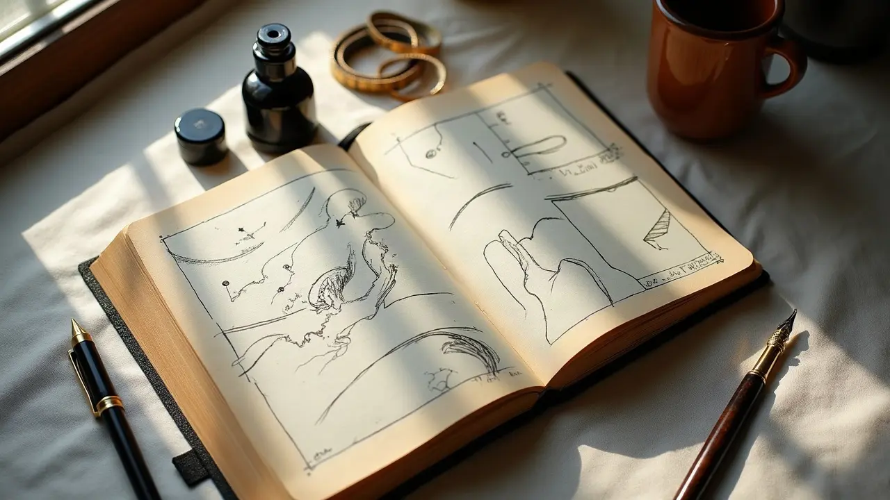
The most memorable story tattoos do not cram in every detail, they organize emotion into a readable sequence. In surveys, about 32 percent of U.S. adults report at least one tattoo, which means meaning has to stand out in crowded visual culture Pew Research Center. If your design has a clear beginning, middle, and return, the wearer and the viewer will remember it years later.
As artists, we already think in composition and flow. Narrative structure is the same toolkit, just tuned for visual storytelling. It is pacing, point of view, and symbol, mapped to curved skin that moves. Below is a practical way to build a tattoo that reads like a story at one glance and unfolds over many looks.
What Narrative Structure Means On Skin
Narrative is not only plot, it is arrangement. On skin, your prologue might be a small icon at the wrist, the climax a high-contrast scene at the shoulder, the epilogue a fading texture near the elbow crease. Think of the body as a book you can walk around. The viewer reads left to right or top to bottom depending on placement, and the owner can rotate the limb to reveal beats in order.
A reliable framework: set a core motive (why this story), identify three beats that earn it, then select visual devices that cue those beats. Beats can be events, emotions, or thresholds. The devices are your composition, line weight, color, and negative space. If you want help aligning style with story, bookmark our guide to style compatibility.
Choose the Core Narrative: Motif, Metaphor, Memory
Before sketching, reduce the brief to one sentence: “A recovery arc from chaos to clarity,” or “A chronicle of a grandmother’s garden across seasons.” Then pick a motif the wearer connects to, a metaphor that carries it, and one memory anchor that makes it specific. Those three inputs keep the design grounded when you make stylistic choices later.
- Motif ideas with range: birds, mountains, compasses, flowers, waves. Each can be literal or symbolic, and can scale from micro tattoos to full sleeves.
- Metaphor choices: rebirth as molting feathers, resilience as kintsugi seams, growth as nested rings in wood. Metaphors steer style and texture.
- Memory anchors: a date hidden in petals, grandma’s recipe handwriting, GPS coordinates, a specific star map. These make the story un-copyable.
If the client is unsure, do a symbol audit. List five objects they collect, two places they return to, one line they repeat. Then build a quick page of thumbnail studies. Use a visual prompt workflow to vary style and scale. If you want to explore options fast, generate references via our advanced prompt iteration.
Beat Mapping: Panels, Vignettes, and Transitions
Comics solved narrative layout a century ago. You can borrow that grammar for tattoos without making it look like a page. A sleeve can read in three vignettes separated by soft transitions, or in stacked panels that curve around the limb. The trick is keeping a consistent visual hierarchy so the eye knows where to start.
- Three-beat spiral: setup at wrist, turn at forearm, resolution at bicep. Use foliage or waves to spiral and connect beats.
- Stacked ribbons: horizontal bands with micro-scenes, separated by negative space gutters that mimic comic gutters without lines.
- Radial burst: A central emblem at shoulder or chest, with radiating fragments that depict memories, getting smaller as they move out.
- Path layout: A trail or river snakes through, each bend hosts a beat, letting the wearer rotate the limb to read the path in order.
Transitions are part of the story. Fog, water, fabric, smoke, or geometric dispersion can imply passage of time. If you skip transitions, beats feel pasted not lived. For crisp blending, reinforce edges with line-weight contrast and fade into textured grayscale. For a refresher on line and contrast, see our linework and contrast techniques.
Time, Place, and Sequencing on Curved Canvases
Skin moves and the viewer moves. Put your inciting image where conversations start, like the forearm or upper chest. Reserve the reveal for a bend or turn that invites participation, like inner forearm, ribs, or calf wrap. Avoid placing critical faces or type across high-stretch zones that distort during movement, like the elbow ditch or knee pit.
Sequence with gravity. Top-heavy compositions feel climactic, bottom-weighted ones feel rooted. On a sleeve, ascending elements read as progress, descending as release. On a back piece, a centerline emblem reads as identity, off-center reads as journey. Use the body’s lines, clavicles and spine, as natural horizon lines.
Visual Grammar: Light, Line, Scale, and Viewpoint
Story is legible when your grammar is consistent. Pick a dominant light source and stick to it so forms resolve clearly. Build depth with three line weights, thin for detail, medium for contours, bold for story beats. Scale contrast is currency, one oversized form against smaller supporting details cues importance without shouting.
Viewpoint changes emotion. A low angle makes a character feel heroic, a top-down view feels reflective or archival. Cropping a face to the eyes reads as witness, cropping to the hands reads as act. If you use text, treat it as an actor, not a caption, and keep baseline and kerning consistent with the rest of the geometry.
Symbols, Culture, and Responsibility
Narrative tattoos borrow symbols from cultures and faiths. Get the references right. Confirm meanings with sources the client trusts, and avoid sacred marks that are not yours to use. A quick ethics check protects both story and skin. For broader context on meaning-making and belief, see our essay on tattoo culture and spirituality and our feature on personal narratives in ink.
- Ask for provenance: “Where did you first see this symbol, and what does it mean to you today?” Record that in the design brief.
- Offer culturally respectful alternatives if a sacred mark is requested without context, explain why and propose a metaphorical stand-in.
- Embed specificity, swap generic lotus with the actual species from the client’s memory, or use a local landmark silhouette.
Color, Texture, and Negative Space as Plot Devices
Color is timing. A limited palette keeps a serious narrative coherent, while split-complementary accents can spotlight a turning point. If memory is the theme, consider desaturated cores with saturated pivots. Texture signals genre, crosshatch for archival feel, watercolor bleeds for dream beats, stipple for quiet interiors.
Negative space is not empty, it is breath. Reserve clean gaps to serve as your gutters, the silent beats where the viewer fills in meaning. If the story is about loss, carve shape out of absence. If it is about growth, let new forms push into that space and disturb the edges. Test these ideas quickly with a virtual try-on before lining.
Prototyping: Sketch, Reference, and Client Alignment
Do not skip the storyboard. Quick four-frame thumbnails lock your beat order. Next, gather references for texture and pose, not to trace but to triangulate. Build a narrative key, a one-page sheet of motif, metaphor, memory, with two alternate palettes and three symbol variants. Share versions, not just one sketch, so the client can choose the path, not just the destination.
- Prototype tools: China marker on tracing paper for overlays, iPad Procreate layers, Windsor & Newton inks on vellum for real-world wash tests.
- Try-on check: do a full-scale print and tape, then a virtual mockup to spot tangents and stretch before stencil.
- Named aftercare to plan for finish: Saniderm, Aquaphor, Hustle Butter, Mad Rabbit, Bepanthen (non-sponsored examples).
Sessions, Budget, and Healing Between Chapters
Narrative depth usually takes 2–5 sessions. For a half sleeve with three vignettes, expect 8–15 hours total, billed at $120–$220 per hour in many U.S. studios, so $1,000–$3,000 is typical. Plan your beats by session, line and black fills first, then color and effects, then polish. Stagger sessions to respect the skin and the story.
Surface healing usually takes about 2–3 weeks for most people, deeper settling takes longer. Reputable sources outline these windows, see the American Academy of Dermatology and the Cleveland Clinic for ranges and aftercare basics. If clients ask about numbing or tenderness, point them to neutral summaries from Healthline that explain why ribs and ankles often feel like 7–9 out of 10, while outer arms can feel like 3–5 out of 10.
- Book spacing: 3–4 weeks between major passes so color sits and line heals clean for crisp second-pass choices.
- Budget cues: allocate 20 percent of project cost for touch ups, reschedules, and an extra polishing hour at the end.
- Product planning: If using second-skin bandages like Saniderm, pre-trim shapes for joints. If using ointments, keep towels close to control shine for photos.
Safety note for pigments, the U.S. Food and Drug Administration has historically not approved many tattoo inks for injection, and has issued guidance and alerts on contamination risks. For rare reactions or granulomas, refer clients to clinical sources like JAMA Dermatology and coordinate with healthcare professionals if needed. This keeps the story sustainable over decades, not just the first year.
Case Structures You Can Steal and Make Your Own
Use these skeletons as starting points, then bend them to the wearer. For a migration story, place footprints or feathers low and build to a sky break high on the shoulder. For a grief-to-growth arc, start with fragmented geometry that resolves into an organic bloom, leaving one deliberate unresolved seam as truth. For a family chronicle, anchor with a central emblem and weave threadlike lines to satellite icons, each with a date or micro-engraving.
- Ascending journey: trail motif rising from wrist to shoulder, fog transitions lighten, color saturates with each bend.
- Circular return: ring of elements on shoulder cap, seasonal symbols quartered, one negative-space gap as the open future.
- Twin timelines: two parallel bands on outer and inner forearm, crossing once at the elbow crease with a shared object.
- Archive montage: typewriter or ledger base texture with stamped vignettes, dates tucked into paper edges, sepia accents only at the pivot moment.
Ready to test your story on your body, not just paper, use AI for Tattoo to generate variations of your motif, metaphor, and memory, then preview scale and flow with our design creator and live virtual try on. If you want fresh narrative prompts by style, browse ideas in Explore and our constantly updated Library.
Try AI for Tattoo Free