
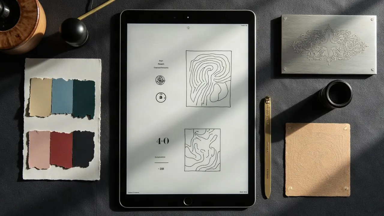
Most AI tattoo drafts fail for a simple reason, the palette drifts and the theme splinters after a few iterations. You can prevent that with precise prompt anchors, a fixed color system, and a repeatable review workflow. Do this well and you will land a unified design in 3 to 5 iterations, not 30.
What Cohesion Really Means in AI Tattoo Design
Cohesion is not just matching hues. A cohesive AI tattoo keeps a consistent value hierarchy, a constrained color vocabulary, and repeating motifs that reinforce one story. If your line weight, shading logic, and focal contrasts stay predictable, the piece reads as one voice. The goal is a palette you could paint with your eyes closed, and a theme you could summarize in one sentence. If you cannot, the prompt needs tightening. Start by declaring the design’s container, no more than 5 to 7 colors, one dominant theme phrase, and two secondary motifs. Everything else is noise.
Color Systems That Respect Skin
Screen color is backlit RGB. Skin is a variable canvas with undertones, melanin, and blood flow. That mismatch is why many AI palettes collapse in the chair. Anchor your prompts to a system that translates to skin, not just the monitor. Use a limited palette with known hex codes for ideation, but verify with values that map to inks your artist trusts. Warm, olive, and deep skin tones can swallow low-contrast pastels, so keep your lightest tones at least 70 to 80 percent value-lift over surrounding skin for clarity. When in doubt, push contrast through linework and black packing, not just saturation. For longevity, remember that sun exposure accelerates fading. The American Academy of Dermatology notes that consistent sun protection helps tattoos hold color, so plan for SPF 30+ in your aftercare language and color choices (AAD advice on sun protection).
- Pick a base scheme that survives desaturation checks. If your focal shapes read in grayscale, the color will help instead of carry. Aim for a clean light, mid, and dark triad.
- Favor analogous or complementary pairs for small pieces. Triadic sets look exciting on screen but often pack muddy on 6 to 10 cm placements with limited real estate.
- Test palettes against approximate skin values. Drop a tan or deep brown layer behind your art mockup, then reduce saturation by 10 to 15 percent to preview healed reality.
- Avoid over-reliance on red for contrast. Red inks have higher allergy and persistence concerns in literature, so keep them as accents unless medically cleared and artist-approved.
Prompt Formulas to Control Palette
You do not get cohesive color by asking for it. You get it by naming specific constraints, rejecting drift, and calling proof targets. Build prompts with explicit palette guards, then reinforce in negative prompts. Below are field-tested framings you can adapt to your generator.
- Palette lock template: “tattoo design of [subject], style [tattoo style], use a 5-color palette only, hex #0F0F0F, #3A6EA5, #88C0D0, #EBCB8B, #D08770, high value contrast, black linework, no gradients.”
- Cohesion reinforcement: “repeat blue-gold accents on all secondary motifs, match line weight across elements, avoid neon, avoid purple, avoid pink, avoid metallic texture, focus on matte inks.”
- Readability gate: “must read at arm’s length, prioritize silhouette clarity, focal on [subject], background pushed to 30 percent opacity, no photoreal pores, no micro noise.”
- Theme statement: “the story is [phrase], include two recurring symbols only, [symbol A] and [symbol B], no third symbol families, no extra animals, no extra florals.”
If you are working in an AI for tattoos workflow with multiple drafts, combine these prompts with version notes. Keep a seed constant when testing micro-edits, then change the seed only when you hit a dead end. For deeper color logic, see our color dynamics guide.
Theme Integration Through Motifs and Narrative
Theme cohesion is about repetition with intent. Pick two symbols that carry the narrative roles of protagonist and chorus, then echo them in framing, not clutter. In prompts, bind motif appearance to placement and scale rules. That keeps the AI from inventing new subplots. Describe how motifs interact, for example, the snake always curves around florals and never crosses the face. Anchor your scene with a single focal hierarchy. One primary, one secondary, everything else tertiary. Tie the theme back to a short narrative statement and resist adding “just one more” cool object.
- Narrative anchor: “story is renewal after loss, phoenix as primary, ginkgo leaves as secondary, repeating crescent arc framing, no third flora, no smoke.”
- Motif grid rules: “phoenix faces left, 30 degree tilt, wingspan fills 60 percent of canvas width, ginkgo clusters appear in pairs, size ratio 1:3 to primary.”
- Style binder: “consistent dot shading, single bold outline, no sketch hatching, background is sparse line dusting only, 15 percent density cap.”
If your narrative leans complex, map it first. A one page beat sheet will save you hours of editing. For practical structure methods, visit our narrative structure techniques.
Value, Contrast, and Placement Readability
Cohesion dies when the focal point is unclear at viewing distance. Solve that with hard rules around value tiers and contrast. Place your brightest lights and hardest edges near the focal. Keep background textures lower contrast and slightly cooler or warmer than the subject to separate planes. On small placements, rely on negative space and micro-contrast in the linework rather than stuffed gradients. Large back pieces can support triadic schemes and denser supporting motifs if the silhouette stays strong.
- For forearm pieces, assume a 1 to 1.5 meter viewing distance in everyday life, so test legibility by squinting or downscaling to 15 percent size before approving.
- For ankles and fingers, prioritize black saturation and sparse color hits. These areas abrade faster, so prioritize value contrast over saturated midtones that can wash out.
- For chest and back, stage your warms forward and cools backward. Control edges with soft shading cones that fade into skin tone to keep the piece breathable.
Iteration, Seeds, and Version Control
Iteration without control creates drift. Lock your seed ID, record hex codes, log negative prompts, and change one variable per version. If a new seed produces a better composition, reapply your palette and theme constraints before pushing detail. Keep a short acceptance checklist, silhouette reads at a glance, palette limited to declared swatches, motifs follow grid rules, and texturing is consistent. A consistent rubric makes approvals faster and clients happier. For a deeper walkthrough of disciplined experiment loops, use our advanced iteration guide.
From Screen to Ink, Converting Color Safely
AI output is not ink. Before finalizing, translate each swatch to the brand and pigment set your artist trusts. Some reds and yellows are more reactive, and aftercare affects longevity. The U.S. Food and Drug Administration provides consumer information on tattoo inks and regulation, which is a useful baseline when discussing materials with your artist (FDA overview on tattoos and permanent makeup). Keep the client’s skin history in mind, especially around pigment sensitivities and keloid risk. If a client has a history of reactions, that is a medical conversation, not a color tweak.
- Convert your hex palette to the shop’s ink set. Match to label names and make a printed swatch card, then test a tiny patch digitally against the placement photo.
- Discuss potential pigment sensitivities with the client. The Cleveland Clinic maintains overviews on tattoo reactions and infections that are good reading before sessions (Cleveland Clinic overview on tattoo reactions).
- Bake aftercare into design notes, darker packing or UV-vulnerable colors get bold reminders for SPF 30+ sunscreen and shade. Reinforce with a written care sheet.
For day one to week six, sunscreen is off until the skin is fully healed. After that, sun protection is critical for color preservation. The American Academy of Dermatology stresses UV avoidance and sunscreen for skin health and tattoo longevity (AAD sun protection guidance). If clients ask about numbing creams like TKTX, advise them to consult a clinician and the artist. Topicals can alter vasodilation and skin feel, which can affect color perception during stencil review. Healthline’s consumer guides on tattoo healing and fading are also helpful for setting expectations on color change over time (Healthline tattoo color and fading basics).
Briefing Your Artist and Budgeting for Cohesion
A clean brief protects cohesion and your wallet. Attach your palette card, motif grid, and the three best AI outputs with version notes. Note preferred pigment brands, finish expectations, and any off-limits hues. For most studios, color work runs $120 to $250 per hour depending on city and artist reputation. Expect 1 to 2 sessions for a palm-size color piece with controlled palette, and more for complex backs and thighs. Budget time for stencil tweaks on the day. Bring your reference prints in color and in grayscale to keep everyone honest under shop lighting.
- Prep pack, palette printouts, grayscale mockups, motif rules, and a short design intent paragraph. Include healed-look mocks with 10 percent desaturation for realism.
- Aftercare kit suggestions, Saniderm, Aquaphor, Bepanthen, Hustle Butter, Mad Rabbit (non-sponsored examples). Label which products suit your skin and pigment choices.
- Set boundaries in writing, stick to 5 to 7 colors, do not add new motifs on the day unless you remove something else to keep the visual budget balanced.
For context on how environment and lifestyle affect healed color, cross reference our prompt environment guide. The better you align the art to real life, the longer your cohesion holds.
Ready to lock a palette and theme before you book? Use AI for Tattoo to generate with palette-locked prompts and preview placement in real scale. Start a draft in Create, then see it on your skin with Try On. If you need style ideas that play well with limited palettes, browse Styles and Explore to pull cohesive references.
Try AI for Tattoo Free