
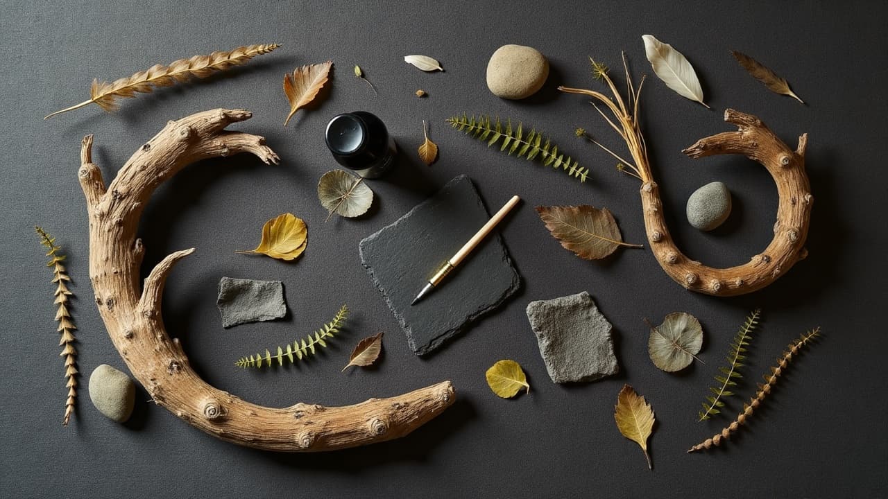
Strong nature tattoos read from six feet away because composition decides what your eye sees first, what it lingers on, and what it ignores. Whether you are pairing a fox with ferns or a mountain range with wildflowers, the win is never the quantity of detail. It is the hierarchy, flow, and consistency of light that make the story feel inevitable.
Start with a clear story and focal hierarchy
Pick one focal point that carries the narrative, then support it with two or three secondary elements that echo the theme without competing. A monarch butterfly can lead, milkweed and a soft sky can support. Keep your hero proportionally larger, sharper in detail, and framed by contrast. Sketch tiny, ugly thumbnails first. Speed roughs inside Procreate or Adobe Fresco on an iPad Pro let you test shapes and separation quickly (Procreate, Adobe Fresco, iPad Pro, Clip Studio Paint, Apple Pencil, non-sponsored examples).
- Use the rule of thirds to place the hero slightly off center, then let supporting elements bridge toward joints or edges.
- Push contrast at the focal point, softer edges in the background. Your viewer will naturally land where the crispness lives.
- Repeat shapes or motifs. Pine needles can echo a wolf’s fur direction, which subtly binds subjects.
- Limit story beats to 3–4. If you cannot pitch the concept in one sentence, the skin will read it as noise.
Build depth with scale, overlap, and atmosphere
Nature looks believable when you separate foreground, midground, background. Overlap leaves in front of the animal’s shoulder, then push mountains back with lower contrast and cooler hues. Use aerial perspective, cooler and lighter in the distance, warmer and darker in the foreground. This is where an on-body mockup helps. Before committing, preview placements and scale with our gallery integration guidelines and test orientation using AI for Tattoo’s virtual try-on to see how elements stack in motion. If you hand stencil, quality transfer gels like Electrum Eco Stencil or Stencil Stuff help keep overlaps readable during long sessions (Electrum Eco Stencil, Stencil Stuff, non-sponsored examples).
Design to the body’s flow, not the page
Tattoo composition lives on anatomy. Use the body’s S-curve, collarbone line, rib sweep, or calf taper to guide movement. Angular subjects, antlers or cliffs, look best cutting across muscular diagonals. Softer subjects, koi or peonies, can coil with the limb. Break big shapes around joints so the image does not kink when you bend. Plan negative space consciously, small breathable gaps around petals or feathers stop mud and keep edges legible. For advanced shape carving and whitespace strategies, see our negative space guide. When drafting, switch to a grey-wash marker set on tracing paper or a Procreate low-opacity brush to preview where the skin tone will act as air.
One light source, one shadow language
Pick a single light direction and commit. If sunlight hits from top left, every leaf vein, beak, and cliff face should agree. Use cast shadows to anchor subjects to each other, a fern leaf kissing a fox’s ribcage, and add a subtle rim light to lift silhouettes. In black and gray, map values first with Neutral Gray sets and glaze to depth. In color, underpaint with complementary grays so hues do not chalk out. Choose a reliable black like Dynamic Black for line and deepest accents, and keep shaders consistent with a Cheyenne Sol Nova or equivalent rotary for even saturation (Dynamic Black, Cheyenne Sol Nova, Eternal Ink Neutral Gray, non-sponsored examples). Stable light makes even busy botanicals feel calm and intentional.
Texture contrast makes nature read fast
Texture is your readability switch. Pair smooth with rough, matte with glossy. A wet otter nose shines next to moss that scatters light. Use stippling on bark, whip shading on fur, hatching on feathers. Keep texture scales honest. Micro-dotting on a far mountain will look noisy. For tools, a KWADRON 03RL or Da Vinci 3RL keeps fine needle texture crisp, while 9M or 15M mags lay soft greenery quickly. Ink sets like Eternal Ink Earth Tones or World Famous Master Sets give you reliable browns and greens that heal predictably in skin (KWADRON, Da Vinci Cartridges, Eternal Ink, World Famous, non-sponsored examples).
Color strategies that unify flora and fauna
Nature is not an equal-opportunity color party. Choose a limited palette with a dominant temperature. A cool blue-green world lets a warm fox pop. Echo that fox’s orange quietly in lichen and leaf stems to glue the scene. Keep reds thoughtful, certain red pigments have higher reaction risk according to the American Academy of Dermatology. Protect all color from UV exposure with SPF once healed, sun is the main driver of early fading per Healthline’s skin health guidance. For mixing and control, build from Eternal Ink Neutral Gray, then glaze Fusion Ink warms or World Famous cools to taste (Eternal Ink, Fusion Ink, World Famous, non-sponsored examples). The FDA notes tattoo inks and pigments are not approved for injection, so buy reputable brands and avoid decanted supplies (FDA tattoo safety overview).
- Set a dominant hue and a support hue, then limit accents to one small family for the focal point.
- Keep value separation wider than hue separation. If values collapse, your colors will read as mush from distance.
- Use muted earths in the background, reserve high chroma for the hero. This protects hierarchy.
- Glaze complementary color temperature shifts across forms, warm light, cool shadow, to add roundness without extra outlines.
- Swatch directly on a skin-tone test patch or synthetic skin to preview healed values before a full day session.
Suggest motion and time without clutter
Wind, water, and growth are story gold, but they bloat fast if overdrawn. Use a few directional lines in grass to imply wind and curve your flow around the hero. Water reads with edge softness, froth highlights, and a value gradient. To mark time, build season cues, buds to bloom to seed, or use a subtle moon-phase arc as a framing device. Keep the number of motion cues to 2–3 so anatomy still breathes. For crisp, repeatable geometric frames that echo natural rhythms, stencil with Spirit Classic Thermal on a quality copier and seal with Dermalize Pro film after the session to protect fine lines during early healing (Spirit Classic Thermal, Dermalize Pro, non-sponsored examples).
Backgrounds and framing that do real work
Backgrounds should earn their keep by separating planes and carrying mood. A soft sky gradient can float mountains. A dot halo around a beetle can rescue tiny legs from mid-value chaos. Geometry and nature play well together when scale matches. Honeycomb for bees, a compass rose for alpine scenes. If you crave watercolor energy, corral it with hard edges so the hero does not drown. For more ways to connect layout to surrounding pieces, see our gallery integration guidelines and plan how this tattoo will talk to neighbors on your body.
- Keep edges varied, hard against the focal point, softer in the background, to drive depth.
- Use negative space silhouettes behind birds or antlers when the body placement has busy pores or sun texture.
- Choose geometric frames that echo subject rhythm, hexagons for insects, arcs for waves, triangles for peaks.
- Lay a textured wash behind flora using stipple or crosshatch so leaves do not merge into skin mid-tones.
- Reserve pattern density for areas that need slowing down, like elbows or knees where skin movement is high.
- Hide small symbol elements in the background, coordinates or dates, rather than crowding the hero subject.
Placement, size, and practical constraints
Botanical fine lines want stable real estate. Forearms, outer calves, upper arms, backs hold detail and flow well. High-movement zones like wrists and ankles compress scale, keep line weight up. Nature pieces with animals and landscapes usually need 5–8 inches minimum to breathe. Expect 1–3 sessions at $150–$300 per hour, with larger back or sleeve compositions running $1,200–$4,000 total depending on market and coverage. Aftercare protects your composition from self-sabotage. Occlusive films like Saniderm or Dermalize for the first 3–5 days, then light hydrators like Bepanthen, Aquaphor, or Hustle Butter help even healing, per general dermatology guidance from the Cleveland Clinic. Keep fresh tattoos out of sun and pools, the AAD also flags contact allergies and photosensitivity risks with some pigments, so watch for unusual redness or itch and consult a clinician if it persists (AAD public guidance).
Workflow that keeps complexity under control
Big nature scenes collapse when the workflow is chaotic. Story, thumbnails, rough block-in, value map, color plan, then line plan. Lock each checkpoint before moving forward. Share a quick on-body comp with your client so you can correct scale before stencils. If you are designing for yourself, use our AI style adaptation guide to translate references into your aesthetic without copying. On the tech side, save brush sets for bark, fur, and foliage so your textures stay consistent across revisions. Keep a short list of trusted consumables, Spirit paper, Electrum stencil, Dynamic Black, and a mid-range rotary so execution matches the plan (Spirit, Electrum, Dynamic, non-sponsored examples). For health and pigment safety basics, the FDA maintains public advice on inks and aftercare for consumers and artists (FDA tattoo safety overview).
Preview composition on your own body before the first line. Generate nature-inspired layouts, resize flora and fauna, and test backgrounds with AI for Tattoo. Start in minutes in Create, swap variants in Explore, then see it on skin with Try On.
Try AI for Tattoo Free