
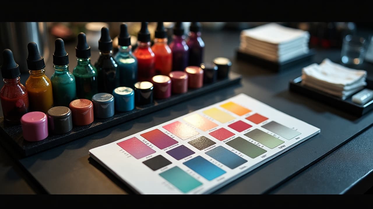
Smooth color gradients are not magic, they are the result of planned value steps, disciplined hand speed, and controlled pigment load. If your blends look muddy, the culprit is usually value, not hue. Build the gradient on paper first, then translate it with measured passes in skin.
Plan the Gradient Before Needles: Value Maps and Palettes
Start with a value map. Even in full color, your gradient should work in grayscale. Print your reference and squint test it, or convert to black and white. Aim for 5–7 distinct value steps from darkest to lightest, each step no more than 10–15 percent apart. This spacing prevents banding and makes feathering predictable. Choose inks that maintain that value separation on the client’s undertone.
- Build a 5-cup test strip on fake skin, moving from full-strength to lightest tint, then photograph under daylight to confirm steps.
- Limit your palette to 2 hue families and 1 supporting neutral. For example, teal to lime with a warm gray buffer.
- When in doubt, prioritize value contrast over rare hues. Your gradient must read from 6 feet away.
- For long fades, use a midtone anchor. Drop both directions into and out of that anchor to avoid chalky light ends.
- Keep white to tiny accents only. White across a light fade often chalks out on healing.
Reliable color lines matter. I reach for Eternal Ink, Fusion Ink, World Famous, Intenze (non-sponsored examples) because their midtones dilute predictably and heal close to how they go in. Swatch your client’s actual skin first, then tweak. On cooler undertones, push warms slightly more saturated to keep them from dying out on healing.
Needle and Machine Setup That Makes Blends Easy
For large blends, curved magnums are your friend. A 17CM, 21CM, or 27CM lays pigment softly without edge scratches. Straight mags cut lines into soft blends, so I reserve 9M or 11M straight for small areas and textural corners. For transitions tighter than 1 cm, a 7CM or 9CM is ideal.
Machine choice affects your forgiveness window. A 3.5–4.0 mm stroke rotary with 5.5–8.0 V is a sweet spot for buttery blends. Shorter stroke and lower voltage give you time to build tone gradually. Keep your needle hang short, about 1.5–2.0 mm, to avoid blowouts when feathering off the edge. Coil machines can blend beautifully too, but require steadier hand speed to avoid chatter lines.
- Favorite motions for blends: small circles to lay in tone, pendulum for edge tapers, and whip shading to throw value into the light.
- Angle the needle 10–15 degrees to the skin for fades. Steeper angles dig pigment, shallow angles glaze.
- Stretch in two directions. A crisp stretch lets pigments stack evenly without chatter or hot spots.
Mixing for Transitions: Dilution Sets and Drop Systems
You can glaze color like watercolor if your dilutions are consistent. Build a simple drop system. In four rinse caps, do full-strength, 1:1, 1:3, and 1:7 dilutions using distilled water with 1–2 drops of witch hazel for slip. Add 1–2 drops of glycerin per cap if you want a slower dry and smoother passes. Always label caps and mix fresh each session.
- Dark-to-light workflow: Saturate your darkest pass, then step down to 1:1 and 1:3 to feather. Reserve 1:7 for surface glaze only.
- Neighbor hues blend cleaner if you glaze a neutral buffer between them, like a warm gray between teal and yellow.
- Pre-mixed color wash sets exist, but custom drops give you control. Test blends with Eternal Mixing White sparingly, since heavy white can chalk or heal cool.
Be mindful of pigment chemistry. Reds and greens can muddy to brown if overworked together. Lay one hue to full saturation, fully clean your needle, then approach from the other side with light glazes. The U.S. FDA flags that tattoo inks vary widely in composition and are not FDA-approved for injection, so knowing your brand and client history reduces risk. Read the FDA tattoo inks consumer updates for broad safety context FDA tattoo information.
Hand Speed, Pass Count, and Preventing Banding
Banding happens when your steps are too far apart or you try to force a jump with one pass. Fix it in the workflow, not in a panic. Keep a steady hand speed, approximately the pace you can count as one Mississippi per inch. The darker pass can take 2–3 slow passes to reach saturation, but your lightest glaze should be a single soft veil.
Work from dark toward light so you do not push residual dark pigment into your highlight zone. Wipe with a damp pad, not a dry paper towel, to avoid lifting fresh color. If you see hotspots, stop, switch to a more diluted cap, and cross-hatch gently at 45 degrees. Overworking causes trauma and can lead to blowouts and premature fading. If you are unsure what a blowout looks like or how it happens, review medical explanations from Healthline on tattoo complications Healthline dermatology content.
Design for Skin Tone: Value First, Hue Second
Gradients succeed when they respect melanin as a permanent filter. On deeper skin, push your darks deeper and your lights warmer so the contrast survives healing. Avoid heavy white and powdery pastels across large fades, they can read dull after 4–6 weeks. Concentrate saturation where the eye needs it, then taper in translucent glazes toward the highlight.
If you are planning a pastel-heavy gradient, consider a higher contrast anchor hue, then feather your pastels into it. For more skin tone strategy, see our guide for deeper skin tones at navigating tattoo options for a deep skin tone. For watercolor-style layering that behaves similarly to color glazes, read watercolor tattoo layering techniques.
Placement and Flow That Make Gradients Pop
A gradient is a ribbon of attention. Wrap it with the body’s movement lines so it looks alive, not stuck on. Run long fades along the limb’s longest axis so your transitions have space to breathe. Avoid cramming a 10 cm blend into a 4 cm gap, or you will band.
- Forearm, outer bicep, calf, and lateral thigh give you 15–30 cm of runway for long fades.
- For circular forms like shoulders, spiral your gradient around the deltoid cap rather than straight top to bottom.
- Use the natural light source of the body. On arms at rest, light often hits from the outside. Put your lightest point there and fade inward.
- If a design has motion, align the gradient to that motion, for example, flame tips to cool base.
- Respect flex points. Heavy saturation over elbow ditch, armpit edge, or knee can heal rough and mottle the blend.
Aftercare That Preserves Color Transitions
Even the best blend dies in the sun. UV scatters pigment and kicks melanin response, which can mute light ends first. Daily broad-spectrum SPF 30+ on healed tattoos helps preserve transitions. Major medical orgs reinforce sun protection for skin health, and by extension, tattoo longevity. See Cleveland Clinic for practical sun safety guidance Cleveland Clinic sun protection.
During healing, expect 14–28 days before top layers settle. Use Saniderm or Tegaderm for the first 3–5 days if you like second-skin healing, then switch to a light moisturizer. I recommend Bepanthen, Aquaphor, Hustle Butter, Mad Rabbit (non-sponsored examples), applied in a rice-grain thin layer 2–3 times daily. Avoid soaking, tight athletic wear over fresh blends, and heavy workouts that crease the area. For a full sun safety breakdown specific to tattoos, read our sun exposure guide.
Allergic reactions are uncommon, but reds and some yellows can be culprits. The American Academy of Dermatology outlines tattoo allergy signs and when to seek care AAD tattoo information. JAMA Dermatology has published case reports on pigment reactions, which is why patch tests and thorough histories matter JAMA Dermatology journal.
Common Blending Mistakes and Quick Fixes
- Muddy midpoint between complements: Insert a neutral buffer glaze first, then lightly overlap the neighbors.
- Visible bands: Your steps are too far apart. Add an in-between dilution, then cross-hatch at 45 degrees with a 1:3 mix.
- Chalky lights: You used too much white. Replace with a warm-tinted glaze and reserve true white for pinpoint accents.
- Hot spots or trauma sheen: You overworked. Stop, cool compress, let it settle. Finish with a fast glaze next session.
- Dull healed gradient: UV or under-saturation. Add SPF 30+ daily, then book a touch-up to lift midtones.
If you are unsure whether to fix now or at the touch-up, wait. Overworking a fresh blend rarely ends well. Photograph in diffuse daylight at 2 weeks and 6 weeks to judge true settled value before deciding.
Time, Pain, and Budget Expectations for Gradient Work
A forearm gradient band at 6–8 inches tall typically takes 2–4 hours, depending on detail. A full upper arm wrap with multiple hue transitions can run 5–8 hours, often split into two sittings for best healing. Many studios price color work at $150–$300 per hour in the U.S., with big-city shops hitting higher.
Pain is moderate for most people. Large soft shading rates 4–7 out of 10, higher at tender spots like inner arm or knee back. Plan micro breaks every 45–60 minutes to keep your hand consistent and your client steady. Hydration, a carb snack, and a clean stretch make more difference to blend quality than you think.
Preview how your gradient flows before you book the chair. Use AI for Tattoo to generate hue steps, map value anchors, and test placements on your body. Build your palette in the app, then create and try on a wrap or band to see the transition in motion. Start now at Create or test it live with Try On.
Try AI for Tattoo Free