Roughly one in three American adults has at least one tattoo, with many collecting multiples, according to recent Pew Research Center data. The image you pick matters, but how those elements are arranged is what makes the piece read, age, and feel intentional. Composition is the quiet author behind your tattoo’s meaning, and it is as much about flow, hierarchy, and negative space as it is about symbols.
Composition 101: How Tattoos Communicate Beyond the Motif
In tattooing, composition means the relationship between elements on your skin and the body underneath. The same rose can feel fierce or tender depending on scale, line weight, contrast, and where your eye lands first. Strong composition guides viewers, protects readability as the tattoo ages, and locks your intent into the overall arrangement.
Think of your tattoo like a small poster you wear forever. We use familiar visual tools from art and graphic design, adapted for skin that moves and heals. These building blocks create clarity and meaning even before someone deciphers specific symbols.
- Hierarchy decides your focal point and supporting cast, so one element speaks first and others add context.
- Balance chooses symmetry or asymmetry to signal order, energy, tradition, or spontaneity.
- Flow follows anatomy and motion lines, so the piece sits comfortably on muscles, joints, and curves.
- Contrast uses value range and color temperature to keep details readable from 3–10 feet away.
- Proximity and overlap create relationships, like a guardian placed above or a memory tucked behind.
- Negative space acts as a breathing room buffer, the difference between elegant and cluttered.
Flow With the Body: Placement, Direction, and Motion
Skin is not flat. A forearm twist, a rib breath, a shoulder roll, these change how a piece reads. Direction adds meaning too. In many Western contexts, left to right suggests time moving forward, so a bird flying right can imply progress, while inward facing can feel protective. Positioning an element to face the heart often reads as intimate, while facing outward reads as public.
Good flow respects muscles and joints, and it gives elements room to expand during healing. It also anticipates aging. Lines that follow a deltoid’s arc keep their lift longer than lines fighting against it. When in doubt, we map a line of action through the body part, then anchor your focal point to that curve.
- On limbs, angle major motifs along the bone line for stability and elegance.
- Keep faces and animals pointing inward for personal pieces, outward for broadcast energy, unless cultural rules dictate otherwise.
- Let joints, like elbows and knees, carry connectors such as wind bars or filigree rather than tiny lettering that will distort.
- For wrap areas, ensure key details live on a primary plane, not tucked where they disappear without rotating.
Symbol Order and Hierarchy: Who Leads the Story?
Hierarchy is how viewers learn what matters. We set a clear focal point, often at a strong anatomical landmark or using the rule of thirds, then place supporting elements to frame and reinforce the message. Size signals importance, but so do line weight, saturation, and edge sharpness. A crisp, high-contrast anchor piece pulls the eye before softer textures do.
Overlap sequences time and memory. Place a mentor or guardian above or in front of a symbol to suggest protection. Tuck a keepsake slightly behind botanical elements to imply it is cherished and held. Framing devices like laurels, smoke, or geometric halos can elevate a subject without stealing focus.
- Promote one star with 30–50% more scale or contrast than any other element.
- Use hard edges on the focal point and soft gradients on backgrounds to build depth.
- Frame with arches, halos, or waves that point back to the subject, not away from it.
- Reserve pure black for the focal zone and use mid tones elsewhere to protect hierarchy.
Symmetry vs Asymmetry: What Balance Says Culturally
Symmetry feels ceremonial and stable. Think mandalas, ornamental chests, or mirrored knee caps. It can signal harmony, oath, or permanence. Asymmetry feels lived-in and kinetic, more like a moment caught mid motion. It can say growth, journey, or openness. Both are valid, but each carries different cultural weight depending on the tradition you reference.
Japanese irezumi often prefers asymmetric balance, with a dominant hero and a counterbalancing background, while Polynesian work can lean symmetrical within bands to represent structure and lineage. Blackwork geometry thrives on strict mirroring, but even then we tailor halves to your unique muscle shapes rather than forcing perfect flat-paper symmetry.
- Choose symmetry for vows, crests, and spiritual centers that benefit from ritual weight.
- Choose asymmetry for narratives, journeys, and nature scenes with implied motion.
- If mixing, center a symmetrical anchor and let asymmetric backgrounds add movement around it.
Color, Value, and Negative Space: Readability Over Time
Color feels like meaning, but value does most of the readability work. Two different reds read the same from across the room if they are the same darkness level. We build a safe value ladder first, then choose hues. High contrast around the focal point and protected negative space keep elements legible as the tattoo settles and softens.
Sun and skin biology will test your palette. Dark pigments hold longest, and warm colors like red and yellow often fade faster when overexposed. Consistent SPF matters. See the Cleveland Clinic overview of tattoo aftercare for skin protection basics, and the American Academy of Dermatology guidance on tattoo reactions regarding pigment sensitivities, especially to reds.
- Lock in readability using a 3-step value map, light, mid, and dark, before picking hues.
- Save pure white for pinpoint highlights so it stays special and does not turn muddy.
- Guard edges with negative space buffers rather than outlines alone, especially in color realism.
- After healing, use SPF 30+ daily on exposed pieces to slow color loss and blurring.
Layering, Backgrounds, and Connectors: Building Sleeves That Breathe
Sleeves fail when every inch fights for attention. Backgrounds give your main elements room and provide cultural texture. In Japanese compositions, waves, wind bars, and clouds carry seasons and tone. In neo-traditional, smoke, filigree, and dotwork can glue a patchwork of flash into a coherent arm. Plan the background as deliberately as the star motifs.
Use connectors at joints and transitions that compress or stretch without looking broken. Backgrounds usually carry less contrast and thicker clustering, so details do not outshine foregrounds. Work in phases. A robust background often requires 2–3 sessions to wrap cleanly around anatomy and preserve the focal rhythm you set on day one.
- Classic connectors include smoke whips, wind bars, waves, maple leaves, filigree, and stipple haze.
- Reserve soft blacks and mid tones for backgrounds so the focal subject stays king.
- Map wrap points so no key detail lands in an armpit fold or on the elbow cap.
Culture and Context: Arrangements That Carry Protocol
Meaning is not just what you intend, it is what a design already means to a culture. Placement can be part of that meaning. In Thai sak yant traditions, specific yantra and their positions on the back or chest carry rules. In Polynesian patterns, the upward or downward flow inside bands can express lineage and protection. Māori moko facial placements are deeply personal and not aesthetic ornaments.
Research and respect protect you from unintentional harm. If you plan to borrow motifs, study credible sources and work with artists connected to that lineage. Start with our primer on cross-cultural comparison of tattoo symbols and our stance on tattoo cultural reappropriation. When in doubt, design inspired-by geometry that does not lift reserved patterns or placements.
- Confirm whether a motif or placement is restricted within its culture.
- Adapt structural ideas like symmetry or flow rather than copying sacred specifics.
- If appropriate, collaborate with a culture-bearer artist and follow their protocol.
- When symbolism is universal, like sun, moon, waves, adjust arrangement to make it yours.
Material Realities: Aging, Ink, and Skin Responses
Compositional choices should anticipate healing and decades of wear. Fine micro details packed edge to edge will merge faster than designs with breathing room. Larger shapes with protected negative space keep clarity longer. Allergy risk also intersects with color selection, most often with certain reds, so meaning should not hang on a pigment you might need to avoid.
For safety basics, see the FDA guidance on tattoo inks regarding regulation and pigment variability. A survey published in JAMA Dermatology reported that roughly 6% of tattooed individuals experienced complications like itching or rash that lasted longer than expected, a reminder to plan for alternatives if a color is problematic. Consult the JAMA Dermatology journal for methodology and context and the American Academy of Dermatology for warning signs and care recommendations.
- Favor bold shapes over hair-thin filigree when the message must hold at 10+ years.
- If you react to reds, reassign meaning using warm grays, umbers, or patterned line instead of pigment.
- Place crucial micro text away from high-motion zones like wrist creases to reduce blur.
Testing Readability: Scale, Mockups, and Try‑Ons
Scale tests save regrets. Print your design at real size and tape it on. Stand 3, 6, and 10 feet away in a mirror and squint. If you cannot name the subject at 6 feet, the hierarchy is off. Then rotate your arm or take a breath to watch which details collapse when the skin stretches, and adjust line weight and spacing accordingly.
Digital previews help too. Our guide on the harmony of color and shape explains how value contrast affects legibility. If you plan a sleeve from scattered pieces, mock the backgrounds first to see how they steer the eye. Commit to your key negative spaces now so you do not crowd them later.
- Test black and gray first, then add color to avoid value surprises.
- Try a stencil-sized printout to confirm wrap, then a full-size mock for final checks.
- View under warm and cool lighting because many interiors shift saturation.
From Idea to Stencil: A Practical Workflow
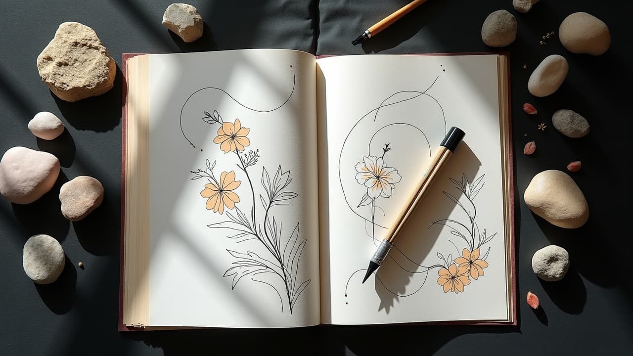
Start with meaning notes, not a mood board. Write your three non negotiables, then pick one clear focal subject and two supportive elements that echo the theme. Gather references that show pose and lighting, not just vibes. For digital sketching, many artists use Procreate on iPad to test flows quickly, or build photo mockups to check wrap and scale.
In studio, we tune composition at stencil. Products like Stencil Stuff help transfers stay crisp during long sessions, and a thin layer of Hustle Butter or Vaseline keeps skin workable without flooding lines. Aftercare films like Saniderm can protect large multi session backgrounds so they heal evenly, while creams such as Bepanthen, Aquaphor, or Mad Rabbit help moisturize the settle phase (non-sponsored examples).
- Book a design consult, usually $100–$300, to solve composition before session day.
- Block 3–6 hours per large element so you do not rush hierarchy or backgrounds.
- Bring a printout with annotations on what each element means to you, this guides small placement calls.
- If collaborating with AI, see our prompt optimization guide to steer layouts, not just images.
Ready to see how your elements play together before committing? Use AI for Tattoo to generate balanced layouts and try them on your own body. Build a focal point, test backgrounds, and preview flow with quick swaps. Start by [creating a design](/create), then use the [virtual try on](/try-on) to check readability from every angle.
Try AI for Tattoo Free