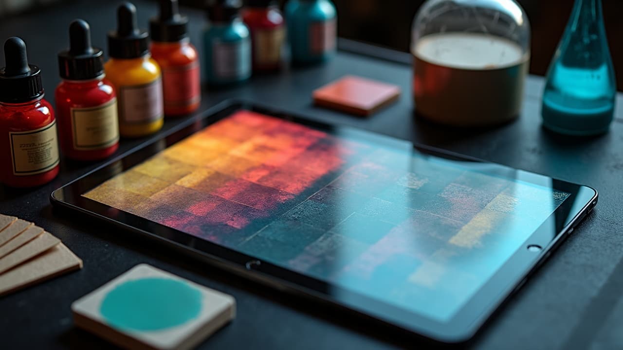
AI listens to color instructions more than most people realize. If you give it structured palette language, it will prioritize hue, value, and saturation before it nails composition. Vague adjectives create drift, but a palette written with hex codes, HSL, and harmony rules behaves predictably and stays true through iterations. This is how you move from pleasant accidents to repeatable, studio-grade results. Think like a designer, not a poet. Pair the creative brief with numeric cues, contrast targets, and ink behavior notes that anticipate real skin. If you are new to hue relationships, bookmark our color theory guide for quick refreshers, then bring that language into your prompts.
Why color language drives AI tattoo results
Multi prompt models often weight color tokens strongly. That means writing color precisely can lock your palette early and reduce unwanted shifts later. Replace fuzzy terms with explicit hue names, numeric ranges, and relationships the model understands. Keep your palette declaration at the front of the prompt so it anchors the scene. For longer briefs, repeat the core palette near the end to reinforce it during sampling. This is also where negative prompting helps. Tell the model not just what you want, but what to avoid, for example, no neons, no grey wash, or no pastel contamination. If you are optimizing longer briefs, see our workflow notes in AI prompt optimization tips.
- Swap vague words like "colorful" for "limited palette of #0A0A0A, #B80F0A, #F2D16B" with 70/20/10 dominance.
- Replace "blue-green" with "teal (H 180–190, S 55–70, L 35–45)" for tighter targeting across samplers.
- Use "muted, low-chroma" or "pastel, high-L" instead of "soft" to pin saturation or lightness.
- Add negative color instructions, for example, "no neon, no magenta cast, avoid muddy browns" to prevent drift.
- Repeat the palette at end of prompt, for example, "palette lock: #222222, #0E7490, #F59E0B, ratio 70/20/10".
Write palettes like a designer, not a poet
Give the model the same scaffolding a brand guide uses. Specify hex codes or HSL, assign a 70/20/10 hierarchy, and describe tints and shades as steps. You can also reference Pantone by name or number to anchor hue families, then back it with hex or HSL so the model has numeric targets. Close with behavior notes like "matte finish" or "opaque pack" to avoid watercolor bleed. Use palette tools to plan before prompting. Build combinations in Adobe Color, Coolors, or Pantone Connect (non-sponsored examples), export hexes, then paste them into your prompt. If you work in Procreate or Krita, keep a swatch file open so revisions remain consistent across concepts.
- Palette syntax starter: "Palette: #111111 charcoal, #E63946 crimson, #F1FAEE eggshell, dominance 70/20/10, finish matte, opaque."
- HSL version: "HSL colors: H 350 S 72 L 46 (crimson), H 200 S 68 L 36 (cyan-teal), H 55 S 80 L 74 (gold)."
- Pantone assist: "Pantone 7621 C, Pantone 7549 C, Pantone 432 C (approx hex #C8102E, #FFC72C, #1C1F2A)."
- Tint ladder: "red tints at +15 L, +30 L, neutralized with +8 gray for desaturation."
- Value map: "70 dark, 20 mid, 10 highlight, keep blacks at #0A0A0A not pure #000000 to maintain skin realism."
Lock harmony and contrast with explicit rules
Tell the AI which color relationship to use. Complementary, split complementary, triadic, analogous, or monochrome with accent are all understood when you describe them plainly and back them with hex or HSL. Add a contrast floor so details read on different skin tones and under different lighting. A practical baseline is a contrast ratio of 4.5:1 for small elements, which mirrors accessibility standards and keeps linework legible when the design is shrunk for the stencil. For reference on contrast thinking, the W3C accessibility guidelines popularized numeric contrast targets. We borrow the mindset for tattoo planning even though we ink on skin, not screens.
- Complementary example: "teal vs rust split comp, base #0E7490, accents #C2410C and #F59E0B, ensure 4.5:1 contrast on edges."
- Triadic example: "triadic red, blue, yellow, muted -25% saturation, dominance 70/20/10, no neon."
- Analogous example: "analogous violet to blue-green, H 250–190 sweep, highlights at +20 L, shadows at -15 L."
- Monochrome plus pop: "mono gray #111, #333, #777 with single accent #E11D48 (15%), matte finish."
- Gradient control: "no rainbow gradients, use two-step blend between #1D4ED8 and #22C55E, stop midpoint at 50%."
Prompting for real skin: hue, value, and undertone
Skin is not a white canvas, so anchor your colors to a skin context. Reference Fitzpatrick I–VI when needed, then speak to undertone. On deeper skin, bump value in your lightest pigment and raise saturation for accents so midtones do not collapse. On lighter skin, prevent flare by slightly warming your blacks and de-saturating competing highlights. If you are unsure of undertone language, Healthline gives a clear overview of Fitzpatrick types and undertone basics, useful when translating real skin to prompts. See the Healthline overview. For care and fading context, the American Academy of Dermatology underscores how sun exposure and pigment choice affect appearance over time. Building contrast now helps the design read years later, especially for yellow, pastel, and light blue which can appear lower value on skin.
- Fitz I–II prompt: "skin context Fitz I–II, cool undertone, avoid pinkish reds, prefer blue-leaning crimson, keep highlights L 80–85."
- Fitz III–IV prompt: "Fitz III–IV, warm to olive, accents +10 saturation, midtones L 45–55, avoid low-contrast yellow on highlights."
- Fitz V–VI prompt: "Fitz V–VI, push highlights to L 70, blacks #0A0A0A, accents high-chroma teal or gold, no pale pastels."
- Undertone fix: "if skin reads too red, add green bias -5 to shadows, remove magenta cast in negative prompt."
- Aging guardrail: "prefer matte, opaque pigments, avoid watercolor bleed, keep edge contrast ≥ 4.5:1 for longevity."
Lighting and color grading control
Lighting language changes perceived hue. Tell the model your white balance and mood. 6500K daylight keeps blues true, 3200K tungsten warms reds and ambers, and overcast softens specular highlights. Ask for flat, studio lighting if you want the palette represented faithfully for stencil planning. When you want drama, specify rim light or colored gels but keep a neutral key so your inks remain honest. You can also guide color grading. Use "film stock" or "LUT" references as creative direction, then add a correction like "skin-neutral grade" to protect the palette. If you keep references on hand, tools like Adobe Lightroom, Capture One, or DaVinci Resolve help you read histograms while you iterate images from the AI (non-sponsored examples).
- Neutral proof: "studio flat light, 6500K, high CRI, no gel, color grade neutral to show true ink hue."
- Warm mood: "3200K tungsten, softbox left, rim light cool #60A5FA, protect skin midtones L 55–65."
- Golden hour: "low sun, warm key, cool fill, keep accent red H 350, avoid orange shift in negative prompt."
- Film look: "Portra-style grade, gentle contrast S-curve, no teal-orange cast, preserve cyan and crimson hex targets."
- Gel control: "cyan gel on background only, subject lit neutral, prevent global tint in negative prompt."
Pigment behavior and realism cues
AI will guess at how inks behave unless you specify it. Solid color packing reads different than watercolor or whip shading. Call out opaque vs translucent, matte vs glossy, solid fill vs wash, and the needle effect like stippling. To ground safety and longevity language, the U.S. FDA tracks tattoo ink considerations, and journals like JAMA Dermatology discuss pigment reactions, especially with red pigments. We use that awareness to bias toward durable choices in prompts. Even for stylized work, keep black values honest. Pure #000000 looks digital. A near-black like #0A0A0A or a cool black keeps texture believable and prevents banding when you shrink the image for stencil transfer.
- Behavior cues: "opaque pack, matte finish, no watercolor bleed, edge crisp, fill even."
- Red caution: "prefer deep crimson not orange-red, avoid cadmium-like neon in negative prompt."
- Black realism: "use #0A0A0A for blacks, add cool bias -3 to shadows, prevent crushed detail."
- Wash vs solid: "solid fill for primary shapes, controlled wash S 20–30 for background depth."
- Texture: "stippling in shadows, soft whip transitions, no airbrush look, preserve grain."
An iterative workflow that keeps color consistent
Treat the palette as a system you carry through drafts, not a one-off line in your prompt. Start with a palette-only render to test harmony. Once it looks right, lock the seed, then expand the subject description. Use a color reference image with IP-Adapter or a ControlNet color pass to force palette adherence on complex compositions. Iterate in small deltas, 2–3 variations at a time, to avoid palette drift. Manage swatches outside the model too. Build and reuse ASE files from Adobe Color, Coolors, or Paletton, and keep a pinned note with your palette string for quick paste. If you are writing longer briefs, modularize your prompt with a color module, a subject module, and a lighting module so edits do not scramble hues.
- Stage 1: "render abstract shapes only with full palette, verify 70/20/10 balance and legibility."
- Stage 2: "lock seed, add subject and composition, repeat palette string at end for reinforcement."
- Stage 3: "apply IP-Adapter color or ControlNet reference, keep CFG moderate to avoid hue shift."
- Stage 4: "iterate 2–3 variations, adjust only saturation or lightness, avoid changing hue names."
- Archive: "save ASE swatches, export prompt snippets, note exact hex codes for future projects."
Troubleshooting muddy, neon, or washed-out outputs
Most color failures come from missing contrast floors, unbounded saturation, or lighting that tints the entire scene. Fixes are promptable. Name the problem, define a numeric correction, and add a negative constraint. If the model keeps ignoring you, split the job into palette-first and subject-second passes so the hue family is set before details. For foundational composition help that pairs nicely with color, see our placement and landmarks guide.
- Muddy colors: "raise contrast to 4.5:1, add +10 saturation to accents, specify matte, opaque, forbid brown contamination."
- Neon drift: "-30% saturation, no neon, prefer muted palette, highlights capped at L 78."
- Washed out: "increase midtone L 5–10, specify solid fill, add black key #0A0A0A for anchors."
- Skin reads too red: "add green bias -5 to shadows, neutralize background, avoid warm global tint."
- Highlights clipping: "cap highlights at L 85, avoid pure white, keep skin-friendly off whites like #F1F5F9."
Ready to put this into practice with subject prompts, symbolism, and style mixes that respect your palette rules? Pair these color methods with structure from our prompt crafting guide and keep a running library of swatches you trust.
Build a color-locked tattoo concept now. Use AI for Tattoo to generate with your exact **hex palette**, then **try it on** your skin photo to assess contrast before booking. Start at [Create](/create) and preview placements with [Try On](/try-on).
Try AI for Tattoo Free