Most generic AI tattoo results trace back to vague prompts, not weak models. Shorten the brief, sharpen the constraints, then iterate with purpose. In practice, unique designs come from 3–5 personal anchors, a tight style stack, and anatomy-aware direction. That mix consistently beats sprawling word soups that ask for everything at once.
Start With Personal Anchors, Not Aesthetics
Before naming styles, list the personal facts your tattoo must express. A good AI prompt focuses on your story, then translates it into visual constraints. Give the model specific nouns and verbs tied to your life, plus 2 or 3 hard limits that rule ideas out. This yields coherent, original results and avoids copycat vibes.
- Write 3–5 anchors: event, place, trait, date, or object. Example: “Sagittarius mother, night-shift nurse, coastal roots, 2012 recovery.”
- Add 2 hard constraints: “no faces, no text.” These prune clichés and keep the model from defaulting to filler.
- Define intent in one line: “quiet resilience” or “playful mischief.” Emotional cues direct composition and spacing.
- Include environment or motion verbs: “cresting wave,” “interlocking vines,” “ascending smoke,” which suggest flow on curved anatomy.
- Close with scale and complexity, like fine-line, 8–10 cm, or bold blackwork, palm-size, to set detail ceilings.
If you already know the surface, bake it in. Example: “for left outer forearm, vertical flow, negative space at wrist crease, wraps 20%.” That tiny placement sentence is a powerful anatomy lock that filters out thousands of unwearable arrangements. For more first principles on prompt structure, see our prompt crafting starter guide.
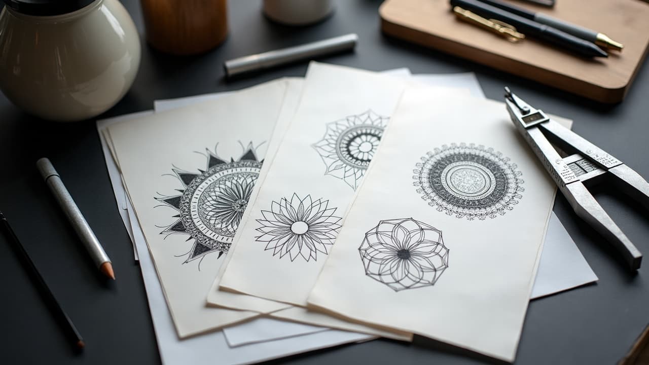
Build a Style Stack That Signals Technique, Not a Single Artist
“In the style of X” invites clones. Describe technique instead. I use a three-layer style keyword stack: macro genre, technical treatment, and finish. Keep each layer short and concrete, then cap the stack with a clarity clause that matches your target size.
- Macro genre: blackwork, neo-traditional, Japanese irezumi, geometric, watercolor, illustrative.
- Technical treatment: single-needle, whip shading, stippling, dotwork, bold line 7–9RL equivalent, hatching.
- Finish and mood: low-contrast, matte paper texture, gritty stipple, high-contrast, soft glow kept minimal.
Reference aesthetics without cloning: instead of “like Mo Ganji,” write “continuous-line silhouettes, high negative space, no midtones.” Avoid naming living artists when possible. If you must orient a model to a canon, cite movements or publications, for example “’70s airbrush poster vibe” or “woodcut engraving qualities.” For style research, browse our styles library and cross check with your anchors. Tools like Procreate, Clip Studio Paint, or Krita (non-sponsored examples) help you sketch over outputs and refine edges before sharing with your artist.
Anatomy-Aware Prompts: Flow, Orientation, and Wrap
Great tattoos read clearly from the most common viewing angle and respect joint motion. Write directionality into your prompt. A forearm prefers vertical flow, a pec prefers diagonal S-curve, and a calf loves rising arcs that follow the gastrocnemius. State left or right, inner or outer, and any necessary negative space around creases or scars.
- Forearm, vertical, wrist to elbow: portrait orientation, negative space at wrist crease, taper at distal end.
- Upper arm, outer: wrap 30%, primary contour faces anterior, no dense detail over deltoid apex.
- Calf, lateral: ascending flow, apex below knee, avoid full wrap to prevent foreshortening on medial side.
- Spine or sternum: central symmetry, low midtone density to reduce muddy healing in high-movement zones.
- Hands and fingers: bold line minimum 5RL look, simple geometry, reduce micro detail since healing friction is high.
Add “mock on curved surface” or “maintain legibility at arm’s-length” to keep compositions simple enough to survive on skin. If you plan to shield healing with Saniderm or similar second-skin (non-sponsored examples), space elements so edges are not trapped under adhesive lines. For placement research, our geometric flow breakdown explains curvature and tiling with real examples.
Color Strategy That Respects Skin and Longevity
Color choices must account for melanin and UV exposure. Warmer, darker skin tones often swallow low-saturation pastels, so guide models toward high-chroma warms, opaque gray, or blackwork with selective accents. Note the likely sun exposure and specify contrast floors, like “keep value contrast above 60%.” The American Academy of Dermatology notes that tattoo reactions can include pigment sensitivities, especially with reds, so keep color sets deliberate and consistent AAD overview.
- State palette size: 2–3 ink colors plus black, or monochrome for first pass.
- Name undertones: olive skin, cool brown, warm tan, to nudge harmonies that read through epidermal tint.
- Set contrast floor: “no low-contrast pastels,” “avoid muddy greens,” “prefer rust, indigo, off-white highlights.”
- Cue fade realism: “sun-exposed zone, design must read at 3–5 years fade,” so models push bolder shapes.
- Optionally name inks for vibe, like Eternal Ink Muted Earth Tones or Fusion Opaque Gray palettes (non-sponsored examples).
For skin and healing context, reputable medical sources outline sun and skin-care impacts on tattoos. See the Cleveland Clinic for practical tattoo safety and skin guidance Cleveland Clinic resource and Healthline for aftercare basics and color retention primers Healthline tattoos. Pigment oversight and safety info live with the U.S. FDA, which tracks tattoo ink issues and advisories FDA tattoo inks.
Use Negative Prompts, Weights, and Aspect Ratios Intentionally
Most platforms accept negative prompts and sometimes keyword weights. Use them to keep clutter out and to balance focal hierarchy. If your target is a crisp forearm piece, ban backgrounds, floating particles, and tiny micro-details that turn to mush at 8 cm.
- Negative prompt staples: no background, no text, no watermark, no extra limbs, no photoreal skin texture.
- Weighting idea: “rose:1.3, compass:0.8, rope:0.7,” which keeps the flower dominant over navigation motifs.
- Line discipline: “clean outlines favored, minimal crosshatch,” or “dotwork shading only” to avoid painterly mush.
- Aspect ratio: specify 9:16 for vertical limbs, 1:1 for round placements, 3:2 for torso panels to suggest spatial layout.
- Simplicity clause: “reduce elements to 3 shapes, limit micro-detail,” then scale up complexity in later iterations.
Not every tool uses the same syntax, so write platform-agnostic first, then translate. If your app exposes seed control, lock a seed once you see a promising silhouette so you can iterate without losing composition. If it supports control images, use a quick pencil thumbnail from Procreate or Adobe Fresco as a composition guide.
Iteration Loops: From Batch to Shortlist to Hybrid
Treat generation like thumbnailing in a sketchbook. Start wide, then narrow. Batch 8 to 12 low-cost candidates with strict constraints, fix the best 2 to 3 with incremental relaxations, then hybridize elements. Keep an eye on legibility at intended size, not just on a large monitor.
- Batch pass: 8–12 images, strict negatives, high contrast, no backgrounds. Reject fast.
- Refine pass: lock seed, widen one variable at a time, like line weight or wrap percentage.
- Hybrid pass: “combine A’s frame with B’s focal,” or feed a rough collage as a control image.
- Score each candidate on 5 criteria: silhouette, flow, focal contrast, tattoo-ability, and story match. Keep the top 2–3.
- Export finals at high resolution, then test-print at actual size to judge line economy and readability.
Use print mockups or the AI for Tattoo Try-On to preview scale and placement live. Real-world size checks protect you from chasing intricate renders that collapse on skin. When you are ready to commit, save your prompt and settings with version numbers so your artist can trace choices easily. For broader system thinking, see our optimization deep dive.
Translate AI Renders Into Stencil-Ready Linework
Most models over-shade and under-define edges. Your artist needs line hierarchy and clear blacks. Ask for line-art emphasis in the prompt, then clean the chosen render in software your studio uses. Emulate stencil logic, not glossy illustration, and stay aware of line swell over time.
- Extract lines in Adobe Illustrator or Affinity Designer using Image Trace, then simplify anchor points.
- In Procreate, lower opacity of the render, draw clean lines on a new layer with a 6B pencil or Studio Pen.
- Test two line weights, for example 3RL look for details, 7RL look for structure, so healed contrast survives.
- Flatten fuzzy midtones into solid black shapes or stippling, since soft airbrush shading can heal muddy.
- Deliver your artist a layered file plus a 300 dpi print at exact size, labeled with key constraints and palette notes.
Plan aftercare and placement realism early, even at prompt time. High-friction zones and daily sun will challenge soft color blends. The AAD and Cleveland Clinic both outline risk factors like infections and allergic reactions that influence what techniques age best AAD guidance and Cleveland Clinic overview. Use that lens to prefer durable blackwork or opaque gray in heavy-use areas.
Ethics, Safety, and Cultural Precision
Prompts carry responsibility. Avoid sacred motifs you do not belong to, and never request identifiable artist copies. If you love a tradition, like Māori tā moko or Samoan tatau, work with culture-bearer artists and use AI only to explore respectful adjacent geometry. For biomedical and ink safety info, the U.S. FDA summarizes regulatory notes and recalls related to pigments and contamination risks FDA guidance.
- Avoid “in the style of [living artist].” Use technique descriptors instead.
- Research motifs through cultural institutions or publications, not just social feeds.
- Note medical constraints early, for example “nickel allergy, avoid red pigments,” which AI can respect in palette planning.
- Build a consent checklist with your artist if scars or birthmarks are involved, so camouflage vs highlight choices are intentional.
- Remember AI is a drafting tool. Final authorship and safety judgment sit with a licensed artist and you.
Generative AI is now common in creative planning. Surveys from Pew Research Center show growing public contact with AI tools across tasks, which includes visual ideation and design Pew Research Center. Use AI to widen your sketchbook, then narrow back to your lived story and anatomy so the result is unmistakably yours.
Example Prompt Blueprints You Can Adapt
Use these as structures, not scripts. Swap in your anchors, placement, and style stack. Keep them concise, then iterate with weights and negatives until the silhouette and story lock in. Test on your intended body area with a real-size print or our virtual try-on.
- Blackwork forearm, resilience anchor: “for left outer forearm vertical, rising smoke morphing to mountain ridge, continuous-line silhouettes, high negative space, dotwork shading only, no background, no text, seed locked.”
- Neo-traditional calf, family anchor: “right lateral calf, ascending flow, swallow and olive branch, bold line 7–9RL look, muted earth palette, value contrast above 60%, no filigree, wrap 25%.”
- Geometric sternum, travel anchor: “sternum centered, compass abstracted into tessellated triangles, symmetry tight, thin-to-thick line hierarchy, no gradients, matte paper texture, no background, 1:1 aspect ratio.”
Ready to turn sharper prompts into designs that fit your body and your story? Generate with **AI for Tattoo** using your anchors and style stack, then live-preview placement with the **Try-On** tool. Start now at [Create](/create) and [Try-On](/try-on).
Try AI for Tattoo Free